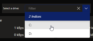
Dropdown
This basic control allows the user to select an item in a dropdown list. The selectable items can be based on any data.

Dropdown component in DataMiner 10.4.6
Note
Prior to DataMiner 10.3.5/10.4.0, this component is available under Feeds.
To configure the component:
Apply the necessary data. See Adding data to a component.
Note
- From DataMiner 10.3.0 [CU13]/10.4.0 [CU1]/10.4.4 onwards, when you apply a single query data source or Tables data source, individual rows from that query or table are listed instead of the query or table itself. Additionally, if you want to use this dropdown component as data, the entry will be listed as Tables or Query rows in the Data pane (depending on your DataMiner version). When you apply multiple query data sources or Tables data sources, the queries or tables themselves are listed as data. Prior to DataMiner 10.3.0 [CU13]/10.4.0 [CU1]/10.4.4, when you apply a single query data source, the query itself is listed as data. If you use this dropdown component as data, the entry will be listed as Queries in the Data pane.
- You can use the Tables data source for this component from DataMiner 10.3.0 [CU21]/10.4.0 [CU9]/10.4.12 onwards.
Optionally, fine-tune the component layout. In the Component > Layout pane, the following options are available:
The default options available for all components. See Customizing the component layout.
Display column: Available from DataMiner 10.3.0 [CU13]/10.4.0 [CU1]/10.4.4 onwards. Allows you to select a column that should be picked to display the name of an item in the dropdown box. This setting is only available when a single query data source or Tables component data source was applied.
Label: Allows you to specify text that should be displayed next to the dropdown box.
Optionally, customize the following component options in the Component > Settings pane:
WebSocket settings: Allows you to customize the polling interval for this component. To do so, clear the checkbox in this section and specify the custom polling interval.
Initial Selection > Select first item by default: Available from DataMiner 10.3.0 [CU13]/10.4.0 [CU1]/10.4.4 onwards. Sets the first item as the value that will be applied in the data when the dashboard is opened, unless a custom URL is used specifying a different value. This setting is enabled by default.
Initial Selection > Select item by default: Allows you to specify a default value. This is the value that will be applied in the data when the dashboard is opened, unless a custom URL is used specifying a different value. From DataMiner 10.3.0 [CU13]/10.4.0 [CU1]/10.4.4 onwards, this setting is only available when the Select first item by default setting is disabled.
Note
- Prior to DataMiner 10.3.0 [CU13]/10.4.0 [CU1]/10.4.4, this setting is called Initial Selection instead.
- Prior to DataMiner 10.3.6/10.4.0, this setting is called Feed Defaults instead.
Clear selection: Available from DataMiner 10.3.0 [CU13]/10.4.0 [CU1]/10.4.4 onwards. Allows you to clear the selected values in the component by clicking the X button in the top-right corner of the filter box. This setting is disabled by default.
Data retrieval > Update data: Available from DataMiner 10.3.0 [CU13]/10.4.0 [CU1]/10.4.4 onwards. Allows the values displayed in the component to be updated in real time, if the data supports this (see Query updates). This setting is only available when a single query data source or an indices data set was applied. This setting is disabled by default.