Dropdown
This basic control allows you to select an item in a dropdown list. The selectable items can be based on any data.
This component is typically used to let users interact with a dashboard or low-code app by selecting a value that influences what is shown elsewhere. For example, a dropdown can be used to filter data in other components, switch between different data sets, or focus on a specific element, protocol, or status. This makes it easier to explore large amounts of data and quickly find the information that is most relevant.
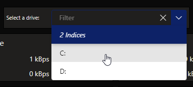
Dropdown component in DataMiner 10.4.6
Note
Prior to DataMiner 10.3.5/10.4.0, this component is available under Feeds.
How data is displayed in the dropdown
The way items are listed in the dropdown depends on the type and number of data sources applied:
Built-in data sources (such as Elements or Protocols):
When you apply a single data source, the dropdown lists the individual items from each data source.
If multiple data sources are applied, the items are grouped per data source in the dropdown list. For example, element items may be listed first, followed by a Protocols heading and the protocol items.
Query and Tables data sources:
When you apply a single query data source or Tables data source, the dropdown lists the individual rows from that query or table. As a result, each row becomes a selectable item in the dropdown.
Note
Prior to DataMiner 10.3.0 [CU13]/10.4.0 [CU1]/10.4.4, when you apply a single query data source, the query itself is listed as data.
When you apply multiple query data sources or Tables data sources, the dropdown instead lists the queries or tables themselves.
Using a dropdown to filter data in other components
A dropdown component can be used as a dynamic filter input for other components in your dashboard or low-code app. This allows you to refine the displayed data based on a selected value.
A common use case is filtering the results of a query shown in a table component. Since a table displays query results row by row, it is well suited for scenarios where users need to focus on a subset of a larger dataset.
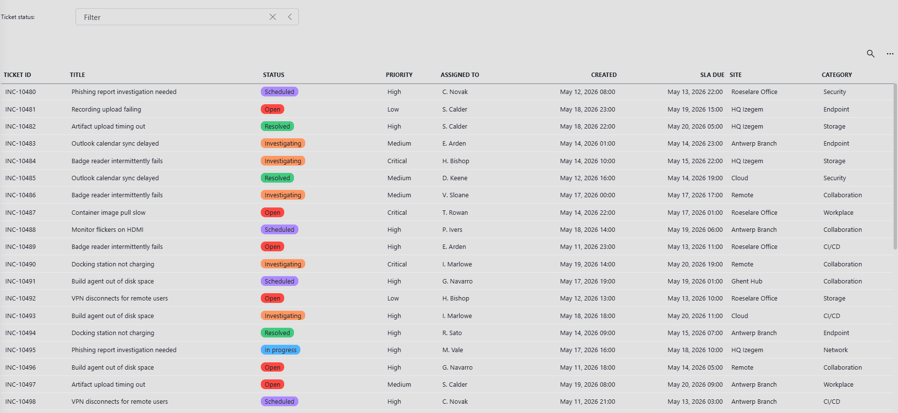
Dropdown and table components in DataMiner 10.6.6
In the example above, a table displays a list of support tickets. A dropdown component is used to filter the table based on the selected ticket status.
To obtain a result similar to this:
In the Data pane, locate the query used as the data source for the component you want to filter.
Click the pencil icon to edit the query.
Click Select operator and select Filter.
Select the column you want to filter.
Set the filter method to Equals or Contains.
On the right side of the Value box, click the
 icon to open the Link to dialog.
Configure the following settings:
Data: Select the dropdown component.
Property: Select the column that contains the value to filter on.
Type:
Tables.Empty data shows: Define what happens when no value is selected in the dropdown:
Everything: Display all data.
Nothing: Display no data.
Click Apply.
Click the pencil icon again to stop editing the query.
Note
The Tables data source (used here to link dropdown values to other components) is available from DataMiner 10.3.0 [CU21]/10.4.0 [CU9]/10.4.12 onwards.
Configuration options
Dropdown layout
In the Layout pane, you can find the default options available for all components. See Customizing the component layout.
Additionally, the following layout options are also available:
| Section | Option | Description |
|---|---|---|
| Advanced | Display column | Available from DataMiner 10.3.0 [CU13]/10.4.0 [CU1]/10.4.4 onwards. Select the column whose values are shown in the dropdown. Only available when a single query data source or Tables component data source was applied. |
| Advanced | Label | Add text that will be displayed next to the dropdown. |
Dropdown settings
In the Settings pane for this component, you can customize its behavior to suit your requirements.
| Section | Option | Description |
|---|---|---|
| WebSocket settings | Inherit WebSocket settings from page/panel | Clear the checkbox to use a custom polling interval for this component. When cleared, you can specify a different polling interval (in seconds). |
| Initial selection | Select first item by default | Available from DataMiner 10.3.0 [CU13]/10.4.0 [CU1]/10.4.4 onwards. When enabled, the first item is automatically selected when the data in the dropdown is refreshed, unless a custom URL is used specifying a different value. This setting is enabled by default. |
| Initial Selection | Select item by default | Specify a fixed default value, which is automatically selected when the data in the dropdown is refreshed, unless a custom URL is used specifying a different value. From DataMiner 10.3.0 [CU13]/10.4.0 [CU1]/10.4.4 onwards, this setting is only available when the Select first item by default setting is disabled. Formerly known as: - Initial Selection (Prior to DataMiner 10.3.0 [CU13]/10.4.0 [CU1]/10.4.4) - Feed Defaults (Prior to DataMiner 10.3.6/10.4.0) |
| Data retrieval | Update data | Available from DataMiner 10.3.0 [CU13]/10.4.0 [CU1]/10.4.4 onwards. Toggle the switch to determine whether the values displayed in the component should be updated automatically (provided this is supported by the data source). See Query updates. This setting is only available when a single query data source or an indices dataset was applied. This setting is disabled by default. |
| Clear selection | Allow clearing the selection | Available from DataMiner 10.3.0 [CU13]/10.4.0 [CU1]/10.4.4 onwards. Toggle the switch to determine whether the selected values in the component can be cleared by clicking the X button in the upper-right corner of the filter box. This setting is disabled by default. |