Rich text input
Available from DataMiner 10.5.0 [CU15]/10.6.0 [CU3]/10.6.6 onwards.
The rich text input component allows you to enter and edit formatted text in a dashboard or low-code app. The entered content is then exposed as HTML.
Rich text input component in DataMiner 10.6.6
With this component, you can:
Add structured notes, comments, or instructions.
Highlight important information with formatting such as bold text, colors, or links.
Maintain separate notes linked to selected items in an app.
Use case: item-specific notes
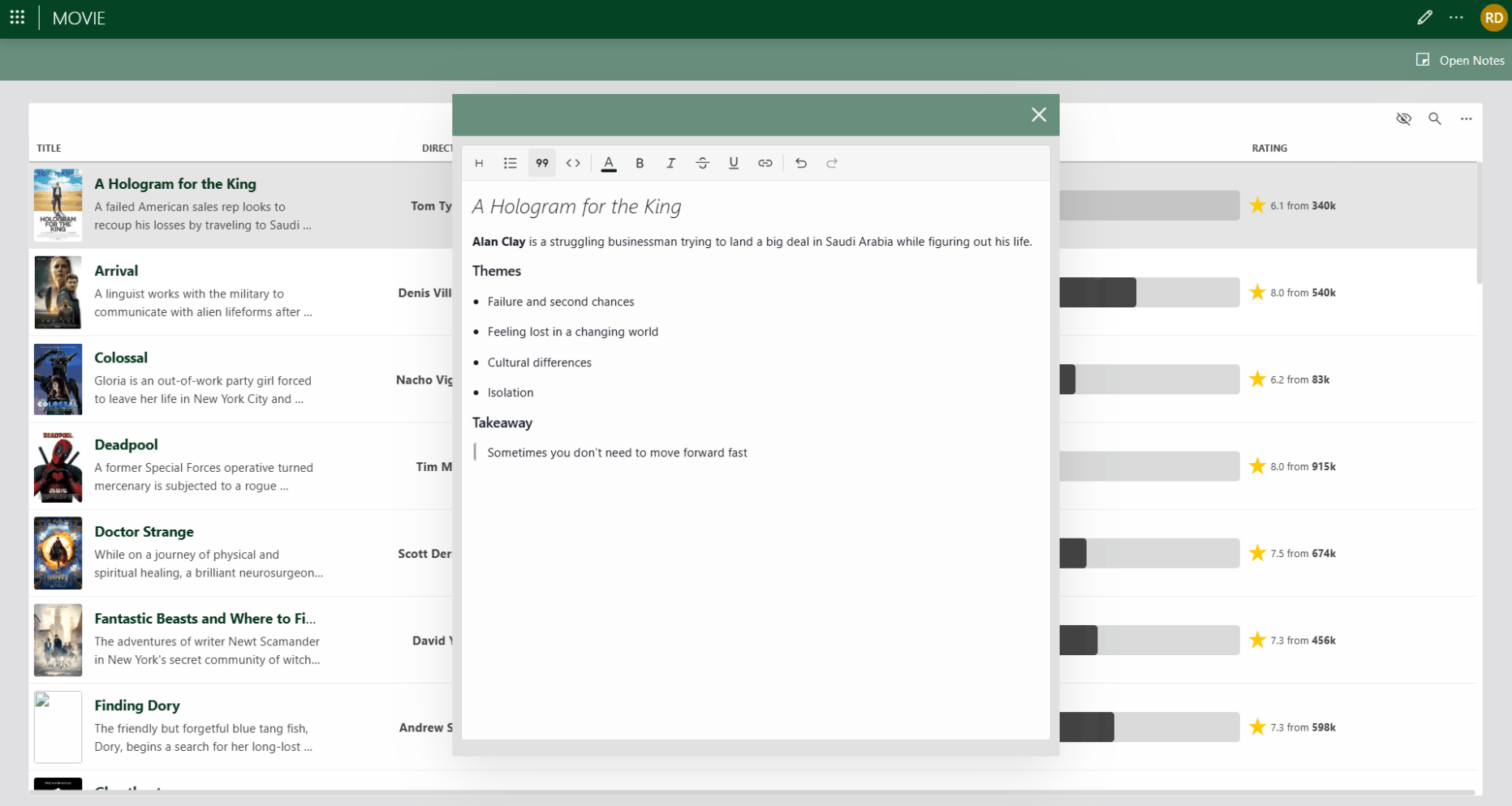
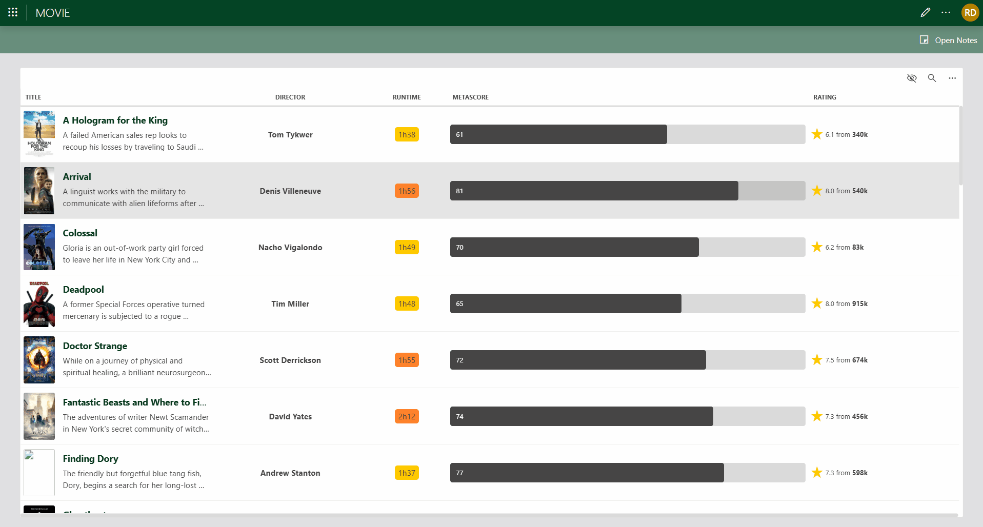
A common use case in the Low-Code Apps module is to allow users to edit notes for a selected item (for example, a row in a table) in a dedicated panel. The rich text input component is well suited for this, as it supports formatted notes while remaining fully data-driven.
Example of a rich text input component used to store item-specific notes. Users can select a movie and store formatted notes for that item (DataMiner 10.6.6).
When the notes panel is opened, an On open event triggers a Set value component action on the rich text input component. The value is typically retrieved from the data of the currently selected item, such as a column in a table data source:
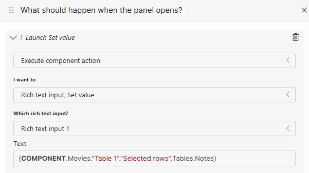
On open event configuration in DataMiner 10.6.6
As a result, the rich text input is prefilled with the existing notes for the selected item. From this moment on, the user is directly editing the data associated with that item. While the panel remains open, the user can freely edit and format the content using the rich text toolbar.
When the notes panel is closed, one or more On close events are typically configured:
Launch a script: Pass the current value of the rich text input to an automation script that updates the underlying data source.
Fetch the data: Refresh the underlying data source used by the component (for example, the table), so the updated notes are available the next time the item is selected.
(Optional) Set value: Reset the rich text input to an empty value. This is recommended when the component is reused for different selections, as it prevents previously loaded content from briefly appearing when the panel is opened for another item.
Formatting options
The toolbar provides the following formatting options, from left to right:
| Icon | Option | Description |
|---|---|---|
 |
Headings | Apply headings from level 1 to level 4. |
 |
Lists | Create bulleted or numbered lists. |
 |
Blockquote | Format the selected text as a block quote. |
 |
Code block | Format the selected text as a code block. |
 |
Font color | Specify a custom text color, either by specifying the color in RGB format, by entering the hex value or HTML color name, or by using the color picker box. The most recently used template colors and the theme colors are always displayed. |
 |
Bold | Make the selected text bold (Ctrl+B). |
 |
Italic | Make the selected text italic (Ctrl+I). |
 |
Underline | Underline the selected text (Ctrl+U). |
 |
Strikethrough | Apply strikethrough formatting to the selected text. |
 |
Hyperlinks | Insert, edit, or remove hyperlinks. |
 |
Undo | Undo the last action (Ctrl+Z). |
 |
Redo | Redo the last undone action (Ctrl+Y). |
Configuration options
Rich text input layout
In the Layout pane, you can find the default options for all components. See Customizing the component layout.
Rich text input settings
| Section | Option | Description |
|---|---|---|
| General | Emit value on | Determine when the value in the box becomes available as data. This can be when the focus is no longer on the box ("Focus lost"), or when the value in the box changes ("Value change"). |
| General | Default value | Specify the default value that will be entered into the input box when the dashboard or low-code app is opened. HTML text formatting is supported. |
Rich text input component actions
Component actions are operations that can be executed on a component when an event is triggered.
When you select the Execute component action option, you can choose from a list of components in the app and the specific actions available for each of them.
For the rich text input component, the following component action is available:
- Set value: Sets the current value of the component to either a static or dynamic value.