Button panel
Available from DataMiner 10.3.9/10.4.0 onwards.
The button panel component serves as a digital twin of a hardware button panel. It allows you to replicate the exact functionality of physical buttons in a virtual environment. With its flexible configuration options, the component offers a powerful way to monitor and control hardware panels remotely. The button panel is particularly useful for XY switching, but its versatility extends to nearly any button panel that can be connected and controlled via DataMiner.
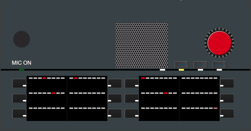
Button panel component in DataMiner 10.3.9
With this component, you can:
Control physical hardware panels remotely.
Interact with different button types, including, for example, turning a virtual rotate button.
Monitor the real-time status of buttons.
Enjoy a customized look that mimics your physical hardware panel, all the way down to screws or logos.
Supported data types
A button panel component should always be configured using a table parameter from a button panel element as its data source. Each button on the panel corresponds to a row of the table parameter.
Using an element with a custom button panel protocol, you can configure what kind of buttons are displayed and how the buttons are displayed.
You can also add parameter data as a filter to the component in order to determine which page is displayed.
Available button types
The following types of buttons can be configured:
Simple buttons used only to set parameters.
HTML buttons.
Rotate buttons, resembling a control dial, used to decrement or increment the value of a particular parameter. They can be used by dragging and dropping with the mouse, using the arrow keys on the keyboard, or sliding on a mobile device.
UI buttons used to display information. These buttons do not trigger a parameter set when clicked.
Tip
You can configure which buttons are available and how they are displayed in the button panel element. See Button panel table.
To avoid unwanted interaction with the buttons, they are not active while the button panel is being edited. However, it is possible to press them or rotate them in order to check what they look like when a user interacts with them. Buttons can also be locked in the button panel element to keep users from interacting with them.
Configuration options
You can configure what kinds of buttons are displayed and how they are displayed using an button panel element with a custom button panel protocol.
Once this setup is complete, add the table parameter from that button panel element as data to your button panel visualization and further configure the component's settings and layout options.
Configuring the button panel element protocol
To define how the button panel behaves and how its buttons are rendered, configure the following tags within the Param tag of the protocol:
Param.Dashboard.Type: Optional. Indicates the type of button panel. Can be set to the following values:
Button panel: The parameter is a table containing all the buttons. Every row in the table represents a button. A button could be linked to a page (see button panel containers).
Button panel containers: The parameter lists the different “pages” or "containers".
Button panel collection: The parameter contains grouping information. A group is a collection of one or more button panels. Every row of this table parameter represents one group with all the necessary information for the dashboard or app to be able to display the button panels of that group.
This parameter can be used as data in the dashboard or app that will allow the user to easily switch between dashboard groups.
Param.Dashboard.DashboardOptions.DashboardOption: These tags allow you to configure the options that will determine how the button panel is displayed. Each DashboardOption tag has the following attributes:
type: Should be set to either idx if the option applies to a particular column in the table, or to pid if it applies to a specific parameter. Depending on this type setting, the tag contains either an IDX or a PID.
name: The name of the option (cf. below).
The following options can be configured:
activeContainer: Determines which container is to be displayed by the dashboard. For this option, type should be set to pid and the tag should contain the PID of the parameter that allows the user to select the active container.
advancedLayout: Allows the user to specify the layout of the button using a JSON string. For example:
For a button with custom HTML:
{"buttonLayout":{"alignHorizontal":"Left","alignVertical":"Center","html":"\<div class='button-container'>\<div class='button'>Button\</div>\</div>"},"version":"1.0.0.0"}For a rotate button:
{"rotateButtonLayout":{"sliderOrientation":"Horizontal"},"version":"1.0.0.0"}
Note
Using the HTML class toggled, you can determine what the button will look like when it is interacted with. Using the HTML class locked, you can determine what the button will look like when it is locked.
height: Determines the height of the button (in percent).
container: Determines the container the button is located in.
css: Determines the CSS to apply to HTML content of buttons. For this option, type should be set to pid and the tag should contain the PID of the parameter that contains the CSS.
Note
To apply a different CSS to a specific button, specify this in line in the advancedLayout JSON.
panelAdvancedLayout: Allows the user to specify the general layout of the panel using a JSON string. For this option, type should be set to pid and the tag should contain the PID of the parameter that contains the JSON string.
panelButtonName: Determines the name of the button.
panelButtonOperation: Displays the different buttons, which are the same for all rows. The next option, panelButtonPossibleOperations, will determine which of these buttons are used.
panelButtonPossibleOperations: Allows the user to specify which operations are possible with the button. For rotate buttons, four types of increments are possible. By default, at least a small decrease and increase are available, but it is possible to add a large increase and decrease. For example:
click,largedecrease;smalldecrease;smallincrease;largeincreasepanelButtonType: Determines the type of button. The user will be able to select one of the following types:
Simple
Advanced - HTML. The advancedLayout option should be used to further configure a button of this type.
Rotate
UI
width: Determines the width of the button (in percent).
xpos: Determines the position of the button on the X-axis (in percent).
ypos: Determines the position of the button on the Y-axis (in percent).
For example:
<Param id="100">
  <Name>mainButtonPanel</Name>
  <Description>Main Button Panel</Description>
  <Type>array</Type>
  <ArrayOptions index="0" options=";naming=/101,102">
    <ColumnOption idx="0" pid="101" type="retrieved" options=""/>
    <ColumnOption idx="1" pid="102" type="retrieved" options=";save" />
    <ColumnOption idx="2" pid="103" type="retrieved" options=";save" />
    <ColumnOption idx="3" pid="104" type="retrieved" options=";save" />
    <ColumnOption idx="4" pid="105" type="retrieved" options=";save" />
    <ColumnOption idx="5" pid="106" type="retrieved" options=";save" />
    <ColumnOption idx="6" pid="107" type="retrieved" options=";save" />
    <ColumnOption idx="7" pid="108" type="retrieved" options=";save" />
    <ColumnOption idx="8" pid="109" type="retrieved" options=";save" />
    <ColumnOption idx="9" pid="110" type="retrieved" options=";save" />
    <ColumnOption idx="10" pid="111" type="retrieved" options=";save;foreignKey=200" />
    <ColumnOption idx="11" pid="112" type="retrieved" options=";save" />
    <ColumnOption idx="12" pid="139" type="retrieved" options="" />
    <ColumnOption idx="13" pid="140" type="displaykey" options="" />
  </ArrayOptions>
  ...
  <Dashboard>
    <Type>button panel</Type>
    <DashboardOptions>
      <DashboardOption type="idx" name="panelButtonName">1</DashboardOption>
      <DashboardOption type="idx" name="xpos">3</DashboardOption>
      <DashboardOption type="idx" name="ypos">4</DashboardOption>
      <DashboardOption type="idx" name="height">5</DashboardOption>
      <DashboardOption type="idx" name="width">6</DashboardOption>
      <DashboardOption type="idx" name="panelButtonType">8</DashboardOption>
      <DashboardOption type="idx" name="advancedLayout">9</DashboardOption>
      <DashboardOption type="pid" name="panelAdvancedLayout">147</DashboardOption>
      <DashboardOption type="pid" name="css">148</DashboardOption>
      <DashboardOption type="idx" name="container">10</DashboardOption>
      <DashboardOption type="pid" name="activeContainer">149</DashboardOption>
      <DashboardOption type="idx" name="panelButtonPossibleOperations">11</DashboardOption>
      <DashboardOption type="idx" name="panelButtonOperation">12</DashboardOption>
    </DashboardOptions>
  </Dashboard>
</Param>
Configuring the button panel element
In the button panel element, you can configure how the buttons should be displayed in a dashboard or app.
Button panel table
In the table listing the buttons, add the buttons that you want to display and specify their Position, Height, Width, etc. The available columns depend on the protocol configuration (see Configuring the button panel element protocol). However, the following possible columns are of particular note:
Lock Status: Locked or Unlocked. Set to Locked to keep users from using the button.
Layout Type: Determines the type of button. The following types are available:
Simple: Button with simple click action that performs a parameter set. Requires no further configuration.
Rotate: Buttons that allow users to increase or decrease a value, simulating an actual rotate button. The possible increment sizes are determined by the Possible Operations column. By default, at least a small increase and decrease are possible.
HTML - Advanced: HTML button, configured in the Advanced Layout column. For HTML buttons, a separate CSS parameter can also be available, which allows you to specify the CSS for all HTML buttons (allowing overrides in the Advanced Layout column).
UI: This button will not trigger a parameter set when it is clicked, but is only used to display information.
Advanced Layout: Allows you to configure the layout of the button using a JSON string.
For example:
For a button with custom HTML:
{"buttonLayout":{
    "alignHorizontal":"Left",
    "alignVertical":"Center",
    "html":"<div class='button-container'><div class='button'>Button</div></div>"},
    "version":"1.0.0.0"}
For a rotate button:
{"rotateButtonLayout":{
    "sliderOrientation":"Horizontal"},
    "version":"1.0.0.0"}
For a button with images:
{"buttonLayout": {
    "alignHorizontal": "Left",
    "alignVertical": "Center",
    "sources": [{"var":"$btn1", "image": "button1.png"}, {"var":"$btn2", "image": "button2.png"}],
    "html": "<div class='content'><img src='$btn1'><img src='$btn2'></div>"},
    "version":"1.0.0.0"}
In the example above, buttonLayout.sources is a list of mappings. In the "html", you can then refer to a source, e.g., $btn1, to display the corresponding image, in this case button1.png.
Note
Any images you refer to in the advanced layout of a button must be placed in the folder
C:\Skyline DataMiner\Dashboards\_IMAGES\buttons.Container or Page: Allows you to link the button to a particular container or page. In that case, a separate parameter can be used to select the currently active container or page.
Possible Operations: Allows you to specify the possible operations that can be executed with the button. For example:
For a simple button: click
For a rotate button: largedecrease;smalldecrease;smallincrease;largeincrease
Other parameters
If a separate parameter is used for the advanced configuration of the entire panel, it can be configured with a setting to allow free configuration of the button panel layout:
{"panelLayout": {"layoutStyle": "FreeLayout"} }
If the configuration above is specified, and the button panel component setting In configuration mode is selected in the dashboard or low-code app, you can then reposition buttons on the panel in the dashboard or app by dragging and dropping them. You can select multiple buttons at the same time by keeping the Ctrl key pressed when you select them, and reposition them at the same time.
Note that this same parameter also allows you to set the panel to a fixed layout, if you configure it as follows:
{"panelLayout": {"layoutStyle": "FixedLayout"} }
Note
This parameter must be defined using the panelAdvancedLayout dashboard option in the protocol. See Configuring the button panel element protocol.
Button panel layout
Once your button panel element is configured and added as data, you can adjust how it appears using the layout options described below.
In the Layout pane, you can find the default options available for all components. See Customizing the component layout.
Additionally, the following layout options are also available:
| Section | Option | Description |
|---|---|---|
| Advanced | Override number of columns | Enable this option to specify a different number of columns than is configured in the button panel element. The size and position of the buttons will be adapted to match this configuration. |
| Advanced | Number of columns | Available when Override number of columns is enabled. Specify the number of columns to display. |
| Advanced | Simple button text size | Determine the size of the text displayed on buttons of type "Simple" (Small, Medium, or Large). Default: Medium. |
Button panel settings
In the Settings pane for this component, you can customize its behavior to suit your requirements.
| Section | Option | Description |
|---|---|---|
| WebSocket settings | Inherit WebSocket settings from page/panel | Clear the checkbox to use a custom polling interval for this component. |
| WebSocket settings | Allow WebSockets | Available when Inherit WebSocket settings from page/panel is disabled. Determine whether WebSocket connections are permitted. |
| WebSocket settings | Polling interval | Available when Inherit WebSocket settings from page/panel is disabled. Specify a custom polling interval (in seconds). |
| General | In configuration mode | Determine whether the component should be set to configuration mode or published mode (default). For more information, see Configuration mode versus published mode. |
Configuration mode versus published mode
The button panel component offers two distinct modes of operation, which you can switch between via the button panel settings:
Configuration mode: In this mode, you can create your button panels by arranging the buttons through a drag-and-drop interface. This setup process allows for quick customization to meet specific requirements.
When configuration mode is enabled, clicking a button will not execute its action but will select it instead. This selection can be linked to a button component that launches an automation script. When that button is clicked, an interactive automation script will be executed that can be used to configure the button of the button panel.
Published mode: Once the button panel is configured, you can switch to published mode to enable interaction with the virtual buttons. Actions performed on these buttons are translated into commands that manipulate the corresponding physical buttons.
Enabling the component in soft launch
Prior to DataMiner 10.3.9/10.4.0, the button panel component is available in soft launch, if the soft-launch option ReportsAndDashboardsButtonPanel is enabled. For more information, see Soft-launch options.
If you use the preview version of the button panel component, its functionality may be different from what is described on this page.