DataMiner web apps Main Release 10.3.0 – New features
Note
For known issues with this version, refer to Known issues.
Highlights
Dashboards app - Node edge graph: Option to visualize the direction of the edges [ID 32519]
When configuring a node edge graph, it is now possible to have the graph visualize the direction of the edges.
To do so, enable the Visualize directions setting and select one of the following options:
| Option | Description |
|---|---|
| Flow (default) | The direction is visualized by means of animated edges. |
| Arrows | The direction is visualized by means of arrows drawn on the edges. If you select this option, you can also specify the exact position of the arrows on the edges. |
Dashboards app: GQI now supports external data [ID 32656] [ID 32659] [ID 32930] [ID 33795]
It is now possible to configure the Generic Query Interface to retrieve external data, so that dashboard users can use a query data source based on data that is for example retrieved from a CSV file, a MySQL database, or an API endpoint. This is configured through a DataMiner automation script that is compiled as a library. The GQI will make use of this library to load the external data.
Configuring an external data source in a query
This is the most basic procedure to use an external data source in a query:
In the Automation app, add a script containing a new class that implements the IGQIDatasource interface (see below for more detailed info).
Above the class, add the GQIMetaData attribute in order to configure the name of the data source as displayed in the Dashboards app.
For example (see Example script for a full example):
using Skyline.DataMiner.Analytics.GenericInterface;

[GQIMetaData(Name = "People")]
public class MyDataSource : IGQIDataSource
{
...
}
Note
This is the name that will be shown to the user when they select the data in the Dashboards app. If you do not configure this name, the name of the class is displayed instead, which may not be very user-friendly.
Compile the script as a library. You can use the same name as defined in the GQIMetaData attribute, or a different name. If there are different data sources for which the same name is defined in the GQIMetaData attribute, the library name is appended to the metadata name.
Validate and save the script. It is important that you do this after you have compiled the script as a library, as otherwise the compiler will detect errors.
In the Dashboards app, configure a query and select the data source Get ad hoc data.
In the Data source dropdown box, select the name of your ad hoc data source.
Depending on how the script is configured, there can be additional configuration possibilities. You can for instance use the IGQIInputArguments interface in the script to define that a specific argument is required, for instance to filter the displayed data. For more information, refer to the sections below.
Interfaces
An ad hoc data source is represented as a class that implements predefined interfaces. The interfaces you can use are detailed below.
IGQIDataSource: This is the only required interface. It must be implemented for the class to be detected by GQI as a data source. This interface has the following methods:
Method Input arguments Output arguments Description GetColumns GQIColumn[] The GQI will request the columns. GetNextPage GetNextPageInputArgs GQIPage The GQI will request data. IGQIInputArguments: This interface can be used to have the user specify an argument, for example the CSV file from which data should be parsed, or a filter that should be applied. This interface has the following methods:
Method Input arguments Output arguments Description GetInputArguments - GQIArgument[] Asks for additional information from the user when the data source is configured. OnArgumentsProcessed OnArgumentsProcessedInputArgs OnArgumentsProcessedOutputArgs Event to indicate that the arguments have been processed. Note
The GQI does not validate the input arguments specified by the user. For example, a user can input an SQL query as a string input argument, and the content of the string argument will be forwarded to the ad hoc data source implementation without validation.
IGQIOnInit: This interface is called when the data source is initialized, for example when the data source is selected in the query builder or when a dashboard using a query with ad hoc data is opened. It can for instance be used to connect to a database. This interface has one method:
Method Input arguments Output arguments Description OnInit OnInitInputArgs OnInitOutputArgs Indicates that an instance of the class has been created. IGQIOnPrepareFetch: This interface is used to implement optimizations when data is retrieved. This can for instance be used to limit the retrieved data. This interface has one method:
Method Input arguments Output arguments Description OnPrepareFetch OnPrepareFetchInputArgs OnPrepareFetchOutputArgs Indicated that the GQI has processed the query. IGQIOnDestroy: This interface is called when the instance object is destroyed, which happens when the session is closed, e.g., in case of inactivity or when all the necessary data has been retrieved. It can for instance be used to end the connection with a database. This interface has one method:
Method Input arguments Output arguments Description OnDestroy OnDestroyInputArgs OnDestroyOutputArgs Indicates that the GQI will close the session.
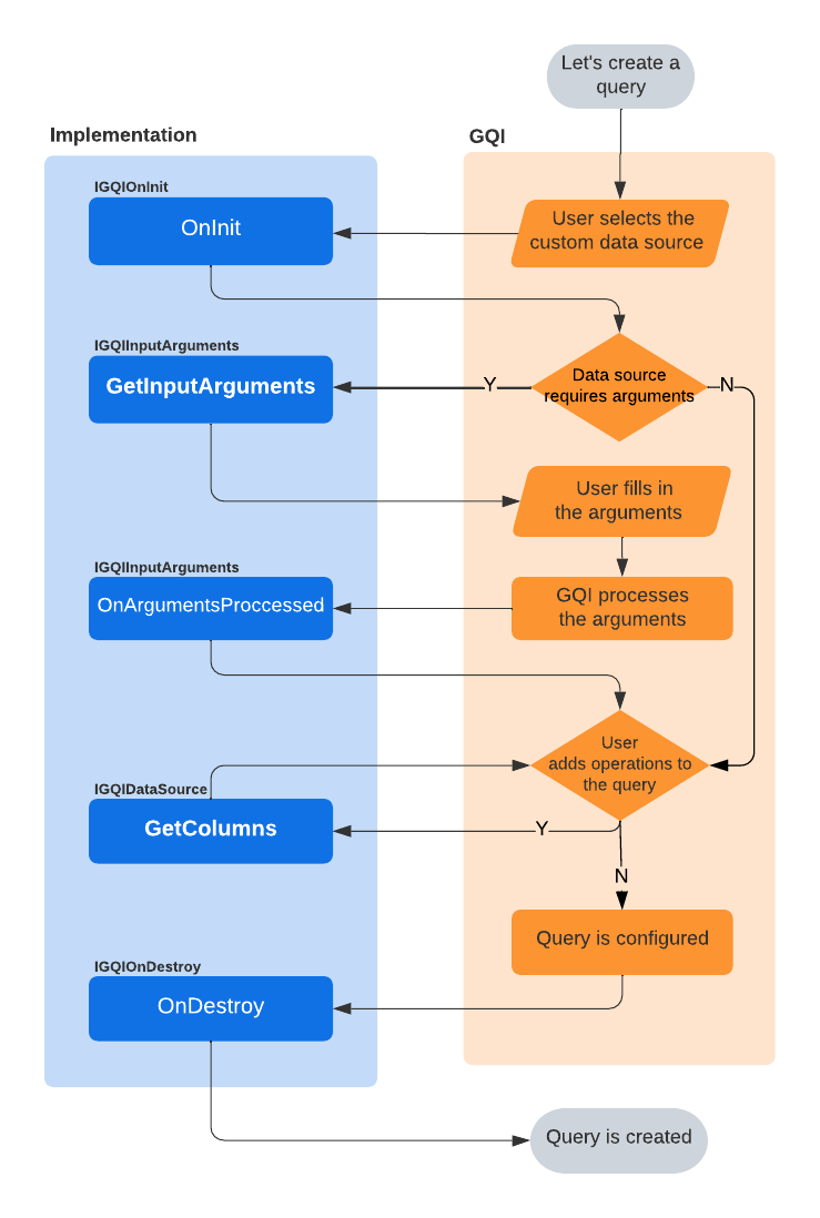
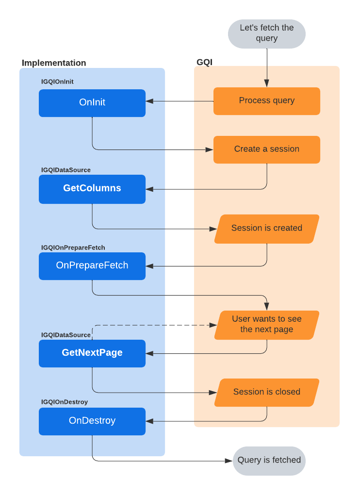
Lifecycle
All methods discussed above are called at some point during the GQI lifecycle, depending on whether a query is created or fetched, and depending on whether they have been implemented.
The following flowchart illustrates the GQI lifecycle when a query is created:
The following flowchart illustrates the GQI lifecycle when a query is fetched:
Objects
To build the ad hoc data source, you can use the objects detailed below.
GQIColumn: This is an abstract class with the derived types GQIStringColumn, GQIBooleanColumn, GQIIntColumn, GQIDateTimeColumn and GQIDoubleColumn and with the following properties::
Property Type Required Description Name String Yes The column name. Type GQIColumnType Yes The type of data in the column. GQIColumnType is an enum that contains the following values: String, Int, DateTime, Boolean or Double. GQIPage, with the following properties:
Property Type Required Description Rows GQIRow[] Yes The rows of the page. HasNextPage Boolean No True if additional pages can be retrieved, False if the current page is the last page. GQIRow, with the following properties:
Property Type Required Description Cells GQICell[] Yes The cells of the row. GQICell, with the following properties:
Property Type Required Description Value Object No The value of the cell. DisplayValue String No The display value of the cell. Note
The type of value of a cell must match the type of the corresponding column.
GQIArgument: This is an abstract class, with the derived types GQIStringArgument and GQIDoubleArgument, and with the following properties:
Property Type Required Description Name String Yes The name of the input argument. IsRequired Boolean No Indicates whether the argument is required.
Example script
Below you can find an example script that forwards dummy data to the GQI. The name of the data source, as defined in the GQIMetaData attribute, will be “People”.
First the IGQIDataSource interface is implemented, then GetColumns is used to define the custom columns for the data source. In this case, there are 5 columns. The GetNextPage method then returns the actual data to the GQI. In this case these are 3 rows, defined as an array of cells. For each cell, a display value can also be defined. In this case, this is done for the cells within the Height column to indicate the unit of measure. The HasNextPage property is set to False to indicate that no additional pages need to be fetched.
The optional IGQIInputArguments interface is also implemented in the example, in this case to allow the user to add an input argument indicating the minimum age for the records that will be retrieved. The argument is indicated as required, so the user will have to specify it to be able to configure the query. The argument value is retrieved with OnArgumentsProcessedInputArgs and used to filter the returned data.
using System;
using System.Collections.Generic;
using System.Linq;
using Skyline.DataMiner.Analytics.GenericInterface;

[GQIMetaData(Name = "People")]
public class MyDataSource : IGQIDataSource, IGQIInputArguments
{
    private GQIDoubleArgument _argument = new GQIDoubleArgument("Age") { IsRequired = true };
    private double _minimumAge;

    public GQIColumn[] GetColumns()
    {
        return new GQIColumn[]
        {
            new GQIStringColumn("Name"),
            new GQIIntColumn("Age"),
            new GQIDoubleColumn("Height (m)"),
            new GQIDateTimeColumn("Birthday"),
            new GQIBooleanColumn("Likes apples")
        };
    }

    public GQIArgument[] GetInputArguments()
    {
        return new GQIArgument[] { _argument };
    }

    public OnArgumentsProcessedOutputArgs OnArgumentsProcessed(OnArgumentsProcessedInputArgs args)
    {
        _minimumAge = args.GetArgumentValue(_argument);
        return new OnArgumentsProcessedOutputArgs();
    }

    public GQIPage GetNextPage(GetNextPageInputArgs args)
    {
        var rows = new List<GQIRow>() {
            new GQIRow(
                new GQICell[]
                    {
                        new GQICell() { Value = "Alice" },
                        new GQICell() { Value = 32 },
                        new GQICell() { Value = 1.74, DisplayValue = "1.74 m" },
                        new GQICell() { Value = new DateTime(1990, 5, 12) },
                        new GQICell() { Value = true }
                    }),
            new GQIRow(
                new GQICell[]
                    {
                        new GQICell() { Value = "Bob" },
                        new GQICell() { Value = 22 },
                        new GQICell() { Value = 1.85, DisplayValue = "1.85 m" },
                        new GQICell() { Value = new DateTime(2000, 1, 22) },
                        new GQICell() { Value = true }
                    }),
            new GQIRow(
                new GQICell[]
                    {
                        new GQICell() { Value = "Carol" },
                        new GQICell() { Value = 27 },
                        new GQICell() { Value = 1.67, DisplayValue = "1.67 m" },
                        new GQICell() { Value = new DateTime(1995, 10, 3) },
                        new GQICell() { Value = false }
                    })
            };

        var filteredRows = rows.Where(row => (int)row.Cells[1].Value > _minimumAge).ToArray();

        return new GQIPage(filteredRows)
        {
            HasNextPage = false
        };
    }
}
DataMiner Low-Code Apps [ID 33002] [ID 33040] [ID 33208]
With the DataMiner Low-Code Apps (also known as the "Application Framework"), you can create custom low-code applications that interact with data from a DataMiner System or an external source.
These applications can be created on the root webpage of a DataMiner System and can be organized into sections. To place an application in one or more specific sections, open the App.info.json file in the correct application folder (C:\Skyline DataMiner\applications\APP_ID) and add the section names to the Sections array.
Note
The “Low-Code Apps” license is required to use or access the DataMiner Low-Code Apps.
Pages and panels
Pages and panels are the basic building blocks of an application. On a page or a panel, or even between pages and panels, data can be fed between components to create dynamic visualizations. Pages and panels can also each have a header bar with different buttons that are used to execute actions via events. Each button can have a customized icon and label.
The application sidebar allows you to navigate between the different pages, which can each have a label and an icon. It is also possible to hide pages. That way they will not appear in the sidebar and will only be accessible via actions.
Panels are used to group data on a page. They can be displayed on the left side of a page, on the right side of a page or as a popup, and can be shown or hidden via actions that are executed when an event occurs. Panels can be reused on different pages.
Events and actions
In an application, you can configure actions that will be executed each time one of the following events occur:
- A new page is loaded.
- A (header bar) button is clicked.
At present, the following actions can be configured:
| Action | Description |
|---|---|
| Launch a script | Launch an automation script with a specific configuration and a specific number of inputs (which can be linked to feeds like e.g., the Query Row feed). |
| Navigate to a URL | Navigate to a specific URL (in a new tab). |
| Open a page | Open a (hidden) page in the same application. |
| Open a panel | Open a panel on the current page. Panels can appear on the left side of a page, on the right side of the page or as a popup. |
| Close a panel | Close a panel that was open on the current page. |
| Open an app | Navigate to another application. |
| Execute component action | Execute a component action. For example, select an item in a table, create a new instance, etc. |
By default, actions are executed asynchronously. However, it is also possible to configure chains of actions that should be executed synchronously, i.e., only when the preceding action was executed successfully.
Also, by combining different actions into one, you can create complex behavior. For example, open a page, open a panel and launch an automation script that updates parameters displayed on that panel while it is being opened. This complex action can then be linked to, for example, a header bar button.
Versioning
The DataMiner Low-Code Apps include a versioning system that allows different versions of the same application to exist simultaneously. These different versions can be accessed via the versions panel of the application, which also allows the versions to be edited.
When you create a new application, a first draft version of that application is created. That version can then be published, i.e., made accessible to end users. Each time the published version of an application is edited, a new draft version will be created. Draft versions are meant to be used as prototypes for testing purposes.
Per application, there can be up to 15 versions: 14 draft versions and one published version. When a 16th version is created, the oldest draft version will automatically be deleted. The published version will never be deleted. As there can be only one published version, whenever you publish a version, the previously published version will automatically be demoted to draft version.
Security
The Low-Code Apps have two levels of security:
- on DataMiner level, user permissions control access to the Low-Code Apps in general, and
- on application level, user permissions control access to specific applications.
Access to the Low-Code Apps is controlled by the following user permissions that can be configured per user or user group:
- View applications
- Add new applications
- Edit applications
- Delete applications
- Publish applications
Note
Users without “View applications” permission do not have access to the Low-Code Apps. Even if they have been granted some of the other user permissions, they will not be able to perform any action whatsoever within the Low-Code Apps.
Access to a specific application can be configured in the application itself. Per application, you can define a list of users with view and/or edit permission. By default, no restrictions will be applied, meaning that everyone will be allowed to view and edit the application.
Low-Code Apps: Data input via URL [ID 34261]
Low-code apps can now be provided with data (e.g., element data, parameter data, view data, etc.) via URL query parameters.
To do so, add a URL query parameter with key data. The value should be a URL-encoded JSON object with the following structure:
- v: version number (currently always 1)
- components: an array of component input objects
{
   v: <version-number>;
   components: <component-data>;
}
The component input objects (component-data) have the following structure:
{
   cid: <component-id>,
   select: <data>
}
In the following example, the URL selects one default element on the initial page:
- component ID = 1
- element ID = 1/6
https://<dma>/<app-id>?data=%7B%22v%22:1,%22components%22:%5B%7B%22cid%22:1,%22select%22:%7B%22elements%22:%5B%221%2F6%22%5D%7D%5D%7D%7D
Other new features
Jobs app: Name, Start Time and End Time fields in default job section can now be set read-only [ID 31485] [ID 31506]
In the default job section, the Name, Start Time, and End Time fields can now be set read-only.
Ticketing app: System name will now be checked for illegal characters [ID 31496]
From now on, the system name of a ticket will no longer be allowed to start with an underscore character or contain one of the following characters: . # * , " '
When the system name contains one of these illegal characters, an error message will appear.
Jobs app: Fields will automatically be set to 'not required' when hidden [ID 31513]
From now on, when you hide a job field, you will receive a message that it will automatically be set to “not required”.
Note
When you unhide a hidden field, it will remain set to “not required”.
Web Services API v1: New methods to manage service templates [ID 31612]
Using the following methods, it will now be possible to manage service templates via the web services API:
- CreateServiceTemplate
- DeleteServiceTemplate
- GetServiceTemplate
- UpdateServiceTemplate
Dashboards app - GQI: Element, service and view data sources now also return an 'In timeout' column [ID 31671]
The element, service and view data sources now return an additional “In timeout” column.
| Data source | Meaning of “True” in “In timeout” column |
|---|---|
| Element | The (replication) element is in timeout. |
| Service | One of the elements in the service is in timeout. |
| View | The enhancing element, one of the first-level child elements or one of the recursive child views is in timeout. |
Dashboards app: Default index filter for parameter feed component [ID 32595]
It is now possible to add a default index filter to a parameter feed component. This way, it's not necessary to apply your filter to the component again whenever the dashboard is refreshed.
This new option is available as an advanced setting that is not displayed by default. To be able to configure it, you therefore first need to add the showAdvancedSettings=true option to the dashboard URL. In the Data pane of the dashboard edit mode, a new Parameter table filters section will then become available. You can configure the default filter in this section and then drag it to a component to apply it.
Dashboards app - GQI: Linking feeds to arguments of external data sources [ID 32658]
When you build a GQI query that uses an external data source, it is now possible to link feeds to arguments of that external source.
Dashboards app: User groups can now be selected in dashboard security [ID 32681]
When you configure who can view or edit a specific dashboard, it is now possible to select entire user groups instead of only individual users. Groups are indicated with a different icon to make the difference clear. In the selection box, they are listed together with individual users. Natural sorting is applied, with individual users being sorted by full name and groups being sorted by group name.
Dashboards - Data panel: Enhanced element selection [ID 32769]
A number of enhancements have been made to the Elements section of the Data panel.
Up to now, when you switched to edit mode, the first 10,000 elements would be loaded. From now on, the elements will be loaded in batches and a “Load more” button will allow you to load in the next batch.
Also, there is now an element search box as well as a number of element filter options:
- a view filter to only show elements in a particular view (and its subviews),
- a protocol filter to only show elements running a particular protocol,
- an EPM managers checkbox to only show EPM Manager elements, and
- a Spectrum analyzers checkbox to only show Spectrum elements.
Dashboards app: New sidebar icons to list private and shared dashboards [ID 32854]
In the sidebar, next to the All dashboards and Recent dashboards icons, there are now two new icons:
- Private dashboards, and
- Shared dashboards.
The first icon will only be available when there are private dashboards, the second icon will only be available when the DataMiner Agent is connected to dataminer.services and there are shared dashboards.
Dashboards app - Service definition component: Arrows will now automatically be drawn when a Process Automation definition was added [ID 32960]
When a Process Automation definition is added to the Service definition component, the component will now automatically draw the necessary arrows to indicate the connections between the different blocks/nodes in the diagram.
Dashboards app: Using the script output of an interactive automation script as a feed [ID 32977]
When building a GQI query, you can now also use the script output of an interactive automation script as a feed.
Dashboards app - Service definition component: Function shapes will now reflect the function type [ID 32995]
When a Process Automation definition is added to the Service definition component, the added function shapes will now reflect the function type (UserTask, ScriptTask, ResourceTask, Gateway, NoneStartEvent, TimeStartEvent or EndEvent).
Dashboards app - Service definition component: Function nodes will now display the number of Process Automation tokens in queue or in progress [ID 33025]
When a Process Automation definition is added to the Service definition component, all function nodes will now display the number of tokens currently in queue or in progress.
The token counters will be updated every 10 seconds.
Web apps - Data table component: Search box [ID 33385]
When you hover over a data table component (e.g., a GQI table), a search box will now appear in the lower-right corner. When you enter a search string, a case-insensitive client-side search will be performed.
Web apps: Dashboards, app pages and app panels now all have a 'Fit to view' setting [ID 33401]
In the Dashboards app and the Low-Code Apps, dashboards, app pages, and app panels now all have a “Fit to view” setting that, when enabled, will make sure the items in question are automatically adapted to fit the screen.
Web apps - Data table component: Sorting, grouping and filtering options [ID 33403] [ID 33433] [ID 33454]
When you right-click a column header of a data table component (e.g., a GQI table), you will now be presented with a number of sorting, grouping and filtering options.
To sort by the column in question, select a sort order (e.g., A > Z, Z > A, etc.).
To group by the column in question, select Group.
To filter the data in the table, construct a single or composite condition depending on the column type:
Column type Filter option String/GUID One or more of the following conditions (combined with OR):
- contains some text (case insensitive)
- does not contains some text (case insensitive)
- matches a regular expression
- does not match a regular expression
- equals some text (case insensitive)
- does not equal some text (case insensitive)Numeric/DateTime One or more ranges (combined with OR) Boolean True or false Note
- You can specify multiple column filters. If you do, they will be combined with AND.
- Column filters can be used in combination with the component’s search box.
- Grouping and column filters are not persistent. When you leave the page, all grouping and filtering will be cleared.
Web apps - Data table component: Copy cell/row/column/table [ID 33440]
When you right-click a non-empty cell in a data table component (e.g., a GQI table), you can now choose to copy the cell value, the entire row, the entire column or the entire table.
If you choose to copy the entire row or the entire table, the data will be copied in CSV format.
Note
- If you copy a cell or an entire column, the values will not be enclosed in double quotes.
- If you copy an entire row or an entire table, the values will be enclosed in double quotes.
- If a value contains double quotes, they will be escaped upon copying.
Dashboards app: Service Definition component now supports both types of Process Automation service definitions [ID 33615]
The Service Definition component now supports both types of Process Automation service definitions:
- Skyline Process Automation
- Custom Process Automation
Dashboards app / Low-Code Apps - Service Definition component: Text displayed on Process Automation service definition node will now be the value of that node's Label property [ID 33754]
Up to now, when a Service Definition component displayed a service definition of type "Skyline Process Automation" or "Custom Process Automation", the name of the associated function definition would be displayed on the nodes. From now on, the text displayed on a particular node will be the value of that node's Label property. Only when no Label property could be found will the name of the associated function definition be displayed instead.
DataMiner web apps updated to Angular 13 [ID 33869]
The DataMiner mobile apps that use Angular (e.g., Low-Code Apps, Dashboards, Monitoring, Ticketing, Jobs, and Automation) now use Angular 13 instead of Angular 12.
GQI: Improved performance when retrieving data [ID 33873] [ID 33890] [ID 33935]
Several improvements have been implemented to increase performance when GQI data is requested. At present, the most noticeable change this results in is an increase of the page size when all GQI data is requested. Up to now, when all GQI data was requested, the page size was always set to 50. From now on, the page size will be set to a number between 50 and 1000 based on the number of columns that are retrieved (max. 3000 cells).
Dashboards app - GQI: Line & area chart component is now able to visualize GQI query results as a single line [ID 33879]
The Line & area chart component is now able to visualize GQI query results as a single line.
Add GQI query data to the chart component.
In the component settings tab:
Select the query.
Select the X axis column.
Select the Y axis column.
In the component layout, adapt the style of the chart.
Note
If you want the component to show a classic trend chart, make sure the query result is sorted by the X axis column.
Dashboards: An EPM feed can now be used to feed EPM identifiers to a parameter feed [ID 33977]
An EPM feed can now be used to feed EPM identifiers to a parameter feed.
Dashboards / Low-Code Apps: Parameter table component brought in line with Table component [ID 34132]
The Parameter table component of dashboards and low-code apps has now been adjusted to be more like that generic Table component. In addition to improving consistency between these components, this also makes the Parameter table component more user-friendly:
- The horizontal scrollbar is now permanently displayed, while previously you had to scroll all the way to the bottom of the table to see it.
- The table will load more easily, improving performance of the dashboard or app especially with large tables.
Moreover, the additional features of the Table component will now also be available for the Parameter table component:
- Grouping on one or multiple columns.
- Sorting based on multiple columns.
- Filtering on multiple columns via the column header context menu.
- Filtering using the search box below the table.
- Resizing columns.
- Dragging and dropping columns to change the column order.
Note
This change does not affect the Parameter table component as viewed on mobile devices.
GQI: columnInfo object of data source columns of type 'discrete' will now contain the possible values [ID 34179]
For each of the following GQI data source columns of type "discrete", the possible values will now be available in their columnInfo object:
| Data source | Columns |
|---|---|
| AlarmAdapter | Alarm severity Alarm type Alarm status Alarm source Alarm user status |
| BookingAdapter | Booking status |
| ChangePointAdapter | Change type Alarm severity |
| DCFInterfaceAdapter | Interface type |
| LiteElementInfoAdapter | Element state |
| TicketingAdapter | All (custom) enum columns |
| DOMInstanceAdapter | State All custom enum fields |
| ParameterTableAdapter | All parameters of type "discrete" |
| PaProcessAdapter | PaProcess state PaProcess activity PaProcess start event type |
| PaTokenAdapter | PaToken status PaToken error state PaToken sub process type PaToken type |
| PatternOccurrenceAdapter | Pattern type |
GQI - EPM feed: Linking 'System Name' and 'System Type' to the query [ID 34222]
Using an EPM feed, it is now possible to link System Name and System Type to the GQI query you are building.
Dashboards / Low-Code Apps: Checkboxes to select discrete values in column filter Table component [ID 34234]
When you configure a column filter for a Table component in a dashboard or low-code app, you can now select checkboxes to filter on discrete values.
GQI: Using GQI query columns to filter a 'State' component [ID 34235]
It is now possible to use GQI query columns to filter a State component.
GQI: Query columns of type 'string' can now be filtered using 'Equals' and 'NotEquals' [ID 34246]
Query columns of type "string" can now be filtered using Equals and NotEquals.
Dashboards app / Low-Code Apps: 'Return no rows when feed is empty' option replaced by a triple-state option [ID 34280]
Up to now, when configuring the filter of a GQI data feed, you could enable the Return no rows when feed is empty option to indicate that, when the feed was empty, you wanted an empty table to be returned instead of the entire table.
Now, this option has been replaced by a triple-state option. You can now indicate that, when the feed is empty, you want
- to have an empty table returned,
- to have the entire table returned, or
- to have the table filtered on empty values.
Dashboards app: Filtering a parameter feed that lists EPM parameters [ID 34287]
When an EPM identifier from an EPM feed is fed to a parameter feed, it will now be possible to drag multiple parameters onto the parameter feed in order to use them as filters.
Web apps - Interactive automation script components: Minor enhancements [ID 34373]
A number of minor enhancements have been made to the interactive automation script components with regard to font styles, button styles, text alignment and button and checkbox height.
Dashboards app / Low-Code Apps: GQI queries now support sort operators [ID 34414] [ID 34528] [ID 34479]
In dashboards and low-code apps, you can now add sort operators to GQI queries.
After selecting a data source, do the following:
- Select a Sort operator.
- Select the column to sort on.
- Select Ascending if you want to sort in ascending order instead of descending order.
Dashboards app / Low-Code Apps: An eye icon will now appear when you make a modification to a GQI table [ID 34445]
When you make one of the following modifications to a GQI table, an eye icon will now appear in the header of the table component.
- Change the sorting
- Apply a grouping
- Change the order of the columns
- Change the width of the columns
- Apply a column filter (using the context menu that appears when right-clicking a column header)
This eye icon will make you aware that the table is no longer identical to the one that was loaded originally. Clicking it will reset all modifications.
DataMiner web apps updated to Angular 14 [ID 34447]
The DataMiner mobile apps that use Angular (e.g., Low-Code Apps, Dashboards, Monitoring, Ticketing, Jobs, and Automation) now use Angular 14 instead of Angular 13.
Dashboards app / Low-Code Apps: Enhanced filtering by protocol [ID 34453]
From now on, when you add a protocol filter to a component without specifying any particular version(s), that filter will return all data related to that protocol irrespective of protocol version. If you want the data in the component to be filtered by a specific version of the protocol in question, you can select that version from the protocol filter box.
GQI: New 'IsActive' column added to 'Get alarms' data source [ID 34455]
A new IsActive column has been added to Get alarms data source. This column will be set to true when the alarm is an active alarm.
Dashboards app / Low-Code Apps: Improved multiple sort in the Table component [ID 34526]
When, in the Dashboards app or a low-code app, you apply multiple sort orders in a Table component, multiple sort operators will now be appended to the GQI query that feeds data to the component. This way sorting is done server-side, which will improve performance.
Dashboards app: Parameter feeds that list EPM parameters now allow items to be preselected [ID 34554] [ID 34588]
When an EPM feed is used to feed EPM identifiers to a parameter feed, it is now possible to configure filters that will preselect certain items in the parameter feed.
Dashboards app: Items selected in a parameter feed listing EPM parameters will now be saved in the URL of the dashboard [ID 34622]
The parameters and indices selected in a parameter feed listing EPM parameters will now be saved in the URL of the dashboard.
As a result, the same items will automatically be selected again after you refresh the page.
Dashboards app: Parameter indices selected in a parameter feed listing EPM parameters can now be fed to other components [ID 34629]
After selecting column parameter indices in a parameter feed listing EPM parameters, you can now feed those selected indices to other components.
Dashboards app: Reports will no longer contain visual replacements [ID 34632]
Missing information in dashboards is no longer indicated by means of a visual replacement. In PDF reports they are now replaced by a short message.
Dashboards app: Jobs and Dashboards app now support PDF module [ID 34634]
The PDF module is now available in the Jobs and Dashboards app. From now on, you can e.g., export dashboards to PDF.
Dashboards app: PDF and share button will now be hidden in edit mode [ID 34653]
The PDF and Share option in the Dashboards app are now no longer visible in edit mode. Additionally, you can now pin the Share dashboards action in the settings menu of the Dashboards app.
Dashboards app: Parameter feeds listing EPM parameters now allow parameter grouping [ID 34705]
It is now possible to group parameters in a parameter feed that lists EPM parameters.
Dashboards app - EPM parameter selector: Data retrieved from the collector that was displayed as a table with a single row will now be displayed as single parameters [ID 35412]
In an EPM parameter selector, in some cases, data retrieved from the collector was displayed as a table with a single row, which often had the system name as primary key.
From now on, data retrieved from the collector that used to be displayed as a table with a single row will now be displayed as single parameters (one for every column).