Configuring the Generic Penalty Box
Every data-facing part of the Generic Penalty Box, including parameter IDs, element properties, card fields, detail panels, grouping rules, branding, and real-time settings, is declared in a single config.json file. To have the wall show information for a different connector, all you need is a configuration change, not a code change.
Below you can find an overview of the different settings available in config.json.
Note
config.json is reloaded whenever you refresh the app, so any edits you make take effect immediately on the next browser refresh.
configVersion
Stamps the schema config.json was written against.
This key is required. The schema at the time of the initial release of the app is version 1. If a future release changes the schema, this is the key that lets the app tell you plainly that your file is written using a different version, instead of failing with unrelated "missing key" errors.
Example:
"configVersion": 1
Branding
Allows you to customize the app to show specific branding.
Example
"branding": {
  "title":           "Network Penalty Box",
  "subtitle":        "NOC Infrastructure Monitor",
  "logoUrl":         "logo.png",
  "emptyStateTitle": "network devices"
}
Reference
| Key | Type | Description |
|---|---|---|
title |
string | The name of the app shown in the header and set as the browser tab title. |
subtitle |
string | The secondary line shown next to the title in the app header. |
logoUrl |
string | The path to the logo image, relative to the app folder. |
emptyStateTitle |
string | The plural noun shown in the all-clear message. For example, if this is "network devices", the message will show "All network devices are operating normally." |
dataSource
Controls how the app fetches its data from DataMiner.
Example
"dataSource": {
  "scriptName":           "GetGenericPenaltyBoxData",
  "protocolName":         "Generic Dummy",
  "pollIntervalMs":       4000,
  "stalenessThresholdMs": 15000
}
Reference
| Key | Type | Description |
|---|---|---|
scriptName |
string | The name of the DataMiner automation script that returns the penalty box JSON payload. |
protocolName |
string | The connector name passed to the script so it knows which elements to scan. |
pollIntervalMs |
number | How often (in ms) to poll the script when real-time updates are disabled or unavailable (see realtime). |
stalenessThresholdMs |
number | If polling has not been successful for this length of time (in ms), cards are dimmed to indicate stale data. |
parameterIds
Maps human-readable configuration keys to DataMiner parameter IDs for the given connector. These keys are referenced throughout cardFields, detailPanels, and groupingOptions.
Every entry must be a positive integer parameter ID. The automation script reads exactly these parameters for every element and returns them under params in the JSON response.
Example:
"parameterIds": {
  "deviceStatus":    1,
  "serviceType":     3,
  "uptimePercent":  21,
  "chargePercent":  209
}
elementProperties
Maps configuration output keys to a DataMiner element custom property name, using the same left-to-right direction as parameterIds (configuration key on the left, DataMiner source on the right).
The keys (on the left) are what you reference in cardFields and groupingOptions when the source key is set to "property". Each key reads exactly one property name; if an element carries the value under a different property name, it will not be picked up.
Example:
"elementProperties": {
  "region":   "Region",
  "siteCode": "SiteCode",
  "location": "Location"
}
groupingOptions
An array of grouping modes shown in the Grouping toolbar dropdown box. Users will be able to switch between them at runtime, and the last choice will be remembered per browser.
This key is optional. For a flat, ungrouped wall, omit it or leave it set to [].
Example
"groupingOptions": [
  {
    "key":    "serviceType",
    "source": "parameter",
    "label":  "Group by service tier",
    "tiers": [
      { "value": "Core",         "tier": "core",         "label": "Core - Backbone" },
      { "value": "Distribution", "tier": "distribution", "label": "Distribution - Aggregation" },
      { "value": "Access",       "tier": "access",       "label": "Access - Edge" }
    ]
  },
  { "key": "region",   "source": "property", "label": "Group by region",   "dynamic": true },
  { "key": "location", "source": "property", "label": "Group by location", "dynamic": true }
]
Reference
Each option object supports the following keys:
| Key | Type | Required | Description |
|---|---|---|---|
key |
string | Yes | The parameterIds key (when source is "parameter") or the elementProperties output key (when source is "property"). |
source |
"parameter" or "property" |
Yes | Where to read the group value from. |
label |
string | Yes | Text shown in the grouping dropdown. |
tiers |
array | Only when dynamic is not true |
Fixed set of group buckets, listed in rank order (the first entry listed shows first). |
dynamic |
boolean | No | When true, groups are created automatically from whatever values exist. No tiers are needed. Unassigned elements collect in an "Unassigned" bucket. |
Each tier object (inside tiers) supports the following keys:
| Key | Type | Description |
|---|---|---|
value |
string or number | The raw parameter or property value that matches this tier. |
tier |
string | Internal identifier for the tier (used in CSS class names). |
label |
string | Header text shown above the group on the wall. |
The list order of the tiers is their rank order: the first tier listed is shown first, using the same convention as cardFields. Inserting a new tier just means placing it where it should rank, not renumbering the rest. Each non-dynamic grouping option must define its own tiers; there is no fallback shared between grouping options.
cardFields
Controls which data appears on each alarm card, in what order it is shown, and how it is formatted.
The list order is the display order and drop order: the first field listed is the first to disappear as cards are progressively hidden while shrinking. Fields marked "pinned": true never drop.
As the wall fills with elements, the fit algorithm automatically makes cards narrower and hides lower-priority fields first, in the order they are listed. Fields marked "pinned": true are always visible regardless of card size.
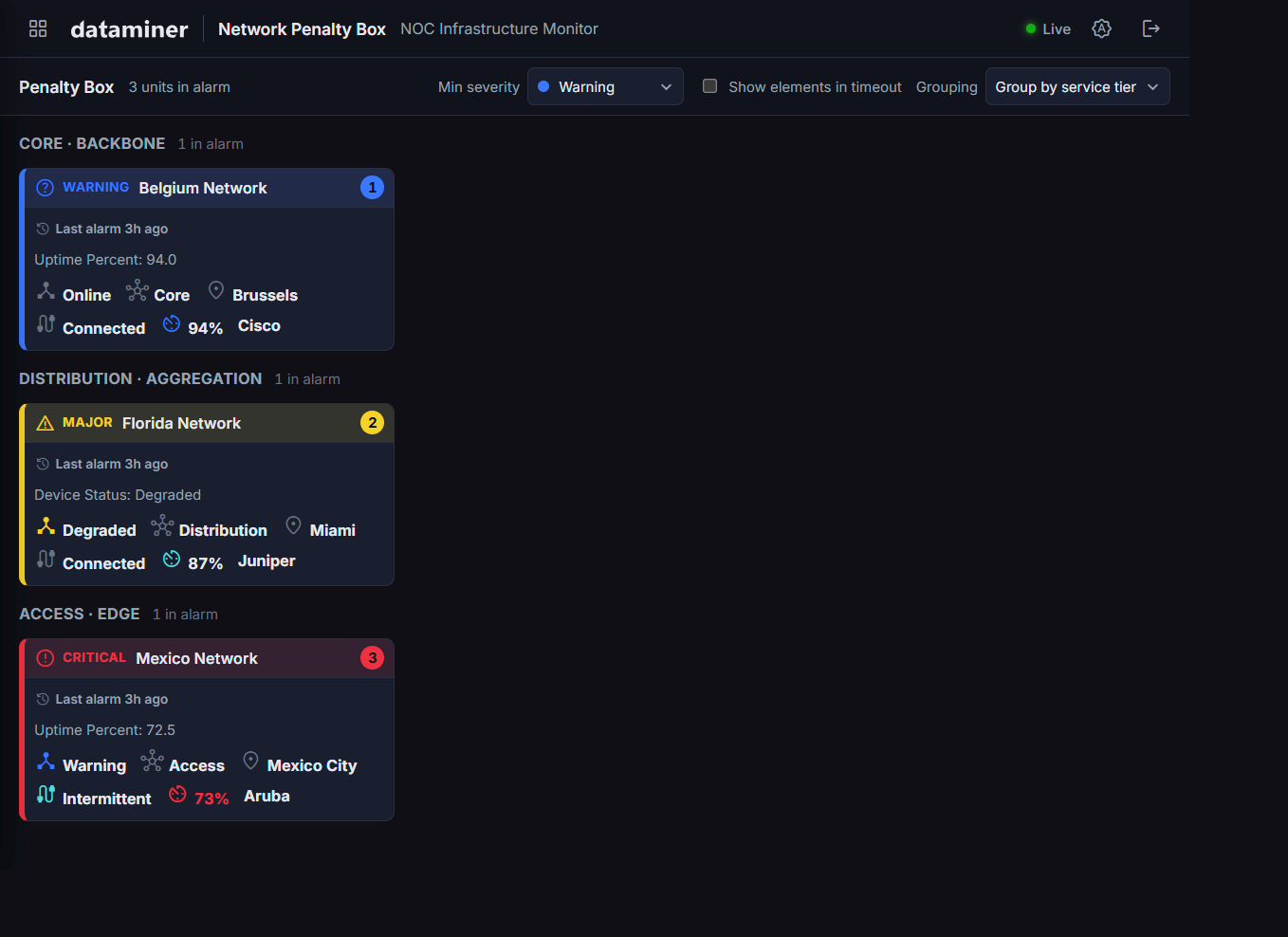
Example
"cardFields": [
  { "key": "alarm.time",     "label": "Last alarm" },
  { "key": "deviceStatus",   "label": "Status",      "format": "text",    "icon": "device_hub",  "alarmColor": true,  "pinned": true },
  { "key": "serviceType",    "label": "Tier",        "format": "text",    "icon": "hub" },
  { "key": "location",       "label": "Location",    "format": "text",    "source": "property",  "icon": "location_on" },
  { "key": "connectionState","label": "Connection",  "format": "text",    "icon": "cable",       "alarmColor": true },
  { "key": "alarm.message",  "label": "Message" },
  { "key": "uptimePercent",  "label": "Uptime",      "format": "percent", "icon": "av_timer",    "alarmColor": true },
  { "key": "vendor",         "label": "Vendor",      "format": "text" }
]
Reference
| Key | Type | Description |
|---|---|---|
key |
string | A parameterIds key, an elementProperties output key, or one of the reserved keys alarm.time and alarm.message. |
label |
string | The display label shown before the value. |
format |
"text", "percent", "runtime", or "number" |
How to format the value. "percent" appends %; "runtime" formats seconds as Xh Ym; "number" accepts an optional unit value (any string) and a decimals sub-key (an integer) indicating how many decimal places to show. Omit for alarm.time and alarm.message. |
source |
"parameter" or "property" |
Defaults to "parameter". Set to "property" for values from elementProperties. |
icon |
string | A DataMinerIcons ligature name shown next to the value (decorative only). If the name is not recognized, the literal text is shown on the card instead of an icon. |
batteryLevel |
boolean | When true, the value is rendered as a battery gauge icon instead of icon, tinted with this field's alarm color. |
alarmColor |
boolean | When true, the value text (and, for batteryLevel fields, the gauge) is tinted with the color of the active alarm on that specific parameter. This is the only per-field coloring mechanism; there is no client-side threshold. |
pinned |
boolean | When true, the field is never dropped as cards shrink, regardless of its position in the list. |
Note
DataMinerIcons ligature names largely follow the naming convention of Google's Material Symbols, so that gallery can be used to browse for an appropriate icon name. Not every Material Symbols name is available in DataMinerIcons, and DataMinerIcons also has some names of its own, so always verify that the chosen name renders as an icon rather than as literal text.
The reserved key values are namespaced under alarm. so that a real parameter can safely be named time or message without colliding:
| Key | Description |
|---|---|
alarm.time |
Shows the age of the most recent alarm, for example "Last alarm 3m ago". If no explicit entry is listed for it, it drops first, before any listed field. |
alarm.message |
Shows the highest-severity alarm's parameter name and display value. If no explicit entry is listed for it, it is never dropped. |
detailPanels
Defines the tabular panels shown in the detail overlay when a card is clicked. Panels are shown in the order listed. Each panel groups related fields under a heading.
Example
"detailPanels": [
  {
    "title": "Device Identity",
    "fields": [
      { "key": "ipAddress", "label": "IP Address", "format": "text" },
      { "key": "vendor",    "label": "Vendor",     "format": "text" },
      { "key": "model",     "label": "Model",      "format": "text" }
    ]
  },
  {
    "title": "Service",
    "fields": [
      { "key": "serviceType",  "label": "Service Tier", "format": "text" },
      { "key": "deviceStatus", "label": "Device Status","format": "text" }
    ]
  }
]
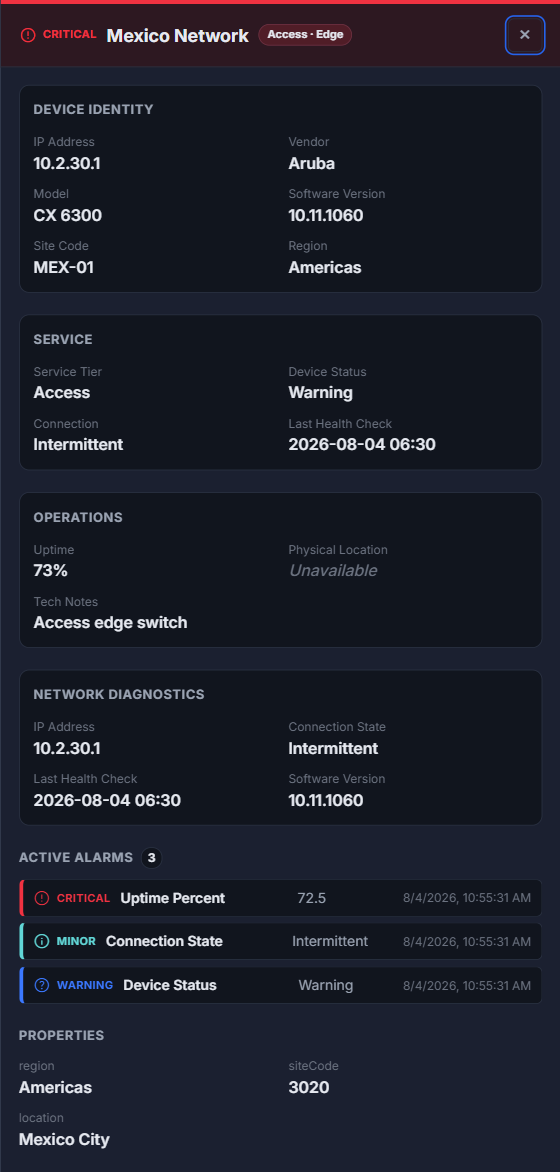
Reference
Each panel supports the following keys:
| Key | Type | Description |
|---|---|---|
title |
string | The panel heading. |
fields |
array | List of fields to display in the panel, using the same field structure as cardFields. |
Each entry in fields supports the following keys:
| Key | Type | Description |
|---|---|---|
key |
string | Identifier matching a parameterIds key (default) or an elementProperties output key when source is "property". |
label |
string | Display label. |
format |
string | Same values as cardFields ("text", "percent", "number", "runtime"). |
source |
string | "parameter" (default) reads from script parameters; "property" reads from element properties (keys defined in elementProperties). |
alarmColor |
boolean | When true, the value is tinted with the color of the active alarm on that specific parameter, using the same mechanism as in cardFields. |
realtime
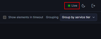
Enables WebSocket push updates layered on top of polling. When this is enabled, alarm counts and parameter values update within seconds without waiting for the next poll cycle.
The Live/Offline indicator in the header will show the current push state.
Example
"realtime": {
  "enabled":        true,
  "reconnectMs":    3000,
  "pollIntervalMs": 300000
}
Reference
| Key | Type | Description |
|---|---|---|
enabled |
boolean | Set to true to turn on WebSocket push updates. Falls back to polling-only when false or absent. |
reconnectMs |
number | How long (in ms) to wait before reconnecting after a dropped WebSocket. Default: 3000. |
pollIntervalMs |
number | Poll interval used when enabled is true. Can be much longer than the polling-only interval, as push updates will fill the gaps. |
severityPalette
Maps severity names to CSS color values, used by the alarm-tinted card fields (when alarmColor is true in cardFields) and the battery gauge. This key is optional; omit it entirely to use the built-in theme colors, and only add it if you want to override one or more of them.
The defaults reference CSS custom properties defined in the theme, so dark and light mode automatically apply the correct tones. Override with any valid CSS color value.
Example:
"severityPalette": {
  "critical": "var(--sev-critical)",
  "major":    "var(--sev-major)",
  "minor":    "var(--sev-minor)",
  "warning":  "var(--sev-warning)"
}
defaults
Sets what a first-time visitor sees, before they have made any choices in the toolbar. Their choices are remembered per browser afterward.
Example
"defaults": {
  "minSeverity": "warning",
  "grouping":    "serviceType",
  "hideTimeout": true
}
Reference
| Key | Type | Description |
|---|---|---|
minSeverity |
"critical", "major", "minor", or "warning" |
Minimum severity shown on first load. |
grouping |
string | A groupingOptions[].key value to select as the initial grouping mode. Falls back to the first entry in groupingOptions if omitted or invalid. |
hideTimeout |
boolean | Initial state of the Show elements in timeout option (true hides the elements in timeout). |
Note
All three keys are optional and only apply once, i.e., the first time a browser visits. The user's own choice always takes over after that.
layout
Controls card sizing and density behavior.
Example
"layout": {
  "minCardPx":         200,
  "minLegibleCardPx":  150,
  "showMoreThreshold": true
}
Reference
| Key | Type | Description |
|---|---|---|
minCardPx |
number | The target minimum card width in pixels. The grid fills available space and does not go below this value. |
minLegibleCardPx |
number | Below this width, extra fields are hidden to keep the card readable. |
showMoreThreshold |
boolean | When true, an indicator on small cards signals that fields have been hidden. |
monitoring
When enabled, a View in Monitoring button is shown in the detail overlay, linking directly to the element in the DataMiner Monitoring app. A small link icon will also be shown on each card. To see what this looks like, refer to Using the Generic Penalty Box.
Example
"monitoring": {
  "enabled":     true,
  "urlTemplate": ""
}
Reference
| Key | Type | Description |
|---|---|---|
enabled |
boolean | Shows the monitoring link in the detail overlay. |
urlTemplate |
string | Custom URL pattern. {dmaId} and {elementId} are substituted at runtime. Leave empty to use the DataMiner default path. |