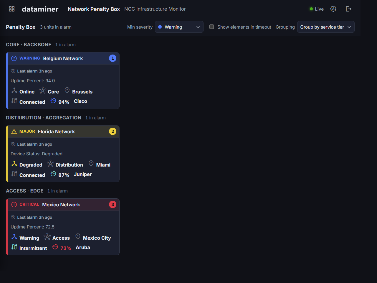
Using the Generic Penalty Box
Overview of the app components
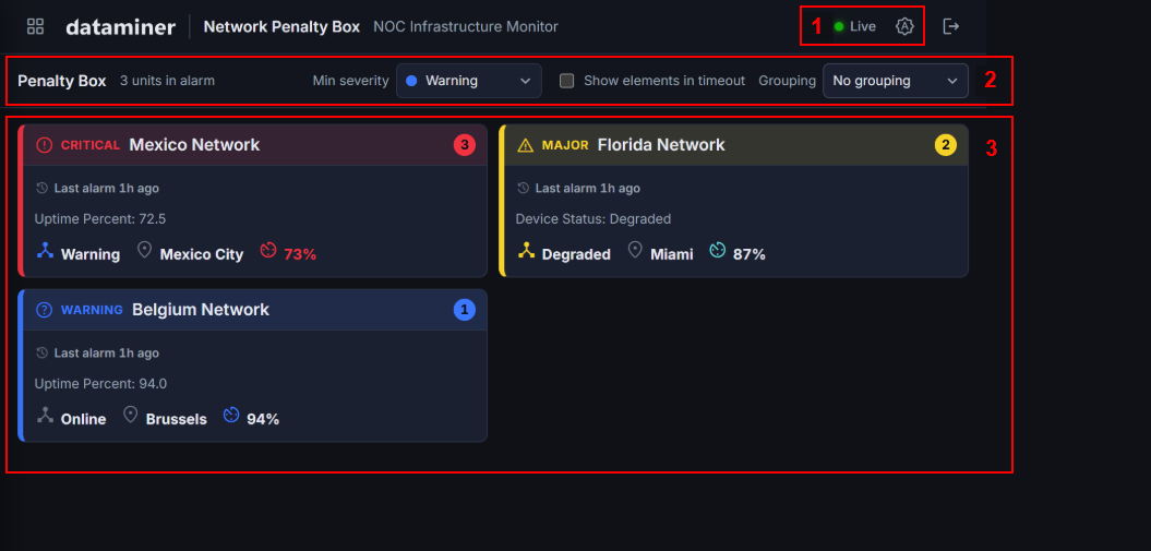
The app consists of the following main components:
- Connection indicator and theme selector.
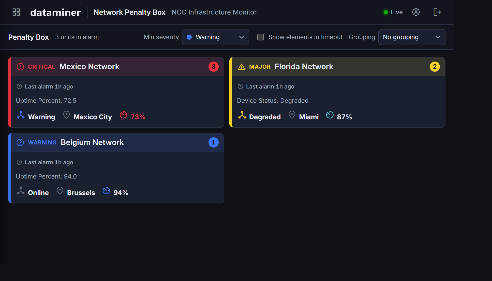
- Toolbar with, from left to right, an indicator of the total number of items in alarm, a severity filter, timeout visibility checkbox, and grouping selection box.
- Cards showing the items currently in an error, degraded, or alarm state. Clicking a card shows a detail view. Depending on the configuration, cards can have an external monitoring link.
Connection indicator
The Live/Offline indicator in the header indicates whether the app currently shows up-to-date information.
If real-time updates are enabled (with the realtime.enabled in config.json), the app opens one WebSocket session per monitored element using the Generic Parameter Webhook GQI data source. Parameter value changes arrive within seconds and update card fields immediately, without waiting for the next polling cycle. A separate alarm page subscription updates severity and alarm counts. On a WebSocket disconnect, the app will show Offline, and it will try to reconnect automatically after the configured reconnectMs interval.
If real-time updates are not enabled, the indicator will show Live as long as the app is able to communicate with the DataMiner server.
Theme selector
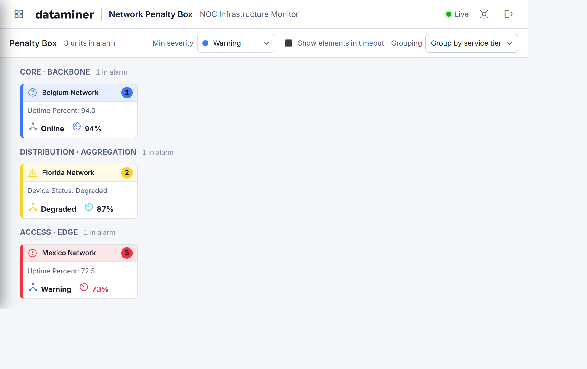
The theme button in the upper-right corner cycles through the options Dark, Light, and System. When you select an option, your choice is remembered per browser.
Severity filter
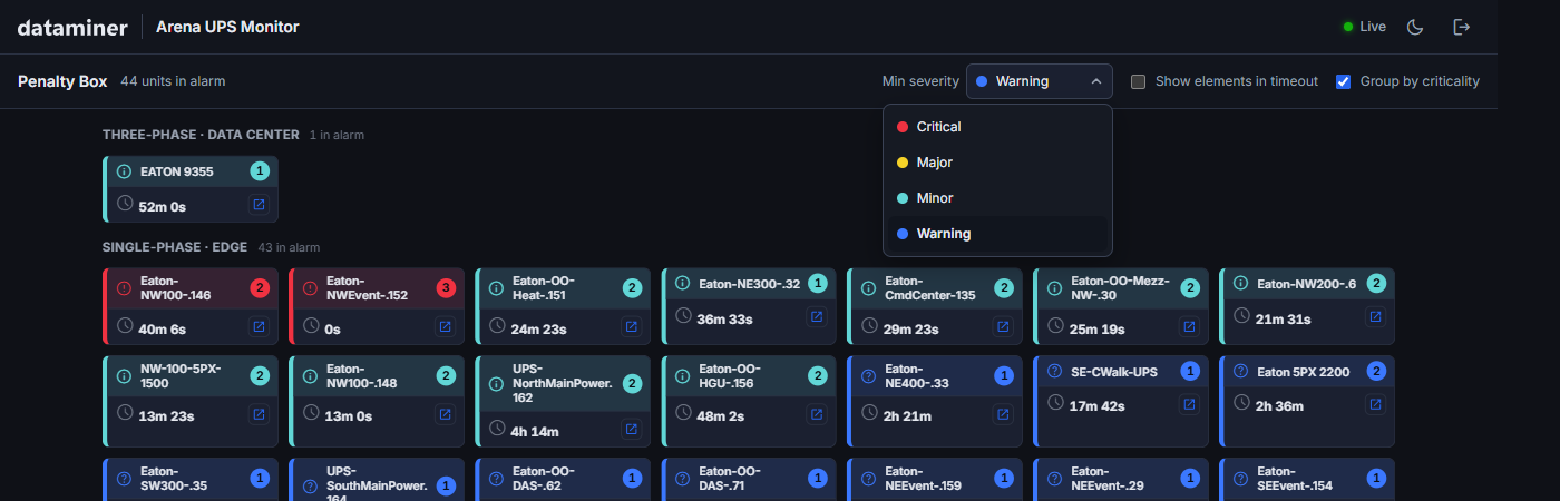
The Min severity dropdown box allows you to select the minimum severity level for which cards are shown. Any cards below the selected severity level will be hidden.
For example, selecting Major removes all warning-only cards, so that the wall only shows the most important problems.
This filter is runtime-only and resets to the configured default (defaults.minSeverity in config.json) when the app is loaded again.
Timeout visibility setting
The Show elements in timeout checkbox in the toolbar reveals elements that are in a communications timeout state.
Elements in timeout are hidden by default because their alarm data is stale. Showing them allows you to monitor how many elements are currently unreachable.
Grouping selection box
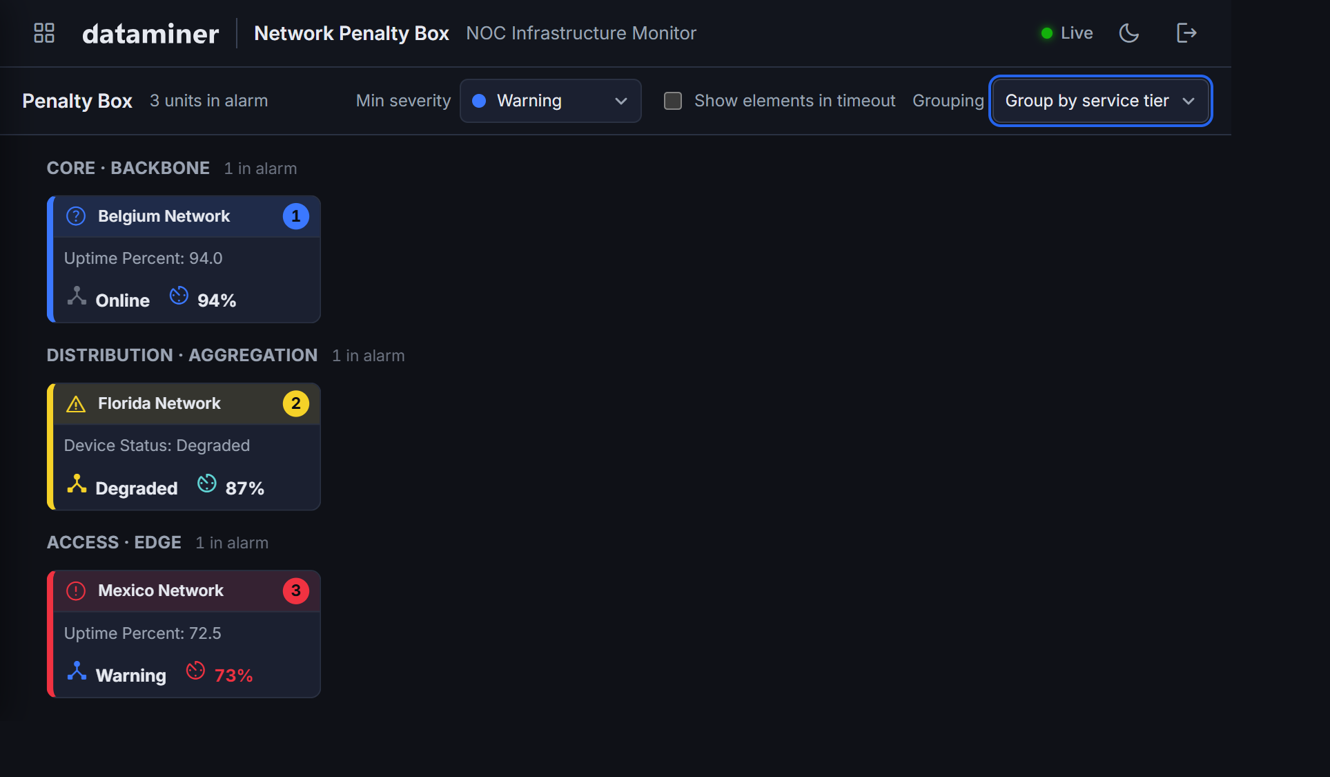
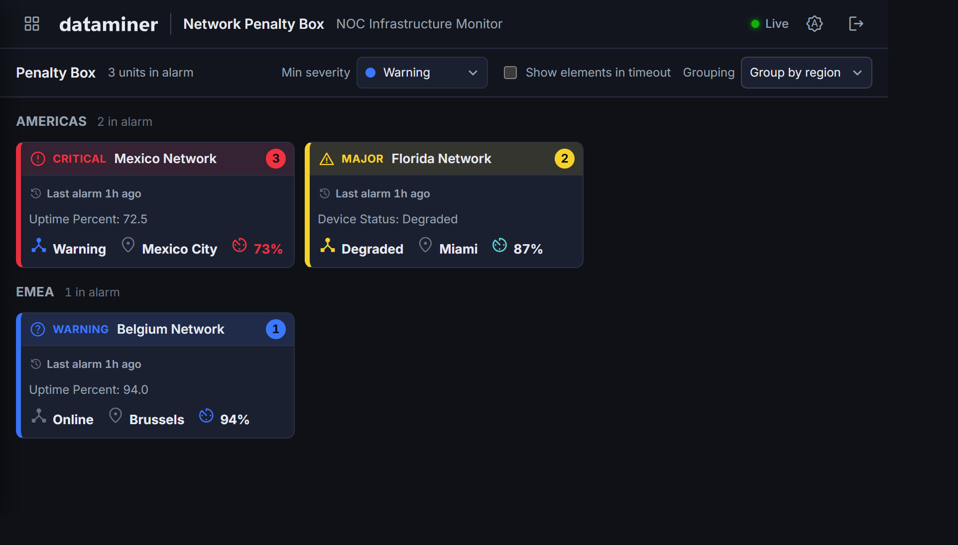
In the upper-right corner of the app UI, you can find the Grouping dropdown box. You can use this to switch between the different modes defined for the app (using the groupingOptions in the configuration file):
- Tier-based: elements are placed into named buckets by matching their value against the configured tiers. Groups appear in the same order the tiers are listed (the first one listed shows first). Elements that match no tier collect in an "Uncategorized" bucket.
- Dynamic: groups form automatically from the distinct values that exist in live data. This is useful for properties like region or location, where the set of values is not fixed in advance. New values appear as new group headers automatically.
- No grouping: a flat grid sorted by severity and alarm recency.
The active grouping is remembered per browser.
Detail view
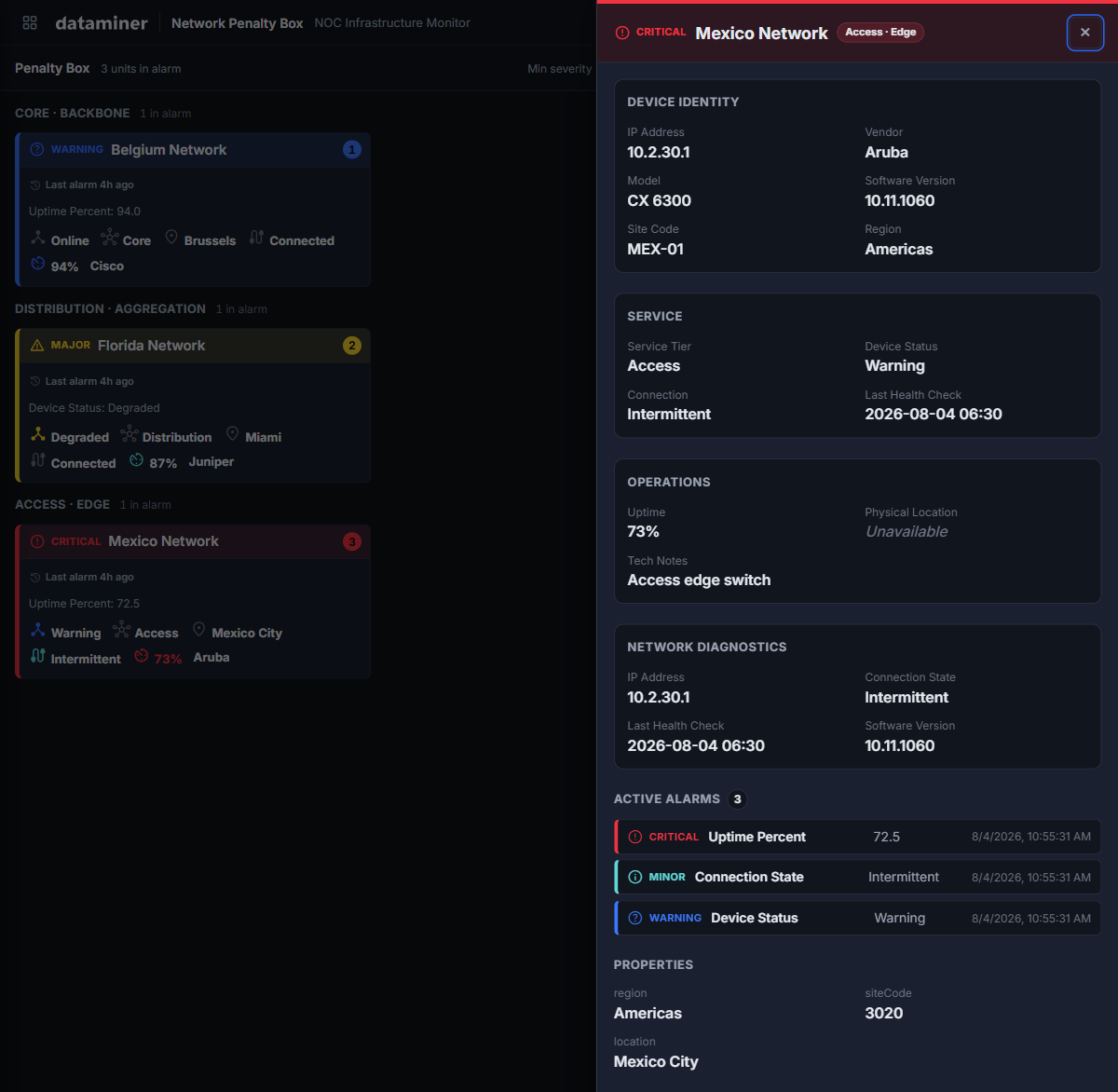
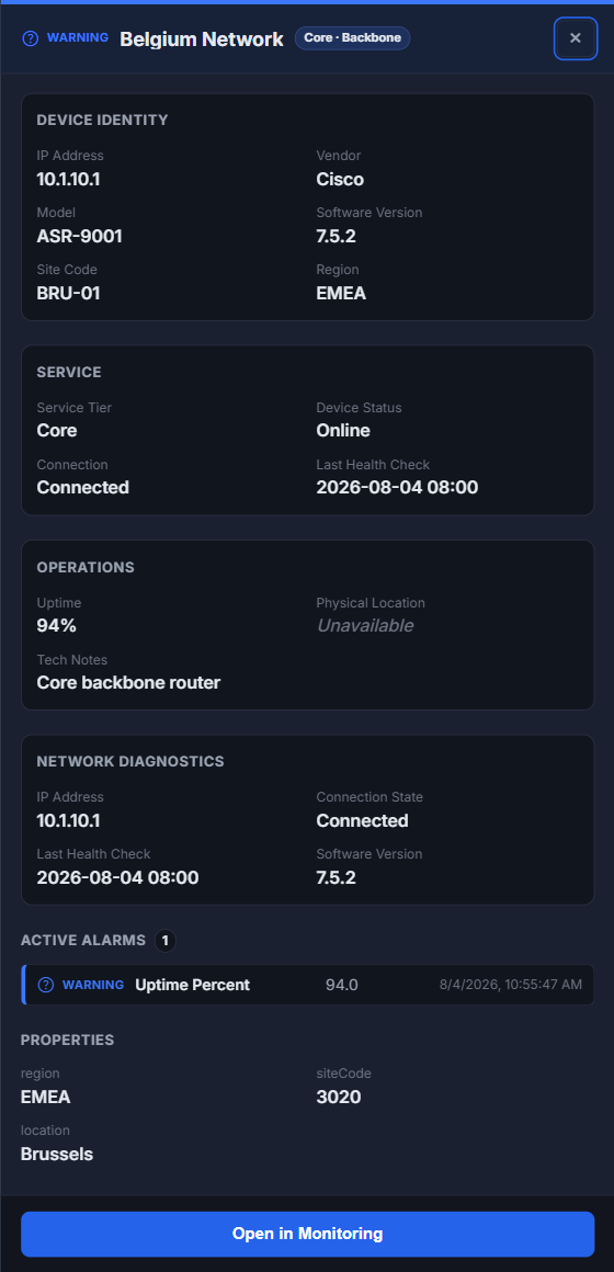
Click any card to open the detail overlay. It consists of the following components:
- Header: Shows a severity indicator, the element name, and a criticality tier label.
- Config-driven panels: These panels can show different information depending on the detailPanels configuration in config.json.
- Active alarms: A full list of all relevant alarms, showing severity, parameter name, display value, and timestamp.
- Properties: The custom properties of the DataMiner element, as configured in elementProperties in config.json.
- Monitoring link: See External monitoring link.
External monitoring link
When enabled in the config.json configuration (i.e., monitoring.enabled is set to true), an external monitoring link icon is shown on each card, and a View in Monitoring button is available at the bottom of the detail overlay.
Both links open the element in the DataMiner Monitoring app in a new browser tab, using the URL pattern defined in config.json (using monitoring.urlTemplate).
Below you can see what a card looks like when this setting is disabled or enabled:
| Link disabled | Link enabled |
|---|---|
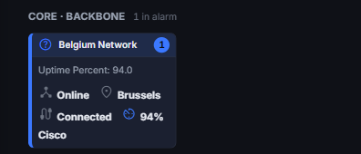 |
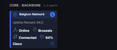 |
If the setting is enabled, a blue button is shown at the bottom of the detail overlay:
Mobile and responsive layout
The wall adapts to the available viewport without a separate mobile build:
- Cards fill the viewport in as many columns as fit at the configured layout.minCardPx width.
- If a field is listed earlier in the cardFields configuration in config.json, it is hidden first as cards narrow below
layout.minLegibleCardPx. - Fields that have been pinned (with
"pinned": truein config.json) are always visible at any card size. - The detail overlay slides in as a full-height panel on tablet viewports.