Using the maps component in a low-code app
In this tutorial, you will learn how to add and configure a maps component in a low-code app, by means of an example where the maps component is used to visualize cell towers, their connections, and their coverage.
Expected duration: 30 minutes.
The content and screenshots for this tutorial have been created in DataMiner version 10.4.1.
Prerequisites
- A DataMiner System using DataMiner 10.4.1 or higher, which is connected to dataminer.services.
Note
If you do not use a DaaS system, and you use a DataMiner version prior to DataMiner 10.5.0 [CU1]/DataMiner 10.5.4, you will also need to activate the ReportsAndDashboardsGQIMaps soft-launch option to be able to use the maps component. See Soft-launch options.
Overview
- Step 1: Set up the data
- Step 2: Visualize the cell towers
- Step 3: Configure the map
- Step 4: Style the markers
- Step 5: Add grouped markers
- Step 6: Visualize connections
- Step 7: Add navigation buttons
- Step 8: Add an overlay
Step 1: Set up the data
Go to https://catalog.dataminer.services/details/package/5506.
Click the Deploy button to deploy the Maps tutorial package on your DMA.
This package contains an ad hoc data source that can read in a JSON file and return GQI rows. It also contains three JSON files with cell tower data that will be visualized in this tutorial.
Step 2: Visualize the cell towers
In the Data pane, create a new query.
Configure the query to retrieve the cell towers from the CellTowers.json file using the JSON Reader ad hoc data source.
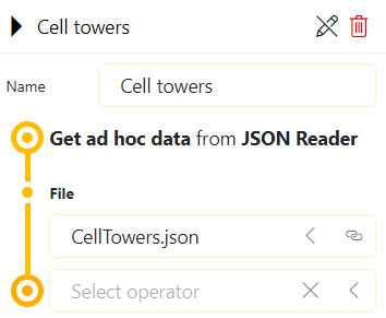
Add a maps visualization to the page and add the query to it by adding data to a component.
The maps component will look at the columns returned by the query and will try to automatically configure the identifier, latitude, and longitude. This means that the cell towers will automatically be shown on the map. By default, the query will be in the first layer.
Make sure the component is selected and go to the Layout pane on the right.
Under Layer settings, rename the first layer to Cell towers:
Step 3: Configure the map
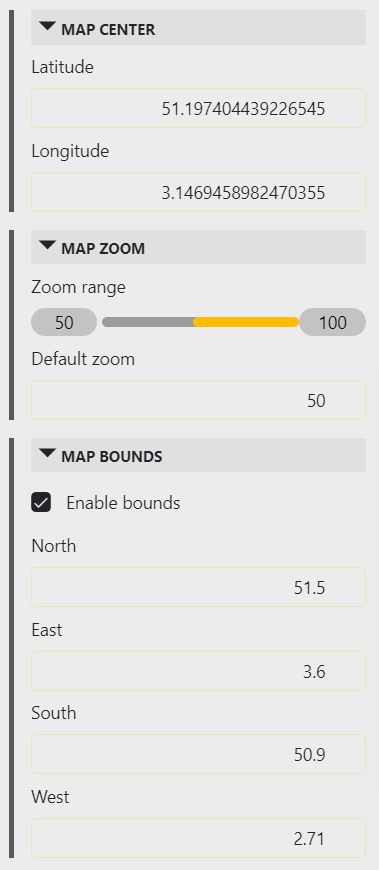
The markers you added in the previous step are all located on a small part of the map, but the map itself shows a large part of the world by default. To make it easier for the users to locate the markers, you can set some default values and limits for the map:
Zoom to the area of the map that you would like to have as the default view.
In the Layout pane, go to the Map settings section, and click Save current view.
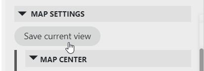
This will set the default map center and default zoom level to what is currently displayed.
Under Map zoom, use the slider to limit the minimum zoom level.
This will make it impossible for a user to zoom out past a certain level.
Under Map bounds, select Enable bounds.
This will limit the bounds of the map, so that the user cannot pan too far away away from the markers.
Step 4: Style the markers
At this point, the cell tower markers are always shown in the component, but they still look very basic. To make them stand out more and display some additional information, you can edit their template:
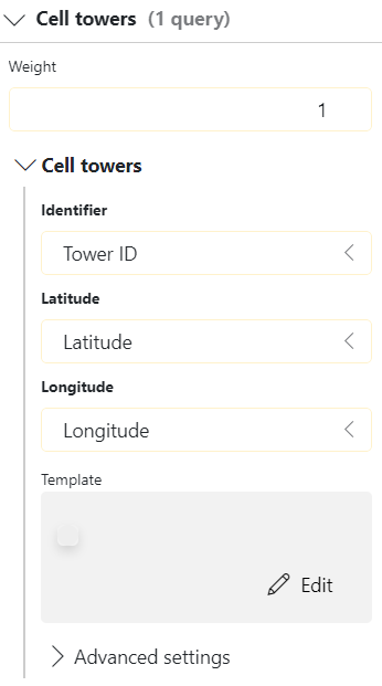
In the Layout pane for the component, expand the Layer settings and then expand the Cell towers query.
In the Template box, click Edit.
This will open the template editor.
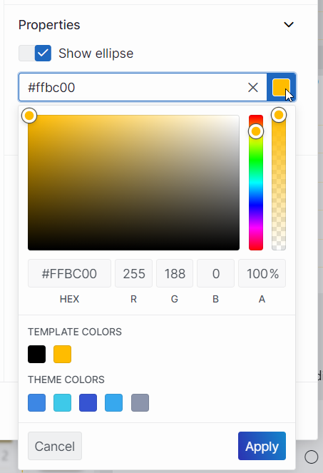
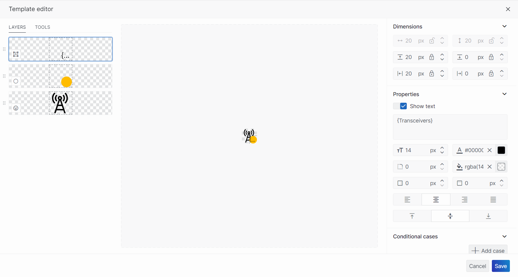
Modify the default ellipse layer to use as the background for a text shape:
In the Layers tab on the left, select the layer and then modify the Dimensions on the right to position it at the bottom right of the template.
Below Show ellipse on the right, click the color icon to select a custom color for the background.
Create a text layer that displays the number of transceivers on the tower:
In the Tools tab on the left, select Text and then click and drag in the center pane to add a text layer.
In the box below Show text on the right, enter the text
{Tranceivers}.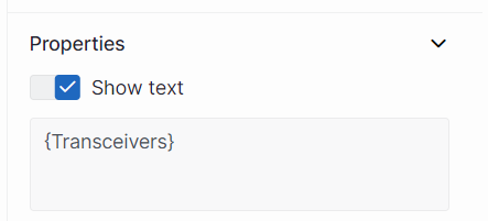
This placeholder text will be replaced by the content of the corresponding cell value from the query data source.
Create an icon layer to represent the cell towers:
In the Tools tab on the left, select Icon and then click and drag to place the icon in the right location in the center pane.
In the pane on the right, click Icon, enter
towerin the filter box, and select the tower icon.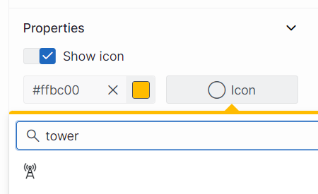
The result should look like this:
Step 5: Add grouped markers
The templates you added in the previous step look good, but at this point the visualization still feels cluttered when you zoom out all the way. You can deal with this by adding grouped markers. For this, you will need to create additional queries to retrieve data from the CellTowersGroups and CellTowersCities JSON files you installed with the package in step 1.
In the Data pane, create a new query named Cell tower groups, and configure it to retrieve the cell towers from the CellTowersGroups.json file using the JSON Reader ad hoc data source.
Create another query similar to the previous one, but this time use the name Cell tower cities and the CellTowersCities.json file.
Drag the two new queries to the maps component.
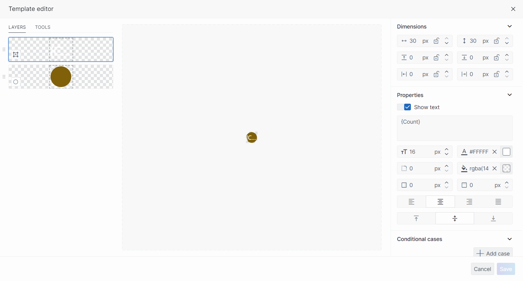
Configure a template for both queries that shows the Count of cell towers that are grouped in the markers:
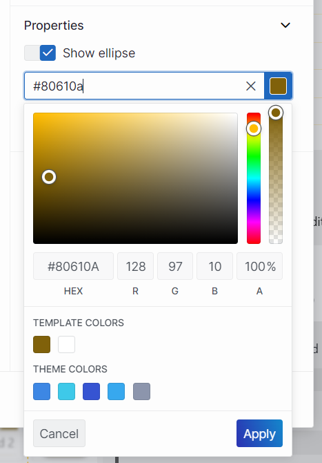
Modify the default ellipse layer to use as the background for a text shape:
In the Layers tab on the left, select the layer.
Below Show ellipse on the right, click the color icon to select a custom color for the background.
Create a text layer that displays the number of transceivers in the group:
In the Tools tab on the left, select Text and then click and drag in the center pane to add a text layer.
In the box below Show text on the right, enter the text
{Count}.This placeholder text will be replaced by the content of the corresponding cell value from the query data source.
The resulting template should look like this:
Configure the new markers to only be shown between certain zoom levels:
In the Layout pane for the component, expand the Layer settings and then expand the Cell towers layer.
Expand a query and open the Advanced settings section for that query.
Enter the minimum and maximum zoom levels where the markers of the query should be shown on the map:
Cell towers should be shown from 60 to 100.
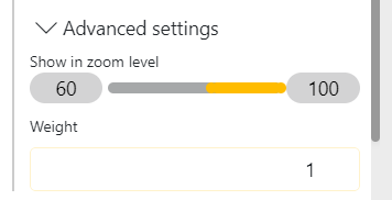
Cell towers groups should be shown from 52 to 60.
Cell towers cities should be shown from 50 to 52.
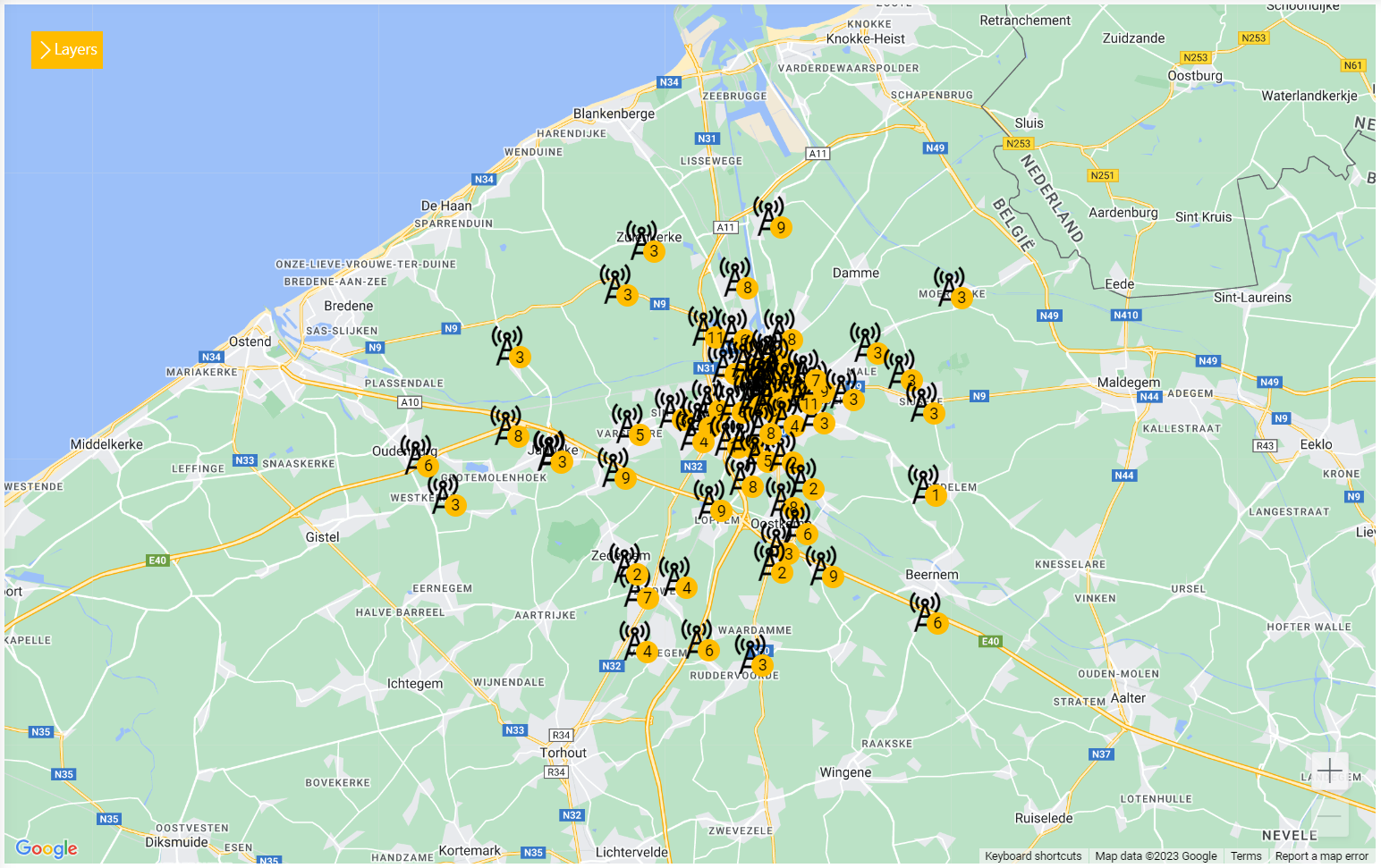
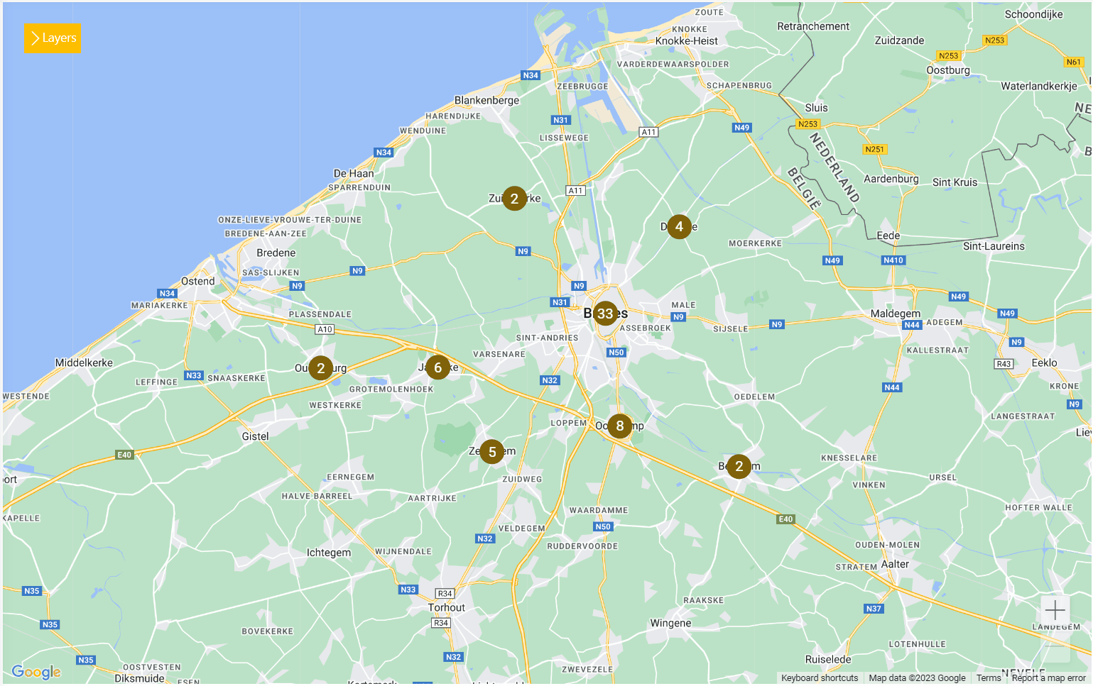
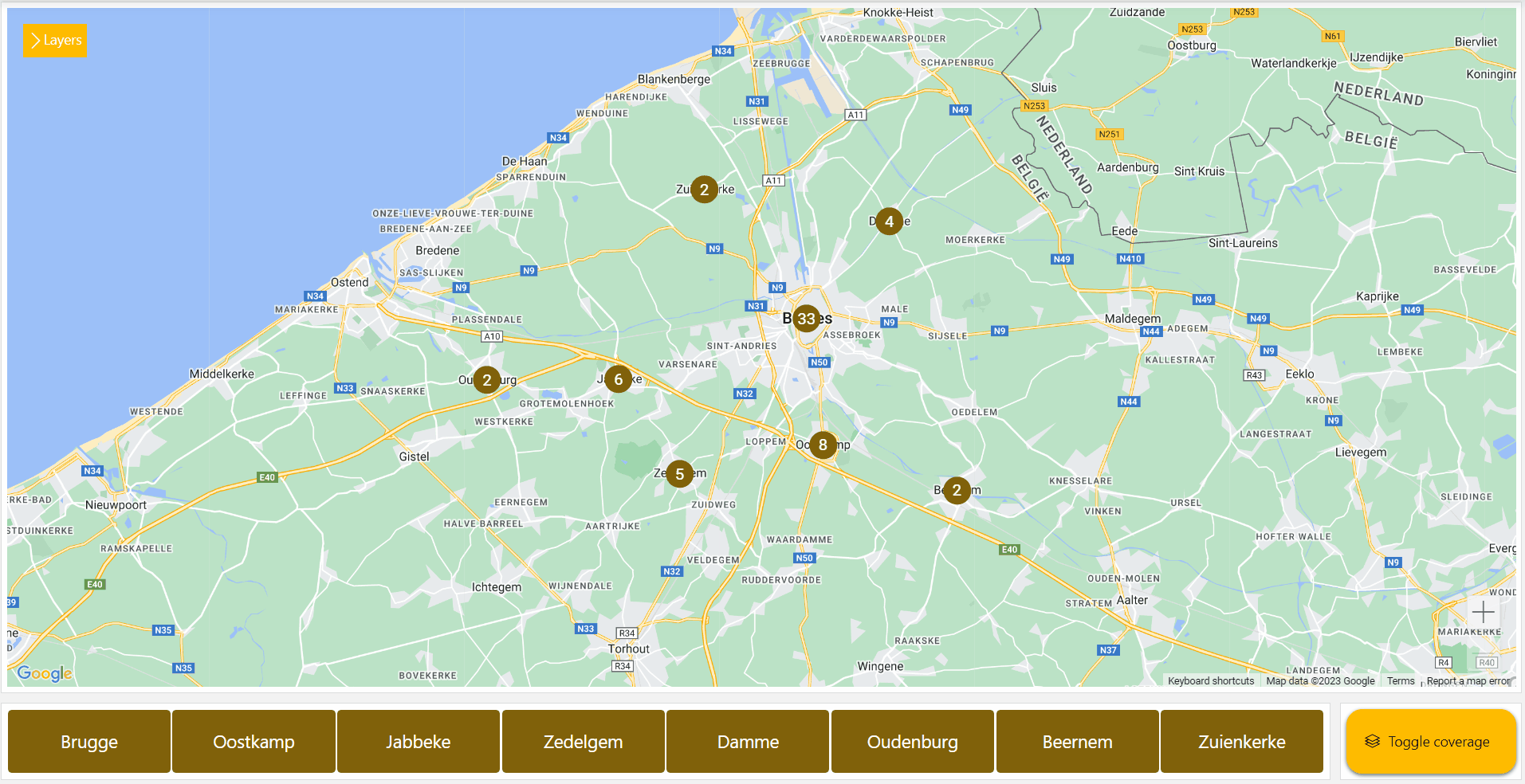
When you zoom in on the map, more and more grouped markers should now be shown, until the cell towers themselves become visible:
Step 6: Visualize connections
Now that all the cell towers are shown on the map, you can visualize the connections between them:
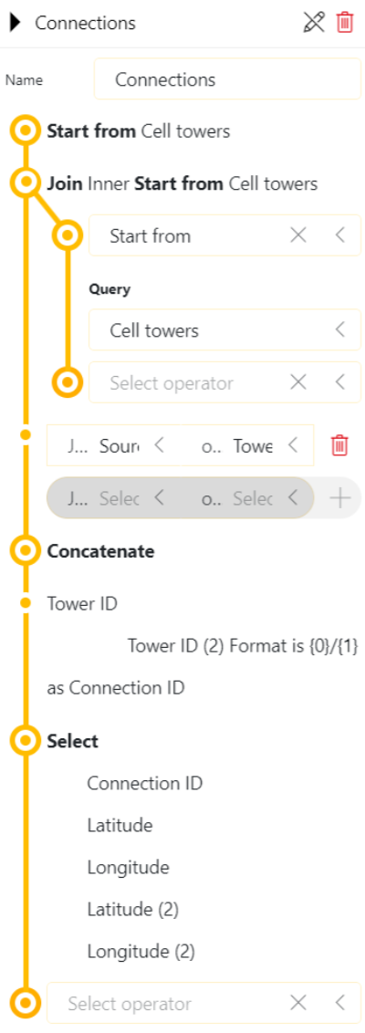
Create a new query.
Select the data source Start from and the query Cell towers.
This CellTowers data set contains a source column with the ID of the cell tower that another tower is linked to.
Create a new query that starts from the CellTowers query and joins itself based on this column:
As the name of the query, specify Connections.
Select the operator Join and the type Inner.
Below the Join operator, select the data source Start from and the query Cell towers.
Select the fields Source and Tower ID.
Create a new concatenated column of the IDs of both towers:
Continuing from the same query, add the operator Column manipulations with the manipulation method Concatenate.
Select the column Tower ID.
In the Format box, specify
{0}/{1}.In the New column name box, specify Connection ID.
Select only the necessary columns to display the connections:
Continuing from the same query, add the operator Select.
Make sure only the following columns are selected: Connection ID, Latitude, Longitude, Latitude (2), and Longitude (2).
This will result in a new data set with a unique ID and two sets of coordinates that you can visualize as lines on the map:
To be able to show and hide these connections, add them to the maps component in another layer than the cell towers:
Drag the query from the Data pane to the component.
In the Layout pane, under Layer settings, click Add layer to add a new layer.
Drag and drop the Connections query from the top layer to the new layer.
To make sure that the connections are shown underneath the markers, increase the weight of the new layer by one.
To make sure the query is visualized as connection lines, hover over the query and click Set as line to the right of the query name.
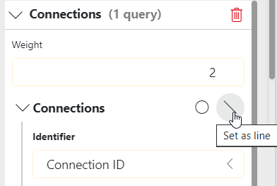
The component will try to automatically configure the dimensions and show the lines on the map.
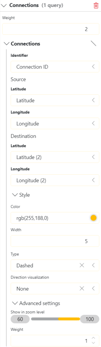
In the Style section, pick a color, width, and type for the lines.
This is what the configuration of the connections will look like:
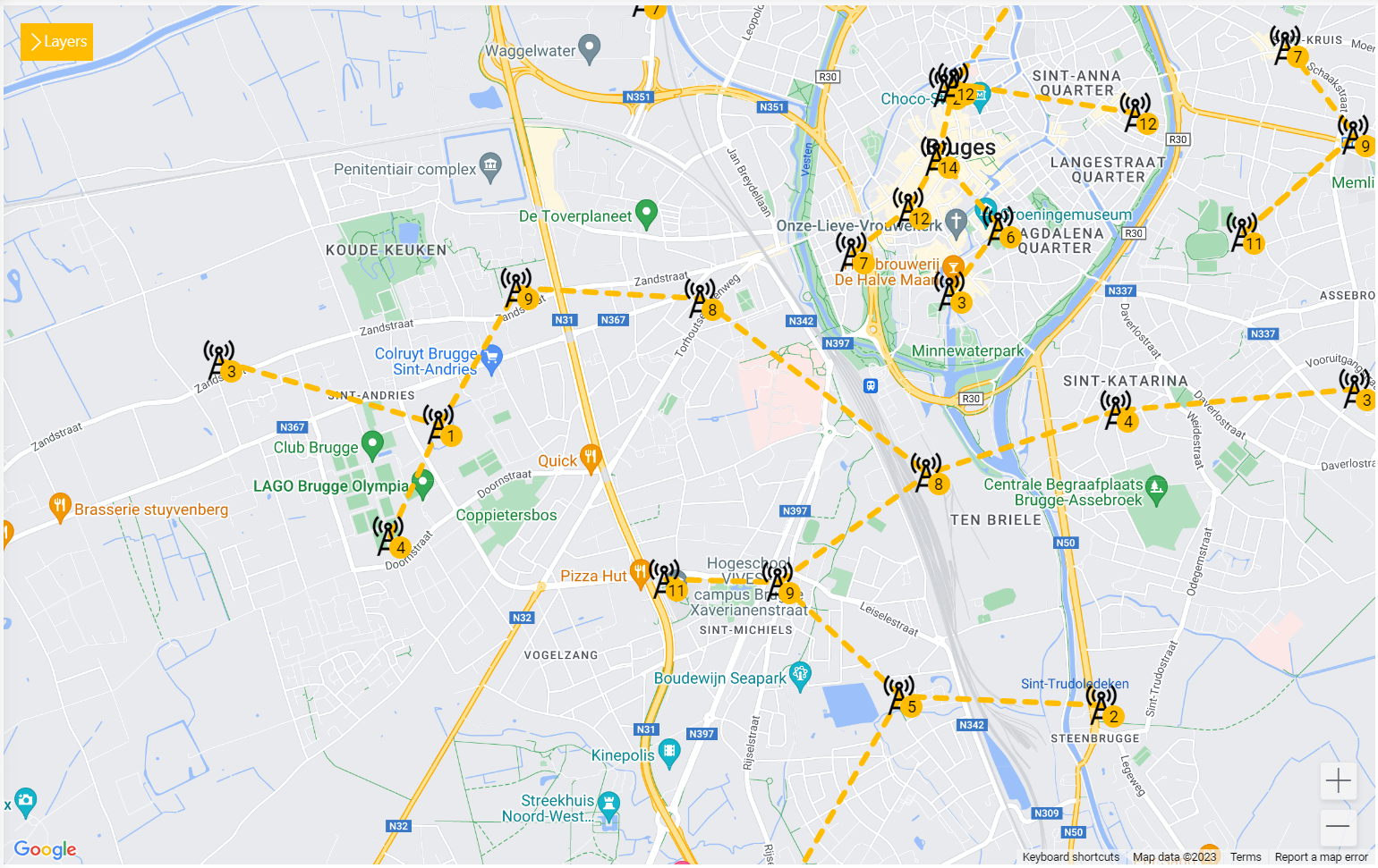
This will be the result in the maps component:
Step 7: Add navigation buttons
Now that your map will show the grouped cell towers and connections, you should add a way to easily navigate between different groups of markers. For this, you can add a grid component that visualizes another query:
In the visualizations pane, in the Other section, select the grid visualization and drag it to the area below your map component.
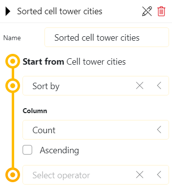
In the Data pane, create a query that starts from the cell tower cities and sorts them by transceiver count:
Drag the new query to the grid component.
Go to the Layout pane for the component, and click Edit in the Item templates section.
Configure the template as follows:
Modify the default text layer to display the text in a larger font and center it in the template:
Below Show text on the right, change the font size:
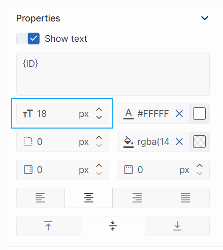
In the same section, change the color of the text:
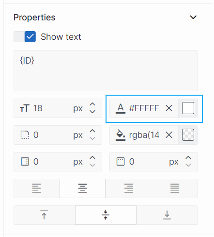
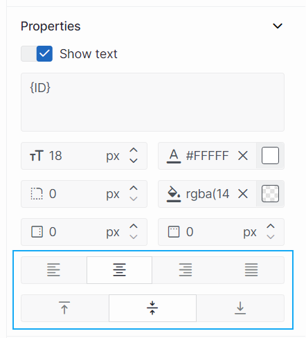
Use the buttons at the bottom to center the text horizontally and vertically:
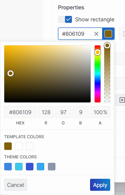
Create a transparent layer that executes actions when clicked:
In the Tools tab on the left, select Rectangle and then click and drag in the center pane to add a rectangle layer.
Below Show rectangle on the right, select a custom color for the background, making sure the opacity is set to 100:
Click the Configure actions button on the right to add the actions that should be executed when an item in the grid is clicked:
Select Execute component action and Pan to view to pan to the grouped marker.
Link the latitude and longitude arguments to the corresponding columns that are fed by the grid:
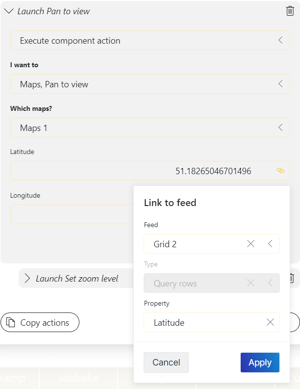
Click Add action at the bottom to add another action.
Select Execute component action and Set zoom level to set the zoom level to a level where the cell towers are visible:
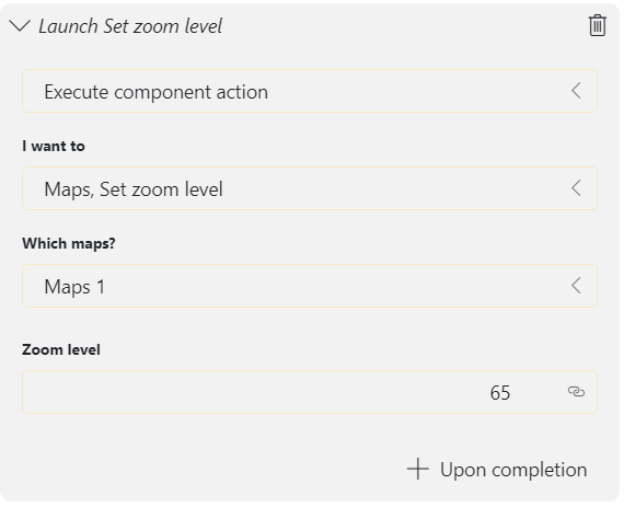
Click Ok to close the actions configuration and Save to save the template.
In the end, the component should look and function like this:
Step 8: Add an overlay
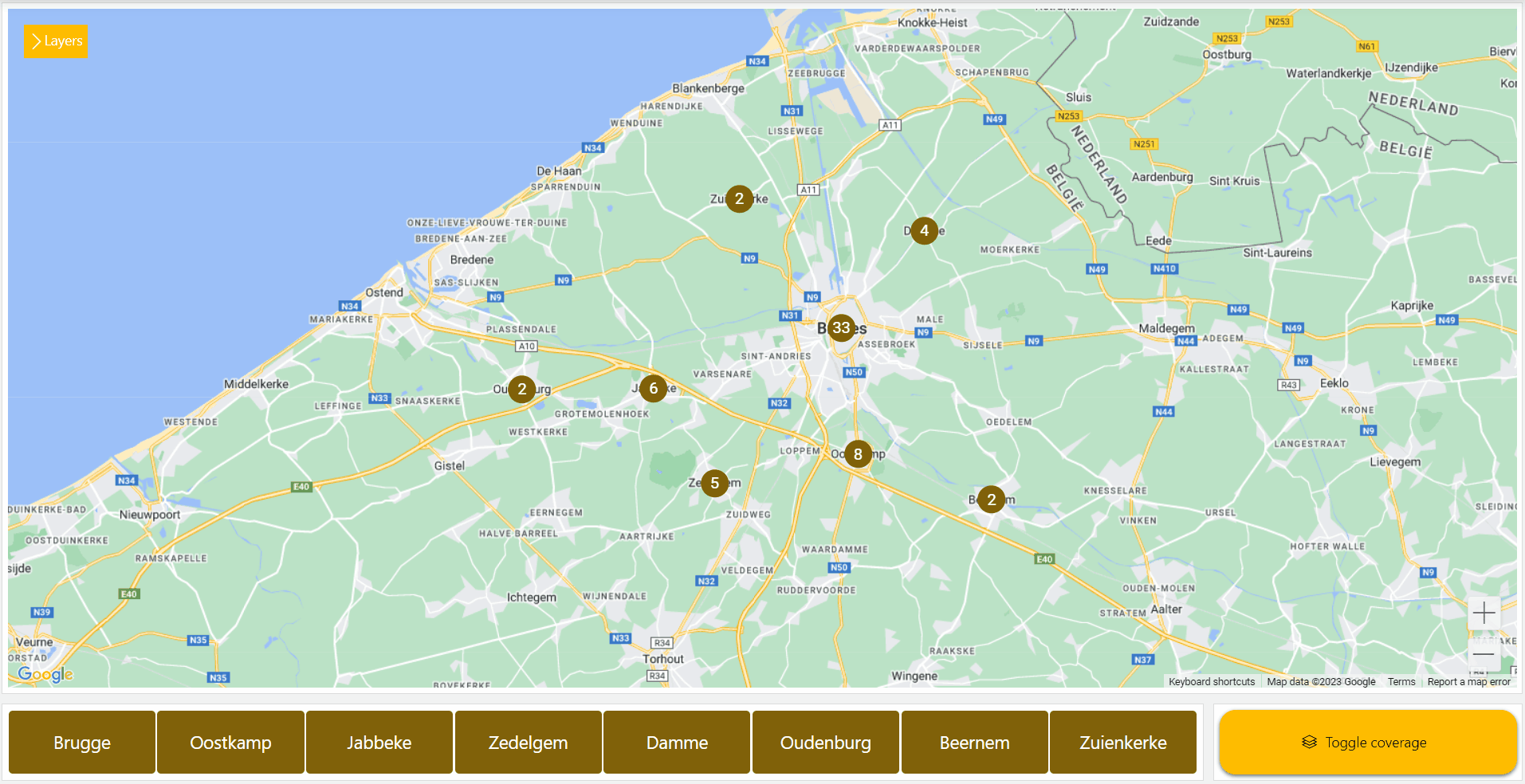
As a final touch to finish the configuration, you can now add an overlay to the component to visualize the coverage of all the cell towers. This can be done via a KML file that is toggled with a component action:
In the visualizations pane, in the Other section, select the button visualization and drag it below your maps component, to the right of the grid component.
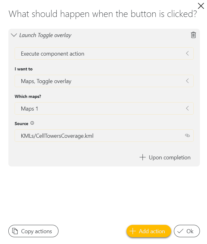
Configure an action for the button:
In the Settings pane for the component, click the button next to On click.
Select Execute component action and Toggle overlay.
Enter
KMLs/CellTowersCoverage.kmlas a local source for the overlay.This overlay file is included in the package you deployed in step 1.
You should now have a fully functioning application that can visualize (grouped) markers, their connections, and their coverage, and that allows users to easily navigate to the different cell towers on the map.