Using the trending right-click menu
When you right-click anywhere in the trend graph window, a shortcut menu appears.
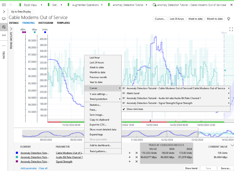
Trending right-click menu in DataMiner 10.4.5
The trending right-click menu contains the following commands:
Last hour/Last 24 hours/Week to date/Month to date/Previous month/Year to date: Allows you to zoom in on a particular time frame.
Note
The Previous month option zooms to the last completed month, while the Month to date options displays the last 30 days up to the current date.
Curves: Allows you to remove a curve from a graph or to place a curve on an additional Y-axis (if units are identical).
Curves > Show Min/Max: Additional option under Curves, which allows you to toggle whether minimum and maximum values are shown.
When you enable this option, the minimum and maximum values will be indicated with a colored area behind the curve. By default, the option is not enabled for trend graphs with multiple parameters.
Y-axis settings: Use this command to customize the range of the Y-axis. In the Y-axis settings window, you can choose one of two options:
Auto, in which case the scale is automatically determined.
Range, in which case you manually have to set a minimum and maximum, and indicate whether exception values should be included.
Trend prediction: Available from DataMiner 10.2.9/10.3.0 onwards. Allows you to select the trend prediction type. See Working with trend predictions.
Print: Allows you to print the trend graph that is currently displayed.
Save image: Allows you to save the trend graph into an image file (.png or .jpg)
Copy to clipboard: Allows you to copy the trend data to the Windows Clipboard. From there, you can then paste it into third-party applications like Microsoft Word or Microsoft Excel.
Note
If you right-click while the cursor is on the trend graph itself, the trace point information will be included in the copied image. If you want to copy the graph without the trace point information, right-click in the area to the left of the Y-axis.
Export to CSV: See Exporting a trend graph.
Show most detailed data: If you select this option, the most detailed data available will be shown, rather than average data.
Expand tags: Highlights all patterns matching the configured tags. See Working with pattern matching.
Show percentile: Displays a percentile line for the currently displayed data. The calculated percentile and its value will be displayed to the right of the line. Changing the displayed range does not update the percentile line, so that you can compare it with the data for a larger or smaller time frame. The percentile line will be displayed as a full line over the range for which it was originally displayed, and as a dashed line over the rest of the graph. Click the line to change the percentile or to refresh it to the currently displayed data.
Note
- By default, the 95 percentile is displayed, but this can be customized in the user settings. See Trending settings.
- If the trend graph contains average data points in its most detailed data set, only average data will be used in the percentile calculation. This will be indicated with a warning icon in the percentile menu.
Add to dashboard: Obsolete from DataMiner 10.4.0/10.4.1 onwards. Adds the trend graph to a legacy dashboard. See Adding an item to a dashboard from outside the Dashboards app.