Button
The button component lets you trigger actions with a single click. In a low-code app, a button is typically used to launch events, such as running an automation script, navigating to another page, or updating data. In a dashboard, the button component (currently in preview) is used to execute a button parameter from an element.
Button component in DataMiner 10.6.4
The classic button (i.e., the one used in Low-Code Apps) is intentionally simple: it does not display data, but performs an action. It works independently of any data source, and you can configure what should happen when a user clicks it.
Tip
See also: Using button components and header bars in Low-Code Apps 
Configuring what happens on click
Select the button component.
In the Settings pane, select Configure actions next to On click.
Add and configure one or more actions as described in Configuring app events.
When the button is clicked, the configured actions are executed in the order in which they were added.
Example:
In the example below, the Virtual - Zoom button is configured to set the value of the text input component to "Virtual - Zoom" when clicked. Because the text input is linked as a filter on the Location column of the table, the table then only displays events that take place via Zoom.
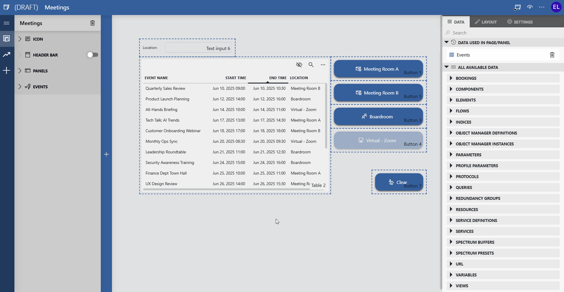
Table and button components in DataMiner 10.6.4
Customizing the button appearance
You can adapt the look of a button so users immediately understand what it does.
In the Layout pane, you can find the default options available for all components. See Customizing the component layout.
Additionally, you can define a custom label and icon:
In the Layout pane, expand the Advanced section.
In the Label field, enter the text that should appear on the button.
In the Icon section, select an icon to display next to the label.
Use the search field to quickly find an icon that matches the purpose of your button.
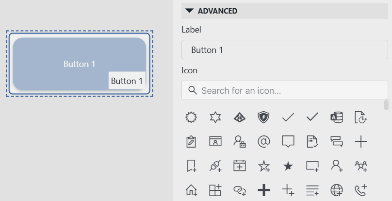
Button component in DataMiner 10.6.4
Using the button in dashboards (preview)
The button component is currently still in preview in the Dashboards app, and requires the soft-launch option ReportsAndDashboardsButton to be enabled.
In a dashboard, a button is used to execute the action of a button parameter. Unlike in low-code apps, where a button does not require data, a dashboard button must always be configured with parameter data.
Each parameter added to the component appears as one or more buttons that trigger the same action as the corresponding button parameter in DataMiner Cube.
Connecting the button to a parameter
Add a button component to the dashboard.
In the Data pane, expand the Parameters section.
Drag compatible parameter data onto the component.
You can add multiple parameters, even from different elements.
Each parameter added to the component will appear as one or more buttons.
Clicking a button performs the same action as selecting the equivalent option in DataMiner Cube.
In the Settings pane, configure how the buttons should be grouped:
By parameter
By element
By table index (if relevant)
By all of the above
(Optional) Customize the appearance of the buttons in the Layout pane:
Button text: Change the button text to override the default label from Cube.
Simple button text size: Select the size of the button text (small, medium, or large).
When multiple buttons are displayed, you can also configure how they are arranged:
Layout: Display buttons next to each other or below each other.
On smaller screens, buttons are always displayed below each other.
Maximum rows per page: Determine how many items can at most be displayed below each other on a single page.
Maximum columns per page: Determine how many items can at most be displayed next to each other on a single page.
Example:
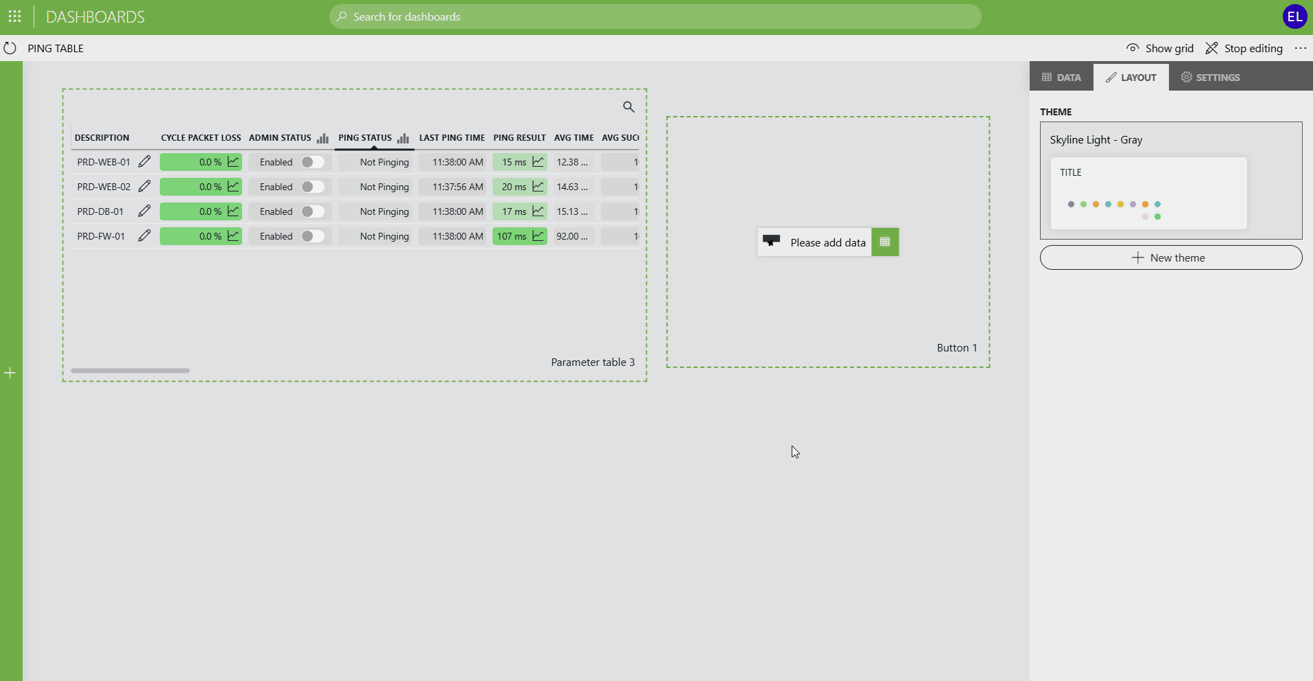
In the example below, the button component is connected to parameter data that lets you:
Enable or disable all ping targets at once.
Add a new ping target, which can then be further configured in the parameter table.
Any changes triggered by the buttons are immediately reflected in the parameter table.
Automation script behavior
If the soft-launch option ReportsAndDashboardsAutomationScript is enabled, the component can also function as an automation script component instead.
In that case, you can link the button directly to an automation script in the Settings pane.
Note
If you add a button parameter to the component, it will still act as a parameter button, even if this soft-launch option is enabled.
When the component runs an automation script, additional settings will also be available related to this script.
Depending on the script configuration, it may be possible to configure the parameters and/or dummies used in the script. For each of the parameters and dummies, a checkbox allows you to select whether these are required, i.e., whether the script can be executed only if these are filled in.
The standard options for script execution can be configured. See Script execution options.
The following additional options are available:
Ask for confirmation: Determines whether the user will be asked for confirmation before the script is executed.
Show success popup: Determines whether a pop-up message is displayed when the script has been successfully executed. By default enabled.
Custom success message: Allows you to configure a custom message to be displayed when the script has been successfully executed.
Note
The input for an interactive automation script can be specified by the user or retrieved via linked data. In case both are possible for the same component, user input always takes precedence.
In case several data is linked to the component, they are considered in the order they were added. For example, if 2 data sources are used and the data that was first added is applicable, the second data input will be ignored.