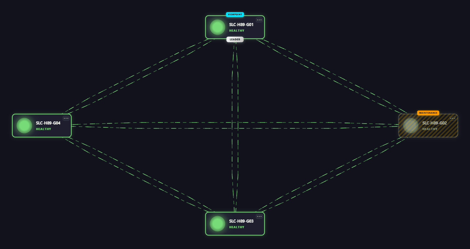
Node edge graph
The node edge graph component allows you to visualize any type of objects (i.e., "nodes") and the connections between them (i.e., "edges"). By linking parameters and properties to those nodes and edges, you can turn the graph into a full-fledged analytical tool that shows real-time alarm statuses and KPI data.
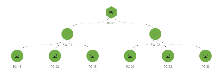
Node edge graph component in DataMiner 10.4.9
Supported data types
The data necessary to create a node edge graph can be provided by means of GQI queries. Node queries provide data that will be visualized as nodes (i.e., objects), whereas edge queries provide data that will be visualized as edges (i.e., connections between objects).
The component should therefore always be configured with query data input.
Interacting with the node edge graph
What you see in the node edge graph depends on the provided data and your component configuration.
Note
When edges are closely grouped together, edge labels may become minimized. If you hover the mouse pointer over the edge, the label becomes visible again. From DataMiner 10.3.0 [CU4]/10.4.0 [CU2]/10.4.5 onwards, you can press Ctrl+Space to display all labels at once.
Available interactions
You can interact with the node edge graph in several ways:
Selecting an item: Click an item to select it. You can select multiple items at the same time by keeping the Ctrl key pressed while clicking nodes. You can select all items at once, by pressing Ctrl + A.
When you select one or multiple items in the node edge graph, the selected data becomes available under All available data > Components > [Page/Panel name] > Node edge graph > Tables.
Thanks to this exposed data, you can use the node edge graph component as a dynamic selector, i.e., a component whose selection determines behavior or data elsewhere in your dashboard or app. A common use case is showing additional details when a node is selected.
Note
Note that depending on your setup, the exact path to the exposed data may differ. For example, in versions prior to DataMiner [CU21]/10.3.0 [CU9]/10.4.12, component data is found under the Feeds data category.
Moving a node: You can select and drag a node to a new position. You can move multiple nodes at the same time by keeping the Ctrl key pressed while selecting several nodes and then moving them together. You can move all nodes at once by pressing Ctrl + A and dragging them together.
The conditions for repositioning nodes depend on your DataMiner version:
From DataMiner 10.5.0 [CU10]/10.6.1 onwards:
In the Settings pane, Default mode must be set to Edit.
Ensure that node moves update the underlying data and do not remain purely visual:
When Advanced > Node positions is set to Layered in the Layout pane, node positions are stored automatically when the user has editor permissions. See Configuring security for a dashboard and Configuring app security.
When Advanced > Node positions is set to Linked to data, node positions are only stored if a node-move event is configured that triggers a Launch a script action. This automation script should update the original data objects with the modified ones exposed by the event. For more information, see Configuring node movement events.
Up to DataMiner 10.5.0 [CU9]/10.5.12:
In the Layout pane, Advanced > Node positions must be set to Custom.
The user must have the appropriate permissions to edit the dashboard/low-code app. See Configuring security for a dashboard and Configuring app security.
At any time during an interaction, you can press ESC to cancel the action and restore the item to its last known position (available from DataMiner 10.5.0 [CU14]/10.6.0 [CU2]/10.6.5 onwards).
Zooming and panning
When the Zooming option is enabled, you can zoom in or out in two ways:
Scroll up or down. Depending on your DataMiner version and the Hold Ctrl to zoom option, you may need to hold the Ctrl key while scrolling.
Right-click, drag to select an area, and zoom into it.
To move left or right across the component, click the graph and drag your mouse. Note that panning is only possible when zooming is enabled.
Using dynamic coloring
The component uses dynamic coloring, which can be adjusted according to preference. When you hover the mouse pointer over a node or edge, a tooltip is displayed with detailed info. Click the circle in the upper-right corner of the tooltip to switch between different coloring modes for all the nodes or edges of this type:
Static: Edges have no color, nodes have the color from the node settings.
Analytical: If you select this mode, further below in the tooltip you can select any of the columns that have a color filter applied (cf. configuration below) to make this the dominant column. This column is then indicated in bold and determines which color is used in the graph. The value of this column is also displayed under the nodes or edges. If WebSocket communication is enabled, the colors and values will be updated in real time to match parameter value updates and other real-time updates.
Alarm: Nodes and edges are colored according to the highest severity of the parameters in the tooltip.
Highlighting specific nodes
When you highlight items based on a query filter, only the items that match the filter are emphasized. Items outside the filter criteria remain visible, but with lowered opacity. The level of transparency can be adjusted.
To highlight items with a query filter:
In the Layout pane, make sure the Filtering & Highlighting > Highlight option is enabled.
Set your preferred opacity, for example
20 %. This determines how clearly you will see the items that do not meet the criteria specified in the query filter.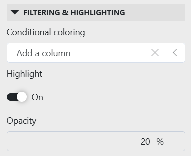
Node edge graph layout settings in DataMiner 10.6.1Add a query filter visualization to your app or dashboard.
Apply the same query data to the query filter that is used by the node edge graph.
From DataMiner 10.5.0 [CU12]/10.6.3 onwards, navigate to All available data > Components > [Page/Panel name] > Query filter in the Data pane, and drag the Query columns data item onto your node edge graph component.
Note that depending on your setup, the exact path may be different. For example, in versions prior to DataMiner [CU21]/10.3.0 [CU9]/10.4.12, component data is found under the Feeds data category.
You can now use the query filter component to filter and refine the data displayed in the node edge graph component. Items that do not meet the specified criteria will be shown with lowered opacity.
Note
When you disable the Highlight option, the nodes that do not match the filter will no longer be displayed and the remaining nodes will be reorganized.
Configuration options
Node edge graph layout
In the Layout pane, you can find the default options available for all components. See Customizing the component layout.
Additionally, the following layout options are also available:
| Section | Option | Description |
|---|---|---|
| Filtering & Highlighting | Conditional coloring | Highlight certain columns in a tooltip based on a condition. For more information, refer to Conditional coloring. |
| Filtering & Highlighting | Highlight | Toggle the switch to determine whether the items that match the criteria specified in a query filter will be highlighted. Enabled by default. For more information, see Highlighting specific nodes. |
| Filtering & Highlighting | Opacity | Set the level of transparency of the nodes and edges that do not match the criteria specified in a query filter. This option is only available when Highlight is enabled. |
| Filtering & Highlighting | Highlight/Show entire path | Toggle the switch to determine whether only the nodes matching the filter are highlighted, or whether the entire tree structure they are a part of (from root to leaves) is highlighted as well. |
| Advanced | Empty result message | Available from 10.3.11/10.4.0 onwards. Specify a custom message that is displayed when a query returns no results. From DataMiner 10.5.0 [CU12]/10.6.3 onwards, this setting can be left empty, in which case no message is displayed and the component remains empty. See also: Displaying a custom empty component message. |
| Advanced | Node positions | Change how the nodes are positioned within the component. See Node position options. |
| Advanced | Direction | Available when the Node positions option is set to Layered (default). Determine how different nodes are displayed depending on their importance, as indicated by their configured weight. See Node position options. |
| Advanced | Zooming | Toggle the switch to determine whether users should be able to zoom in on the component or not. See Zooming and panning |
| Edges | Style | Select whether the connections should be displayed as curly (default) or straight lines. Prior to DataMiner 10.5.0 [CU14]/10.6.0 [CU2]/10.6.5, this setting is called Edge style and can be found under Advanced. |
| Edges | Max bundle size | Set the maximum number of edges that can be shown before they are automatically combined into a single line (default value: 20). The color and style of that line are based either on the highest alarm severity (in alarm mode) or the lowest color (in analytical mode). Clicking the line will expand all edges, revealing their actual values and colors. Available from DataMiner 10.5.0 [CU14]/10.6.0 [CU2]/10.6.5 onwards, when the parameter showAdvancedSettings=true is added to the URL. |
| Edges | Spread offset | Determine the distance from the source or destination node at which edges begin to spread (default value: 0%). Available from DataMiner 10.5.0 [CU14]/10.6.0 [CU2]/10.6.5 onwards, when the parameter showAdvancedSettings=true is added to the URL. |
| Edges | Spread length | Determine the portion of the path where edges spread apart from the connection point (default value: 25%). Available from DataMiner 10.5.0 [CU14]/10.6.0 [CU2]/10.6.5 onwards, when the parameter showAdvancedSettings=true is added to the URL. |
| Edges | Max spread size | Determine the maximum distance occupied by bundled edges (default value: 80px). Available from DataMiner 10.5.0 [CU14]/10.6.0 [CU2]/10.6.5 onwards, when the parameter showAdvancedSettings=true is added to the URL. |
| Edges | Min gap | Determine the minimum distance between adjacent edges in a bundle (default value: 15px). Available from DataMiner 10.5.0 [CU14]/10.6.0 [CU2]/10.6.5 onwards, when the parameter showAdvancedSettings=true is added to the URL. |
Conditional coloring
In the Layout pane, under Conditional coloring, you can configure color filters for specific columns so that these can be used for highlighting in case analytical coloring is used. You can switch to this coloring mode via the tooltip of a node or edge. See Using dynamic coloring.
To configure a color filter:
If the column you want to use for highlighting contains discrete values, click the color icon next to a value and then specify a highlight color for that value. If there are too many values to easily list them, you will first need to specify a filter in order to select a value.
If the column you want to use for highlighting contains values for which a specific range can be specified, select the column, indicate the range to be highlighted, select the range and then click the color icon on the right to specify a highlight color. Multiple ranges can be indicated for one column, each with a color of its own.
Node position options
The node position settings determine how the graph arranges nodes visually. Depending on your dataset and use case, different positioning modes may be more suitable.
The following options are available:
Layered (default): Nodes are displayed in different layers. The component will automatically arrange nodes and edges in the most logical way.
When this option is enabled, you can then determine how different nodes are displayed depending on their importance, as indicated by their configured weight.
Backwards: Nodes are displayed from right to left in order of importance.
Downwards: Nodes are displayed from top to bottom in order of importance.
Forwards: Nodes are displayed from left to right in order of importance;
Upwards: Nodes are displayed from bottom to top in order of importance
Custom: Available up to DataMiner 10.5.0 [CU9]/10.5.12. Allows users with editing permission to drag and drop the nodes to a custom position. In that case, it is also possible to select a group of nodes by keeping the Ctrl key pressed while clicking them, and then move them together.
Linked to data: Available from DataMiner 10.3.0 [CU15]/10.4.0 [CU3]/10.4.6 onwards. Location information from your data is used to determine the node positions. To use this feature, your data must include at least two numeric columns representing the X and Y positions of each node's center. You can configure these columns in the Identifiers > Nodes section of the Settings pane.
Note
If the location info is missing for certain nodes, the Settings pane header will have an orange font.
Configure the initial viewport:
Auto: Automatically determine the viewport to fit all nodes. This is the default option.
Custom: Specify the Center X, Center Y, Width, and Height of your custom viewport.
Node edge graph settings
In the Settings pane for this component, you can customize its behavior to suit your requirements.
| Section | Option | Description |
|---|---|---|
| WebSocket settings | Inherit WebSocket settings from page/panel | Clear the checkbox to use a custom polling interval for this component. When cleared, you can specify a different polling interval (in seconds). |
| General | Override dynamic units | Clear the checkbox to prevent parameter units from changing dynamically based on their value and protocol definition. Disabled by default. |
| General | Default mode | Available from DataMiner 10.5.0 [CU10]/10.6.1 onwards. Select whether the component should open in Read or Edit mode. Only in Edit mode can nodes be repositioned. |
| Data retrieval | Update data | Toggle the switch to determine whether the data should be refreshed automatically (provided this is supported by the data source). See Query updates. Disabled by default. |
| Events | On node move | Available from DataMiner 10.5.0 [CU10]/10.6.1 onwards. Select Configure actions to configure events that will be triggered when a node belonging to the query is moved. See Configuring node movement events. |
| Advanced | Hold Ctrl to zoom | Available from DataMiner 10.4.0 [CU10]/10.5.1 onwards, when the Zooming layout option is enabled. Select the checkbox to make the scroll wheel zoom only when you hold the Ctrl key. |
The node edge graph component supports showing multiple layers. For each query added to the component, you must specify how it should be used in the graph.
Next to the query name, select either Set as node  or Set as edge
  . If a query is set as node, it will move to the nodes section. If a query is set as edge, it will move to the edges section.
Depending on this selection, different Identifiers settings become available, as described below. You can change this selection at any time using the node or edge icon in the query box.
Node settings
| Section | Option | Description |
|---|---|---|
| N/A | Node ID column | Select the column from the query that represents the node ID. |
| N/A | X/Y | Only available when the Node positions layout option is set to Linked as data. Select the column from the query that contains the X and Y positions respectively. |
| Base node | Node name | This name is not displayed in the component itself, and is only intended to clarify the configuration. |
| Base node | Label | Select the column to use as the label for the node. |
| Base node | Shape | Select a different shape in the dropdown box to customize the node shape. By default, no shape is used. You can also select Custom in the dropdown box in order to get additional options that allow you to create a fully customized shape instead of one of the available presets. Click the circle to the right of the dropdown box to select a custom color for the shape. |
| Base node | Visual | Available from DataMiner 10.3.0 [CU15]/10.4.0 [CU3]/10.4.6 onwards. Choose whether to show an icon, custom image, or use the Template Editor. See Customizing nodes. |
| Base node | Icon | Select a different icon from the dropdown box to customize the icon shown within the node shape. Click the circle to the right of the box to select a custom color. From DataMiner 10.3.0 [CU15]/10.4.0 [CU3]/10.4.6 onwards, this setting is only available if the Visual setting is set to Icon. |
| Base node | Image | Only available if the Visual setting is set to Image. Enter a custom image link. |
| Base node | Size | From DataMiner 10.3.0 [CU15]/10.4.0 [CU3]/10.4.6 onwards, use the slider to adjust the size of the node, with a minimum of 1 px and a maximum of 100 px (default: 48 px). Prior to DataMiner 10.3.0 [CU15]/10.4.0 [CU3]/10.4.6, select whether the node should be small, medium-sized, or large. |
| Base node | Weight | A number indicating the relative importance of the node. The higher the number, the more important the node, which determines where it is displayed in the graph (depending on the layout settings). |
| Base node | Enable tooltip | Available from DataMiner 10.3.0 [CU15]/10.4.0 [CU3]/10.4.6 onwards. This setting is only available when the parameter showAdvancedSettings=true is added to the URL. When this option is enabled, a tooltip is shown when the mouse pointer hovers over a node. This setting is enabled by default. From DataMiner 10.5.0 [CU13]/10.6.0 [CU1]/10.6.4 onwards, nodes using templates do not support this setting, as tooltip content is defined in the template. |
| Base node | Metric | Available from DataMiner web 10.5.0 [CU11]/10.6.2 onwards. Configure how the node label is displayed. You can hide the label, derive it from conditional coloring, or select a custom column to display as the label. See Configuring node and edge labels. |
| Base node | Show metric | Available from DataMiner web 10.3.0 [CU15]/10.4.0 [CU3]/10.4.6 up to DataMiner web 10.5.0 [CU10]/10.6.1, when the parameter showAdvancedSettings=true is added to the URL. When this option is enabled, the metric that determines the conditional color of the node will not be displayed underneath the node. |
| Base node | Actions | Select Add action to configure an action that is executed when a node is clicked or double-clicked, or when an icon is clicked in the tooltip. See Adding actions to a node edge graph. |
| Override nodes | Add override | If you want to visualize some nodes differently for the same query, click Add override, specify a filter, and configure the nodes as detailed above. |
Edge settings
| Option | Description |
|---|---|
| Source | Select the column from the query that represents the source of the connection. To the right of the dropdown list, click the icon representing the source node. |
| Destination | Select the column from the query that represents the destination of the connection. To the right of the dropdown list, click the icon representing the destination nodes. |
| Bidirectional configuration section | Optionally, configure how multiple edges between two nodes should be mapped. |
| Actions | Select Add action to configure an action that is executed when an edge is clicked or double-clicked, or when an icon is clicked in the tooltip. See Adding actions to a node edge graph. |
| Style | Optionally, select a different style for the connection lines. |
| Weight | Optionally, specify a number to indicate the relative importance of the edge. This will determine the thickness of the connection line. |
| Enable tooltip | Available from DataMiner 10.3.0 [CU15]/10.4.0 [CU3]/10.4.6 onwards. This setting is only available when the parameter showAdvancedSettings=true is added to the URL. When this option is enabled, a tooltip is shown when the mouse pointer hovers over an edge. This setting is enabled by default. |
| Metric | Available from DataMiner web 10.5.0 [CU11]/10.6.2 onwards. Configure how the node label is displayed. You can hide the label, derive it from conditional coloring, or select a custom column to display as the label. See Configuring node and edge labels. |
| Show metric | Available from DataMiner web 10.3.0 [CU15]/10.4.0 [CU3]/10.4.6 up to DataMiner web 10.5.0 [CU10]/10.6.1, when the parameter showAdvancedSettings=true is added to the URL. When this option is enabled, the metric that determines the conditional color of the edge will not be displayed underneath the edge. |
| Minimize metric | Available from DataMiner 10.5.0 [CU16]/10.6.0 [CU4]/10.6.7 onwards. Configure when edge metrics are minimized. Possible values are Auto (default), where metrics are minimized automatically when edges are too close to each other; Always, where metrics are always minimized; and Never, where metrics are never minimized. |
| Visualize directions | Available from DataMiner 10.2.4/10.3.0 onwards. Toggle the switch to specify whether the edges should display a direction. |
| How | Only available when Visualize directions is enabled. Choose how the direction should be displayed. Select Flow to visualize the direction using animated edges (default), or Arrows to show arrows drawn on the edges. You can also specify the exact arrow position. |
| Add override | If you want to visualize some edges differently for the same query, click Add override, specify a filter, and configure the edges as detailed above. |
Configuring node and edge labels
From DataMiner web 10.5.0 [CU11]/10.6.2 onwards, you can configure how labels are displayed for nodes and edges independently of conditional coloring. This configuration makes it possible to control label visibility and content separately from analytical coloring.
For each node query and edge query, and for any configured node or edge override, you can choose one of the following label options:
None: No label is displayed, even if conditional coloring is configured for the selected column.
Coloring: The label visibility is determined by the conditional coloring configuration.
Custom: Allows you to either select a specific column to use as the label or, from DataMiner web 10.5.0 [CU14]/10.6.0 [CU2]/10.6.5 onwards, link the label to data from another component by clicking the
 icon. If you link the label to another component, the label can change dynamically based on that component, for example based on the column selected in a dropdown component.
The label is shown even if the node or edge itself does not have conditional coloring.
When you select Custom, the background color of edges is determined as follows:
If the selected column has conditional coloring, that color is used.
If the selected column does not have conditional coloring, but the edge does, the edge color is used.
If neither has conditional coloring, the default background color of the node edge graph component is used.
Customizing nodes
You can customize the appearance of nodes in the graph to better represent your data.
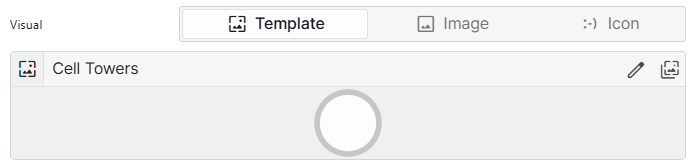
In the Settings pane, navigate to Identifiers > Nodes > Base node > Visual.
Node edge graph settings in DataMiner 10.6.4Choose how you want the node to look:
Image: Enter the URL of a custom image to display inside the node. Available from DataMiner 10.3.0 [CU15]/10.4.0 [CU3]/10.4.6 onwards.
Icon: Select an icon from the dropdown list to display inside the node shape (Default:
CircleRing). Click the circle to the right of the box to select a custom color.Template: Use a prebuilt or custom design for more control over the node's appearance. Available from DataMiner web 10.5.0 [CU13]/10.6.0 [CU1]/10.6.4 onwards.
Node edge graph component in DataMiner 10.6.4In the example above, a custom template is used to display additional node information, such as status indicators, roles, and labels, directly within each node.
The following options are available when the Template option is enabled:
 : Open the Template Editor to edit the node design. See Using the Template Editor.
 : Browse available preset templates or reuse a custom template.
By default, node templates contain the following pre-configured layers:
Layer Type Description 
Ellipse Acts as the background of each node, with conditional formatting for hover and selection. 
Ellipse Acts as a visual border by being slightly larger than the background layer, with conditional formatting for hover and selection. This default template ensures that a node is highlighted when hovered over and stands out when selected, with a light-blue background and a blue border.
This can for instance be useful when the node edge graph component data (for example, Components > [Page/Panel name] > Node edge graph > Selected items > Tables) is used in another component. The highlight helps users identify which data is driving the content of the linked component.
Adding actions to a node edge graph
When you add a node edge graph to a low-code app, you can configure actions that are executed when a node or edge is clicked or double-clicked, or when an icon is selected in the tooltip that appears when you hover over the node or edge.
To configure actions:
In the Component > Settings pane, under the nodes or edges you want to configure actions for, expand the Actions section.
Click Add action.
Note
If the Visual setting is set to Template, the Add action button will not be available. In that case, actions must be defined on shapes within the template itself. See Customizing layer appearance and behavior.
At the top of the action configuration section, specify how the action is triggered:
 : The action is triggered when the node or edge is clicked.
 : The action is triggered when the node or edge is double-clicked.
 : The action is triggered when the icon in the tooltip is selected.
In the Label box, specify a label for the action.
In the Icon box, select an icon for the action.
In the Action box, select the action that should be executed. See Configuring app events.
Configuring node movement events
From DataMiner 10.5.0 [CU10]/10.6.1 onwards, you can configure actions that are executed when a node belonging to a specific node query is moved in the node edge graph.
To configure these events:
In the Settings pane, expand the Events section.
Next to On node move, click Configure actions.
Configure any of the available actions, as detailed under Configuring app events.
When a user moves a node in the node edge graph, the event provides detailed information about what changed. This allows you to keep the graph and the underlying data in sync.
A node move event provides the following parameters:
The row data of the node that was moved.
The old position of the node: {x,y}
The new position of the node: {x,y}
You can use this information to update your data source. For example, you can configure a Launch a script action that updates the original data objects with the modified values provided by the event.
If your data source does not support real-time updates, also configure an Execute component action to refetch the data.
Node edge graph component actions
Component actions are operations that can be executed on a component when an event is triggered.
When you select the Execute component action option, you can choose from a list of components in the app and the specific actions available for each of them.
For the node edge graph component, the following actions are available:
Fetch the data: This action fetches the data for the component again. Available from DataMiner 10.2.10/10.3.0 onwards.
Clear selection: This action clears the data status of the component. Available from DataMiner 10.3.0 [CU14]/10.4.0 [CU2]/10.4.5 onwards.
Set interaction mode: Available from DataMiner 10.5.0 [CU10]/10.6.1 onwards. This action resets the component's default mode. Options:
Edit: Enables editing interactions such as repositioning nodes.
Read: Opens the component in view-only mode.
Toggle: Switches between Edit and Read modes.
Note
You can also override the default action for a node or edge using the Add override option.