Visualizing the Starlink location history in DataMiner
In this tutorial, you will explore how to leverage the Starlink Enterprise solution to monitor and visualize both real-time data and historical location data, by means of ad hoc data sources in a DataMiner low-code app.
Expected duration: 30 minutes
Note
The content and screenshots for this tutorial have been created with the DataMiner 10.5.3 web apps.
Tip
See also: Kata #59: Visualizing Starlink location history in DataMiner on DataMiner Dojo 
Prerequisites
- A DataMiner System that is connected to dataminer.services.
- Version 10.4.12 or higher of the DataMiner web apps.
Note
If you do not use a DaaS system, and you use a DataMiner version prior to DataMiner 10.5.0 [CU1]/DataMiner 10.5.4, you will also need to activate the ReportsAndDashboardsGQIMaps soft-launch option to be able to use the maps component. See Soft-launch options.
Overview
- Step 1: Install the Starlink Enterprise package
- Step 2: Explore the app and data sets
- Step 3: Create a duplicate app with custom components
- Step 4: Create the GQI query to fetch the history location data
- Step 5: Test the GQI result using a table
- Step 6: Visualize the history data on the maps component
Step 1: Install the Starlink Enterprise package
- Go to the Starlink Enterprise solution in the Catalog.
Click the Deploy button to deploy the package on your DMA.
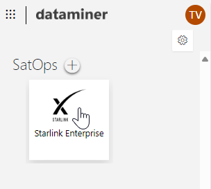
When the package has been deployed, go to the root page of your DataMiner System, for example by clicking the Home button for your DMS on the dataminer.services page.
Check if you can see the Starlink Enterprise app listed under SatOps.
Tip
The deployed app will include demo data, but in case you have a Starlink Enterprise business account, you can already start exploring your own data right away. Refer to the Starlink Enterprise Connector documentation to get started.
Step 2: Explore the app and data sets
In the DataMiner Cube Surveyor, navigate to DataMiner Catalog > Apps & Solutions > Starlink Enterprise > Starlink API (STRLE) and open the element STRLE Starlink Enterprise.
On the User Terminals page, use the filter box at the top to filter the table so that only the terminal Skyline demo cruise_UT*74d101 is shown.
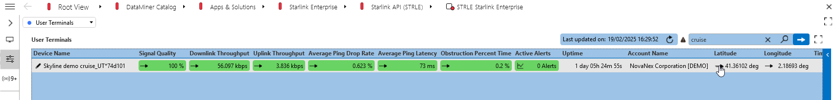
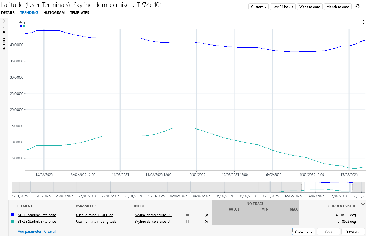
Click the trend icon in the Latitude column.
This will show history data for the past 8 to 9 days. This is the information that will be visualized in a more user-friendly way in a low-code app later in this tutorial.
Note
The data for the Skyline demo cruise_UT*74d101 terminal is demo data meant for testing purposes. If you start working with live data from your own Starlink Enterprise account, you will be able to view actual history data for your own mobile terminals.
Step 3: Create a duplicate app with custom components
To get to a good starting point for the rest of this tutorial, you will first need to create a duplicate version of the app. This way, you allow compatibility with the standard product solution track, so that you will be able to deploy newer versions of the product solution when they become available in the Catalog, while still maintaining your own custom version of the app.
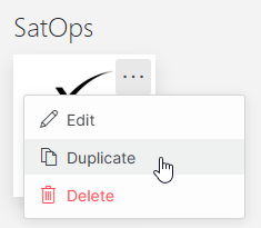
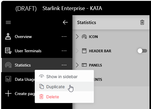
On the root page of your DataMiner System, hover over the Starlink Enterprises icon and click ... > Duplicate.
This will create a duplicate and immediately open it in edit mode.
Click the ... button for the Statistics page, and select Duplicate.
By default, this page will be set to be hidden in the sidebar (just like the Statistics page). You can leave it that way, as the page will only be useful when a user terminal selection has been made.
At the top of the page configuration pane (to the right of the sidebar), rename the page to Location Tracking, and then select a suitable icon.

Because you duplicated the page, it already contains the default title and header KPIs available for the selected user terminal (as shown above), keeping the app layout uniform.
Remove the other components (i.e. the line & area chart and gauge components) from the page, as these will not be needed.
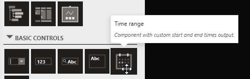
Add a Time range component onto your page.
This will be necessary in a later step to provide the GQI query with the time window of interest to visualize the location tracking.
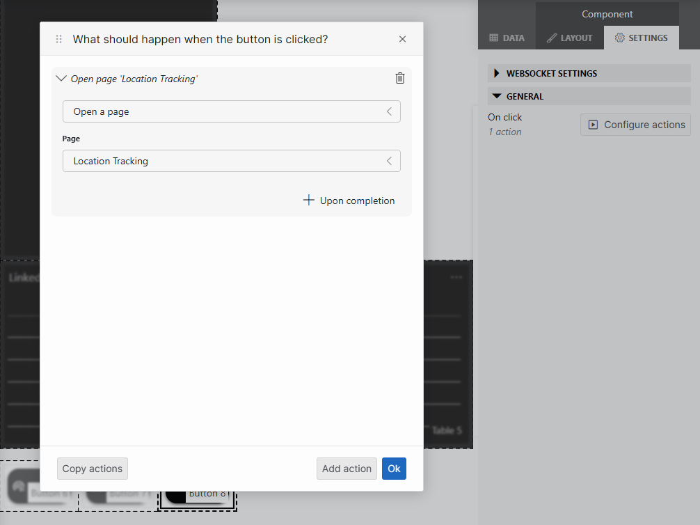
Add a button to navigate to the newly created page:
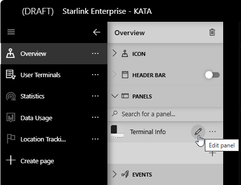
Go to the Overview page, expand the Panels section, and click the pencil icon to edit the panel Terminal Info.
Duplicate one of the buttons at the bottom of the panel, and move the new button to be next to the existing buttons.
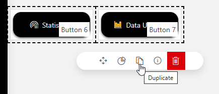
While the button is selected, go to the Layout pane, change Label to Location Tracking, and select a suitable icon.
While the button is selected, go to the Settings pane and click Configure actions.
In the Page box, select the new Location Tracking page, and then click Ok.
Note
If no terminal is selected on the map on the Overview page or on the User Terminals page, no KPIs will be displayed in the panel while you edit it.
Step 4: Create the GQI query to fetch the history location data
In this step, you will configure the GQI query that will fetch the trended data points.
On the Overview page, select the terminal Skyline demo cruise_UT*74d101 on the map.
You can find the terminal on the map docked in the harbor of Barcelona (Spain).
Note
Do not skip this step. Before you start making the new GQI query, it is important that a terminal is selected. Otherwise, the query will not be able to resolve into a valid result and you will not be able to save it.
In the Data tab on the right, expand the QUERIES section and click the + button to add a new query.
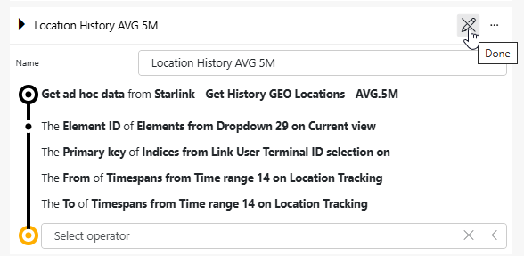
Specify a name for your query, e.g. Location History AVG 5M.
Select the data source Get ad hoc data and select the filter Starlink - Get History GEO Locations - AVG.5M.
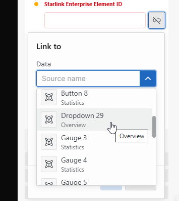
Link the element ID to the dropdown containing the dynamic element reference:
Click the link icon next to the Starlink Enterprise Element ID box:
Select the following values and then click Link:
- Data: Dropdown 29 (Overview)
- Type: Elements
- Property: Element ID
Similarly, link the User Terminal Device ID to the terminal ID selection:
- Data: Link User Terminal ID selection
- Property: Primary Key
Link History Time Range Start to the new time range component:
- Data: Time range X ("X" can be different number depending on your setup; pick the one matching the component on your Location Tracking page)
- Property: From.
Do the same for History Time Range End, with the property To.
In the top-right corner of the query, click the pencil icon to stop editing it.
Step 5: Test the GQI result using a table
As a best practice, you should validate if your query works correctly. In this step, you will do so by taking a look at it in a table.
Make sure the cruise test terminal is still selected on the map.
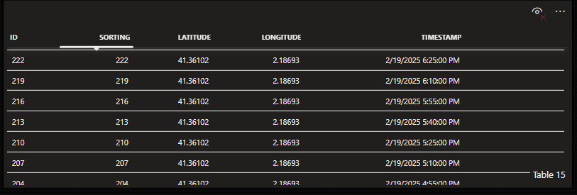
Add a new component to the page of type Table.
Drag your new query (Location History AVG 5M) from the data pane onto the table.
If no data is shown in the table at this point, double-check whether the cruise test terminal is still selected.
Use the time range component to change the timespan shown in the table.
This should increase or decrease the number of results in the table, depending on your changes.
Step 6: Visualize the history data on the maps component
In this final step, you will now visualize the data points on the maps component.
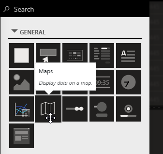
Add a new component to the page of type Maps:
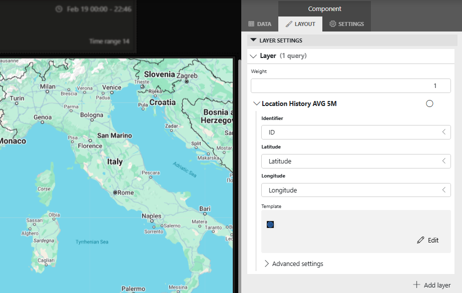
Drag your new query (Location History AVG 5M) from the data pane onto the map.
While the map component is selected, check the Layer Settings in the Layout pane: Identifier, Latitude, and Longitude should be automatically linked to your GQI outputs with similar names.
Configure the template to customize the shape and add conditional formatting, using custom colors and a condition for the last data point to be green:
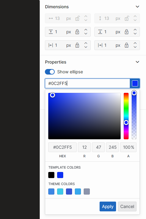
Still in the Layer Settings section, in the Template box, click Edit to open the template editor.
In the pane on the right, set the color for the default ellipse layer to blue.
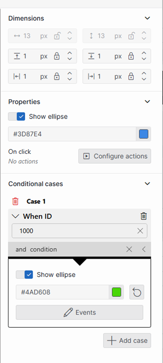
Under Conditional cases in the pane on the right, click + Add case to start configuring a condition.
Configure the condition so that when ID has the value 1000, the color changes to green.
The ad hoc data sources samples the results to avoid too much data being displayed. The last result in the dataset will always have ID 1000, which is why this is the value you should use here.
Configure the template to visualize the selected location:
Go to the Tools tab on the left, select Icon, and then drag and drop in the central pane to draw the area where the icon should be displayed.
In the pane on the right, select the icon you want to display, e.g. a spiral.
Under Conditional cases, click + Add case.
Configure the following condition:
- Criteria: When Is selected
- Value: Yes
- Result: Show icon, with a custom color (e.g. purple).
Display a notification showing the timestamp when a point is selected:
While your additional layer is selected, in the pane on the right, click Configure actions, and then configure the action as follows:
- Action: Show a notification
- Title: Timestamp at this location
- Message: {TimeStamp}
The message uses a placeholder that can contain any of the output columns of the query.
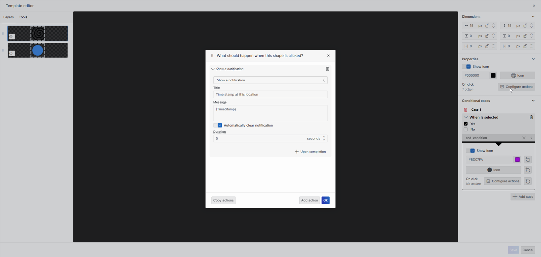
Click OK.
Click Save to close the template editor.
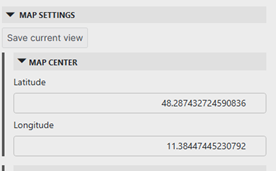
Center the map to your preference, then go to the Map Settings in the Layout pane, and click Save current view.
Publish the app so you can take a look at the end result.
Now you can take a look at the history tracking in action! If you set the timespan to cover the last 8 full days, you will now see the whole cruise trip of our Skyline demo cruise. During the whole trip, the Starlink terminal was providing internet services to all people on board, while also allowing site seeing in Europe.
When you select a specific location of the history track, the notification will show you the timestamp when the cruise was on that exact location.
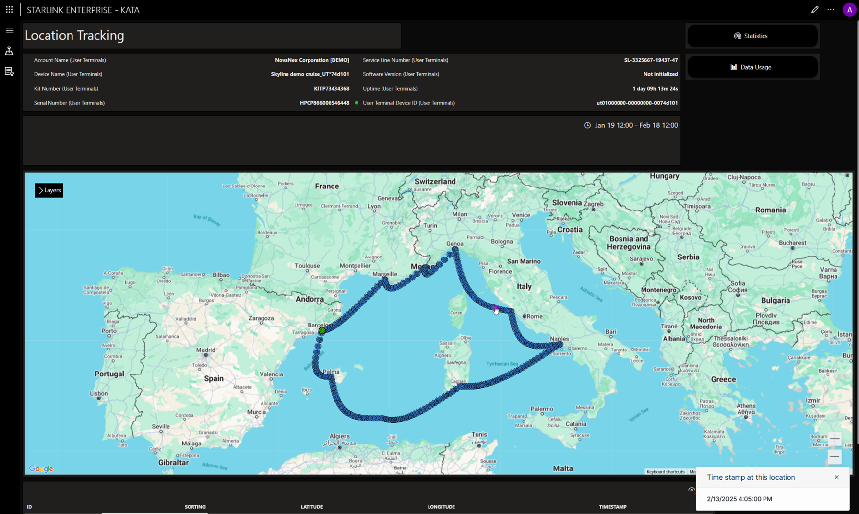
As result, you should be able to trace the cruise route of the 8-day mediterranean journey:
- Barcelona departure (Day 1)
- Marseille (Day 2)
- Monaco overnight (Day 2-3)
- Genoa (Day 3)
- Rome/Civitavecchia extended stay (Day 4)
- Naples (Day 5)
- Cagliari (Sardinian) (Day 6-7)
- Barcelona arrival (Day 8)
Hopefully, this will have sparked your creativity to apply even more customizations covering your use cases and workflows. Check out the other tutorials related to Dashboards and Low-Code Apps to get inspiration as to how you can further customize this app to your needs.