Using the Template Editor
Available from DataMiner 10.4.1/10.5.0 onwards.
The Template Editor allows you to design and customize the layout of supported components in your dashboards and low-code apps. It offers a flexible layer-based interface where you can add icons, text, shapes, and HTML content, apply conditions, and configure styling and actions. This gives you full control over how data is visually represented in your dashboards and low-code apps.
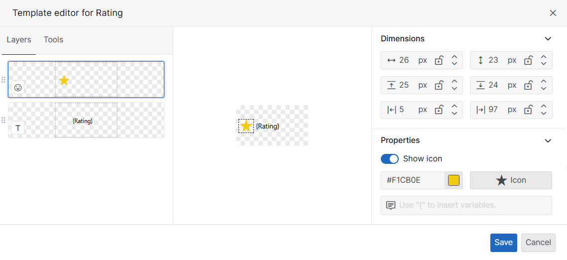
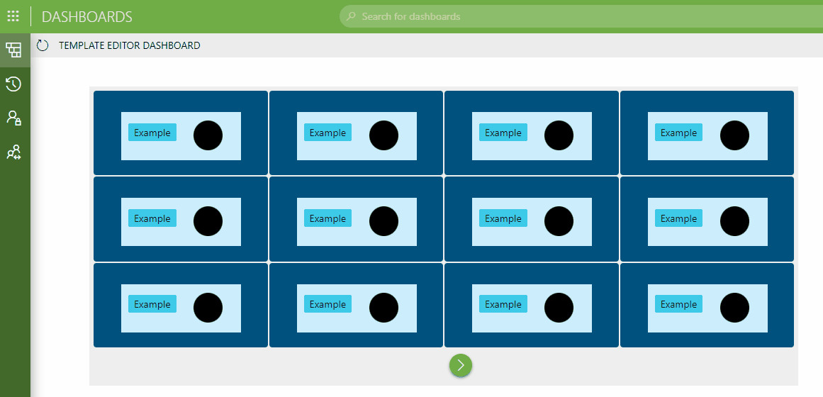
Template Editor in DataMiner 10.5.8
The Template Editor is currently supported for the following components:
Accessing the Template Editor
The way you can access the Template Editor depends on the type of component:
Select the component and go to the Layout pane on the right.
In the Item templates section, click Edit.
Note
A preview of the template currently used for this component is displayed in the Item templates section.
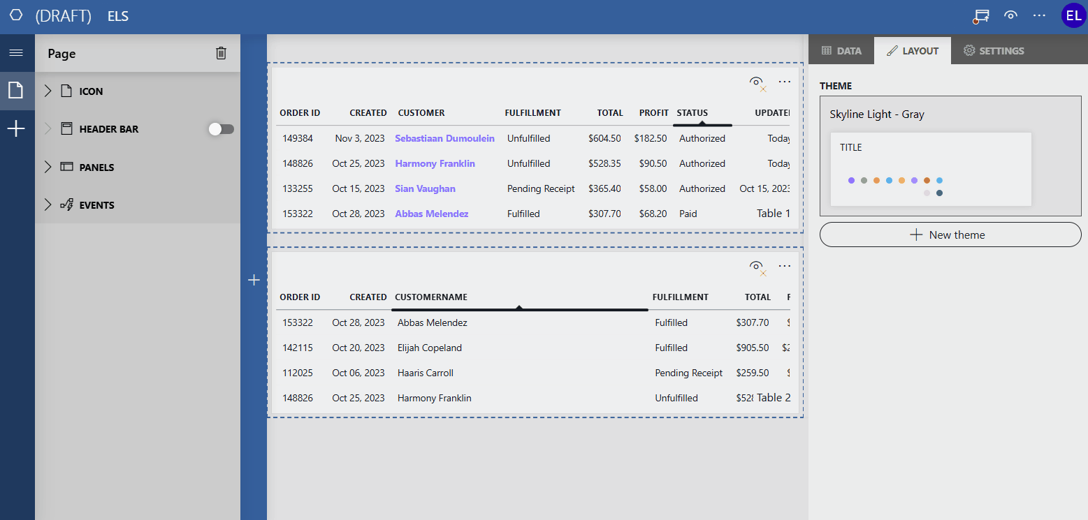
Template Editor UI overview
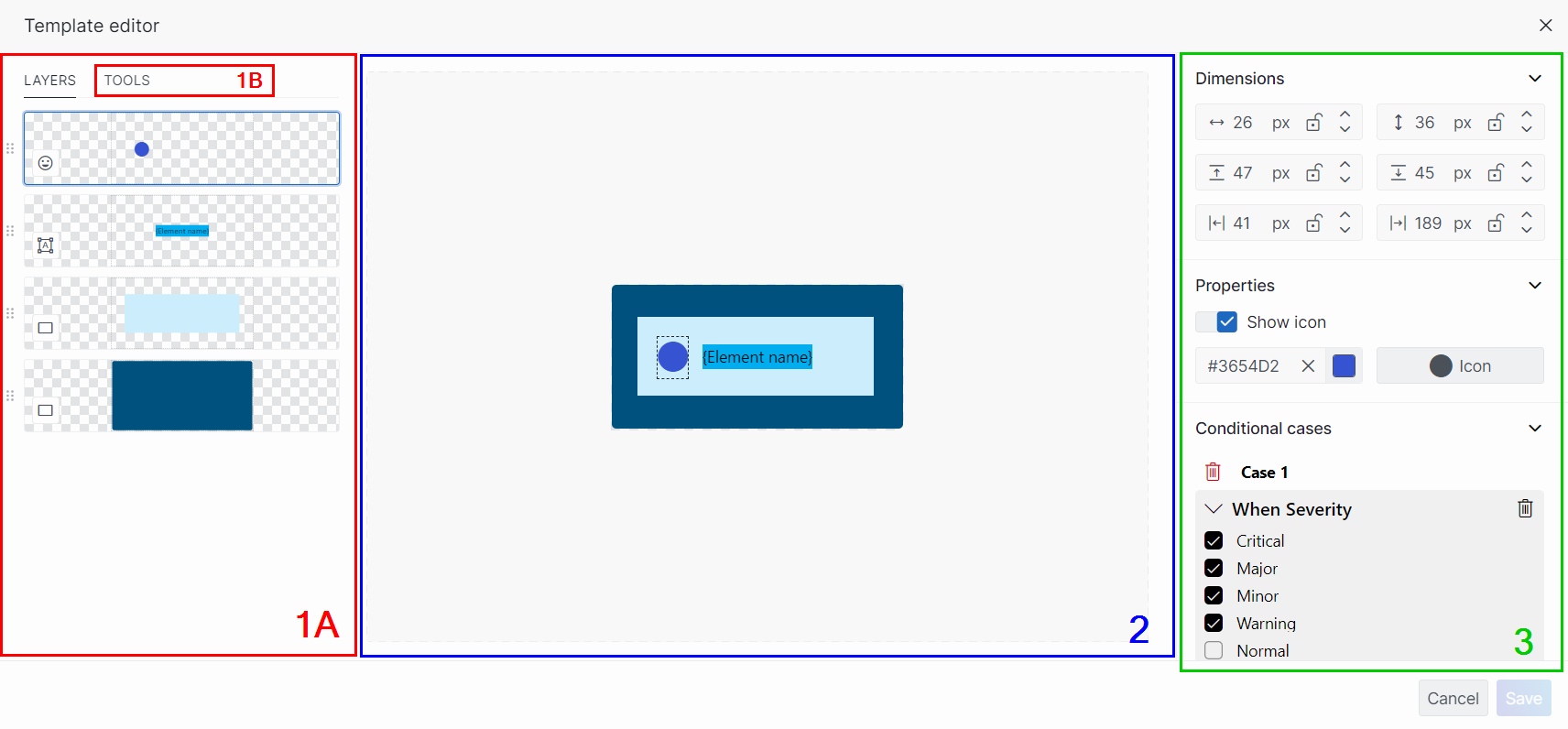
The Template Editor in DataMiner 10.4.1
The Template Editor UI consists of the following main components:
Side pane:
The Layers tab (1A)
The Tools tab (1B)
Preview (2)
Settings pane (3)
Important
Any changes made in the Template Editor are only saved once you click the Save button in the lower right corner. When you close the Template Editor by clicking the "X" in the top-right corner or the Cancel button in the lower right corner, you will be alerted of any unsaved changes that may be lost if you close the editor prematurely.
Working with layers
In the side pane of the Template Editor, the Layers tab offers an overview of all layers. Layers are used to make non-destructive edits by stacking icons, text, HTML content, rectangles, and ellipses one on top of the other without compromising the pixels of individual elements.
The benefits of working with layers:
You can add elements on top of each other without removing data.
You can apply conditions to only one layer of the template.
You can discard any layers you no longer need without affecting the entire template.
You can mask layers so that they are temporarily hidden without the need to delete them.
Adding a new layer
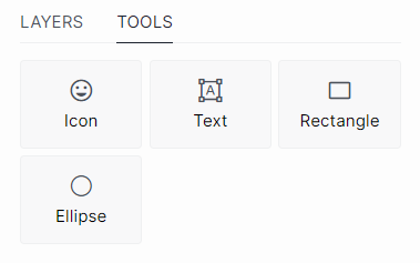
In the Tools tab, you can find an overview of available tools, each corresponding to a type of layer that can be added to your template. The following layer types are available:
Icon
Text
HTML (available from DataMiner 10.4.0 [CU14]/10.5.0 [CU2]/10.5.5 onwards)
Rectangle
Ellipse
The Template Editor in DataMiner 10.5.5
To add a new layer:
In the Tools tab, click the button for the layer type you want to add.
In the preview area, press and hold down the left mouse button to draw the layer. Drag to define the size and position, then release the button to place it.
Optionally, adjust the size or position of the layer:
Drag the frame edges to resize.
Click and drag the entire layer to move it.
Note
Alternatively, you can also adjust the size, shape, and position of the layer in the Dimensions section of the Settings pane.
Optionally, configure additional settings for the layer:
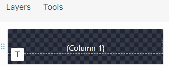
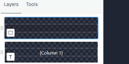
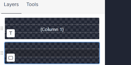
Changing the order of layers
If one layer is positioned higher than another, the higher layer will appear in front of the lower one. To change the order of layers, click the  button and drag the layer up or down in the Layers tab. Release the mouse button when you reach the position where you want to place the selected layer.
Template Editor in DataMiner 10.5.8
Temporarily masking a layer
To temporarily mask a layer within the Template Editor, hover the mouse pointer over the layer and click the eye icon in the lower right corner. This action renders the layer invisible while you modify the template. To bring the layer back into view, click the eye icon again.
Template Editor in DataMiner 10.5.8
Tip
If you want to render a layer invisible in the final result, you can mask the layer by adjusting its properties in the Settings pane. See Customizing layer appearance and behavior.
Deleting a layer
To delete a layer, hover the mouse pointer over the layer, click the ellipsis button ("...") in the top-right corner, and select Delete.
Template Editor in DataMiner 10.5.8
Prior to DataMiner 10.4.0 [CU14]/10.5.0 [CU2]/10.5.5 onwards, hover the mouse pointer over the layer and click the delete button in the top-right corner.
Alternatively, regardless of the DataMiner version, select the layer in the preview and press Delete on your keyboard.
Duplicating a layer
To duplicate a layer, hover the mouse pointer over the layer, click the ellipsis button ("...") in the top-right corner, and select Duplicate. Available from DataMiner 10.4.0 [CU14]/10.5.0 [CU2]/10.5.5 onwards.
Template Editor in DataMiner 10.5.8
Changing template settings
With the Settings pane to the right side of the preview, you can change the settings for the entire template and the different layers. The preview is then immediately updated according to the changes.
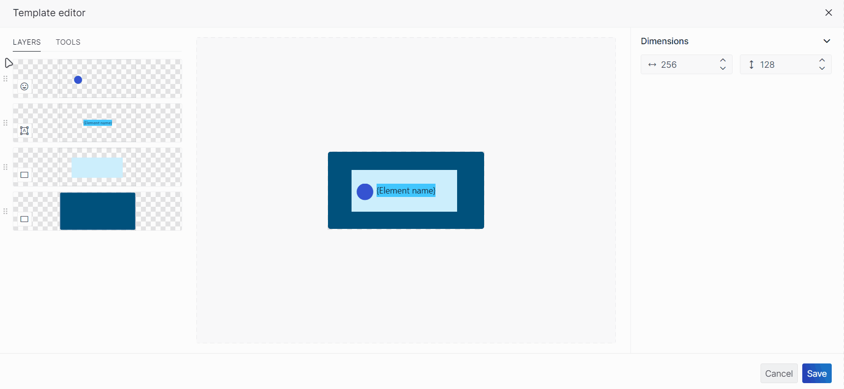
To modify the template settings, make sure no layers are selected. In the Settings pane, you can specify the width and/or height of the template in pixels.
To modify the layer settings, make sure a layer is selected. In the Settings pane, you can adjust the following layer settings in three collapsible sections:
Resizing and positioning a layer
In the Dimensions section of the Settings pane, you can resize and position a layer:
| Icon | Setting | Description |
|---|---|---|
 |
Width | Specify the width of the layer (in pixels or percent). This value should be lower than or equal to the width of the overall template. |
 |
Height | Specify the height of the layer (in pixels or percent). This value should be lower than or equal to the height of the overall template. |
 |
Top | Specify the location of the top of the layer (in pixels or percent). This value should be lower than the height of the overall template. |
 |
Bottom | Specify the location of the bottom of the layer (in pixels or percent). This value should be lower than the height of the overall template. |
 |
Left | Specify the location of the left edge of the layer (in pixels or percent). This value should be lower than the width of the overall template. |
 |
Right | Specify the location of the right edge of the layer (in pixels or percent). This value should be lower than the width of the overall template. |
Note
- In the preview, when you use the drag-and-drop functionality to move a layer, or when you resize a layer by dragging the frame edges, the dimension settings in the Settings pane will automatically be adjusted.
- You can change the unit to percent by clicking px next to the dimension values.
- You can secure one or multiple dimension settings of a layer by clicking the
 icon next to the chosen setting. This lock functionality enhances the security of your design, preserving your template's intended appearance, especially when dealing with variable widths and heights. For example, when adjusting a table column width, you may want to maintain specific proportions. Once a setting is locked, any attempt to override the specified dimension will be restricted. This includes moving or resizing the layer in the preview and adjusting the component size in the dashboard or low-code app edit mode (e.g. changing the size of a table column). The locked dimensions ensure that the template remains in its designated position. If you are unable to lock a dimension setting because of the locking of other settings, the lock icon will be grayed out.
 - For some layers, the width and height is determined by the left and right position and can therefore not be modified.
Customizing layer appearance and behavior
Depending on the type of layer, you can specify different layer properties in the Settings pane.
Common properties:
| Icon | Property | Description | Layer types |
|---|---|---|---|
 |
Show [layer type] | Toggle the switch to determine whether the layer is visible in the final output. When disabled, the layer is visible (with lowered opacity) in the preview, but not in the end result. | All |
 |
Tooltip | Available from DataMiner 10.4.0 [CU14]/10.5.0 [CU2]/10.5.5 onwards. Configure a tooltip that appears when hovering over the layer. If multiple layers overlap, the tooltip of the topmost layer will be displayed. | All |
 |
Configure actions | Configure actions that are executed when a user clicks the layer. Only available for DataMiner Low-Code Apps. | All |
 |
Color | Specify a custom color for the shape, either by specifying the color in RGB format, by entering the hex value or HTML color name, or by using the color picker box. The most recently used template colors and the theme colors are always displayed. From DataMiner 10.4.0 [CU17]/10.5.0 [CU5]/10.5.8 onwards, you can also manually type currentColor into the color box. This will automatically apply the font color of the component. |
Icon, Rectangle, Ellipse |
Layer-specific properties:
| Icon | Property | Description | Layer type(s) |
|---|---|---|---|
| N/A | Icon | Select any of the available icons from the dropdown list. You can search for a specific icon using the filter box. | Icon |
| N/A | Text box | Enter custom text. You can enter a column name surrounded by curly brackets (e.g. {my column}) to insert the corresponding cell value inside your text. Prior to DataMiner 10.4.0 [CU14]/10.5.0 [CU2]/10.5.4, HTML text formatting is supported. Text layers containing HTML content created before these versions will still be rendered as HTML. |
Text |
 |
Font size | Specify the size (in pixels) of the text. | Text |
 |
Text Color | Specify a custom text color, either by specifying the color in RGB format, by entering the hex value or HTML color name, or by using the color picker box. The most recently used template colors and the theme colors are always displayed. From DataMiner 10.4.0 [CU17]/10.5.0 [CU5]/10.5.8 onwards, you can also manually type currentColor into the color box. This will automatically apply the font color of the component. |
Text |
 |
Border radius | Specify the roundness (in pixels) of a shape. The higher the number, the rounder the corners. | Text, Rectangle |
 |
Background color | Specify a custom background color, either by specifying the color in RGB format, by entering the hex value or HTML color name, or by using the color picker box. The most recently used template colors and the theme colors are always displayed. From DataMiner 10.4.0 [CU17]/10.5.0 [CU5]/10.5.8 onwards, you can also manually type currentColor into the color box. This will automatically apply the font color of the component. |
Text |
 |
Horizontal padding | Specify the amount of space (in pixels) that should be left free above the text. | Text |
 |
Vertical padding | Specify the amount of space (in pixels) that should be left free underneath the text. | Text |
 |
Horizontal alignment | Left, center, right, or justify. | Text |
 |
Vertical alignment | Top, center, or bottom. | Text |
| N/A | HTML code | Enter HTML code. Basic syntax highlighting and IntelliSense is supported. | HTML |
| N/A | Link width to | Link the width of this column to that of another column, selected from the dropdown list. Only available for table and grid components. | Rectangle |
| N/A | Link height to | Link the height of this column to that of another column, selected from the dropdown list. Only available for table and grid components. | Rectangle |
Note
Certain HTML tags, such as <iframe> and <object>, are not supported in HTML layers because embedded content is currently restricted in templates. If you want to use these tags, consider using the web component instead. To display content like video thumbnails in a template, you can convert the content to a base64-encoded image and display it using an <img> tag.
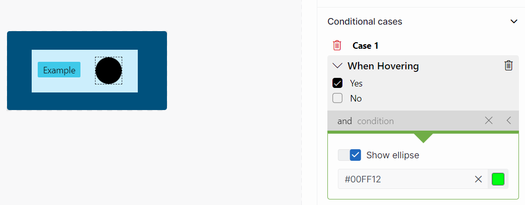
Adding conditional cases to a layer
You can make a layer respond dynamically to certain conditions, such as whether an item is selected or a specific column has a certain value. Conditional cases are defined in the Conditional cases section of the Settings pane.
Each case includes:
Conditions: Criteria that determine when the case applies.
Actions: What happens when the conditions are met (e.g. show or hide the layer, change styling, trigger events).
To configure a conditional case:
Click Add case.
Choose a state or a column from the dropdown list.
The available states:
Is selected: The action will be executed when a user selects the item.
Is busy: The action will be executed when the component is busy.
Hovering: The action will be executed when a user hovers the mouse pointer over the item.
When you have chosen a state, select Yes or No.
Yes: The action is only executed when the element is in the specified state.
No: The action is only executed when the element is not in the specified state.
When you have chosen a column, provide the necessary details based on the column type.
For example:
Element name: The action is only executed when the element name matches this entry.
Parameter description: The action is only executed when the parameter description matches this entry.
Root time: The action is only executed when the current time aligns with the specified timestamp.
= dd/MM/yyyy hh:mm: The root time matches the specified timestamp.> dd/MM/yyyy hh:mm: The root time occurs after the specified lower bound.≥ dd/MM/yyyy hh:mm: The root time occurs at or after the specified lower bound.< dd/MM/yyyy hh:mm: The root time occurs before the specified upper bound.≤ dd/MM/yyyy hh:mm: The root time occurs at or before the specified upper bound.
Optionally, add more conditions by clicking and condition and repeating the step above.
Use the toggle next to
Show [layer type]to control the layer's visibility when the conditions are met:Enabled: The layer is shown.
Disabled: The layer is hidden.
Define how the layer should behave when the conditions are met. You can customize the appearance of the layer or configure on-click actions that can be triggered when the conditions apply.
Styling options: Change the appearance of the layer, such as text color, background color, or size. The available options depend on the layer type and are the same as those listed in the Customizing layer appearance and behavior section.
Event actions: Click the Events button to configure an on-click action that can be executed when the conditions are met. Only available for DataMiner Low-Code Apps. For Text layers, this feature is only available from DataMiner 10.4.0 [CU14]/10.5.0 [CU2]/10.5.5 onwards.
Note
- Any visual changes made when configuring a conditional case will not show up in the preview.
- From DataMiner 10.3.0 [CU12]/10.4.3 onwards, you can reset visual changes made when configuring a conditional case by clicking the
 button to the right of the option you want to reset. Prior to DataMiner 10.3.0 [CU12]/10.4.3, you can only reset custom text entered for a Text layer.
Example
This is a possible conditional case configuration:
Template Editor in DataMiner 10.4.1
This is the behavior that will result from this configuration:
Grid component in DataMiner 10.4.1
Reusing a template
If you have already configured at least one other template for a component in the same dashboard or low-code app you are working on, you can reuse it for a second component that supports templates.
For the grid and timeline components:
Select the component and go the Layout pane on the right.
Under Item templates, click Browse templates.
A list of existing components and their templates is displayed, ordered by component type. A preview shows how the current component would look if the template in question was applied.
Select a template from the list and click Apply in the lower right corner of the pop-up window.
For the table component:
Select the component and go to the Layout pane on the right.
In the Column appearance section, click the downward arrow next to Select a column and select the column you want to assign a template to.
Click the ellipsis button ("...") in the top-right corner and select Browse templates.
A list of existing components and their templates is displayed, ordered by component type. A preview shows how the current component would look if the template in question was applied.
Select a template from the list and click Apply in the lower right corner of the pop-up window.
For the maps component:
Select the component and go to the Layout pane on the right.
Under the Layer settings for a specific layer of the map, click Browse templates in the Template section.
A list of existing components and their templates is displayed, ordered by component type. A preview shows how the current component would look if the template in question was applied.
Select a template from the list and click Apply in the lower right corner of the pop-up window.
Keep in mind that when you reuse templates, you may need to manually update column references: In a text layer of a template, you can enter a column name surrounded by curly brackets (e.g. {CustomerName}) to insert the corresponding cell value into your text. However, when you reuse a template, these linked columns will not be automatically updated. If the component you are applying the template to has columns with different column IDs, you will need to manually update the column reference in the template to ensure the correct data is displayed.
Template Editor in DataMiner 10.5.4