Trigger
The trigger component allows you to manually or automatically refresh other components in a dashboard or low-code app. It is most often used to refresh the results of a query shown in another component, such as a table or grid component.
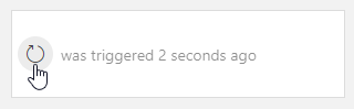
Trigger component in DataMiner 10.4.6
With this component, you can:
Manually refresh data in another component at the click of a button.
Automatically refresh data at regular intervals, helping you keep your view up to date without interaction.
Pause, resume, or reset automatic updates, for example to temporarily stop refreshing while analyzing data.
Visually track when data was last refreshed, thanks to the optional countdown and timestamp.
Supported components
At present, the trigger component can only be used as a filter for a component displaying a GQI query result. It will function as a refresh trigger for that query.
You can for example use this in a low-code app or a dashboard to refresh a table component based on a timer. From DataMiner 10.4.0 [CU12]/10.5.3 onwards, you can also use this component to refresh a query filter component.
Refreshing data
To use a trigger component to refresh the data in another component:
Add a trigger component to your dashboard or app.
In the Data pane, navigate to All available data > Components > Trigger # > Last trigger > Triggers and drag this component data onto a compatible component (e.g. a table or grid component).
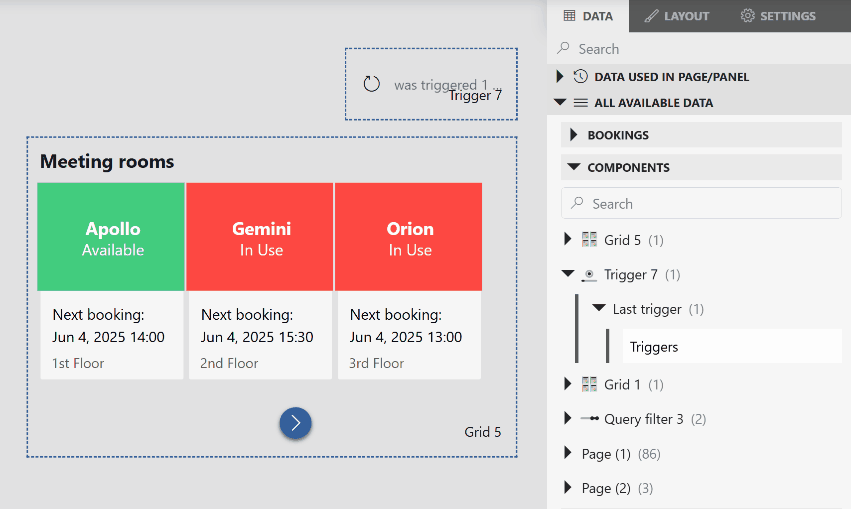
Grid component and trigger component in DataMiner 10.5.8Optionally, enable a trigger timer to automatically refresh the data in the linked component at regular intervals.
In read mode, either click the trigger button (default:
 ) to manually update the data, or wait for it to refresh automatically based on the configured timer.
Configuration options
Trigger layout
In the Layout pane, you can find the default options available for all components. See Customizing the component layout.
Additionally, the following layout options are also available:
| Section | Option | Description |
|---|---|---|
| Trigger label | Label | Specify text that should be displayed on the trigger button. |
| Trigger label | Icon | Select which icon will be displayed on the trigger button. You can search for a specific icon using the filter box. Default: |
| Time label | Show when the last trigger happened | Select this option to have the component display when the trigger last went off. Enabled by default. For more information, see Displaying when the trigger was last activated. |
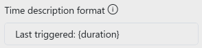
| Time label | Time description format | Only available when Show when the last trigger happened is selected. Customize the format used to display when the trigger last went off. For more information, see Displaying when the trigger was last activated. |
| Layout | Align | Determine whether the label and icon are displayed on the left side, in the middle or on the right side of the component. |
Displaying when the trigger was last activated
If your dashboard or app includes data that gets refreshed manually or on a timer, it can be helpful for users to see when the data was last updated. This provides reassurance that the information is still current and helps users quickly spot if anything might be outdated.
You can show this information directly in the trigger component, so users can always see how recent the data is.
By default, the Show when the last trigger happened option is enabled, and the following default text is used:
was triggered {duration}
You can customize this text in the Time description format box to change how the time is shown when the trigger last activated.
The following placeholders are supported:
| Placeholder | Description |
|---|---|
| {duration} | Shows how long ago the trigger last went off. Example: "2 minutes ago" |
| {time} | Shows the exact time the trigger last went off. Example: "Jun 27, 2025, 12:33" |
Use these placeholders in the text wherever the duration or time should be displayed.
For example:
Trigger layout options in DataMiner 10.5.8
In the end result:
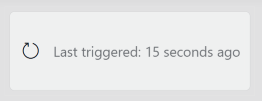
Trigger component in DataMiner 10.5.8
Trigger settings
In the Settings pane for this component, you can customize its behavior to suit your requirements.
| Section | Option | Description |
|---|---|---|
| WebSocket settings | Inherit WebSocket settings from page/panel | Clear the checkbox to use a custom polling interval for this component. When cleared, you can specify a different polling interval (in seconds). |
| General | Trigger timer | Toggle the switch to determine whether the trigger will automatically go off based on a timer. If this option is enabled, a countdown bar will show when the trigger will go off again. For more information, see Automatically triggering updates with a timer. |
| General | Time | Only available when Trigger Timer is selected. Determine after how many seconds the data is refreshed. By default, this is set to 60 seconds. |
Automatically triggering updates with a timer
If you want to keep the data displayed in your components up to date without manually refreshing it, you can configure a trigger timer that automatically activates the trigger at regular intervals.
To set up automatic refresh with a timer:
In the Settings pane, enable the Trigger timer option.
Under Time, specify the interval in seconds between trigger activations.
Note
The interval must be 5 seconds or higher.
In view mode, a countdown bar will appear in the trigger component, showing when the next refresh is scheduled to occur.
Letting users control the trigger timer
From DataMiner 10.4.0 [CU17]/10.5.0 [CU5]/10.5.8 onwards, you can make the timer interactive by allowing users to manually pause, resume, reset it, or trigger an update immediately. This can be useful, for example, if users want to temporarily stop automatic updates while analyzing data.

Trigger component and button components in DataMiner 10.5.8
You can do this by configuring component actions in your low-code app using events. These actions can be linked to button components or other UI elements, giving users more control over how and when data is refreshed.
To configure this:
Add an event to your app. See Configuring low-code app events.
From the dropdown list, select Execute component action.
Under I want to, choose one of the available options under Trigger:
Continue timer: Resumes the timer if it is currently paused.
Pause timer: Pauses the timer. If Show when the last trigger happened is enabled, the displayed time continues updating based on the last trigger.
Reset timer: Resets the timer. The paused or running state of the timer is not affected. If Show when the last trigger happened is enabled, the displayed time is not reset.
Trigger: Immediately activates the trigger, without resetting or affecting the timer.