Table
The table component is a highly flexible visualization designed to display the results of queries in a structured, row-column format, similar to a spreadsheet. It is ideal for working with large sets of information. The table visualization comes with functionalities such as sorting and filtering, but also offers endless customization options.
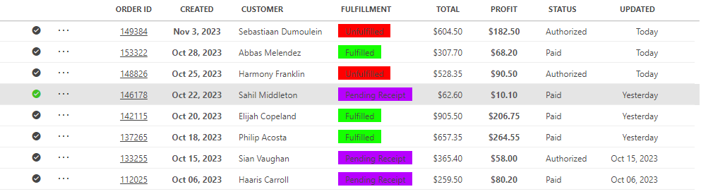
Table component in DataMiner 10.5.6
With this component, you can:
Sort and filter data to quickly find the information you need.
Easily spot key values, thanks to conditional formatting that automatically highlights important data.
View tables that are tailored to your needs, with a custom layout that makes key data stand out and keeps things intuitive.
Copy or export data to CSV for reporting or further analysis.
Interact with table entries. Click rows or cells to trigger actions like opening a pop-up window with more details.
These capabilities make the table component a powerful tool for data exploration and interaction.
Interested in what's possible with the table component? Deploy our Table show case app to see the component in action.

Supported data types
The table component is used to display the results of queries in table format. It should therefore always be configured with query data input.
Each row in a query corresponds to a row in a table.
Tip
For an example of how to configure a GQI query that can be used as data input for a table component, see Tutorial: Creating a custom parameter table connected to an element feed.
Filtering table content
From DataMiner 10.2.7/10.3.0 onwards, you can filter the contents of a table component using one of four available methods:
Use the search box to filter the entire table based on the entered value.
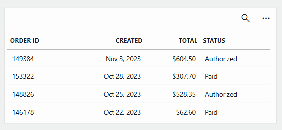
Table component in DataMiner 10.5.6Momentarily change how column data is displayed using column filtering. For example, you can show or hide specific values.
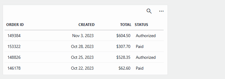
Table component in DataMiner 10.5.6Pass a text string to the table, for example by using a text input component.
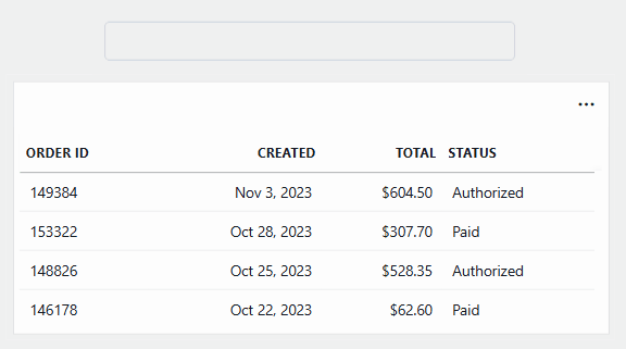
Table component in DataMiner 10.5.6Add a Filter operator to a GQI query to apply a server-side filter. The filter value can be set dynamically via a component or the URL.
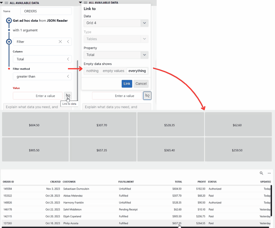
Table component and grid component in DataMiner 10.5.6
Tip
If you have made changes to the way a table is displayed, and you want to quickly reset your changes and return to the initial table view, click the eye icon in the top-right corner of the component (available from DataMiner 10.2.11/10.3.0 onwards).
Resizing the table columns
You can resize the columns of a table by dragging the edges of the column headers. From DataMiner 10.1.8/10.2.0 onwards, you can also change the order of the columns by dragging the column headers to a different position.
Tip
From DataMiner 10.4.1/10.5.0 onwards, you can adjust the default column width by accessing the Template Editor through Layout > Column appearance.
Table component in DataMiner 10.5.6
Sorting columns
To sort the table, you can click a column header. To toggle between ascending and descending order, click the column header again.
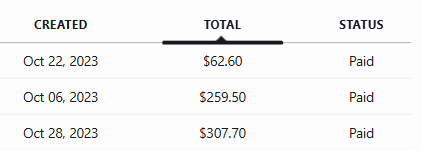
Table component in DataMiner 10.5.6
To apply additional sorting, press Ctrl while clicking one or more additional headers. The first column will then be used for the initial sorting, the next one to sort equal values of the first column, and so on.
Alternatively, you can also select one of the available sorting options in the column header right-click menu.
To group by a specific table column, right-click the column header and click Group. To stop grouping, right-click the header again and select Stop grouping.
Copying table data
From DataMiner 10.2.7/10.3.0 onwards, you can copy a cell, a column, a row, or the entire table via the right-click menu of the component.
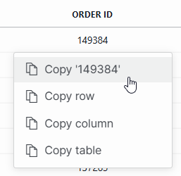
Table component in DataMiner 10.5.6
Unless a single cell is copied, the copy is in CSV format. If an entire column or single cell is copied, the values will not be encapsulated in double quotes. Copying an entire row or table will encapsulate all values in accordance with CSV formatting. If a value contains a double quote, this will be escaped when it is copied.
Exporting the table
From DataMiner 10.1.3/10.2.0 onwards, you can export the content of the table by clicking the ... button in the top-right corner of the component and selecting Export to CSV.
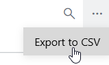
Table component in DataMiner 10.5.6
What happens next depends on your DataMiner version:
Prior to DataMiner 10.3.8/10.4.0, if nothing is selected in the table, the entire table will be exported; otherwise only the selected rows will be exported. The data will contain the display values, not the raw values. This means that units will be included for the parameter values and that discrete values will be replaced by their corresponding display values.
From DataMiner 10.3.8/10.4.0 onwards, a pop-up window will open where you can select whether the raw values or the display values from the table should be exported. Exporting the display values will result in a CSV file that contains all the values as they are seen in the table, formatted and with units. If you export the raw values, no formatting will be applied to them. The only exception are discrete values, for which the corresponding display values will always be exported. If no rows are selected in the table, the entire table will be exported; otherwise only the selected rows will be exported.
The export file will be named “Query XXX” (XXX being the name of the query, as configured in the Data pane). The first line of the CSV file will contain the names of the columns. The subsequent lines will contain the data, each line being a row of the query result.
Note
To only export specific columns, first apply a filter by dragging the columns onto the table component before you export the component.
Configuration options
Table layout
In the Layout pane, you can find the default options available for all components. See Customizing the component layout.
Additionally, the following layout options are also available:
| Section | Option | Description |
|---|---|---|
| Filtering & Highlighting | Conditional coloring | Highlight cells based on a condition. For more information, refer to Conditional coloring. |
| Filtering & Highlighting | Show quick filter | Available from DataMiner 10.3.0 [CU20]/10.4.0 [CU8]/10.4.11 onwards. Toggle the switch to determine whether the search box, which lets you apply a general filter across the table, is available in the top-right corner of the table. Enabled by default. |
| Column appearance | Column appearance | Available from DataMiner 10.4.1/10.5.0 onwards. Customize the appearance of a column. For more information, refer to Column appearance. |
| Advanced | Empty result message | Available from DataMiner 10.3.11/10.4.0 onwards. Configure the message shown when a query returns no results. By default, this message is set to Nothing to show, but you can change this to a custom message. See also: Displaying a custom empty component message. |
Conditional coloring
In the Layout pane for this component, the Conditional coloring option is available, which allows you to highlight cells based on a condition. You can configure this option as follows:
If the column you want to use for highlighting contains values for which a specific range can be specified, select the column, indicate the range to be highlighted, select the range and then click the color icon on the right to specify a highlight color. Multiple ranges can be indicated for one column, each with a color of its own.
Alternatively, from DataMiner 10.2.0/10.1.8 onwards, you can filter on specific text instead. To do so, select the column you want to use for highlighting, specify the text, and select the highlight color. By default, the cell value will need to be equal to the specified text to be highlighted. However, you can change this by clicking equal above the text box and selecting contain or match regex instead, depending on the type of filtering you want to apply. You can also apply a negative filter by clicking does, which will make this field switch to does not instead.
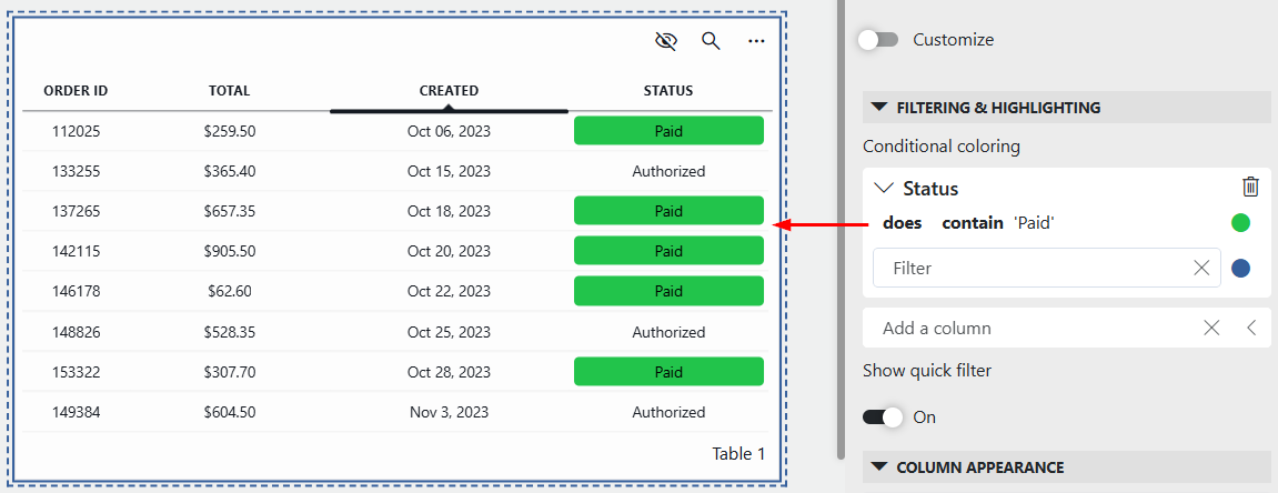
Table component in DataMiner 10.5.6Multiple filters can be applied on the same value. In that case, the filters will be applied from the top of the list to the bottom. Positive filters will get priority over negative filters.
You can remove a column filter again by selecting No color instead of a specific color.
Column appearance
From DataMiner 10.4.1/10.5.0 onwards, in the Layout pane, the Column appearance option is available, which allows you to customize the appearance of a column.
Column appearance presets
To use one of the available presets to alter the column appearance, click the preview below the column name and select a preset option:
| Preset | Description |
|---|---|
 |
Aligns text to the left of the cell. This is the default setting for columns containing values of type string. |
 |
Centers the text within the cell. |
 |
Aligns text to the right of the cell. This is the default setting for columns containing values of type double or datetime. |
 |
Available in low-code apps only. Turns the text into a hyperlink that opens a webpage in a new tab. |
 |
Displays a centered icon in the cell. By default, the info icon is used. |
 |
Adds a background color to the cell. By default, a blue color (#1F68BF) is used. |
Note
If you select the Hyperlink preset option, a Navigate to a URL action is automatically configured. The target URL can be edited using the Template Editor.
Custom column appearance
To freely customize the appearance of a column:
Click the ellipsis button ("...") next to the column name.
Select Customize preset to open the Template Editor.
Note
If you open the Template Editor after selecting a preset option, the template may already contain certain configured layers.
For example, if you selected the Hyperlink preset, a rectangle layer with opacity 0%, including a Navigate to a URL action, will be configured. Additionally, the text color of the text layer will be set to blue (#1F68BF), and the text inside the text box will be enclosed by HTML <u> elements to define underlined text.
From DataMiner 10.4.0 [CU13]/10.5.0 [CU1]/10.5.4 onwards, you can also reuse saved templates from the same dashboard or low-code app:
Click the ellipsis button ("...") next to the column name.
Select Browse templates.
Tip
For thorough instructions on changing the column appearance within the Template Editor, refer to Template Editor.
Examples
Below are two examples illustrating how the Template Editor can be used to customize the appearance and behavior of individual columns beyond the standard presets.
A green checkmark icon is displayed when the status is set to
Paid: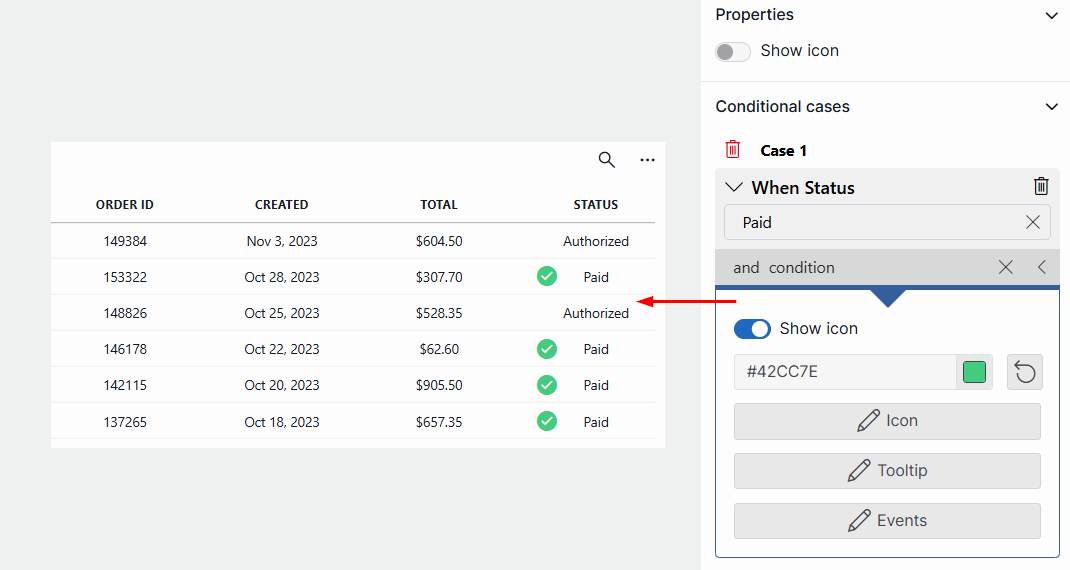
Template Editor and table component in DataMiner 10.5.6A currency conversion menu is added to the Total column using a calculator icon (only possible in Low-Code Apps):
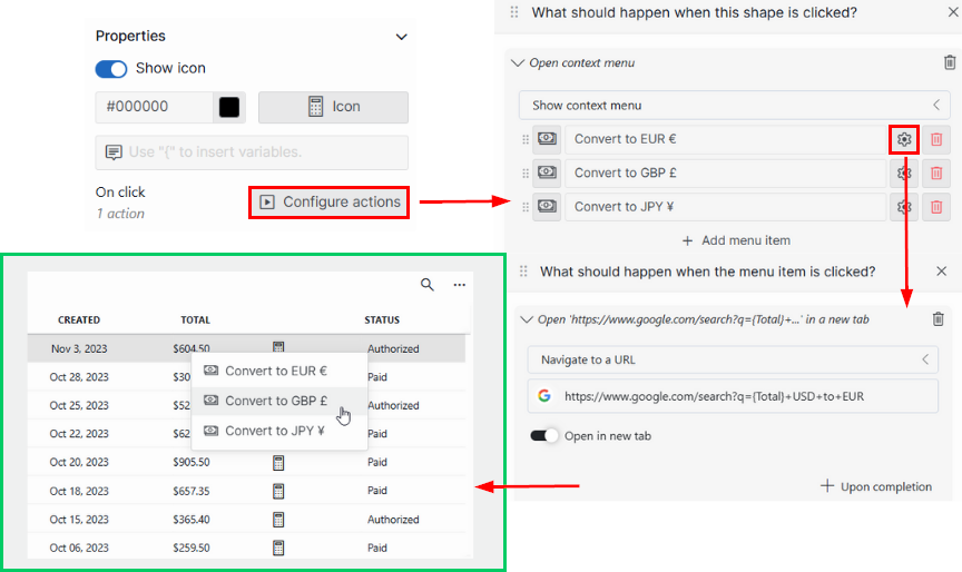
Template Editor and table component in DataMiner 10.5.6Tip
These examples illustrate that the Template Editor can be used not only to customize how data looks but also to add interactive elements. For more information, refer to Adding actions to a table.
Table settings
In the Settings pane for this component, you can customize its behavior to suit your requirements.
| Section | Option | Description |
|---|---|---|
| WebSocket settings | Inherit WebSocket settings from page/panel | Clear the checkbox to use a custom polling interval for this component. When cleared, you can specify a different polling interval (in seconds). |
| General | Override dynamic units | Clear the checkbox to prevent parameter units from changing dynamically based on their value and protocol definition. Disabled by default. |
| Data retrieval | Update data | Available from DataMiner 10.2.0/10.2.1 onwards. Toggle the switch to determine whether the data in the table should be refreshed automatically (provided this is supported by the data source). |
| Actions | On double click | Configure one or more actions to be executed when a row is double-clicked. Only available in Low-Code Apps. |
| Initial selection | Select first row by default | Available from DataMiner 10.3.6/10.4.0 onwards. Toggle the switch to determine whether the first row is selected by default. When enabled, the first row will automatically be selected whenever the component is loaded or when the data in the table is refreshed. |
Note
- While the Update data setting is available from DataMiner 10.2.0/10.2.1 onwards, in older DataMiner versions it can only be used with the Get parameter table by ID query data source. From DataMiner 10.3.10/10.4.0 onwards, other data sources are also supported.
- Instead of enabling the Update data setting to refresh data automatically, you can also refresh it manually using a trigger component or a component action.
- In versions prior to DataMiner 10.3.7/10.4.0, refreshing the table using a trigger component or component action causes the any selected data to be lost. From DataMiner 10.3.7/10.4.0 onwards, the component will try to reapply the selection. This means that the table will keep fetching more data until all previously selected rows are found. When a previously selected row is missing, the table will fetch all data looking for it. Reapplying the previous selection will take precedence over selecting the first row when the Initial Selection setting is enabled. The table will also update its data to reflect the new selection.
Adding actions to a table
If you add a table component to a custom app using the DataMiner Low-Code Apps, you can also configure actions for the component. This feature is not available in the Dashboards app.
To configure actions:
From DataMiner 10.4.1/10.5.0 onwards:
In the Template Editor, you can configure actions for table columns. Actions can be linked to the On click event of a shape in a column template, allowing you to define your own links or buttons inside a table.
Tip
For more information, see Changing template settings.
You can also configure actions that are executed when a row is double-clicked:
In the Component > Settings pane, expand the Actions section.
Click On double-click.
In the pop-up window, select the action that should be executed. See Configuring low-code app events.
Prior to DataMiner 10.4.1/10.5.0:
In the Component > Settings pane, expand the Actions section.
Click Add action.
To specify how the action is triggered, at the top of the action configuration section, click the icon for text hyperlink, row double-click, or cell button.
In the Label box, specify a label for the action.
In the Icon box, select an icon for the action.
In the Action box, select the action that should be executed. You can for instance use this to add an update action to the table, or to allow users to select an item or clear their selection. See Configuring low-code app events.