Working with trend graphs
Whether you access a trend graph from a card or do so from the Trending module, the user interface consists of:
A main graph area with a preview graph underneath. This preview graph represents the entire trend period (week, month, etc.). The main graph is an enlargement of the white part of the preview graph. When you open a trend graph, by default the trending information for the last 24 hours is loaded in the main graph, and the information for the past week is loaded in the preview graph below that.
A set of buttons in the top-right corner that allows you to quickly jump to a specific time frame: the last 24 hours, a week to date, a month to date, or a custom time frame. If you use the Custom button (available from DataMiner 10.2.1/10.3.0 onwards), this opens a pop-up box where you can specify a custom start and end time for the trend graph.
A parameter pane at the bottom. This pane displays more information about the parameter for which trending is shown. If the mouse pointer is held over a point of the trend graph, detailed information on this point will be displayed in the parameter pane.
A trend groups pane on the left-hand side. See Working with trend groups.
A light bulb icon in the top-right corner to add parameters related to those shown in the trend graph (from DataMiner 10.2.12/10.3.0 onwards). See Adding related parameters to a trend graph.
Note
From DataMiner 10.3.6/10.4.0 onwards, the color of the light bulb icon reflects whether parameter relationships have been found. When related parameters are available, the light bulb will be "lit up", using an accent color. If DataMiner was unable to find related parameters, the light bulb will remain blank and appear turned off.
Depending on the type of data that is displayed, the trend line looks different. For example, take a look at this trend graph in DataMiner 10.2.1:
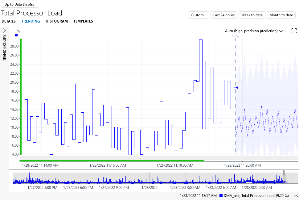
The dark full line represents trend information retrieved from the database.
The light full line represents either the most recent real-time parameter change events, or "history data sets", i.e. parameter change events that are being drawn in the past.
The dotted line past "Now" represents trend prediction data (see Working with trend predictions).
You can change which data are shown in the graph by directly manipulating the trend graph, or via the right-click menu:
Note
- Trend graphs are automatically updated with new trend data, so leaving a trend graph open for a longer time always shows the trending up to the current time.
- If exceptions occur, these are displayed below the trend graph, while in the graph itself gaps will be displayed.
- Gaps are also displayed for zero values or negative values in trend graphs using a logarithmic scale.
- Some display settings for trend graphs can be changed in the Cube user settings. See User settings.