Overview of the Dashboards app UI
The main page of the Dashboards app consists of the following main components:
Header bar (1)
Sidebar (2)
Details pane (3)
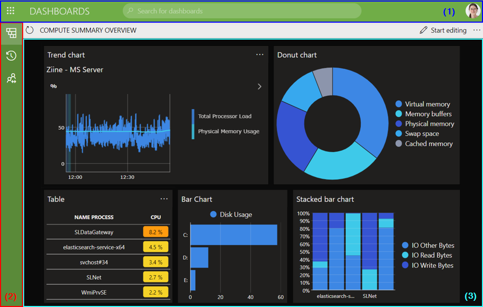
Dashboards app in DataMiner 10.4.5
The Dashboards app header bar

Dashboards app header bar in DataMiner 10.5.2
The header bar contains the following items, from left to right:
Apps button: The button in the upper-left corner provides quick access to other DataMiner web apps.
Dashboards button: Click this button to return to the main page of the app at any time.
Search box: The box in the middle of the header bar allows you to search the app. As soon as you activate the box, a list of suggestions is displayed below it. The list gets updated with new suggestions as you type. Select a suggestion in the list to open the corresponding dashboard or dashboard folder.
WebSocket connection status: Available from DataMiner 10.3.0 [CU13]/10.4.0 [CU1]/10.4.4 up to DataMiner 10.4.0 [CU10]/10.5.1. This indicator shows the current status of your WebSocket connection. The available statuses include:
 : A stable connection with instant updates.
 : An offline connection.
 : No real-time connection could be established. Updates will happen more slowly than usual.
 : Re-establishing a WebSocket connection. Updates will happen more slowly than usual.
From DataMiner 10.4.0 [CU11]/10.5.2 onwards, WebSocket connection issues are indicated via colored banners directly below the header bar instead. When the connection is successful, no banner is displayed. Other options include:
The connection is offline: A red banner with the message
You are offlineis displayed.Note
If your connection is offline, a red "x" icon is also displayed on the user button.
The connection has been interrupted: An orange banner with the message
Connection has been interruptedis displayed.The connection is being re-established: An orange banner with the message
Busy recovering connection...is displayed.The connection has been re-established: A green banner with the message
Connection recoveredis displayed.
User button: A button with the initials or an image of the current user is displayed in the upper-right corner. Click this button to open a menu that provides access to the following options:
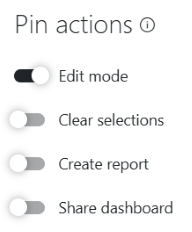
(Dashboard) settings: Allows you to manage any available dashboard theme (1) and configure whether specific actions are pinned to the dashboard header bar (2).
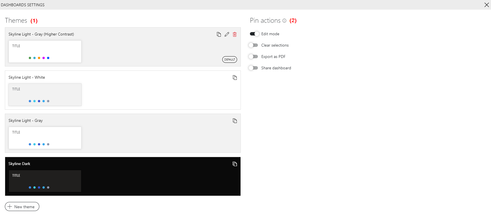
Dashboard settings in DataMiner 10.4.10About: Displays information about the app.
Help: Available up to DataMiner 10.4.0 [CU19]/10.5.0 [CU7]/10.5.10. Opens the DataMiner documentation.
User settings: Available from DataMiner 10.4.0 [CU21]/10.5.0 [CU9]/10.5.12 onwards. Allows you to configure user-specific settings such as changing your password.
Note
User settings are only available if the following conditions are met:
- In System Center > Users, the user's User cannot change password setting must be disabled.
- The user must have the Modules > System configuration > Security > Specific > Limited administrator permission.
- The user must not be logged in with external or delegated authentication.
Sign out: Logs you out of the app and returns you to the logon screen.
The Dashboards app sidebar
The sidebar on the left contains icons that can be used to expand different panes:
| Icon | Description |
|---|---|
 |
Opens the navigation pane, which allows you to navigate through the different dashboard folders in the app. Click a folder or dashboard to view it in the details pane on the right. |
 |
Displays a list of recent items. |
 |
Displays a list of private dashboards. These are dashboards that can only be accessed by specific users (configured in the dashboard settings). This icon is displayed from DataMiner 10.2.7/10.3.0 onwards if there are private dashboards available. |
 |
Displays a list of dashboards that have been shared via dataminer.services. This icon is displayed from DataMiner 10.2.7/10.3.0 onwards if there are shared dashboards available. |
Right-click the background of the navigation pane or click the ellipsis ("...") button next to a dashboard or folder, to open a context menu with the following options:
Add > Dashboard: Creates a new dashboard. By default, it will be added in the selected folder, but a different folder can be specified. See Creating a completely new dashboard.
Add > Folder: Creates a new folder in the selected folder.
Add > From import: Allows you to import an example dashboard. See Creating a dashboard based on an example.
Add > From Catalog: Allows you to deploy a dashboard from the DataMiner Catalog.
Settings: Allows you to rename or move a dashboard or folder, or configure access permissions. See Managing dashboard folders.
When a dashboard folder is selected and the parameter showAdvancedSettings=true has been added to the URL, the pop-up window also contains the option Preserve selections. When this option is selected, any selection you make in a dashboard in the folder is preserved when you navigate to another dashboard in the folder. Note that this only applies to the folder itself, not to any other folders it may contain.
Delete: Deletes the selected dashboard or folder. See Deleting a dashboard.
Open in new tab: Opens the selected dashboard in a new browser tab.
Duplicate: Duplicates the selected dashboard. See Duplicating a dashboard.
Note
You can use the TAB key to navigate through dashboards and folders in the Dashboards app sidebar. The selected item is highlighted and can be opened by pressing Enter. Selected buttons are outlined in green and can also be activated with Enter. When a context menu is open, you can navigate through its options using the arrow keys.
The Dashboards app details pane
The large pane on the right displays the contents of the selected folder or dashboard and provides context-specific actions.
When no dashboard or folder is selected
From DataMiner 10.5.0 [CU11]/10.6.2 onwards: An overview of all dashboards and folders is displayed as tiles. A folder icon
 or a dashboard icon
  indicates the type of item each tile represents. If a dashboard has been shared via cloud share, this is indicated on the tile by a blue Shared label underneath the dashboard name.
In the upper-right corner of the details pane, the following buttons are available, from left to right:
Dashboards app details pane in DataMiner 10.6.3Add: Create a new dashboard.
Downward arrow: Create a dashboard or dashboard folder, import an example dashboard, or deploy a dashboard from the DataMiner Catalog.
Settings: Configure edit access to your dashboards and folders.
Note
In DataMiner 10.5.0 [CU11] and 10.6.2, the Add button and downward arrow are combined into a single menu button, offering the same options as the downward arrow in later versions.
Prior to DataMiner 10.5.0 [CU11]/10.6.2: Buttons are available that allow you to create a new blank dashboard, to create a dashboard based on an example, or to navigate to a recently used dashboard.
When a folder is selected
When a folder is selected, the contents of the folder (subfolders and dashboards) are displayed in the details pane.
From DataMiner 10.5.0 [CU12]/10.6.3 onwards, breadcrumbs are displayed at the top of the details pane. These breadcrumbs show the current navigation path.
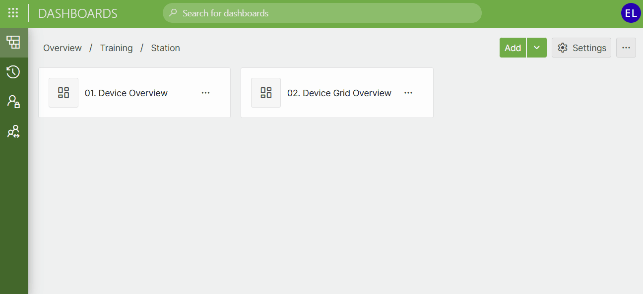
Dashboards app in DataMiner 10.6.3
Click Overview to return to the root view of the Dashboards app.
Click any intermediate breadcrumb to navigate back to that level.
When a folder is selected, the following buttons are available:
Add: Adds a new dashboard to the selected folder. See Creating a completely new dashboard.
Downward arrow: Opens a context menu with the following options:
Dashboard: Adds a new dashboard to the selected folder. See Creating a completely new dashboard.
Folder: Adds a new subfolder.
From import: Allows you to import an example dashboard into the selected folder. See Creating a dashboard based on an example.
From Catalog: Allows you to deploy a dashboard from the DataMiner Catalog.
Settings: Configure edit access for the folder.
...: Delete the folder.
Note
In DataMiner 10.5.0 [CU11] and 10.6.2, the Add button and downward arrow are combined into a single menu button, offering the same options as the downward arrow in later versions.
When a dashboard is selected
When a dashboard is selected, the header bar of the details pane can display a number of buttons, depending on the dashboard and the settings of the app:
Refresh button
 : Loads the most recent data in the displayed dashboard.
Start editing: Allows you to start editing the dashboard. In edit mode, the navigation pane on the left will be hidden.
Stop editing: Closes edit mode.
Clear selections/Clear all: Only displayed if the dashboard contains at least one component. Clears the selection of all the data in the dashboard.
PDF or Create report: Available from DataMiner 10.2.12/10.3.0 onwards. Only displayed in read mode. Allows you to export the dashboard as a PDF file.
Share or Start sharing: Allows you to share the dashboard using dataminer.services. See Sharing a dashboard. This feature is only available in read mode, if the DataMiner System is connected to dataminer.services. See Connecting your DataMiner System to dataminer.services.
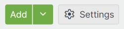
In the settings of the Dashboards app, you can configure whether the edit mode, clear selections, create report/export as PDF, and share dashboard buttons are always displayed (i.e., “pinned” to the header bar) or instead accessible via a button in the upper-right corner of a dashboard.
Dashboard settings in DataMiner 10.6.2
Note
- If the app is viewed on a small screen, no options to edit dashboards or dashboard settings will be available.
- Prior to DataMiner 10.3.0 [CU21]/10.4.0 [CU9]/10.4.12, the Clear selections option is called "Clear feeds".