Creating a custom event scheduler low-code app
This tutorial explains how you can create an event scheduler app. When you have completed this tutorial, you will have an app with two pages: an overview page and a page showing a timeline with all the events.
Expected duration: 45 minutes
The text and screenshots for this tutorial were created using DataMiner 10.5.1.
Tip
See also: Kata #51: Build a custom event scheduler 
Prerequisites
- A DataMiner System that is connected to dataminer.services.
- Basic understanding of DataMiner Low-Code Apps.
Tip
If you are not familiar with DataMiner Low-Code Apps yet, take a look at the following tutorials:
Overview
- Step 1: Install the example package from the catalog
- Step 2: Create the app and the pages
- Step 3: Create the GQI queries
- Step 4: Configure the event overview page
- Step 5: Enable users to add events
- Step 6: Enable users to edit events
- Step 7: Configure the timeline overview page
- Step 8: Configure actions on the timeline
Step 1: Install the example package from the catalog
Go to https://catalog.dataminer.services/details/a7776ac5-dfef-4242-ace0-fac33c1834d4.
Click the Deploy button to deploy the package to your DMA
This package contains the final solution that you can use as a guideline, as well as the necessary DOM models, and it will create some sample events to work with upon installation.
Step 2: Create the app and the pages
Go to
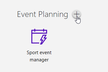
http(s)://[DMA name]/root.In the Event Planning section, you should see the Sport event manager application.
Tip
In this tutorial, you will mainly learn about the functional aspects of an event scheduler app. If you want to experiment with the layout and with custom templates as well, you can use the Sport event manager app as an example.
Hover over the section name and click the "+" icon to create a new app.
Specify a name for the new app.
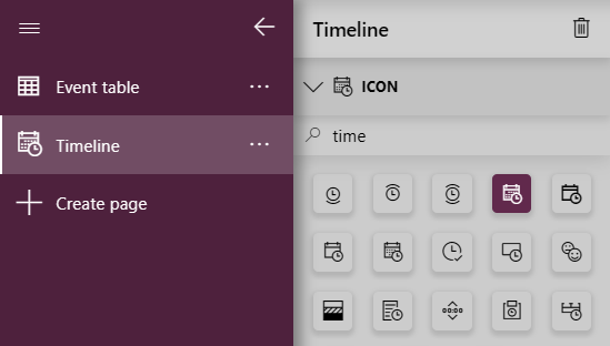
Rename the first page of the app to
Event table.In the pane to the right of the navigation pane, select an icon of your choosing for the page.
Click the Create page button under your current page to add a new page.
Name this new page
Timelineand select a suitable icon for it.For example:
These are the only pages that you will need for this tutorial.
Step 3: Create the GQI queries
In this step, you will create two queries: a full events query and a table events query.
Full events query
On either of the pages of your app, in the Data pane on the right, expand the Queries section and click "+" to add a new GQI query.
In the Name box for your query, add the name
Full Events.Select the data source Get object manager instances, and configure it as follows:
- Module: sporteventmanagement
- Object manager definition: Event
Add a Select operator, keep the selection for all columns that are selected by default for the operator, and select the column ID as well.
Add an Apply custom operator operator, and select the operator Date comparer.
Configure the operator as follows:
- Start: Start Time
- End: End Time
This will add a new column called Compared Times to the result of your query, indicating if the event is "Ongoing" or "Future".
The complete query should look like this:
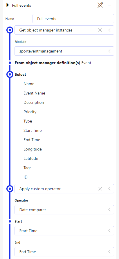
Table events query
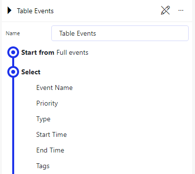
In the same way as before, create a GQI query called
Table Events.Select the data source Start From and make sure the previously created query is selected.
Add a Select operator to only include the following columns in the query:
- Event Name
- Priority
- Type
- Start Time
- End Time
- Tags
The complete query should look like this:
Step 4: Configure the event overview page
Go to the Event table page of your app.
Add a title component:
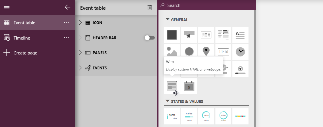
Drag a web component from the visualizations pane on the left onto the page and position it in the upper-left corner.
Make sure the component is selected and select the Settings pane on the right.
Make sure Type is set to Custom HTML and paste the following custom HTML in the HTML box:
<div>
   <h1>Sport <span data-y>Event</span> Manager</h1>
</div>
<style>
div {
   font-family: Segoe UI, sans-serif;
   line-height: .6;
   font-size: 16px;
   color: 464646;
   display: flex;
   align-items: end;
   height: 100%
}

p {
   margin: 0
}

[data-b] {
   color: rgb(0, 191, 239)
}

[data-y] {
   color: rgb(255, 179, 0)
}

[data-p] {
   color: rgb(255, 0, 107)
}

</style>
Go to the Layout pane, and enable the Customize toggle button.
At the top of the Styles section, click Custom theme, and select Transparent.
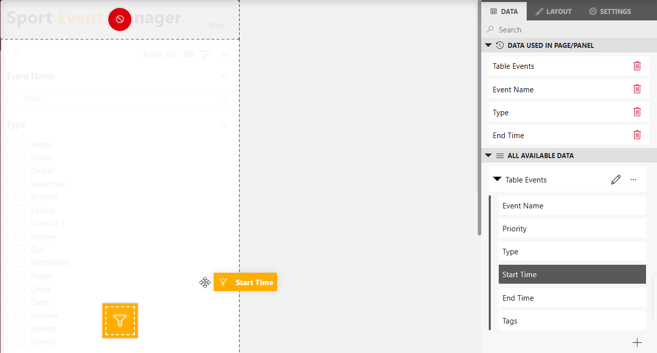
Add a query filter component:
Drag a query filter component onto the page so that it is located on the left side under the title.
Drag the Table events query onto the component to provide it with data.
Expand the Table events query in the Data pane, and drag each of the columns in the query, except for the Priority column, to the query filter component as a filter.
Add a table component:
Drag a regular table component onto the page next to the query filter component.
In the Data pane, expand the Components section, and drag the Query filter component entry onto your table component to provide it with data based on the selection in the query filter component.
Step 5: Enable users to add events
In this step, you will make sure the user can create new events by clicking a button on the page. For this, you will first need to create a button and configure it to open a new panel when it is clicked. This panel will contain a form that the user can use to create new events, together with a button that will allow the user to save the event.
Drag a button component to the top of the Event table page of your app.
Make sure the new component is selected, go to Layout pane on the right, and configure the layout as follows:
- Change the label to
Add event. - Customize the icon according to your preferences.
- Change the label to
In the Panels section on the left, create a new panel called
New event.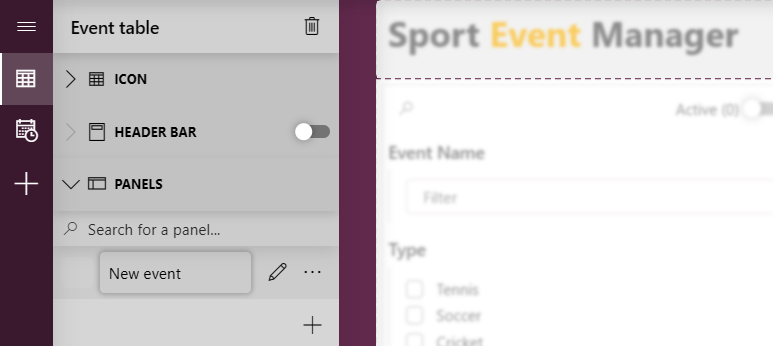
Tip
For more information on panels, see Configuring an app panel.
Click the pencil icon next to the panel name to begin editing the panel.
Drag a form component onto the panel.
In the Data pane, expand Object Manager Definitions > eventmanagement, and drag the Event definition onto the form component.
Make sure the header bar is enabled for the panel, and click the "+" button in the header bar to add a button called
Save.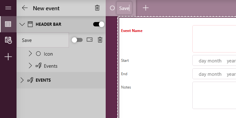
Tip
For more information on the header bar, see Using a header bar.
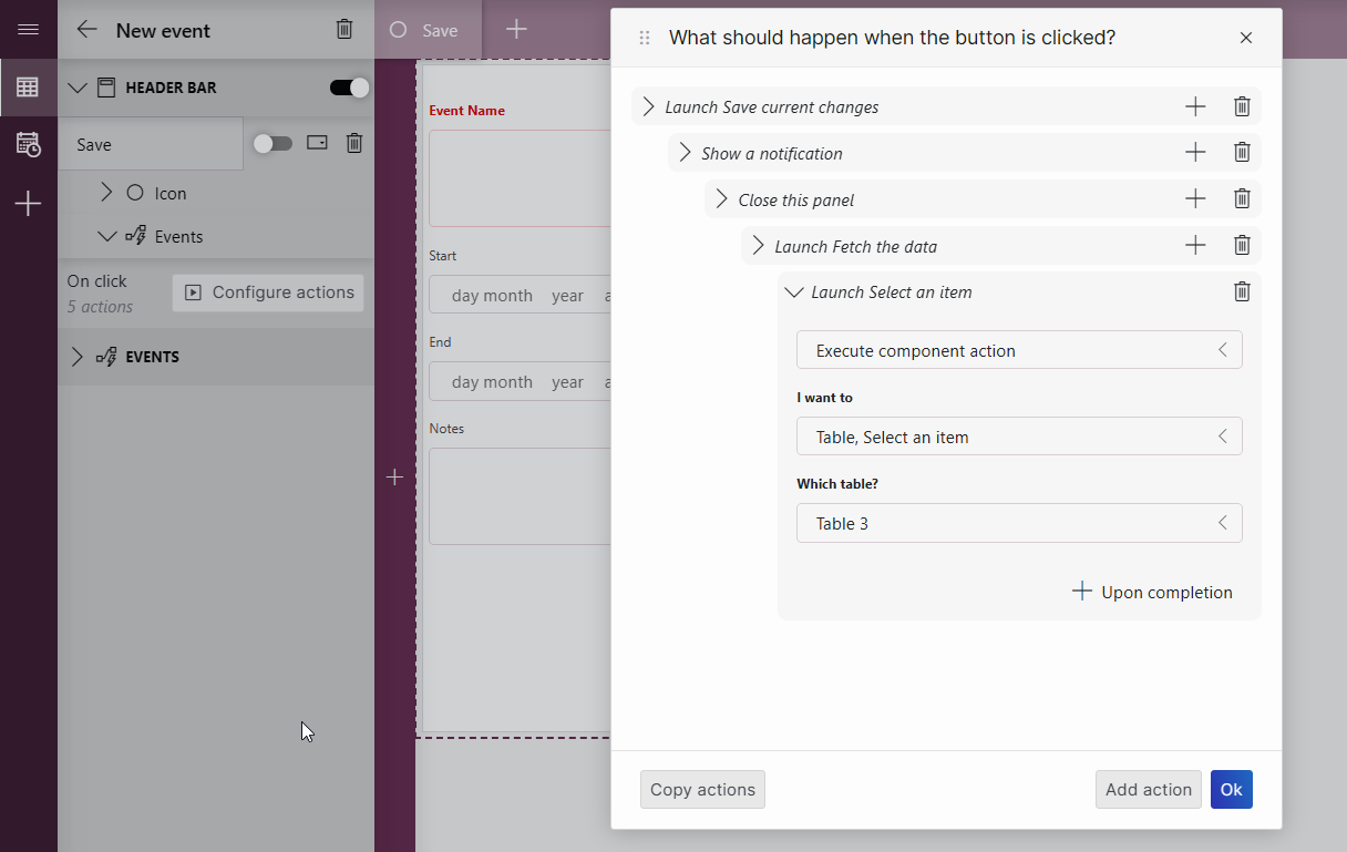
In the Events section for the Save button, click Configure actions.
Configure the following consecutive actions that will run when the button is clicked:
Select Execute component action and Save current changes.
Click + Upon completion to add the next action, select Show a notification, and configure the notification so it indicates that the event has been saved.
Click + Upon completion, and select Close a panel.
Click + Upon completion, select Execute component action, and select Fetch the data for the table component.
Click + Upon completion, select Execute component action, and select Select an item for the table component.
Click OK to save your changes.
Click the arrow icon in the upper-left corner to go back to the Event table page.
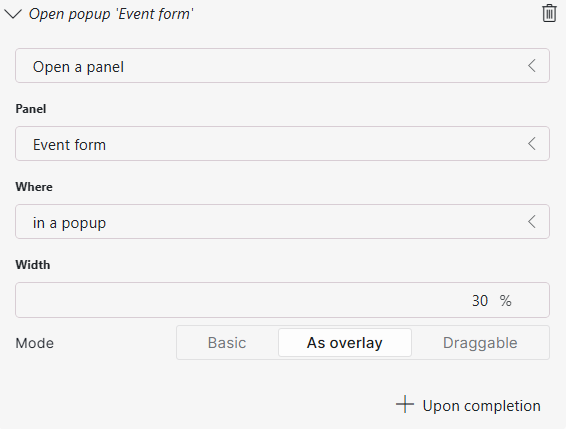
Select the Add event button that you added to the page earlier and go to the Settings pane on the right.
Click Configure actions.
Select the action Open a panel, and configure it so that the New event panel is opened when the button is clicked.
Step 6: Enable users to edit events
In this step, you will add another panel that will open when an event in the table is double-clicked. This new panel will show an overview of the selected event and enable the user to save changes or delete the event.
Select an event in the table.
Important
Make sure not to skip this step. If no event is selected in the table, you will not be able to correctly link the selected event with the form component in the panel.
Create a new panel called
Event form.Add a form component to the panel.
In the Data pane on the right, expand Components > Event table > Table X (e.g., Table 3) > Selected rows, and drag Object manager instances onto the form.
In the form, you should now see the details of the event you have selected.
Add a button named
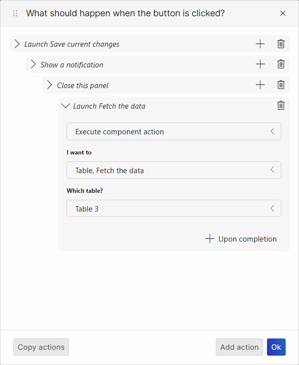
Savein the header bar for the panel.In the Events section for the Save button, click Configure actions.
Configure the following consecutive actions for the button, using the + Upon completion button to add each consecutive action like before:
A component action Save current changes on the form component on the Event form panel.
A Show a notification action with a message indicating that the changes have been saved.
A Close a panel action to close this panel.
A component action Fetch the data for the table component.
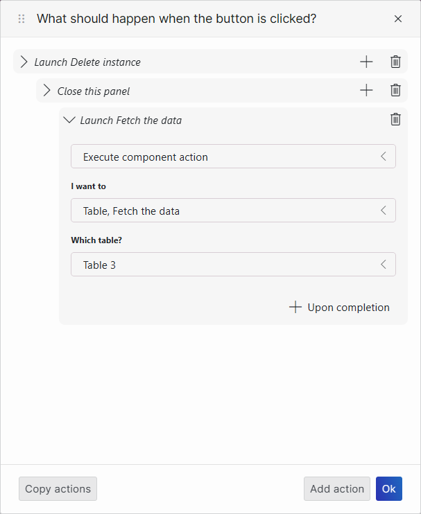
Add a button named
Deletein the header bar.In the Events section for the Delete button, click Configure actions.
Configure the following consecutive actions for the button, using the + Upon completion button to add each consecutive action like before:
A component action Delete instance on the form component.
A Close a panel action to close this panel.
A component action Fetch the data for the table component.
Click the arrow icon in the upper-left corner to go back to the Event table page.
Select the table component and go to the Settings pane on the right.
Under Actions, next to On double-click, click Configure actions.
Select the action Open a panel, and configure it so that the Event form panel is opened when the table is double-clicked.
Step 7: Configure the timeline overview page
In this step, you will add a title, a time range component, and a timeline component, and then link the latter two components to one another so that the timeline updates its viewport when a time range is selected, and that the time range selection updates automatically when a user pans in the timeline.
Add a title component:
Drag a web component onto the page and position it in the upper-left corner.
Make sure the component is selected and select the Settings pane on the right.
Make sure Type is set to Custom HTML and paste the following custom HTML in the HTML box:
<div>
<h1>Timeline</h1>
</div>
<style>
div {
   font-family: Segoe UI, sans-serif;
   line-height: .6;
   font-size: 16px;
   color: 464646;
   display: flex;
   align-items: end;
   height: 100%
}

p {
   margin: 0
}

[data-b] {
   color: rgb(0, 191, 239)
}

[data-y] {
   color: rgb(255, 179, 0)
}

[data-p] {
   color: rgb(255, 0, 107)
}
</style>
Add a time range component:
Drag a time range component onto the page so that it is located to the right of the title.
Make sure the component is selected and select the Settings pane on the right.
In the Default range box, select Last and next 12 hours.
Go to the Layout pane, expand the Presets section, and clear all checkboxes to disable all presets.
Select Use quick picks, and select the quick pick buttons you want to add to the component.
Add a timeline component:
Drag a timeline component onto the page so that it is located underneath the title and the time range component.
From the Data pane, drag the previously created query Full events onto the timeline component.
Expand the Full events query in the Data pane, and drag the Type column to the blue grouping icon that will appear on top of the timeline component.
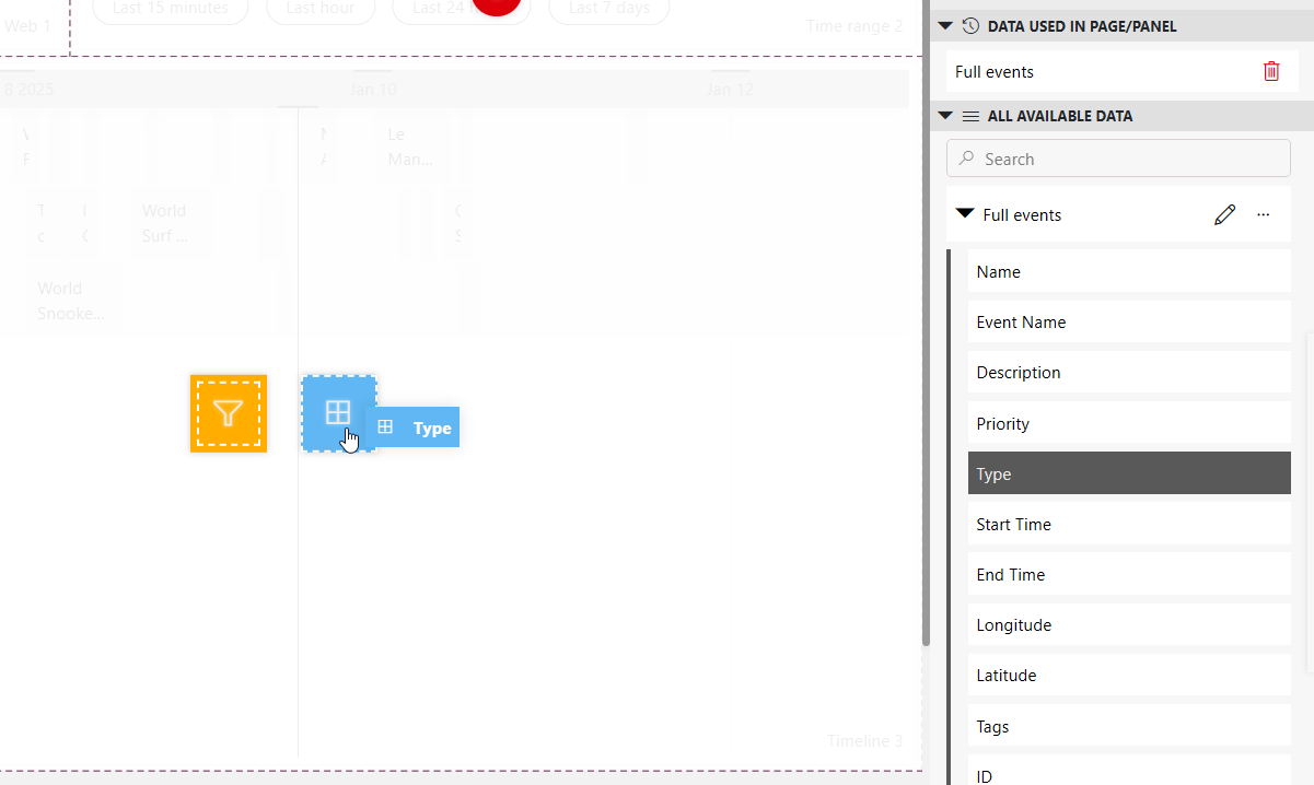
This will group the events on the timeline based on their type.
In the Settings pane, set Default time range to Last and next 12 hours, so that it is the same as for the time range component.
Link the time range to the timeline and vice versa:
Make sure the timeline component is selected, go to the Settings pane, and click the icon next to Link time range.
In the Link to box, select the time range component, and click Link.
In the Data pane, expand Components > Timeline X (e.g., Timeline 3) > Viewport, and drag the Timespans item below this onto the time range component
Step 8: Configure actions on the timeline
In this step, you will further configure the timeline so that users will be able to drag and drop events and to change the start and end time of an event by dragging its edges.
Important
Make sure an event is selected in the timeline before you continue. Otherwise, you will not be able to select the event for the actions.
Select the timeline component and go to the Settings pane.
Next to On item resize, click Configure actions, and configure the actions as follows:
Select Launch a script to add a script action.
Select the Event manager - Update event script.
Expand the Parameters section, and click the link icon next to the Event ID box.
Link to Event info, with the type Current item/Tables, and the property ID.
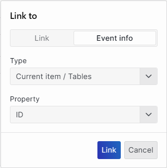
Click the link icon for the From parameter, and link it to Event info, with the type New/Timespans, and the property From.
Click the link icon for the Until parameter, and link it to Event info, with the type New/Timespans, and the property To.
Click + Upon completion.
Add a component action Fetch the data on the timeline, and click OK.
Back in the Settings pane, next to On item move, click Configure actions, and add the same actions as for On item resize.
Tip
For more information on how to configure events and actions on a timeline component, see Adding actions to a timeline.