Timeline
Available from DataMiner web 10.4.1/10.5.0 onwards.
The timeline component is a powerful way to visualize and interact with time-bound data, such as bookings, events, or schedules. It not only provides a clear overview of what’s happening when, but also lets you manage and update items directly on the timeline, with extensive customization options.
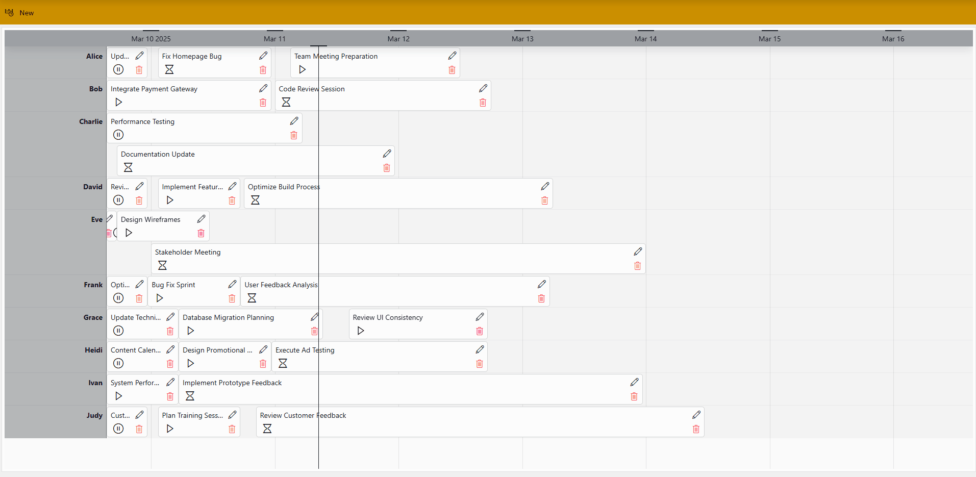
MediaOps solution 1.3.2: Scheduling application
With this component, you can:
Interact with items directly: move, resize, or reassign them to update the underlying data.
Navigate through time by zooming, panning, or intuitively adjusting the scope using a time range component.
Organize and compare items by resource, assignee, or any other common attribute.
Quickly edit or update items without leaving the timeline view, e.g., adjusting a booking or changing task details.
Spot what matters most as important items stand out while less relevant ones fade into the background.
See your data in a way that makes sense to you, with clear visuals, icons, and indicators that help you quickly understand the status or type of each timeline item.
Supported data types
The timeline component is used to display the results of queries in a timeline format. It should therefore always be configured with query data input.
Each row in a query corresponds to an item on your timeline.
Interacting with the timeline component
The items displayed on a timeline component depend on the data you pass to it. How many items are visible at once depends on the displayed time range and the size of the component.
The component automatically adapts to the configured time range, but if more items fall within that range than can fit in the available space, a scrollbar appears when you hover over the component. You can then use the scrollbar to scroll up or down through the items.
Timeline component in DataMiner 10.5.9
Note that when an element has just been restarted, it can take up to five minutes before the timeline will be able to show the latest alarm state changes for that element.
Available interactions
You can interact with the timeline in several ways:
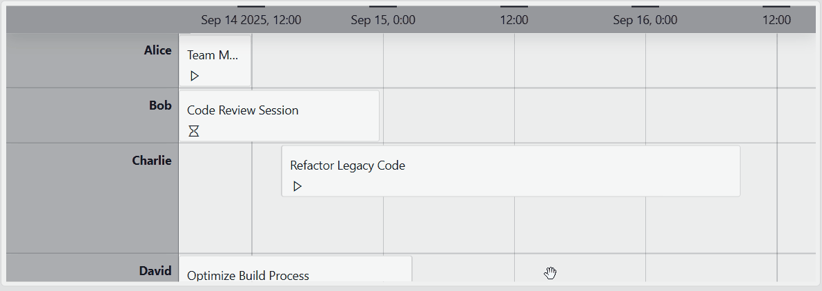
Selecting an item: Click an item to select it. The default timeline template highlights selected items with a distinct background and border color.
Timeline component in DataMiner 10.5.9Selecting a time range: Right-click where you want the range to start, drag to the desired endpoint, and release the mouse button.
Timeline component in DataMiner 10.5.9Resizing an item: Drag the edges of an item to adjust its start and end time.
Timeline component in DataMiner 10.5.9Moving an item: Select and drag an item to a new position. You can also drag it to another group. From DataMiner web 10.3.0 CU14/10.4.0 CU2/10.4.5 onwards, you can hold SHIFT to move items with greater precision, or CTRL to move them precisely both horizontally and vertically.
Timeline component in DataMiner 10.5.9
At any time during an interaction, you can press ESC to cancel the action and restore the item ot its original state (available from DataMiner web 10.3.0 CU14/10.4.0 CU2/10.4.5 onwards).
Important
- To enable moving, resizing, or reassigning items to a different group, you must configure at least one action for that interaction. See Adding actions to a timeline.
- To ensure that interactions update the underlying data and do not remain purely visual, configure an event that triggers a Launch a script action. This automation script should update the original data objects with the modified ones exposed by the event triggered through user interaction. For more information, see Using event data in actions. If your data source does not support real-time updates, you also need to configure an Execute component action to refetch the data.
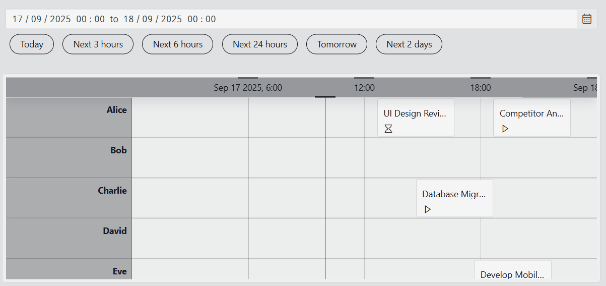
Changing the time range
A timeline component displays time-bound data within a defined time range. The default time range can be configured in the timeline settings. In read mode, you can adjust the view of the timeline by zooming or panning. Alternatively, you can link the timeline to a time range component for more flexible control.
Zooming
Zooming changes the duration of the displayed time range: zooming out shows a larger range, while zooming in shows a smaller range.
To zoom in, press Ctrl while scrolling up.
To zoom out, press Ctrl while scrolling down.
Timeline component in DataMiner 10.5.9
On mobile devices, zoom in by placing two fingers together on the screen and moving them apart. To zoom out, use a pinching motion, starting with your fingers apart and bringing them together.
To zoom in on a specific section of the timeline, right-click at the start of the range, drag to the endpoint, and release the mouse button. The timeline will zoom in to the selected range.
Timeline component in DataMiner 10.5.9For this behavior to work, you need to configure an On range select event in the Settings pane:
Go to Events > On range select and select Configure actions.
Add the following action:
Action:
Execute component actionI want to:
Timeline, Set viewportWhich timeline?:
<name timeline component>From: Click the
 icon and configure:
Link to:
EventType:
TimespansProperty:
From
To: Click the
icon and configure:Link to:
EventType:
TimespansProperty:
To
Note
The component has a minimum time range of 5 milliseconds and a maximum of 10 years, setting the zoom limit.
Panning
Panning changes the position of the displayed time range without affecting its duration.
To pan left or right:
Click and drag the timeline, or
Hold the
Shiftkey and scroll up or down.
Timeline component in DataMiner 10.5.9On mobile devices, move left or right by sliding one finger across the component.
Note
If you have enabled the Lock timeline to now setting, you will be unable to pan past the "now" indicator.
Adjusting item height
From DataMiner web 10.5.0 [CU12]/10.6.3 onwards, you can adjust the height of all items on a timeline at once.
To increase or decrease the height of all timeline items, rotate the mouse wheel while keeping the ALT key pressed.
Timeline component in DataMiner 10.6.3
Note
Items cannot shrink below one tenth of their initial height or grow beyond ten times their initial height.
Linking to a time range component
Instead of adjusting the time range directly in the timeline, you can link it to a time range component. This allows you to control the displayed time range from a dedicated component, which offers both quick and custom selection options.
Timeline component and time range component in DataMiner 10.5.9
To link a timeline component to a time range component:
In the Settings pane, click the
icon next to Link time range (called Link time range to feed in versions prior to DataMiner web 10.3.0 [CU21]/10.4.0 [CU9]/10.4.12).From the dropdown list, select the time range component you want to link.
(Optional) Select the time range component in your app or dashboard, go to the Layout tab, and enable Advanced > Use quick picks to add quick pick buttons.
Once linked, changing the time range in the time range component automatically updates the timeline. You can:
Select a custom time range using the calendar interface.
Apply common time ranges using the quick pick buttons.
Tip
For more information, see Time range.
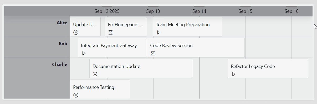
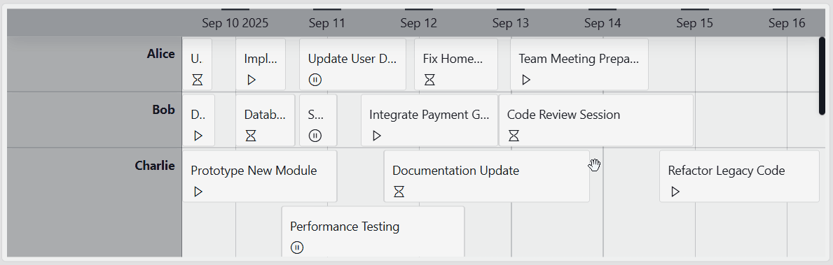
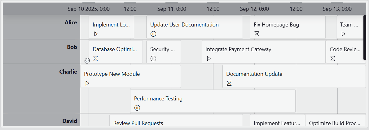
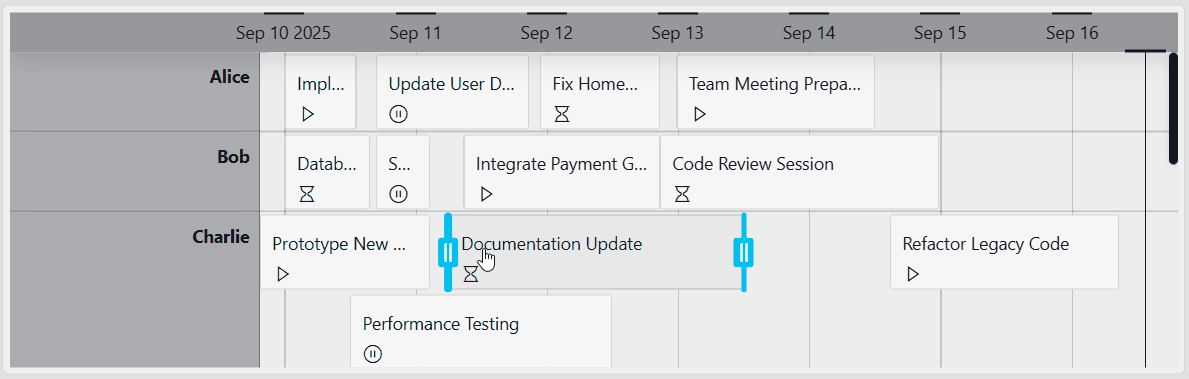
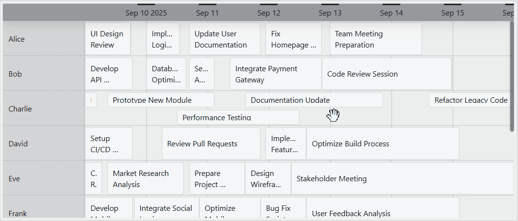
Grouping items in a timeline
You can group items on a timeline to organize them by a common attribute, such as category, resource, or assignee. This allows you to quickly see which items belong together and makes it easier to compare groups side by side.
Timeline component in DataMiner 10.5.4
To group items on the timeline based on one of the columns in your data:
Hover over the component and click the
 icon.
icon.After you click this icon, compatible data will be marked with the
 icon in the Data pane.
Drag compatible data onto the component.
All groups are now displayed in a gray column to the left of the timeline. The timeline items are displayed next to the group they are part of.
Important
When grouping is enabled, the timeline automatically adds a sort operator to the query based on the grouping field. This lets the timeline load groups and their items gradually as the user scrolls. If an ad hoc data source implements IGQIOptimizableDataSource, make sure the returned groups and their items follow the expected sort order (all items within the same group are returned after each other). Otherwise, some items may only appear after all groups have been scrolled through. For more information, refer to GQI extensions.
Note
If a group is empty (i.e., there is no start and end time), it is still displayed in the timeline component.
Group height behavior
When grouping is applied, you can control how the height of each group is handled. This Height setting is available under Groups in the Layout pane, from DataMiner web 10.5.0 [CU12]/10.6.3 onwards.
You can choose between two kinds of behavior:
Fixed (default): The total height of each group remains the same, regardless of how many items it contains. As more items are added to a group, the individual items will automatically shrink so they all fit within the fixed group height.
With this behavior:
All groups remain visually aligned.
The vertical layout is predictable, even when some groups contain more items than others.
Grow: All items within a group keep the same height. As more items are added to a group, the group itself becomes taller to accommodate them.
With this behavior:
Each item will always remain clearly readable.
The number of items in a group is visually reflected by the group's height.
Using the timeline component as an editing tool
A common use case is using the timeline component as an interactive editing tool, i.e., a component where you can directly update or modify items displayed on the timeline.
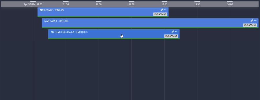
For example, using the Template Editor, you can add a pencil icon in the upper-right corner of each timeline item. When a user clicks this icon, a panel opens where they can edit the details of that item. This makes it possible to manage and adjust data directly from the timeline view, without navigating away.
In the example below, clicking the pencil icon on a timeline item opens an edit panel that allows the user to update job information.
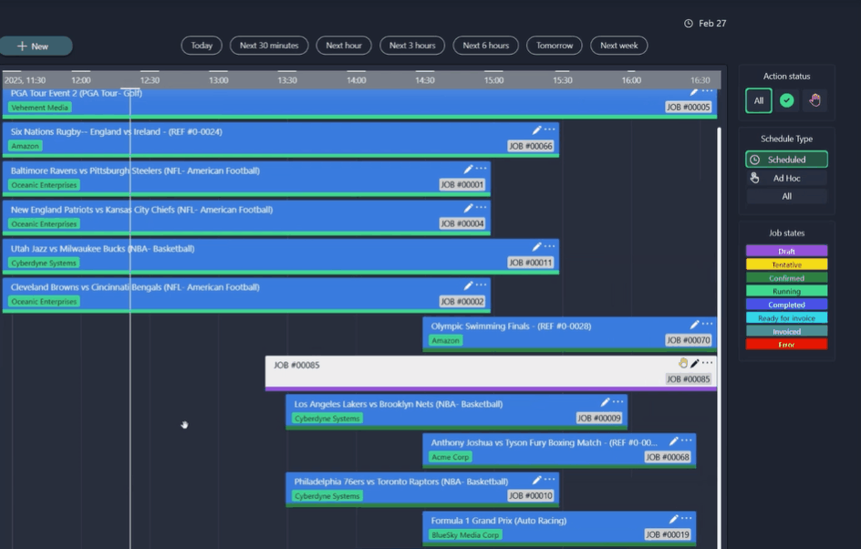
MediaOps solution 1.3.2: Scheduling application
Highlighting data
The timeline component offers two ways to highlight data, helping you draw attention the information that matters most:
You can highlight a section of the timeline based on a defined time range.
You can highlight timeline items that match the criteria of a query filter.
Highlighting a time range
When you highlight a time range, the section of the timeline within the specified range receives a different background color based on the dashboard or app theme. Events that occur fully or partially within the time range are displayed with normal opacity, while events outside the range appear with reduced opacity.
Timeline component in DataMiner 10.5.9
To highlight a time range:
In the Settings pane, make sure the Highlight range > Use highlighting option is enabled.
Once you have enabled this option, the Time range setting will become available.
Set the time range to define which part of the timeline should be highlighted. The time range can be static or dynamic (using the Link to option).
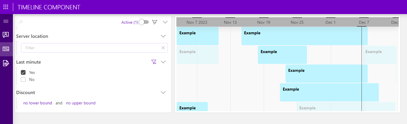
Highlighting specific items
When you highlight items based on a query filter, only the items that match the filter are emphasized. Items outside the filter criteria remain visible, but with lowered opacity. The level of transparency can be adjusted.
Query filter and timeline components in DataMiner 10.5.9
To highlight items with a query filter:
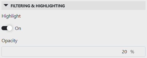
In the Layout pane, make sure the Filtering & Highlighting > Highlight option is enabled.
Set your preferred opacity, e.g., 20 %. This determines how clearly you will see the timeline items that do not meet the criteria specified in the query filter.
Timeline layout settings in DataMiner 10.5.7Add a query filter visualization to your app or dashboard.
Apply the same query data to the query filter that is used by the timeline component.
From DataMiner 10.5.0 [CU12]/10.6.3 onwards, navigate to All available data > Components > [Page/Panel name] > Query filter in the Data pane, and drag the Query columns data item onto your timeline component.
Note that depending on your setup, the exact path may be different. For example, in versions prior to DataMiner [CU21]/10.3.0 [CU9]/10.4.12, component data is found under the Feeds data category.
In read mode, you can now use the query filter component to filter and refine the data displayed in the timeline component. Items that do not meet the specified criteria will be shown with lowered opacity.
Configuration options
Timeline layout
In the Layout pane, you can find the default options available for all components. See Customizing the component layout.
Additionally, the following layout options are also available:
| Section | Option | Description |
|---|---|---|
| Filtering & Highlighting | Highlight | Toggle the switch to determine whether the items that match the criteria specified in a query filter will be highlighted. Enabled by default. For more information, see Highlighting specific items. |
| Filtering & Highlighting | Opacity | Set the level of transparency of the items that do not match the criteria specified in a query filter. This option is only available when Highlight is enabled. For more information, see Highlighting specific items. |
| Advanced | Empty result message | Available from DataMiner web 10.3.11/10.4.0 onwards. Specify a custom message that is displayed when a query returns no results. From DataMiner web 10.5.0 [CU12]/10.6.3 onwards, this setting can be left empty, in which case no message is displayed and the component remains empty. See also: Displaying a custom empty component message. |
| Style | Grouping by | Toggle the switch to determine whether the name of the column the data was grouped by (optionally) is shown. Disabled by default. |
| Style | Segment lines | Toggle the switch to determine whether segment lines are displayed in the timeline component. Enabled by default. |
| Style | Lock timeline to now | Select the checkbox to set a "now" indicator at a fixed position on the timeline. When this option is enabled, users can zoom in and out on the timeline, but are restricted from panning past the indicator. Disabled by default. |
| Item templates | Browse templates or Reuse template (depending on your DataMiner version) |
Reuse a saved template from another component in the same dashboard or low-code app. This option is only available if a template is already in use. |
| Item templates | Edit | Open the Template Editor to customize the appearance of timeline items and configure actions triggered when a layer is selected. For more information, refer to Customizing timeline items. |
| Groups | Height | Available from DataMiner web 10.5.0 [CU12]/10.6.3 onwards, when grouping is applied. Set the height of the timeline groups to Fixed (default) or Grow. For more information, see Group height behavior. |
| Groups | Template | Open the Template Editor to customize the appearance of timeline groups and configure actions triggered when a layer is selected. For more information, refer to Customizing timeline groups. Available from DataMiner web 10.5.0 [CU12]/10.6.3 onwards, when grouping is applied. |
Note
- When you disable the Highlight option, items that do not match the filter will no longer be displayed, and the remaining items will be reorganized.
- Prior to DataMiner web 10.4.0 [CU13]/10.5.0 [CU1]/10.5.4, the option to reuse a template is only available when another timeline component in the dashboard or low-code app is configured with a custom template.
Customizing timeline appearance
Using the Template Editor, you can fully customize the appearance and behavior of timeline items and, when grouping is applied, of timeline groups. This allows you to tailor how data is presented and how users interact with it.
Depending on what you want to customize, you can access the Template Editor from different locations in the Layout pane.
Customizing timeline items
You can customize the appearance of individual timeline items, including their layout, colors, icons, and interactive behavior.
To access the Template Editor for timeline items:
In the Layout pane, navigate to the Item templates section.
This section shows a preview of the template currently applied to the timeline component.
Click Edit to open the Template Editor.
Make your changes as described under Using the Template Editor.
Using conditional cases, you can not only change how items look when certain conditions are met (for example, when the item is selected or hovered over, or based on column values), but also trigger actions that update the underlying data.
Some real-life examples:
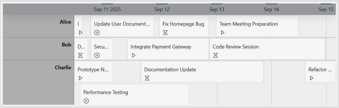
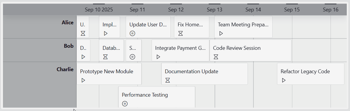
In this example, the Template Editor was used to add an icon in the lower-left corner of each timeline item, indicating whether a task is not started, on hold, or active (represented by an hourglass, pause, or play icon, respectively).
Timeline component in DataMiner 10.5.4Beyond changing the visual appearance, actions were configured on the icon layer so that clicking it opens a context menu. This menu allows users to manually update the icon and, at the same time, modify the underlying task status via an automation script.
In this example, the timeline component is used as an interactive TV schedule, styled with customized colors, icons, and more. A conditional case ensures that when a program has been recorded, a red dot appears in the upper-right corner of the item.
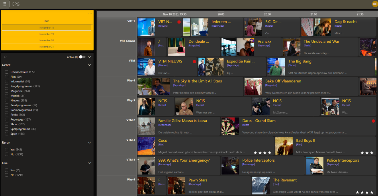
Timeline component in DataMiner 10.4.1
Customizing timeline groups
When grouping is applied to the timeline, you can also customize the appearance of timeline groups, for example to style group headers, add icons, or visually distinguish different groups.
This option is available from DataMiner web 10.5.0 [CU12]/10.6.3 onwards.
To access the Template Editor for timeline groups:
Make sure grouping is applied to the timeline. See Grouping items in a timeline.
In the Layout pane, go to Groups > Template.
Click Edit to open the Template Editor.
Make your changes as described under Using the Template Editor.
Using conditional cases, you can change how timeline groups are displayed when certain conditions are met (for example, when a group is selected or hovered over), and configure actions that are triggered by user interaction.
Default timeline templates
By default, the template of a timeline component includes the following pre-configured layers:
Timeline items (template available from DataMiner web 10.4.0 [CU13]/10.5.0 [CU1]/10.5.4 onwards):
Layer Type Description 
Text Displays the value from the first column in the data source. 
Rectangle Acts as the background of each timeline item, with conditional formatting for hover and selection. 
Rectangle Acts as a visual border by being slightly larger than the background layer, with conditional formatting for selection. Timeline groups (template available from DataMiner web 10.5.0 [CU12]/10.6.3 onwards):
Layer Type Description 
Text Displays the name of the group. 
Rectangle Acts as the background of each timeline group, with conditional formatting for hover and selection. 
Rectangle Acts as a visual border by being slightly larger than the background layer, with conditional formatting for selection.
These default templates ensure that both timeline items and groups are highlighted when hovered over and stand out when selected.
Timeline component in DataMiner 10.5.9
This can, for instance, be useful when the timeline's component data (e.g., Components > [Page/Panel name] > Timeline > Selected groups / Selected time ranges) is used in another component. The highlight helps users identify which data is driving the content of the linked component.
Timeline settings
In the Settings pane for this component, you can customize its behavior to suit your requirements.
| Section | Option | Description |
|---|---|---|
| WebSocket settings | Inherit WebSocket settings from page/panel | Clear the checkbox to use a custom polling interval for this component. When cleared, you can specify a different polling interval (in seconds). |
| General | Timeline | Configure the start and end times of the timeline component. When you add a new timeline component, this is automatically configured. |
| General | Override dynamic units | Clear the checkbox to prevent parameter units from changing dynamically based on their value and protocol definition. Disabled by default. |
| General | Use dynamic units | Determine whether parameter units will change dynamically based on their value and protocol definition. This option is only available if Override dynamic units is enabled. |
| General | Default time range | Select a time range to zoom the timeline to, for example, Today, Last 7 days, or Next hour. Options are grouped into the following categories: Still busy, In the past, Near future, Recently, Long run, Starting from now, and Distant future. If you select Custom, you can set a custom start and end time. Default: Still busy, This week. |
| General | Link time range | Synchronize the timeline's time range with another dashboard or app component, e.g., a time range component. Any changes in the linked component's time range are automatically applied to the timeline. See Linking to a time range component. |
| Data retrieval | Update data | Toggle the switch to determine whether the data in the timeline should be refreshed automatically (provided this is supported by the data source). See Query updates. Disabled by default. |
| Events | On range select | Available from DataMiner web 10.3.0 CU14/10.4.0 CU2/10.4.5 onwards. Configure an action that is triggered when a section of the timeline is selected using the right mouse button. See Adding actions to a timeline. |
| Events | On item resize | Available from DataMiner web 10.3.0 CU14/10.4.0 CU2/10.4.5 onwards. Configure an action that is triggered when an item on the timeline is resized. A timeline item can only resized if at minimum one action has been configured that is triggered on item resize. See Adding actions to a timeline. |
| Events | On item move | Available from DataMiner web 10.3.0 CU14/10.4.0 CU2/10.4.5 onwards. Configure an action that is triggered when an item on the timeline is moved. See Adding actions to a timeline. |
| Events | On group change | Available from DataMiner web 10.3.0 CU14/10.4.0 CU2/10.4.5 onwards. Configure an action that is triggered when an item on the timeline is moved to another group. See Adding actions to a timeline. |
| Highlight range | Use highlighting | Toggle the switch to determine whether a configured time range in the timeline component is highlighted. See Highlighting a time range. |
| Highlight range | Time range | Specify which time range of the timeline component should be highlighted. This option is only available when Use highlighting is enabled. |
Note
- The timeline component has a minimum time range of 5 milliseconds and a maximum of 10 years.
- When you enable the Update data setting, real-time updates will only be applied for the data sources and operators listed on the Query updates page. Prior to DataMiner web 10.4.0/10.4.3, data will only be updated every 30 seconds, and this will only be applied for GQI queries using the Get parameter table by ID data source.
Adding actions to a timeline
From DataMiner web 10.3.0 CU14/10.4.0 CU2/10.4.5 onwards, you can configure actions for any timeline component you add to a low-code app. This feature is not available in the Dashboards app.
To configure actions:
In the Settings pane, expand the Events section.
Choose one of the available event types:
On range select: This event takes place when a section of the timeline is selected using the right mouse button.
On item resize: This event takes place when an item on the timeline is resized.
On item move: This event takes place when an item on the timeline is moved.
On group change: This event takes place when an item on the timeline is moved to another group.
Note
While the On range select event is timeline-based, other events can have a different configuration for each query on the timeline. For example, if there are multiple queries on the timeline, and you move an item belonging to a certain query, the timeline will look at the configuration of actions for the On move event of that specific query to decide which actions to execute.
Click Configure actions next to your chosen event type.
Configure any of the available actions, as detailed under Configuring app events.
Timeline component actions
Component actions are operations that can be executed on a component when an event is triggered.
When you select the Execute component action option, you can choose from a list of components in the app and the specific actions available for each of them.
For the timeline component, the following component actions are available:
Clear highlights: Clears all highlights set by Highlight time range actions.
Clear selection: This action clears the selection of data in the component. Available from DataMiner web 10.4.0 [CU20]/10.5.0 [CU8]/10.5.11 onwards.
Fetch the data: Fetches the data for the component.
Highlight time range: Highlights a range on the timeline component. The highlighted section will expose data in the form of a Timespan object. If multiple sections are highlighted, the data will contain an array of Timespan objects.
Set viewport: Sets the viewport of the timeline to a certain time range.
Note
Prior to DataMiner web 10.3.0 CU14/10.4.0 CU2/10.4.5, highlights can be configured using the Highlight range setting. This setting is still available in later DataMiner versions and can be used in combination with highlights set by actions. Its behavior remains the same: a highlight set by the Highlight range setting will not expose data and it will not be cleared by the Clear highlights action.
Using event data in actions
When a user interacts with the timeline (e.g., moving an item), the event can provide details about what changed. From DataMiner web 10.3.0 CU14/10.4.0 CU2/10.4.5 onwards, you can use this event data in your actions.
This is useful because it allows you to:
Update your data through an automation script based on what the user did.
Keep the timeline and your data in sync, so changes are not just visual.
For example, if a user resizes an item, the event gives you both the old and new time range, along with the item's details. You can then pass that information to a script that updates the actual data behind the timeline.
Each event provides the following data:
| Event | Exposed data |
|---|---|
| Selecting a time range | The selected time range as a Timespan object. |
| Resizing an item | Old and new Timespan values (indicating the start and end of the item before and after the resize), plus the item's data as a Table object. |
| Moving an item | Old and new Timespan values, plus the item's data as a Table object. |
| Changing an item's group | Current and new item state, both as Table objects. |
Tip
Watch the Building an enhanced timeline in Low-Code Apps video tutorial, which walks you through setting up interactions, using event data, and linking it to automation scripts. You can also follow along yourself using the accompanying Catalog package.
Note
- Prior to DataMiner web 10.3.0 [CU21]/10.4.0 [CU9]/10.4.12, the data type "Table" is called "Query row" instead.
- If your data source does not support real-time updates, the Launch a script action (to update your data) will need to be followed by an Execute component action (to refetch the data).