Text input
Available from DataMiner 10.3.5/10.4.0 onwards.
This basic control allows the user to enter text, which will then be available as string data in the dashboard or low-code app. The string data can be used by queries and by script parameters in low-code app actions.
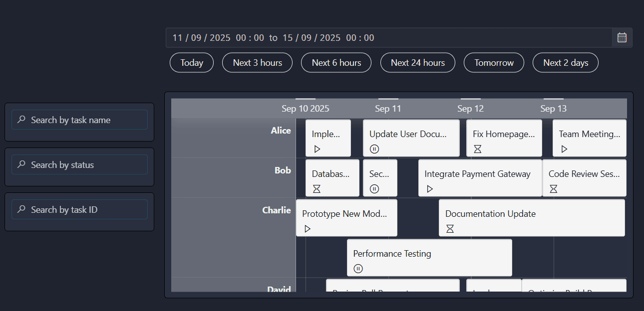
Three text input components (on the left) used to filter a timeline component in DataMiner 10.5.9
Using text input as a filter
A common use case for the text input component is filtering the data displayed in another component. This is especially useful for visualizations that otherwise do not support any filtering.
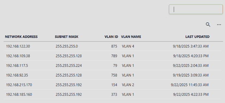
Text input component and table component in DataMiner 10.5.9
There are two ways to configure this:
Using the component data.
Using a Filter query operator.
Creating a filter using component data
Add a text input component to your dashboard or app.
From DataMiner 10.5.0 [CU12]/10.6.3 onwards, navigate to Components > [Page/Panel name] > Text input > Value > Texts in the Data pane.
Note that depending on your setup, the exact path may be different. For example, in versions prior to DataMiner [CU21]/10.3.0 [CU9]/10.4.12, component data is found under the Feeds data category.
Drag this data onto a compatible component, such as a table.
As soon as you start dragging, the
 icon appears on components that support filtering with text input data. Drop the data onto one of these components.
Once linked, entering a value in the text input component automatically updates the target component with the filtered content.
Tip
Creating a filter using a query operator
Add a text input component to your dashboard or app.
Create a new query or edit an existing one, depending on the data you want to filter.
Add a GQI operator of type
Filter.Select the column you want to filter.
Choose the filter method, e.g.,
contains.Under Value, click the
 icon.
icon.In the Link to dialog:
Select your text input component from the Data dropdown list.
Set Empty data shows to
everything.
Click Link in the lower-right corner.
Stop editing the query and drag it onto the target component.
Note
If you edited an existing query that is already used as a data source, you do not need to drag it onto the component again.
You can now use the text input component as a filter:
When the text input is empty, all data is shown.
If a value is entered, the target component automatically updates to show only the filtered content.
Tip
Configuration options
Text input layout
In the Layout pane, you can find the default options available for all components. See Customizing the component layout.
Additionally, the following layout options are also available:
| Section | Option | Description |
|---|---|---|
| Advanced | Label | Enter text that will be displayed above (default) or next to the input box. |
| Advanced | Inline | Available from DataMiner 10.3.9/10.4.0 onwards. Select the checkbox to display the label next to the input box instead of above it. Disabled by default. |
| Advanced | Placeholder | Enter the text that will be displayed as a placeholder inside the input box. |
| Advanced | Icon | Choose an icon that will be displayed in the input box. |
Text input settings
In the Settings pane for this component, you can configure the following optional settings:
| Section | Option | Description |
|---|---|---|
| General | Emit value on | Determine when the value in the box becomes available as data. This can be when the user presses Enter ("Enter"), when the focus is no longer on the box ("Focus lost"), or when the value in the box changes ("Value change"). If you select Focus lost, the value will also become available when the user presses Enter. |
| General | Default value | Available from DataMiner 10.4.0 [CU10]/10.5.1 onwards. Specify the default value that will be entered into the input box when the dashboard or low-code app is opened. |
| General | Multiline | Toggle the switch to determine whether the input can consist of multiple lines or not. |
Text input component actions
Component actions are operations that can be executed on a component when an event is triggered.
When you select the Execute component action option, you can choose from a list of components in the app and the specific actions available for each of them.
For the text input component the following component action is available:
- Set value: Available from DataMiner 10.3.0 [CU18]/10.4.0 [CU6]/10.4.9 onwards. Sets the current value of the component to either a static or dynamic value.