Column & Bar chart
This chart can be used to display the elements or services in a view that caused the most or the least alarms in a selected time range and were in an alarm state for the longest or the shortest period of time.
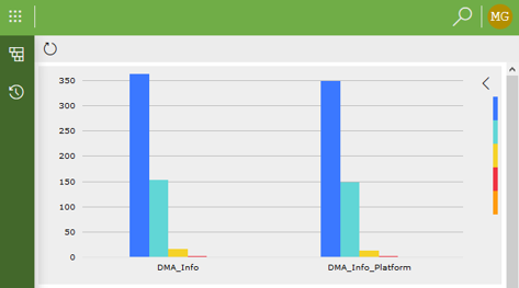
Bar chart component in DataMiner 10.4.5
It can also be used to represent any data based on a data query in the form of a bar chart. In that case the bars can represent any number of variables for any set of categories.
Note
- Negative values are only supported in bar chart components from DataMiner 10.1.0/10.1.3 onwards.
- From DataMiner 10.4.0 [CU11]/10.5.2 onwards, only the first 1000 items in a column & bar chart are shown.
To configure the component:
-
This component also supports queries as data input. See Creating a GQI query.
Optionally, you can add a parameter filter, so that the displayed data are limited to that parameter only. To do so, hover the mouse pointer over the component, click the filter icon, and then add a filter from the parameters section of the Data pane.
Optionally, customize the following component options in the Settings pane:
WebSocket settings: Allows you to customize the polling interval for this component. To do so, clear the checkbox in this section and specify the custom polling interval.
General > Source: Determines whether elements or services are displayed.
General > Type: Determines whether the bar chart is based on the number of alarm events or on the duration of alarm states.
General > Select: Determines whether the top items (i.e., the items that had the most alarms or were in an alarm state for the longest time) or the bottom items (i.e., the items that had the least alarms or were in an alarm state for the shortest time) are displayed.
General > Limit: Determines how many elements or services are included in the chart. From DataMiner 10.4.0 [CU11]/10.5.2 onwards, regardless of this setting, only the first 1000 parameters can be rendered in a single chart.
General > Time span: Determines the time range for which the information is retrieved.
If query data input is used, the following settings are available instead:
Label: Allows you to select which data should be used as a label. Depending on how many different variables are displayed in the chart, several labels can be selected.
Bars: Allows you to select which data should determine the size of the bars in the chart. Multiple bars can be selected.
Note
From DataMiner 10.3.7/10.4.0 onwards, when you add a query to the component, the label and bars will automatically be configured.
Optionally, fine-tune the component layout. In the Component > Layout pane, the following options are available if the chart is not used with queries data input:
The default options available for all components. See Customizing the component layout.
Advanced > Include severities: Allows you to exclude certain severity levels by clearing the checkboxes for those levels.
Chart > Reverse data: By default, the graph displays the number of alarm events or the alarm duration per element. This option allows you to instead display the number of alarm events or the alarm duration per alarm state.
Chart > Stack bars: Determines whether the bars for one particular element or service are stacked in the chart.
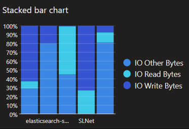
Stacked bar chart in DataMiner 10.4.5Chart > Legend: Determines whether a legend can be displayed. If this option is selected, an arrow icon is displayed in the top right corner of the chart. Clicking this icon will display the legend.
Table > Show: Determines whether a table with detailed information is displayed below the chart.
Table > Add totals: Determines whether a column is displayed within the table with the total number of alarm events or the total alarm duration for each element or service. This option is only available if the Table > Show option is selected.
Table > Add total info: Determines whether the Total column includes the information “alarm events” or “% of time in alarm state”. This option is only available if the Table > Add totals option is selected.
The following options are available if the chart is used with queries data input:
The default options available for all components. See Customizing the component layout.
Advanced > Chart layout: Allows you to choose how the dimensions of the bars are determined. Possible values:
Absolute: The dimension of each bar is shown as an absolute numeric value. From DataMiner 10.4.0 [CU13]/10.5.0 [CU1]/10.5.4 onwards, this is the default value.
Relative per category: The dimension of each bar is shown as a relative percentage compared to other bars representing the different variables for each separate category. (Available from DataMiner 10.1.0/10.1.2 onwards.)
Relative per variable: The dimension of each bar is shown as a relative percentage compared to other bars representing this variable. Prior to DataMiner 10.4.0 [CU13]/10.5.0 [CU1]/10.5.4, this is the default value.
Relative total: The dimension of each bar is shown as a percentage of the sum of all values. (Available from DataMiner 10.1.0/10.1.2 onwards.)
Advanced > Chart orientation: Determines how the chart is displayed, i.e., from left to right, from right to left, from top to bottom or from bottom to top. From DataMiner 10.4.0 [CU13]/10.5.0 [CU1]/10.5.4 onwards, Bottom to top is the default setting. Prior to this, Left to right is the default setting.
Advanced > Stack bars: Available from DataMiner 10.1.0/10.1.2 onwards. Stacks the bars on top of each other instead of showing them side by side. This can be especially useful when combined with the Relative per category layout.
Legend > Show Legend: Determines whether the legend is displayed.
Legend > Position: If the legend is set to be displayed, this option determines whether it is displayed on the left, on the right, at the top or at the bottom of the visualization.
Tooltips > Show Tooltips: Determines whether tooltips are displayed.
Tooltips > Include label: Determines whether the label is included in tooltips.
Tooltips > Include dimension: Determines whether the dimensions are indicated in tooltips.
Tooltips > Include value: Determines whether values are indicated in tooltips.
Advanced > Empty Result message: Available from 10.3.11/10.4.0 onwards. Allows you to specify a custom message that is displayed when a query returns no results. From DataMiner 10.5.0 [CU12]/10.6.3 onwards, this setting can be left empty, in which case no message is displayed and the component remains empty.
Tip
See also: Displaying a custom empty component message.