Maps
Available from DataMiner 10.4.0 [CU13]/10.5.0 [CU1]/DataMiner 10.5.4 onwards.
The maps component lets you visualize and explore geospatial data using markers and/or lines. It currently only supports Google Maps ("gmaps") as the Maps provider.
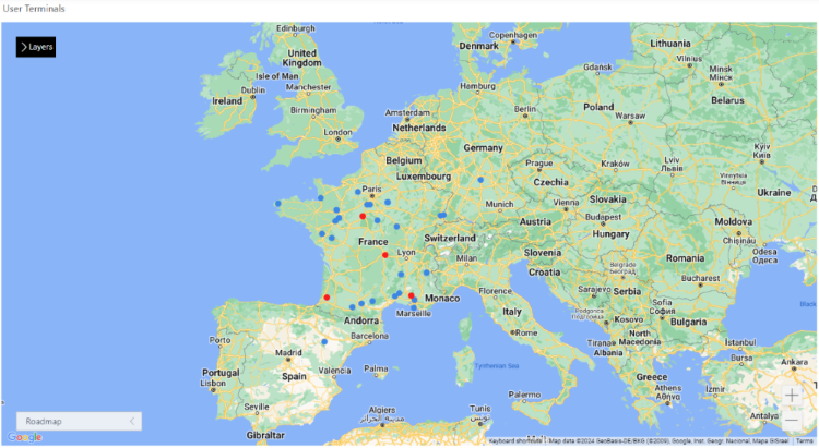
Maps component in DataMiner 10.4.4
With this component, you can:
Track both real-time and historical location data to monitor movements or analyze trends.
Select markers or lines on the map to access more details.
See your data in a way that makes sense, thanks to a range of customization options.
Toggle extra layers on demand to add context without cluttering the map.
Prerequisites
To display the map, the machine running the browser must have internet access.
To use the maps component, a valid maps configuration is required. See Configuring the DataMiner Maps host servers.
Supported data types
The maps component is used to display the results of queries as geospatial data on top of a map. It should therefore always be configured with query data input.
Each row in a query corresponds to a marker or line on the map.
Interacting with the maps component
You can interact with the maps component in several ways to explore and customize the map view.
You can zoom in or out to adjust the level of detail, pan across the map to focus on different areas, select which layers are shown to control the information visible on the map, and change the map type to switch between different map styles.
Zooming
Zooming changes the level of detail shown on the map. You can zoom in or out in several ways:
Click the "+" or "-" icon in the lower-right corner of the component.
Select the maps component and press "+" or "-" on your keyboard.
Hover over the specific area you want to zoom in or out from and scroll up or down. Depending on your DataMiner version and the Hold Ctrl to zoom option, you may need to hold the Ctrl key while scrolling.
Panning
Panning allows you to move the visible area of the map. You can pan in the following ways:
Use one of the following keyboard shortcuts:
Keyboard shortcut Action ← Move left → Move right ↑ Move up ↓ Move down Home Jump left by 75% End Jump right by 75% Page Up Jump up by 75% Page Down Jump down by 75% Click and hold the scroll wheel anywhere on the map and drag the mouse pointer in the desired direction.

Maps component in DataMiner 10.5.11
Selecting which layers are shown
In the upper-left corner of the component, you can choose which layers are displayed on the map by selecting them from the dropdown menu.

Maps component in DataMiner 10.5.11
Changing the map type
When the Show map type control setting is enabled, you can change the type of map in the lower-left corner of the component.
You can switch between the supported map types using the dropdown menu. The available map types depend on the map provider. At present, only Google Maps is supported, with the following types:
roadmap
satellite
hybrid
terrain

Maps component in DataMiner 10.5.11
The Default map type setting determines which type of map is displayed initially when the dashboard or app is opened.
Displaying extra layers
To provide additional context or details on a map without cluttering the base view, you can configure a button to display or hide an extra layer on demand:
Add a button component to the dashboard or page.
Configure an on-click action:
In the Settings pane, click the Configure actions button next to On click.
From the dropdown list, select Execute component action.
Specify the following details:
I want to:
Maps, Toggle overlayWhich map?: Select the desired maps component.
Source: Link to a .kml, .kmz, or .json file. The coordinates can also be dynamic (using the Link to option).
Click Ok in the lower-right corner.
Using the map as a selector
You can use a maps component as a dynamic selector, i.e., a component whose selection determines behavior or data elsewhere in your dashboard or app. A common use case is to display more information about a marker or line on the map when it is selected.
When you select a marker or line on the map, the selected data (e.g., All available data > Components > [Page/Panel name] > Map > Selected markers / Selected lines > Tables) becomes automatically available for use in other components.
Note
In versions prior to DataMiner 10.5.0 [CU12]/10.6.3, the path to the selected data may be different. For example, in versions prior to DataMiner [CU21]/10.3.0 [CU9]/10.4.12, component data is found under the Feeds data category.
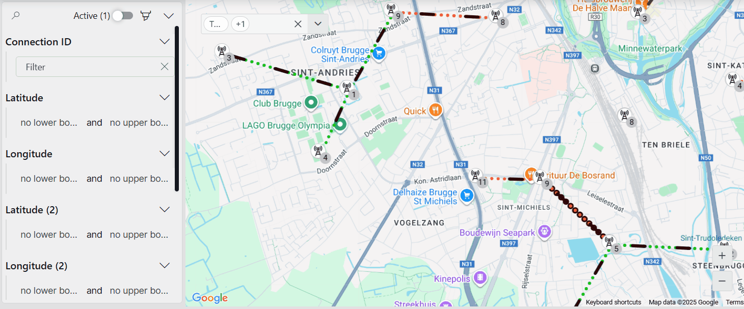
In the example below, the map shows several terminals represented by markers. Clicking a marker opens a panel on the right that provides more details about the selected terminal. Thanks to the marker customization options, terminals with an active alarm are displayed in red, allowing users to quickly identify and inspect affected terminals by selecting the corresponding markers.

Maps component in DataMiner 10.5.11
Tip
From DataMiner 10.4.0 [CU20]/10.5.0 [CU8]/10.5.11 onwards, you can configure an action on another component (e.g., a button) so that this can be used to clear the selection on the map.
Using the map for history tracking
The maps component lets you view and monitor both real-time and historical data through ad hoc data sources.
You can follow the movement or status of assets over time, analyze patterns, and compare past and current activity directly on the map. Combining live and historical data provides a complete picture of operations or events in a single view.
Maps component in DataMiner 10.5.3
Tip
For step-by-step instructions, see Visualizing the Starlink location history in DataMiner. This tutorial shows how to use the Starlink Enterprise solution to track historical data, such as following a cruise ship's movements over time.
Adding data
Add one or multiple GQI data sources to the component. See Adding data to a component.
The data is visualized as a set of markers by default, but it can also be configured as a set of lines. In both cases, the component will try to automatically apply the dimensions needed to show the visualization of the data.
For markers, the process of applying the dimensions works as follows:
As a marker needs an ID, a latitude, and a longitude value to be visualized, the component will look for columns named "ID", "Latitude"/"Lat", and "Longitude"/"Lng" in your query result.
If these columns exist, a marker is configured for each query row in the result, taking the values of the ID, latitude, and longitude columns for that row.
If no match is found, the component will take the first column containing string values for the ID and the first two columns containing numbers for latitude and longitude while taking into account the columns that are already assigned to other dimensions.
The chosen column values are displayed for each query. If a dimension is set incorrectly, you can still change it manually at any point.
This process is similar for the configuration of lines, but instead of one latitude and longitude value, two pairs of coordinates need to be configured, one for the starting point and one for the end point of the line.
Configuration options
Maps layout
In the Layout pane, you can find the default options available for all components. See Customizing the component layout.
Additionally, the following Filtering & Highlighting options are also available:
| Option | Description |
|---|---|
| Highlight | Toggle the switch to determine whether the nodes that match the criteria specified in a query filter will be highlighted. Enabled by default. For more information, see Highlighting filtered results. |
| Opacity | Set the level of transparency of the items that do not match the criteria specified in a query filter. This option is only available when Highlight is enabled. For more information, see Highlighting filtered results. |
Layer settings
The maps component supports showing multiple layers. Each layer determines how you visualize geospatial data on top of the base map. In the Layout pane, the following layer options are available in the Layer settings section:
| Subsection | Option | Description | Available for |
|---|---|---|---|
| N/A | Weight | Define which markers or lines appear in the foreground when items from different layers overlap. The higher the weight of the layer, the more it will be pushed to the foreground. The default weight is 1. |   |
| N/A | or |
Hover over the query name to see whether it is configured as a set of markers (default) or as a set of lines. To change the configuration, click the icon to set it as markers, or the icon to set it as lines. |
|
| N/A | Identifier/Latitude/Longitude | Select the column to use for each dimension. For markers, select string-valued columns for the ID and numeric-valued columns for the latitude and longitude. For lines, select a latitude and longitude for both the source and the destination. | |
| Template | Browse templates or Reuse template (depending on your DataMiner version) |
Reuse a saved template from another component in the same dashboard or low-code app. This option is only available if a template is already in use. | |
| Template | Edit | Open the Template Editor to customize the appearance of the markers. For more information, refer to Customizing markers. | |
| N/A | On line click | Available from DataMiner 10.4.0 [CU19]/10.5.0 [CU7]/10.5.10 onwards. Configure an event that will occur when a line is clicked. | |
| Style | Color | Change the color of the lines. | |
| Style | Conditional coloring | Available from DataMiner 10.4.0 [CU18]/10.5.0 [CU6]/10.5.9 onwards. Specify color filters for specific columns, so that lines can be highlighted based on a condition. | |
| Style | Width | Change the width of the lines. | |
| Style | Type | Change the type of lines (normal, dashed, dotted, or alternate). | |
| Style | Direction visualization | Specify how the direction of the line should be visualized on the map (none, flow, or arrow). | |
| Advanced settings | Show in zoom level | Determine in which range of zoom levels the query should be visible. | |
| Advanced settings | Weight | Determine which markers or lines are pushed to the foreground when two markers or lines from the same layer overlap with each other. | |
: markers; : lines
Note
From DataMiner 10.4.0 [CU20]/10.5.0 [CU8]/10.5.11 onwards, lines can also be colored based on the conditional coloring of a linked query filter. This will override the color configuration in the layer settings of the maps component. Note that if the query filter contains multiple color conditions, only the first color condition will be applied, as a line can only have one color.
Map settings
In the Layout pane, the following settings in the Map settings section determine the default view and behavior of the map within the component:
| Subsection | Option | Description |
|---|---|---|
| N/A | Save current view | After you have panned and/or zoomed to a certain location, click this button to set the center and zoom settings as the default view. This will be the view that users see when they first open the map. |
| Map center | Latitude/Longitude | Determine the default center of the map by means of the latitude and longitude of the center location. To easily get the coordinates of a point on the map, right-click the component and select the latitude and/or longitude value to copy it to the clipboard. |
| Map zoom | Zoom range | Select the minimum and maximum zoom level. |
| Map zoom | Default zoom | Specify the default zoom level of the map. |
| Map bounds | Enable bounds | Enable this option to configure the north, east, south, and west bounds of the map. |
| Default map type | Map type | Select the type of the map. The available types depend on the map provider. At present, only Google Maps is supported, with the following map types: roadmap, satellite, hybrid, and terrain. |
| Default map type | Show map type control | Enable this option to make the map type setting visible in the component itself. |
Highlighting filtered results
To visually distinguish markers and lines that match your filter criteria from others, you can combine the Highlight option with a query filter component. This allows you to lower the opacity of non-matching items while keeping relevant results clearly visible.
Maps component and query filter component in DataMiner 10.5.11
In the Layout pane, make sure the Filtering & Highlighting > Highlight option is enabled.
Set your preferred opacity, e.g., 20 %. This determines how clearly you will see the markers and lines that do not meet the criteria specified in the query filter.
Add a query filter visualization to your app or dashboard.
Apply the same query data to the query filter that is used by the maps component.
From DataMiner 10.5.0 [CU12]/10.6.3 onwards, navigate to All available data > Components > [Page/Panel name] > Query filter in the Data pane, and drag the Query columns data item onto your maps component.
Note that depending on your setup, the exact path may differ. For example, in versions prior to DataMiner 10.5.0 [CU12]/10.6.3, component data is not organized by page.
In read mode, you can now use the query filter component to filter and refine the data displayed in the maps component. Items that do not meet the specified criteria will be shown with lowered opacity.
Customizing markers
You can freely customize the appearance of markers on the map to better represent your data:
In the Layout pane, expand the Layer settings section.
In the Template subsection, click Edit to open the Template Editor.
Make your changes as described under Using the Template Editor.
Note
The center of the marker template is determined by the latitude and longitude values for that marker.
In the example below, the Template Editor was used to customize the markers representing cell towers. Displaying the markers as cell towers makes the map more intuitive and easier to interpret.
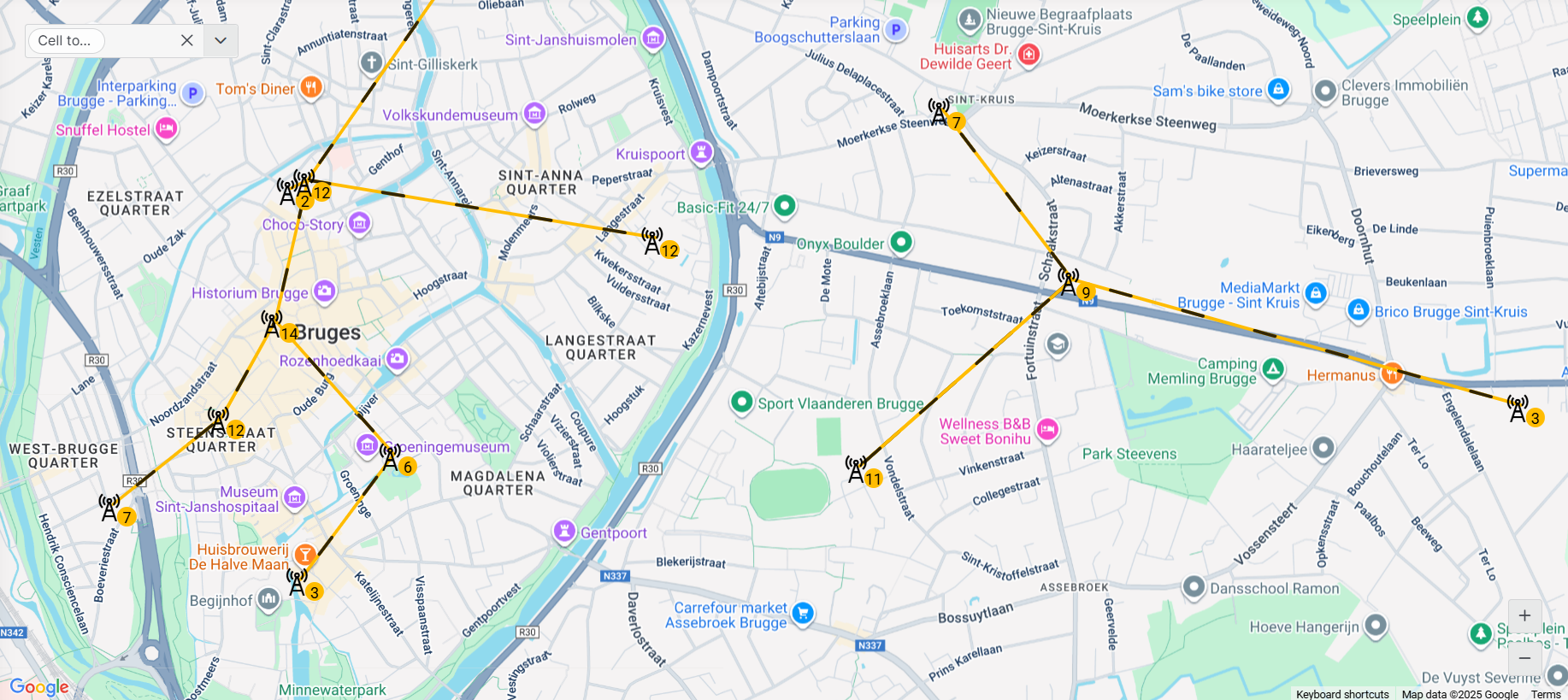
Maps component in DataMiner 10.5.11
Default maps template
By default, the template of a maps component includes the following pre-configured layers:
| Layer | Type | Description |
|---|---|---|
 |
Ellipse | Acts as the background of each marker, with conditional formatting for hover and selection. |
 |
Ellipse | Acts as a visual border by being slightly larger than the background layer, with conditional formatting for hover and selection. |
This default template (available from DataMiner 10.4.0 [CU13]/10.5.0 [CU1]/10.5.4 onwards) ensures that a marker is highlighted when hovered over and stands out when selected, with a light-blue background and a blue border.
This can for instance be useful when the map's component data (e.g., Components > [Page/Panel name] > Maps > Selected markers > Tables) is used in another component. The highlight helps users identify which data is driving the content of the linked component.
Maps settings
In the Settings pane for this component, you can customize its behavior to suit your requirements.
| Section | Option | Description |
|---|---|---|
| WebSocket settings | Inherit WebSocket settings from page/panel | Clear the checkbox to use a custom polling interval for this component. When cleared, you can specify a different polling interval (in seconds). |
| General | Override dynamic units | Clear the checkbox to prevent parameter units from changing dynamically based on their value and protocol definition. Disabled by default. |
| Data retrieval | Update data | Toggle the switch to determine whether the data on the map should be refreshed automatically (provided this is supported by the data source). See Query updates. Disabled by default. |
| Advanced | Hold Ctrl to zoom | Available from DataMiner 10.4.0 [CU10]/10.5.1 onwards. Select the checkbox to make the scroll wheel zoom only when you hold the Ctrl key. |
Note
The Update data setting is currently only applicable for the markers on the map. Real-time updates are not yet supported for lines.
Adding actions to a map
When you add a maps component to a low-code app, you can configure actions that are executed when a marker or line on the map is clicked.
To configure actions for a line click:
In the Layout pane, expand the Layer settings section.
Click Configure actions next to On line click.
Configure any of the available actions, as detailed under Configuring app events.
Actions triggered by clicking a marker on the map can be configured in the Template Editor. These are linked to the on-click event of a shape in the marker template.
Maps component actions
Component actions are operations that can be executed on a component when an event is triggered.
When you select the Execute component action option, you can choose from a list of components in the app and the specific actions available for each of them.
For the maps component, the following component actions are available:
Clear selection: This action clears the selection of data in the component. Available from DataMiner 10.4.0 [CU20]/10.5.0 [CU8]/10.5.11 onwards.
Fetch the data: This action fetches the data from the component again.
Pan to view: This action pans to a certain location. The coordinates for this action can be static or dynamic (using the Link to option).
Set zoom level: This action zooms to a certain level on the map. The zoom level can be static or dynamic (using the Link to option).
Overlay actions: Using app actions, different types of overlays can be shown on the map. The supported overlay types are .kml, .kmz and .geoJSON. The source of the overlay needs to be specified in an input (which can also be received using the Link to option), and it can be either a local source, specified by a relative path in the
C:\Skyline DataMiner\Mapsfolder, or a web source, specified by a public URL that hosts the overlay. The following overlay actions are available:Open overlay: This action displays a specified overlay on the map.
Close overlay: This action removes a specified overlay from the map.
Toggle overlay: This action opens a specified overlay if it is currently closed, or closes it if it is currently open.
Close all overlays: This action removes all overlays currently displayed on the map.
Note
- When you set the overlay source, make sure the source ends with a file extension. If you are using a remote URL that does not include one, you can append a custom query parameter to specify it. For example,
https://myRemoteService/overlaycan be updated tohttps://myRemoteService/overlay?type=.kmz. - While local sources are more secure and not openly accessible like public sources on the internet, you do have to make sure the route to the GetSecureFile API method (
https://DMA/API/v1/GetSecureFile.aspx) is openly accessible in order to use the local overlay files.
Tip
For more information about the different types of overlays, see Layer types.
Example use case: Pan and zoom the map via grid selection
Component actions can be combined to create interactive behavior between components.
In the example below, a grid component lists several locations. When an item in the grid is clicked, the maps component automatically zooms to that location.

Grid component and maps component in DataMiner 10.5.11
Here, the grid component is configured with an on-click event that triggers two actions on the maps component. The Pan to view action pans the map to the latitude and longitude of the selected location, while the Set zoom level action sets the zoom level to 60, focusing on the selected area.
This setup allows users to quickly navigate to the relevant location on the map.
Enabling the component in soft launch
From DataMiner 10.3.2 onwards, the maps component is available in soft launch, if the soft-launch option ReportsAndDashboardsGQIMaps is enabled. For more information, see Soft-launch options.
If you use the preview version of the maps component, its functionality may be different from what is described on this page.