State
This component displays the state, name and, if applicable, the value of a DataMiner object. This can be an element, a view, a parameter, etc.
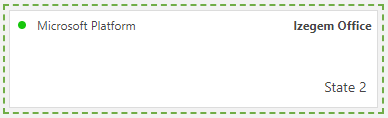
State component in DataMiner 10.4.6
Note
From DataMiner 10.3.6/10.4.0 onwards, if an item in this component is selected, you can clear the selection by clicking it while keeping the Ctrl key pressed. If you are using the State component as data input for other components, this will also clear the data shown in those components.
To configure the component:
-
Column parameter data is supported.
Note
If no filter is specified, the number of parameter rows that can be displayed by this component is limited to 100. To display more rows or filter out specific rows, you can use a Parameter picker and link this to the state component.
In case parameter data included a parameter based on a protocol, a filter can be used to filter on a specific element.
This component also supports queries as data input. See Creating a GQI query.
From DataMiner 10.2.0/10.1.4 onwards, you can select view parameters as a data source to view the alarm state for aggregation rules on specific views. To select these, in the dropdown box for the parameter data source, select View.
Note
Once this component has been configured with data input, the exposed data will appear as component data in the Data pane and can be used by other components. This way, if the input for this component changes, the exposed data will update automatically for all components that use it as their data input.
Optionally, customize the following component options:
To customize the polling interval for this component, expand the Settings > WebSocket settings section, clear the checkbox in this section, and specify the custom polling interval.
If the component shows a parameter with a unit, but you do not want the unit to be displayed, in the Settings pane, clear the Show units option (available from DataMiner 10.1.9/10.2.0 onwards).
In case the component displays more than one item, in the Settings pane, select how the items should be grouped: by parameter, by element, by table index (if relevant) or by all the above together. Note that view parameters can only be grouped together with other parameters with the option All together, otherwise they are placed in a separate group.
In case the component displays a query source and you want the data to be refreshed automatically, Set Update data to On (available from DataMiner 10.2.0/10.2.1 onwards).
If you want the first item in the component to be selected by default, in the Settings pane, under Initial Selection, set the toggle button to On (available from DataMiner 10.3.6/10.4.0 onwards). This way, the first item will be automatically selected whenever the component is loaded or when the data is refreshed.
Fine-tune the component layout. In the Component > Layout pane, the following options are available:
The default options available for all components. See Customizing the component layout.
In case the component displays more than one item, in the Advanced > Layout section, you can adjust the way the different items are displayed:
If the component shows a parameter, in the Labels section, you can select whether the parameter name, element name, index, and/or value should be displayed in the component.
In the Style section, the following options are available:
Design: Allows you to select one of the following options:
Small: The component displays a single line containing a label and value.
Large: The component displays multiple lines with one value and up to three labels.
Auto size: Similar to the Large option, but automatically adjusts the content to fill the entire component.
Alarm state coloring: Allows you to select one of the following options to determine how alarm coloring is displayed:
LED: The alarm color is displayed by a circular LED to the left of the first label.
Line: The alarm color is displayed by a bar along the left side of the component.
Text: The text color of the value matches the alarm color.
Background: The background of the component displays the alarm color. If this option is selected, an additional option, Automatically adjust text color to alarm color, can be selected to make sure the text color is adapted if necessary.
None: No alarm color is displayed.
Layout flow: Allows you to select whether the different states should be displayed in rows or columns. If they are displayed in rows, they will be displayed next to each other until there is no more space and a new row is started. If they are displayed as columns, they will be displayed below each other until there is no more space and a new column is started.
Alignment: Available from DataMiner 10.1.0/10.1.3 onwards. Only displayed if Design is set to Large or Auto Size. Allows you to align the contents of the components to the left, in the center or to the right.