Creating a visually appealing and user-friendly low-code app
This tutorial delves into the practical techniques to create intuitive, visually appealing, and user-friendly low-code apps, highlighting best practices in low-code app design.
Expected duration: 30 minutes.
Tip
See also: Kata #19: Transform low-code apps into visual delights on DataMiner Dojo 
Note
This tutorial uses DataMiner version 10.4.3.
Prerequisites
DataMiner 10.4.2 or higher.
Deploy the KataDesign package from the Catalog.
Tip
For information on how to deploy a package, see Deploying a Catalog item.
Overview
Step 1: Access the low-code app
After installing the app via the Catalog, go to
http(s)://[DMA name]/root.Sign in using your DataMiner credentials.
Select the Best Practices in Low-Code App Design app.
You now see the home page of the application. Since the initial package does not contain any contacts, no contacts are listed on this page yet.
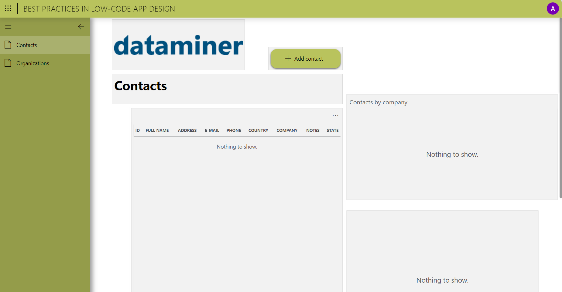
To add sample contacts to the application, click the Add contact button.
In the pop-up window, provide the name, address, email address, phone number, country, and company of the contact, along with any additional notes about the contact.
Click the + Add button at the bottom of the form.
Step 2: Customize the app color and icon
The app's primary color results in low contrast between the text and the background color in the sidebar (visible when fully expanded).
Additionally, the app does not have a customized, identifiable icon. These are the first two aspects you will look into.
Click the user icon in the top-right corner of the app and select Edit.
If you are using a more recent DataMiner version (DataMiner 10.3.0 [CU18]/10.4.0 [CU6]/10.4.9 onwards or higher), click the pencil icon in the top-right corner instead.
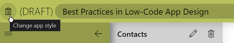
Click the clipboard icon in the top-left corner to open the app's theme editor. Here you can change your app's icon and color.
Enter the following hex value in the Hex field in the lower left corner: #503e6f.
Optionally, choose your color of choice, but make sure there is enough contrast between the background color and the text color (#000000 or #ffffff, depending on the background color).
Tip
If you are uncertain about the contrast, use the online Contrast Checker tool.
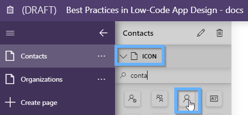
Next, enter contact in the filter box and select the Contact icon.
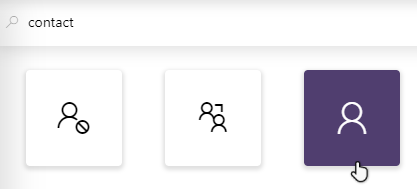
Optionally, select your icon of choice.
Click the new icon in the top-left corner to exit the theme editor.
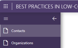
Step 3: Add page icons
The different pages currently still have generic icons, which makes them hard to distinguish.
Make sure the page is selected in the leftmost pane of the app editor.
In the icon section in the top-left corner of the app, select your icon of choice.
Repeat these steps for the second page.
In this example, the contact icon was chosen for the Contacts page and the eDiscovery icon for the Organizations page.
Step 4: Configure a new theme
To ensure an aesthetically pleasing app, start with an appealing theme, which determines default styling for pages and components. Applying a good theme can make your app look a lot better with limited effort.
Click the user icon in the top-right corner, and select View published app to temporarily leave edit mode.
If you are using a more recent DataMiner version (DataMiner 10.3.0 [CU18]/10.4.0 [CU6]/10.4.9 or higher), click the ellipsis button ("...") in the top-right corner instead, and select View published app.
Click the
 icon in the top-left corner, and select Dashboards.
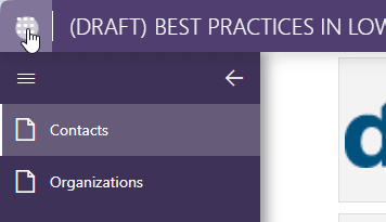
Click the user icon in the top-right corner, and select Settings.
Click + New theme.
In the New theme pop-up window, enter a theme name.
Configure the following properties for the theme:
Background color: rgb(243,243,245)
Title > Font size: 16px
Title > Alignment: Center
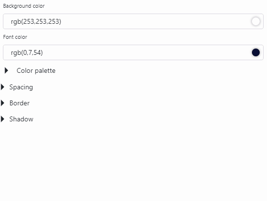
Color > Background color: rgb(253,253,253)
Color > Font color: rgb(0,7,54)
Color > Color palette:
Color 1: rgb(139,115,255)
Color 2: rgb(66,204,126)
Color 3: rgb(255,72,66)
Color 4: rgb(255,194,8)
Color 5: rgb(255,152,97)
Spacing > Vertical Margin: 8px
Spacing > Horizontal Margin: 8px
Spacing > Vertical Padding: 10px
Spacing > Horizontal Padding: 10px
Border > Roundness: 5px
Border > Style: Line
Border > Sides: Top, Right, Bottom, Left
Border > Thickness: 1px
Border > Color: rgb(233,234,237)
Click the Duplicate button next to the default component theme and change the component theme name from "Default (1)" to "Transparent".
Edit the following component style properties:
Set the opacity of the background color to 0%.
Set the opacity of the border color to 0%
Click Create in the lower right corner to save the theme.
In the list of themes, click the Duplicate button next to your new theme to create a copy of the theme.
Click the pencil icon next to it, and change the name of your theme so that it ends in "- Panel", e.g. "Tutorial theme - Panel".
This is the theme you will use for the app panels.
Set the background color to rgb(253,253,253).
Edit the following component style properties:
Title > Font size: 14px
Color > Background color: rgb(248,248,249)
Click Save in the lower right corner.
Step 5: Apply the new theme
Now that you have created a theme, you can apply it to your low-code app.
Click the
 icon in the top-left corner, and select the Best Practices in Low-Code App Design application.
Click the user icon in the top-right corner, and select Edit.
If you are using a more recent DataMiner version (DataMiner 10.3.0 [CU18]/10.4.0 [CU6]/10.4.9 or higher), click the pencil button in the top-right corner instead.
Make sure the Contacts page is selected in the leftmost pane of the app editor.
Depending on your DataMiner version, you may need to click the pencil icon next to "Contacts".
Make sure no components are selected, and navigate to the Layout pane on the right.
Click the box indicating the currently used theme.
A list of available themes will be displayed below the box.
Select the theme you just created in the previous step.
Make sure components displaying titles, buttons, and images do not have a background color:
Select the component, and navigate to Layout > Styles in the configuration pane to the right.
Click the box indicating the currently used theme, and select Transparent.
Click the
 icon in the header bar.
As you can see, the app already looks better. For example, note the clearly distinguishable colors in the pie chart compared to the default theme.
Step 6: Improve the page layout
Set the page to 'fit to view'
To ensure the page adapts to different screen sizes and avoids scroll bars, set it to Fit to view:
Click the user icon in the top-right corner, click Edit, and click the pencil icon in the pane to the left.
If you are using a more recent DataMiner version (DataMiner 10.3.0 [CU18]/10.4.0 [CU6]/10.4.9 or higher), click the pencil icon in the top-right corner instead.
Navigate to Settings > Page/Panel configuration in the configuration pane to the right.
Enable the Fit to view setting.
Rearrange and resize the components
Rearrange and resize components on the page, following these guidelines:
Maintain equal spacing on both sides of the page.
Use available space effectively, minimizing excessive white space.
Align components both vertically and horizontally, ensuring consistent height.
Adjust component widths; if multiple components share a row and are equally important, keep their widths identical (e.g. a chart and grid component each occupy 1/3rd of the width).
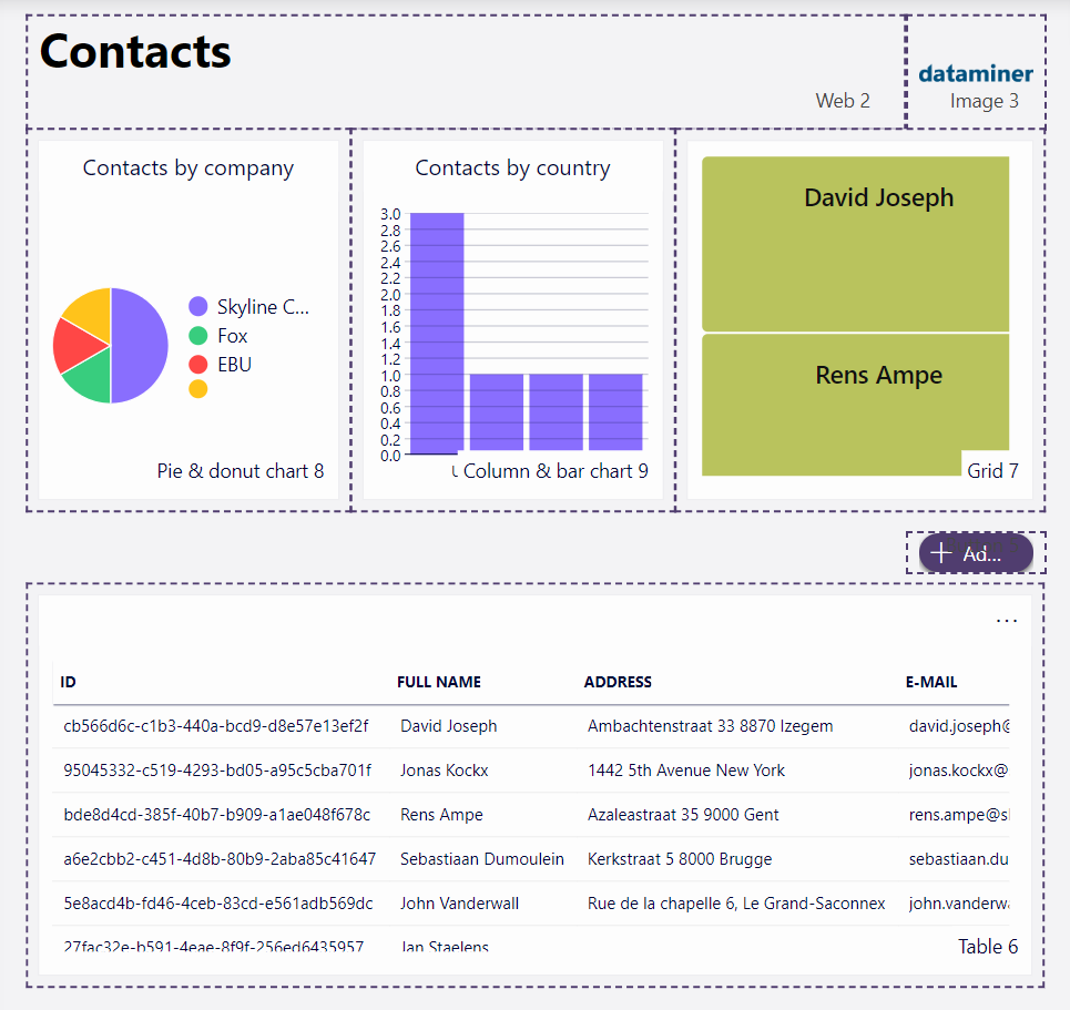
Here is an example of a rearrangement for a visually appealing result:
Step 7: Enhance the titles
Titles can be more than simple text boxes. To make them a little more interesting, use a web component and incorporate HTML. In the app, a web component is already used to display the title. However, the HTML is rather basic.
Select the web component that displays the Contacts title, and go to the Settings pane on the right.
Paste the following HTML in the HTML field:
<div style="height:100%;display:flex;flex-direction:column;justify-content:center;margin:0;"><H1 style="color: rgb(0,9,54); font-family:'Segoe UI Light','Segoe UI Web Light','Segoe UI Web Regular','Segoe UI','Segoe UI Symbol',HelveticaNeue-Light,'Helvetica Neue',Arial,sans-serif;margin:0;font-weight:100;font-size:24px">
<b>Contacts</b> </H1>
<p style="color: rgb(0,9,54,0.7); font-family:'Segoe UI Light','Segoe UI Web Light','Segoe UI Web Regular','Segoe UI','Segoe UI Symbol',HelveticaNeue-Light,'Helvetica Neue',Arial,sans-serif;margin:0;font-weight:600;font-size:16px">
An overview of your contacts
</p>
</div>
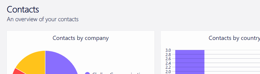
The result should look like this:
Step 8: Enhance the contact forms
You may have noticed earlier, but the form used for creating new contacts also has room for improvement.
Change the form layout
In the panels section to the left, select the pencil icon next to Contact Form.
Go to the Layout pane on the right, and click the box indicating the currently used theme.
Select the theme you created earlier, which ended in "- Panel".
In the Settings pane, enable the Fit to view setting to take on the full panel height.
Hover your mouse pointer over the +Add button component and select the trash icon.
Extend the height of the form all the way to the bottom, and adjust the width to occupy most of the available space.
Add a new title
Add a web component above the form.
Tip
See also: Configuring components
Go to the Settings pane on the right, and paste the following HTML in the HTML field:
<div style="height:100%;display:flex;flex-direction:row;justify-content:space-between;align-items:center;margin:0;margin:0 4%;"><H1 style="color: rgb(0,9,54); font-family:'Segoe UI Light','Segoe UI Web Light','Segoe UI Web Regular','Segoe UI','Segoe UI Symbol',HelveticaNeue-Light,'Helvetica Neue',Arial,sans-serif;margin:0;font-weight:100;font-size:20px">
<b>New contact</b> </H1>
<p style="color: rgb(0,9,54,0.7); font-family:'Segoe UI Light','Segoe UI Web Light','Segoe UI Web Regular','Segoe UI','Segoe UI Symbol',HelveticaNeue-Light,'Helvetica Neue',Arial,sans-serif;margin:0;font-weight:600;font-size:14px">
Here you can <b style="color: rgb(0,9,54)">create</b> a new contact.</p></div>
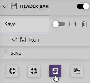
Add a functional save button to the header bar
Click the "+" button in the top-right corner and label it "Save".
In the header bar section, select Icon and enter "Save" in the filter box.
Select the Save icon.
Configure an on-click action:
Select Events, and click the Configure actions button next to On click.
From the dropdown list, select Execute component action.
Specify the following details:
I want to: Form, Save current Changes
Which form?: Form 1
Select Upon completion, and add a Close a panel action.
In the Panel box, select "This panel(Contact Form)".
Select Upon completion, and add a second Execute component action.
Specify the following details:
I want to: Table, Fetch the data
Which table?: Table 6
Click Ok in the lower right corner of the pop-up window.
Configure a functional close button
Click + Add in the top-right corner, and rename it "Close" in the header bar section.
In the Icon section, enter "Close" in the filter box, and select the "X" icon.
Configure an on-click action:
Select Events, and click the Configure actions button next to On click.
From the dropdown list, select Close a panel.
In the Panel box, select "This panel(Contact Form)".
Click Ok in the lower-right corner of the pop-up window.
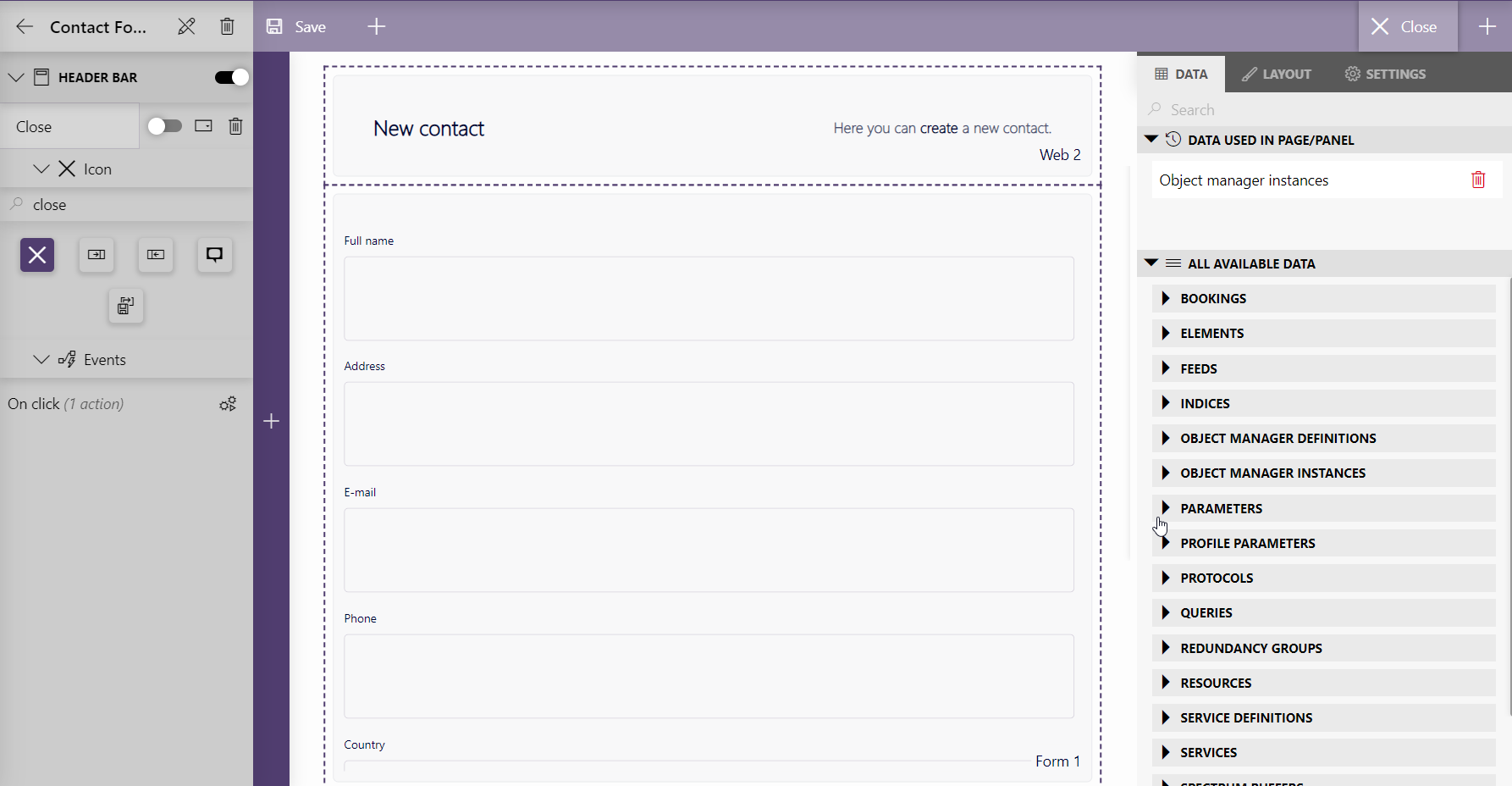
In edit mode, the panel should resemble this:
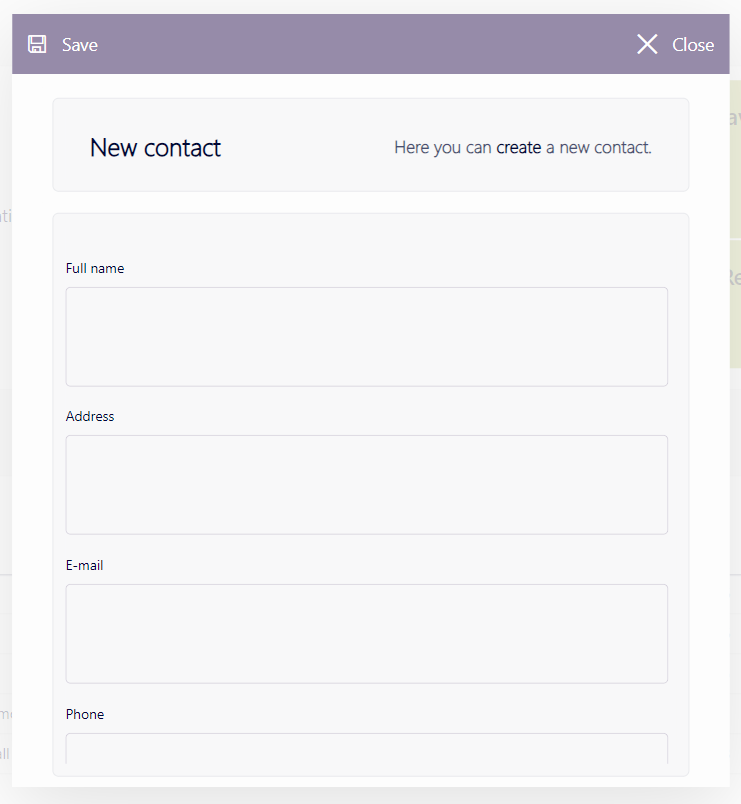
Once you publish the app and click the Add contact button, the panel should look similar to this:
Step 9: Enhance the appearance of the grid component
Avoid using too many colors in one app. Currently, the grid component in our sample app is too colorful.
In edit mode, select the grid component and navigate to Layout > Item templates in the configuration pane to the right.
Click Edit to access the Template Editor.
Select the Rectangle layer in the side pane to the left.
In the Setting pane to the right, change the color of the rectangle to #D3D3DB.
Select Save in the lower right corner of the Template Editor.
Navigate to Layout > Advanced and click the two
 icons to auto-size the rows and columns.
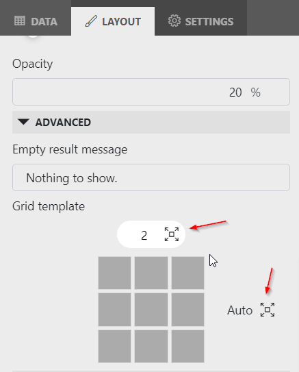
Step 10: Enhance the appearance of the table component
Last but not least, you will improve the appearance of the table component displaying the different contacts.
Reduce the number of columns
Reduce the number of columns displayed in the table component by adding a filter:
Navigate to Data > All available data > Queries in the pane to the right, and select Contacts.
Click and drag the different necessary columns onto the yellow filter icon in the table component.
Important
Never show guides in a table!
Edit the table template
You can improve the appearance of each column by editing the template applied to that column:
Select the table component, and go to Layout > Column appearance in the pane to the right.
Select Full name from the Select a column dropdown list.
Click the ellipsis button ("...") in the top-right corner and select Customize preset.
To modify the template settings, make sure no layers are selected by clicking the gray background.
In the Settings pane to the right, you now see the Dimensions settings for the entire template.
Change the height of the template to 46 to make your table rows taller.
Select the Text layer in the side pane to the left, and specify the following properties in the Settings pane:
Border radius: 5px
Horizontal padding: 35px
Vertical padding: 5px
Tip
For more information about the different Text layer properties, see Customizing layer appearance and behavior.
Make the font bold by entering the following HTML in the text box:
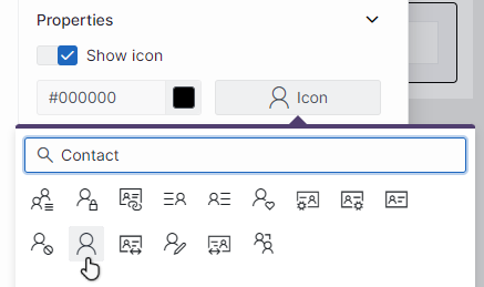
<span style="font-weight:500">{Full name}</span>In the side pane to the left, switch to the Tools tab, and click Icon.
Add an icon to the left of the
{Full name}text.Tip
For more information about adding an icon, see Adding new layers.
In the Properties section of the Settings pane, click Icon and choose a fitting new icon, e.g. an icon depicting a person.
In the Dimensions section of the Settings pane, specify the following properties:
Width: 16px
Height: 16px
Top: 15px
Left: 13px
Tip
See also: Resizing and positioning a layer.
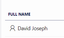
Click Save in the lower right corner.
In the header bar of the low code app, click the
button to publish the app.The Full name column should now appear like this:
Repeat these steps for the E-mail and Phone columns, using different appropriate icons.
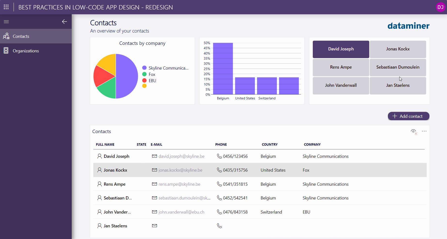
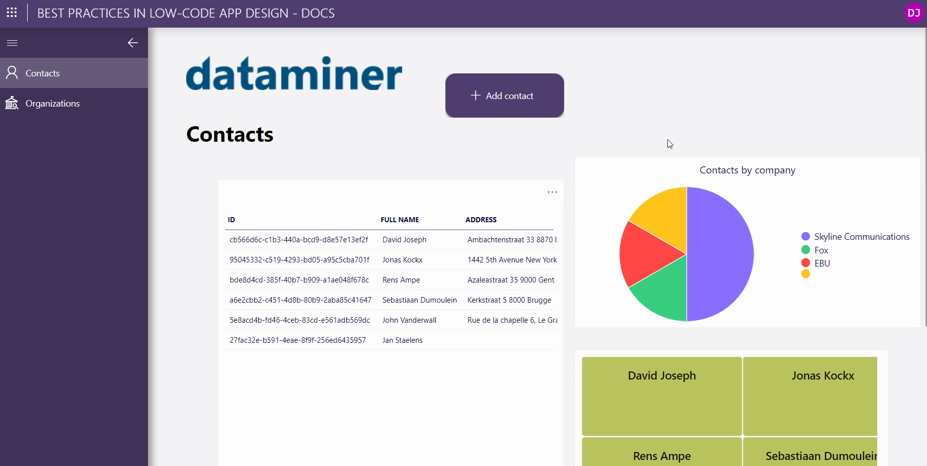
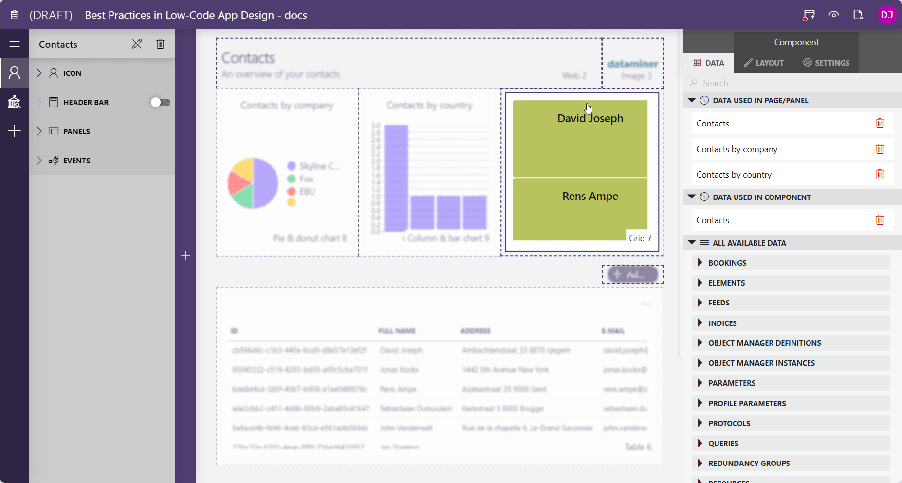
Once you are finished, your final result should resemble this: