Grid
Available from DataMiner 10.4.0/10.4.1 onwards.
The grid component is a versatile visualization designed to display the results of queries in a clear, tile-based grid format. It offers a wide range of customization options, including dynamic scaling, conditional formatting, and interactive features that let you trigger actions directly from each grid block.

Grid component in DataMiner 10.5.6
With this component, you can:
Instantly assess the status of items, thanks to conditional formatting, e.g. red may indicate a service is in alarm.
Use grid selections to pass data to other components. For example, clicking a grid item can control what's displayed in a different component.
Interact with individual blocks to trigger actions, such as opening a pop-up window with more details about an upcoming event.
Focus on items that meet specific criteria, with unmatched blocks automatically dimmed to reduce visual noise.
Stay focused and avoid overwhelming views, even when there is a lot of data. You can limit how many grid blocks appear at once, while still being able to explore everything intuitively.
Interested in getting some hands-on experience with the grid component? Follow this beginner-friendly tutorial!

Navigating grid content
A grid component displays a number of columns and rows, depending on the layout options configured in the Grid template section of the Layout pane. These settings determine how many items are shown at once.
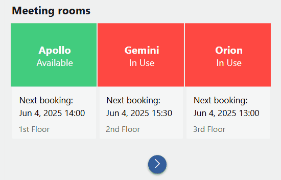
If there are more items than can fit in the grid, navigation arrows appear below it. Click these arrows to move forward and backward through the additional items.
Grid component in DataMiner 10.5.7
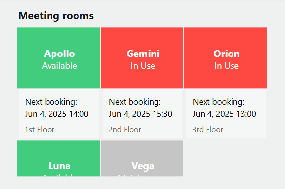
If the individual grid blocks are too large to fit within the visible area of the component, a scrollbar appears when you hover over the grid. Use this scrollbar to scroll through the content.
Grid component in DataMiner 10.5.7
Note
You can edit the size of the grid blocks in the Template Editor.
From DataMiner 10.3.0 [CU11]/10.4.2 onwards, grid components support the following touch interactions on mobile devices:
Swipe with one finger to scroll horizontally or vertically.
Tap to select grid items.
Supported data types
The grid component is used to display the results of queries in grid format. It should therefore always be configured with query data input.
Each row in a query corresponds to an item in the grid.
Tip
For an example of how to configure a GQI query that can be used as data input for a grid component, see Tutorial: Getting started with the grid component.
Using the grid as a selector
You can use a grid component as a dynamic selector, i.e. a component whose selection determines behavior or data elsewhere in your dashboard or app. A common use case is controlling what is shown in another component, but selected values can also serve as input for scripts, queries, or conditional behavior.
When you select an item in the grid, the selected data (All available data > Components > Grid # > Selected items > Tables) becomes automatically available for use in other components.
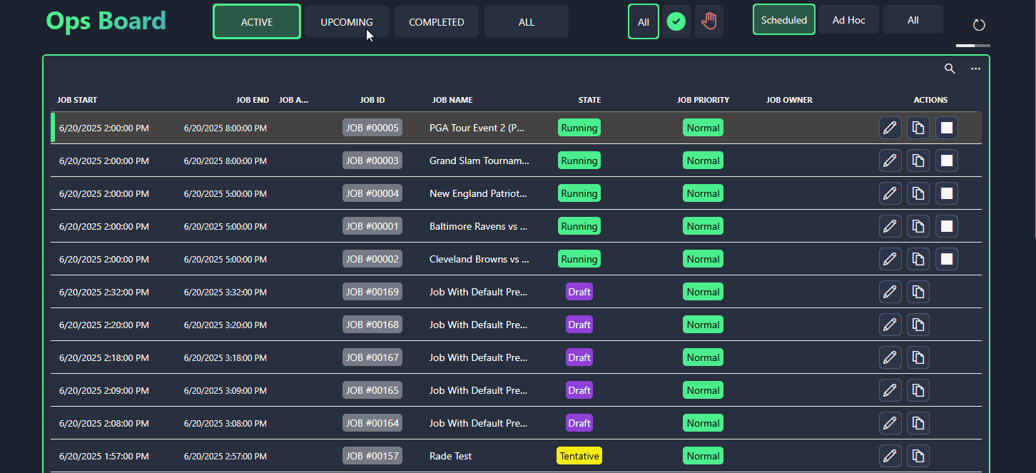
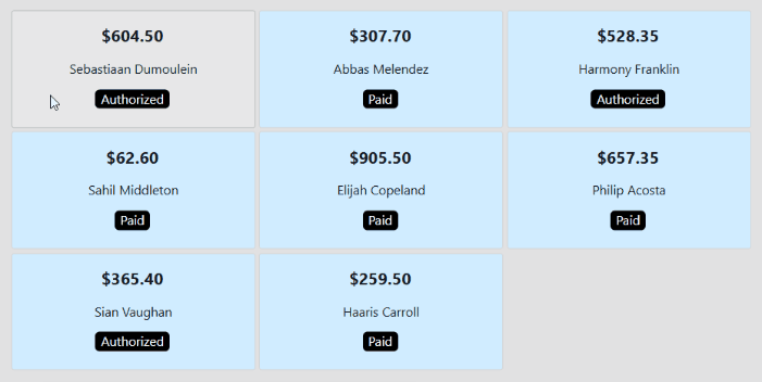
In the example below, a grid filters a table component based on job state. By selecting a grid item, users can quickly switch between active, upcoming, completed, or all jobs.
Grid component and table component in DataMiner 10.5.7
To clear the selection in a grid, keep Ctrl pressed and click each selected item.
Configuration options
Grid layout
In the Layout pane, you can find the default options available for all components. See Customizing the component layout.
Additionally, the following layout options are also available:
| Section | Option | Description |
|---|---|---|
| Filtering & Highlighting | Highlight | Toggle the switch to determine whether the nodes that match the criteria specified in a query filter will be highlighted. Enabled by default. For more information, see Highlighting filtered results. |
| Filtering & Highlighting | Opacity | Set the level of transparency of the items that do not match the criteria specified in a query filter. This option is only available when Highlight is enabled. For more information, see Highlighting filtered results. |
| Advanced | Empty result message | Available from 10.3.11/10.4.0 onwards. Specify a custom message that is displayed when a query returns no results. See also: Displaying a custom empty component message. |
| Advanced | Grid template | Configure the number of columns and rows in the grid, and adjust scaling options. For more information, see Layout and scaling options. |
| Item templates | Browse templates or Reuse template (prior to DataMiner 10.4.0 [CU13]/10.5.0 [CU1]/10.5.4) |
Reuse a saved template from another component in the same dashboard or low-code app. This option is only available if a template is already in use. |
| Item templates | Edit | Open the Template Editor to customize the appearance of grid items and configure actions, such as opening a panel when a cell is selected. For more information, refer to Customize grid items. |
Note
- When you disable the Highlight option, items that do not match the filter will no longer be displayed, and the remaining items will be reorganized.
- Prior to DataMiner 10.4.0 [CU13]/10.5.0 [CU1]/10.5.4, the option to reuse a template is only available if another grid component in the same dashboard or low-code app uses a template.
Layout and scaling options
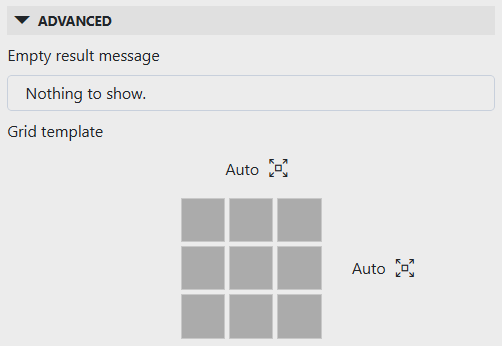
In the Layout pane, under Advanced > Grid template, you can configure the number of columns and rows displayed in the grid component and choose how items scale within the available space.
Grid layout settings in DataMiner 10.5.7
By default, the number of displayed columns and rows is set to Auto (i.e. all columns and/or rows are displayed). To specify a fixed number, clear the checkbox and enter the desired value(s). To revert to Auto, delete the entry.
To switch between scaling options, click the icon next to the column or row count:
 : The cells are scaled dynamically to fit the grid.
 : The cells have a fixed size. This is the default setting.
Note
The number of items that can be displayed in a grid component is limited to 1000.
Customizing grid items
Using the Template Editor, you can fully customize the appearance of each grid item (or block). Thanks to conditional formatting, each item can be styled differently to highlight key information.
To edit the grid item template:
In the Layout pane, navigate to the Item templates section.
This section shows a preview of the template currently applied to the grid component.
Click Edit to open the Template Editor.
Make your changes as described under Using the Template Editor.
More of a visual learner? Watch the Introducing grid components video tutorial to see the Template Editor at work!
Some real-life examples:
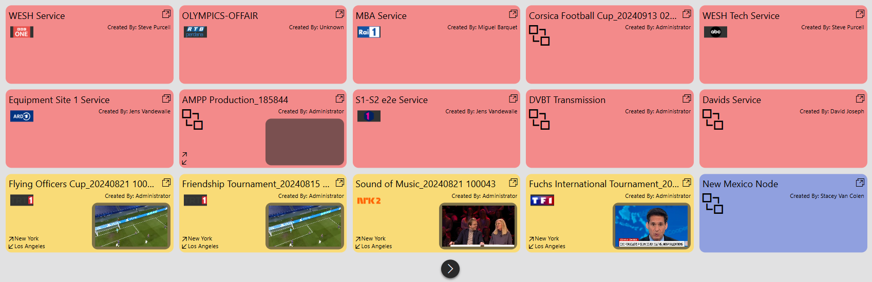
In this example, each block represents a service. The background color reflects the current alarm status, while small media players and logos make it easy to identify which services are affected just by scanning the page.
Grid component in DataMiner 10.5.7This example shows a grid component used on the landing page of an event management app. It shows the next five upcoming events. Each block displays basic details like the event title and its start and end time.

Grid component in DataMiner 10.4.3Tip
While basic event details are already displayed, you can configure the grid to open a panel with additional information when a user clicks an item. For more info, see Adding actions to a grid.
Default grid template
By default, the template of a grid component includes the following pre-configured layers:
| Layer | Type | Description |
|---|---|---|
 |
Text | Displays the value from the first column in the data source. |
 |
Rectangle | Acts as the background of each grid block. Default color is #F6F6F6, with conditional formatting for hover (#E8E8E9) and selection (#D5DBE9). |
 |
Rectangle | Acts as a visual border by being slightly larger than the background layer. Default color is #B8BABC, with conditional formatting for selection (#2563EB). |
This default template (available from DataMiner 10.4.0 [CU13]/10.5.0 [CU1]/10.5.4 onwards) ensures that a grid block is highlighted when hovered over and stands out when selected, with a light-blue background and a blue border.
Grid component in DataMiner 10.5.7
This can for instance be useful when the grid's component data (i.e. Components > Grid # > Selected items > Tables) is used in another component. The highlight helps users identify which data is driving the content of the linked component.
Highlighting filtered results
To visually distinguish items that match your filter criteria from others, you can combine the Highlight option with a query filter component. This allows you to lower the opacity of non-matching items while keeping relevant results clearly visible.
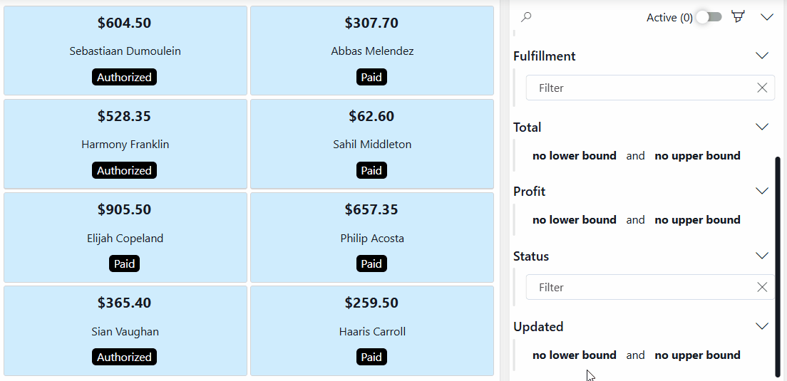
Grid component and query filter component in DataMiner 10.5.6
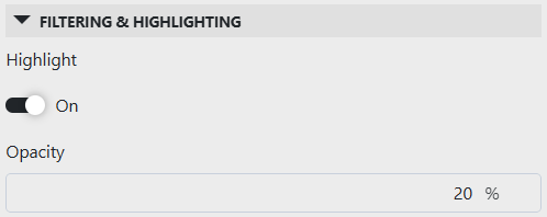
In the Layout pane, make sure the Filtering & Highlighting > Highlight option is enabled.
Set your preferred opacity, e.g. 20 %. This determines how clearly you will see the grid items that do not meet the criteria specified in the query filter.
Grid layout settings in DataMiner 10.5.7Add a query filter visualization to your app or dashboard.
Apply the same query data to the query filter that is used by the grid component.
In the Data pane, navigate to All available data > Components > Query filter #, and drag the Query columns data item onto your grid component.
In read mode, you can now use the query filter component to filter and refine the data displayed in the grid component. Items that do not meet the specified criteria will be shown with lowered opacity.
Grid settings
In the Settings pane for this component, you can customize its behavior to suit your requirements.
| Section | Option | Description |
|---|---|---|
| WebSocket settings | Inherit WebSocket settings from page/panel | Clear the checkbox to use a custom polling interval for this component. When cleared, you can specify a different polling interval (in seconds). |
| General | Override dynamic units | Clear the checkbox to prevent parameter units from changing dynamically based on their value and protocol definition. Disabled by default. |
| General | Use dynamic units | Determine whether parameter units will change dynamically based on their value and protocol definition. This option is only available if Override dynamic units is enabled. |
| Data retrieval | Update data | Toggle the switch to determine whether the data in the grid should be refreshed automatically (provided this is supported by the data source). See Query updates. |
| Initial selection | Select first item by default | Available from DataMiner 10.3.6/10.4.0 onwards. Toggle the switch to determine whether the first item is selected by default. When enabled, this is the value that will automatically be applied in the grid whenever the component is loaded or when the data in the grid is refreshed, unless a custom URL is used specifying a different value. Disabled by default. |
Adding actions to a grid
If you add a grid component to a low-code app, you can configure actions that are triggered when users interact with elements inside the grid. This feature is not supported in the Dashboards app.
In the Template Editor, you can define actions for grid items. These actions can be triggered by the On click event of a shape in the item template, allowing you to define your own links or buttons inside the grid.
Tip
For more information, see Adding conditional cases to a layer.
Some real-life examples:
In the example below, grid components are used to connect sources to destinations. By configuring on-click actions behind the scenes, users can select sources and destinations in read mode and connect or disconnect them directly.
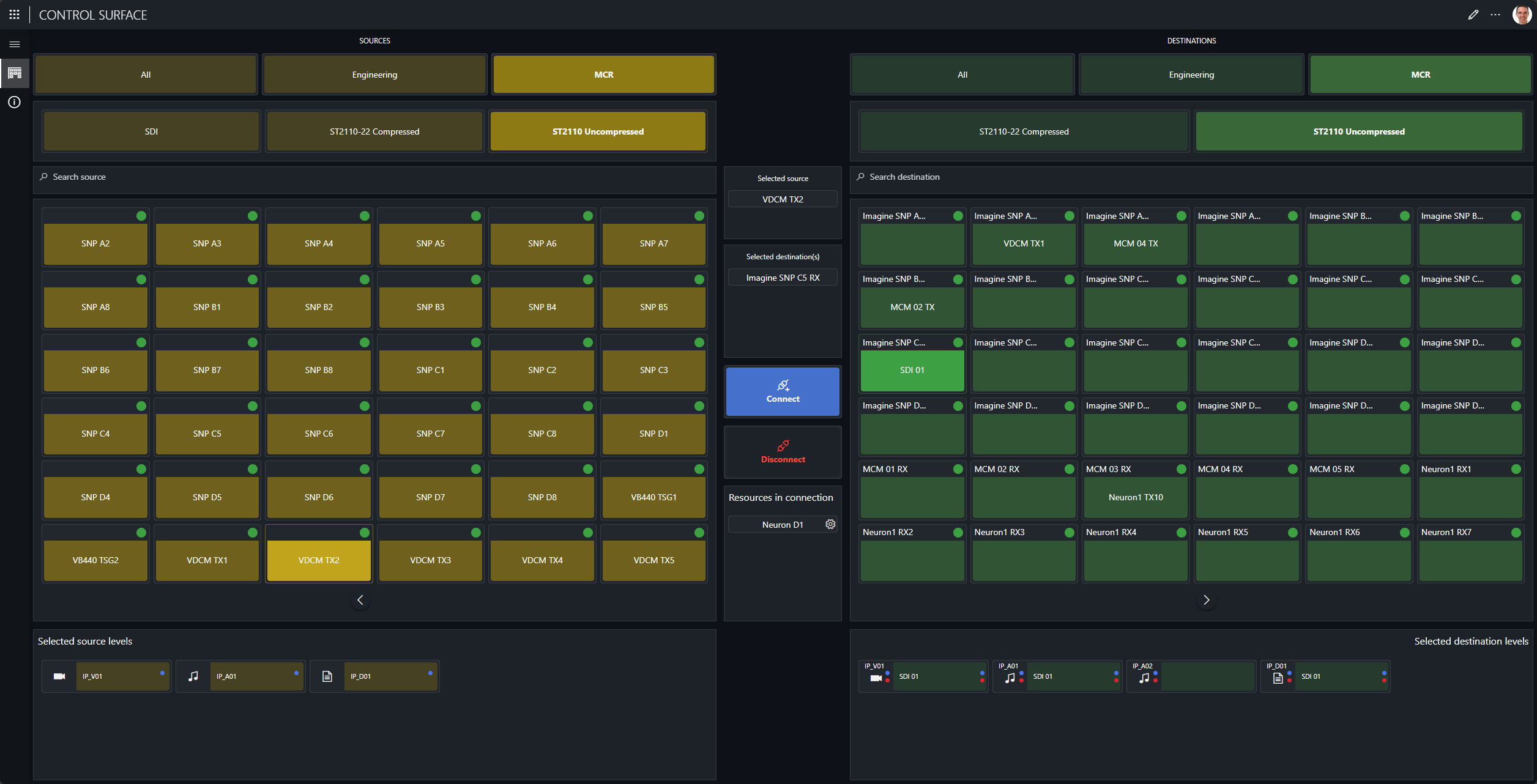
Grid component and button component in DataMiner 10.5.1In this example, an on-click action is configured on a pencil icon within each grid item. When a user clicks the icon, a pop-up panel opens, allowing them to edit the corresponding contract directly.
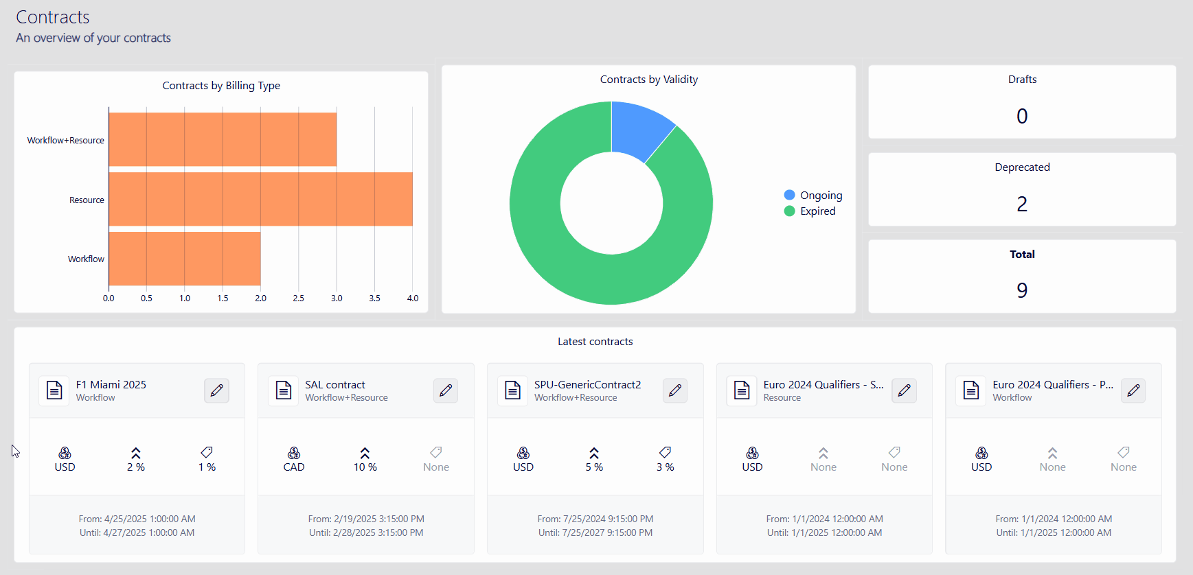
Low-Code Apps module in DataMiner 10.5.7
Enabling the component in soft launch
From DataMiner 10.2.12 onwards, the grid component is available in soft launch, if the soft-launch option ReportsAndDashboardsDynamicVisuals is enabled. For more information, see Soft-launch options.
If you use the preview version of the grid component, its functionality may be different from what is described on this page.