Node edge graph
Note
This feature is in preview until DataMiner 10.1.5. If you use the preview version of the feature, its functionality may be different from what is described below. For more information, see Soft-launch options.
Available from DataMiner 10.2.0/10.1.5 onwards. Prior to this, the component is available in soft launch, if the soft-launch option ReportsAndDashboardsPTP is enabled.
This component allows you to visualize any type of objects (i.e. "nodes") and the connections between them (i.e. "edges"). By linking parameters and properties to those nodes and edges, you can turn a node edge graph into a full-fledged analytical tool that shows real-time alarm statuses and KPI data.
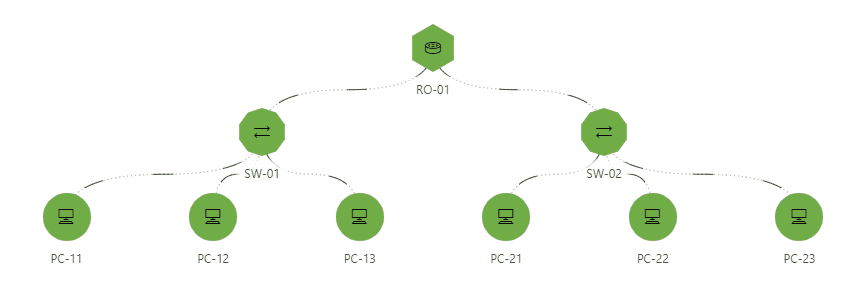
Node edge graph component in DataMiner 10.4.9
The data necessary to create a node edge graph can be provided by means of GQI queries. Node queries provide data that will be visualized as nodes (i.e. objects), whereas edge queries provide data that will be visualized as edges (i.e. connections between objects). Clicking items in the node edge graph also makes these available as data for other components. Keeping the Ctrl key pressed while you click them allows you to select multiple items at the same time.
When edges are closely grouped together, edge labels may become minimized. If you hover the mouse pointer over the edge, the label becomes visible again. From DataMiner 10.3.0 [CU4]/10.4.0 [CU2]/10.4.5 onwards, you can press Ctrl+Space to display all labels in the node edge graph.
The component uses dynamic coloring, which can be adjusted according to preference. When you hover the mouse pointer over a node or edge, a tooltip is displayed with detailed info. Click the circle in the top-right corner of the tooltip to switch between different coloring modes for all the nodes or edges of this type:
Static: Edges have no color, nodes have the color from the node settings.
Analytical: If you select this mode, further below in the tooltip you can select any of the columns that have a color filter applied (cf. configuration below) to make this the dominant column. This column is then indicated in bold and determines which color is used in the graph. The value of this column is also displayed under the nodes or edges. If WebSocket communication is enabled, the colors and values will be updated in real time to match parameter value updates.
Alarm: Nodes and edges are colored according to the highest severity of the parameters in the tooltip.
Basic component configuration
Add the query data that will represent the nodes and edges.
In the Settings pane, assign the queries as nodes or edges:
In the box representing each query, click either Set as node or Set as edge.
If a query is set as node, it will move to the nodes section. If a query is set as edge, it will move to the edges section.
Once a query has been set to be a node or edge, you can still change this setting by clicking the node or edge icon in the top-right corner of the query box.
Configure the nodes as follows:
Next to Node ID column, select the column from the query that represents the node ID.
Next to X and Y, select the column from the query that contains the X and Y positions respectively. This setting is only available when the Node positions setting in the Layout pane is set to Linked as data (available from DataMiner 10.3.0 [CU15]/10.4.0 [CU3]/10.4.6 onwards).
Optionally, expand the Base node section to configure the node further. The following options are available:
Node name: This name is not displayed in the component itself, and is only intended to clarify the configuration.
Weight: A number indicating the relative importance of the node. The higher the number, the more important the node, which determines where it is displayed in the graph (depending on the layout settings).
Shape: Select a different shape in the dropdown box to customize the node shape. By default, no shape is used. You can also select Custom in the dropdown box in order to get additional options that allow you to create a fully customized shape instead of one of the available presets. Click the circle to the right of the dropdown box to select a custom color for the shape.
Visual: Available from DataMiner 10.3.0 [CU15]/10.4.0 [CU3]/10.4.6 onwards. Choose whether to show an icon or custom image within the node shape.
Icon: Select a different icon from the dropdown box to customize the icon shown within the node shape. Click the circle to the right of the box to select a custom color. From DataMiner 10.3.0 [CU15]/10.4.0 [CU3]/10.4.6 onwards, this setting is only available if the Visual setting is set to Icon.
Image: Only available if the Visual setting is set to Image. Enter a custom image link.
Label: Select the column to use as the label for the node.
Size: From DataMiner 10.3.0 [CU15]/10.4.0 [CU3]/10.4.6 onwards, use the slider to adjust the size of the node, with a minimum of 1 px and a maximum of 100 px (default: 48 px). Prior to DataMiner 10.3.0 [CU15]/10.4.0 [CU3]/10.4.6, select whether the node should be small, medium-sized, or large.
Enable tooltip: Available from DataMiner 10.3.0 [CU15]/10.4.0 [CU3]/10.4.6 onwards. This setting is only available when the parameter showAdvancedSettings=true is added to the URL. When this option is enabled, a tooltip is shown when the mouse pointer hovers over a node. This setting is enabled by default.
Show metric: Available from DataMiner 10.3.0 [CU15]/10.4.0 [CU3]/10.4.6 onwards. This setting is only available when the parameter showAdvancedSettings=true is added to the URL. When this option is enabled, the metric that determines the conditional color of the node will not be displayed underneath the node.
If you want to visualize some nodes differently for the same query, under Override nodes, click Add override, specify a filter, and configure the nodes as detailed above.
Configure the edges as follows:
In the Source box, select the column from the query that represents the source of the connection. To the right of the drop-down list, click the icon representing the source node.
In the Destination box, select the column from the query that represents the destination of the connection. To the right of the drop-down list, click the icon representing the destination nodes.
Optionally, expand the bidirectional configuration section (available from DataMiner 10.1.11/10.2.0 onwards) to configure how multiple edges between two nodes should be mapped.
Optionally, next to Style, select a different style for the connection lines.
Optionally, next to Weight, specify a number to indicate the relative importance of the edge. This will determine the thickness of the connection line.
Enable tooltip: Available from DataMiner 10.3.0 [CU15]/10.4.0 [CU3]/10.4.6 onwards. This setting is only available when the parameter showAdvancedSettings=true is added to the URL. When this option is enabled, a tooltip is shown when the mouse pointer hovers over an edge. This setting is enabled by default.
Show metric: Available from DataMiner 10.3.0 [CU15]/10.4.0 [CU3]/10.4.6 onwards. This setting is only available when the parameter showAdvancedSettings=true is added to the URL. When this option is enabled, the metric that determines the conditional color of the edge will not be displayed underneath the edge.
From DataMiner 10.2.4/10.3.0 onwards, optionally, you can make the edges show a direction. To do so, in the Settings pane, activate the Visualize directions toggle button, and select how the direction should be shown:
Flow: The direction is visualized by means of animated edges. This is the default option.
Arrows: The direction is visualized by means of arrows drawn on the edges. If you select this option, you can also specify the exact position of the arrows on the edges.
From DataMiner 10.4.0 [CU12]/10.5.3 onwards, in case the component displays a query source and you want the data to be refreshed automatically, enable the Update data option in the Settings pane.
From DataMiner 10.4.0 [CU10]/10.5.1 onwards, you can configure whether pressing the Ctrl key is required to zoom in or out. To do so, in the Layout pane, toggle the Advanced > Hold Ctrl to zoom option:
Enabled: Hold the Ctrl key while scrolling up or down to zoom in or out.
Disabled: Scroll up or down to zoom in or out. This is the default option.
This setting is only available if the Zooming setting is enabled in the Layout pane.
Component actions configuration
If you add a node edge graph to a custom app using the DataMiner Low-Code Apps, you can also configure actions for the component. This feature is not available in the Dashboards app.
To configure actions:
In the Component > Settings pane, under the nodes or edges you want to configure actions for, expand the Actions section.
Click Add action.
To specify how the action is triggered, at the top of the action configuration section, click the icon for click, double-click, or button in tooltip.
In the Label box, specify a label for the action.
In the Icon box, select an icon for the action.
In the Action box, select the action that should be executed. See Configuring low-code app events.
You can configure the following component actions:
Fetch the data: Fetches the data for the component. Available from DataMiner 10.2.10/10.3.0 onwards.
Clear selection: Clear the data status of the component. Available from DataMiner 10.3.0 [CU14]/10.4.0 [CU2]/10.4.5 onwards.
Note
You can also override the default action for a node or edge using the Add override option.
Layout configuration
You can fine-tune the layout of the component with the following settings in the Layout pane:
Column filters: Only available up to DataMiner 10.1.10. Optionally, you can specify color filters for specific columns, so that these can be used for highlighting in case analytical coloring is used. Users can switch to this coloring mode via the tooltip of a node or edge. To configure a color filter:
If the column you want to use for highlighting contains values for which a specific range can be specified, select the column, indicate the range to be highlighted, select the range and then click the color icon on the right to specify a highlight color. Multiple ranges can be indicated for one column, each with a color of its own.
Alternatively, from DataMiner 10.20/10.1.8 onwards, you can filter on specific text instead. To do so, select the column you want to use for highlighting, specify the text, and select the highlight color. By default, the value will need to be equal to the specified text to be highlighted. However, you can change this by clicking equal above the text box and selecting contain or match regex instead, depending on the type of filtering you want to apply. You can also apply a negative filter by clicking does, which will make this field switch to does not instead.
Multiple filters can be applied on the same value. In that case, the filters will be applied from the top of the list to the bottom. Positive filters will get priority over negative filters.
You can remove a column filter again by selecting No color instead of a specific color.
Filters & Highlighting: Available from DataMiner 10.1.11/10.2.0 onwards. Allows you to configure a number of filtering and highlighting options. However, note that the filtering options require the Query filter component, available from DataMiner 10.3.9/10.4.0 onwards.
Conditional coloring: (Replaces the Column filters option from prior to 10.1.11.) This option allows you to specify color filters for specific columns, so that these can be used for highlighting in case analytical coloring is used. Users can switch to this coloring mode via the tooltip of a node or edge. To configure a color filter:
If the column you want to use for highlighting contains discrete values, click the color icon next to a value and then specify a highlight color for that value. If there are too many values to easily list them, you will first need to specify a filter in order to select a value.
If the column you want to use for highlighting contains values for which a specific range can be specified, select the column, indicate the range to be highlighted, select the range and then click the color icon on the right to specify a highlight color. Multiple ranges can be indicated for one column, each with a color of its own.
Highlight: When this option is enabled, the nodes that match the filter will be highlighted. Default: Enabled
Opacity: When the Highlight option is enabled, this option will allow you to set the level of transparency of the nodes and edges that do not match the filter.
Note
When you disable the Highlight option, the nodes that do not match the filter will no longer be displayed and the remaining nodes will be reorganized.
Highlight/Show entire path: When this option is enabled, not only the nodes matching the filter will be highlighted, but also the entire tree structure they are a part of (from root to leaves).
Node positions: Allows you to change how the nodes are positioned within the component.
The following options are available:
Layered: Nodes are displayed in different layers. This is the default option.
Custom: Allows users with editing permission to drag and drop the nodes to a custom position. In that case, it is also possible to select a group of nodes by keeping the Ctrl key pressed while clicking them, and then move them together.
Linked to data: Available from DataMiner 10.3.0 [CU15]/10.4.0 [CU3]/10.4.6 onwards. Location information from your data is used to determine the node positions. To use this feature, your data must include at least two numeric columns representing the X and Y positions of each node's center. You can configure these columns in the Identifiers > Nodes section of the Settings pane.
Note
If the location info is missing for certain nodes, the Settings pane header will have an orange font.
Configure the initial viewport:
Auto: Automatically determine the viewport to fit all nodes. This is the default option.
Custom: Specify the Center X, Center Y, Width, and Height of your custom viewport.
Direction: When the Node positions setting is set to Layered, this option determines how different nodes are displayed depending on their importance, as indicated by their configured weight:
Backwards: Nodes are displayed from right to left in order of importance.
Downwards: Nodes are displayed from top to bottom in order of importance.
Forwards: Nodes are displayed from left to right in order of importance;
Upwards: Nodes are displayed from bottom to top in order of importance
Zooming: Select whether users should be able to zoom in on the component or not. When this option is enabled, you can zoom in or out by pressing Ctrl while using the scroll wheel. Prior to DataMiner 10.3.0 [CU18]/10.4.0 [CU6]/10.4.9, you can use the scroll wheel of the mouse to zoom in or out.
Alternatively, you can right-click and drag across an area of the graph to zoom in on that area. Enabling this option also makes it possible to pan the graph by dragging it while keeping the left mouse button pressed.
Edge style: Select whether the connections should be displayed as curly or straight lines.
Advanced > Empty Result message: Available from 10.3.11/10.4.0 onwards. Allows you to specify a custom message that is displayed when a query returns no results.
Tip
See also: Displaying a custom empty component message.