Working with cards in DataMiner Cube
DataMiner Pulse
When no docked cards are open, the card pane in DataMiner Cube displays the "DataMiner Pulse" home page.
On this page, you can find:
A list of recent items on the left-hand side. Any pinned items are displayed at the top of the list, separated from the rest of the list with a line.
The alarm distribution of the last day.
News items related to DataMiner. Depending on your user permissions, this may include information about protocol updates or DataMiner software updates.
A link to the landing page for the DataMiner web apps on the right-hand side.
Note
- Depending on your user permissions, some of these items may not be displayed.
- In the Cube user settings, you can customize which information is shown on this page.
Card types
There are many different types of cards, such as:
Element cards
For more information on element cards, see Element cards.
Service cards
For more information on service cards, see Service cards.
View cards
For more information on view cards, see View cards.
Alarm cards
For more information on alarm cards, see Alarm cards.
User cards
For more information on user cards, see Managing users.
Spectrum analyzer cards
Depending on the protocol used, many more types of cards are possible, such as Carrier Management cards for carrier monitoring elements, or EPM Manager cards.
Card navigation pane
On the left side of view cards, service cards, and element cards, a navigation pane is displayed.
You can collapse and expand this pane with the arrow button in the top-right corner of the pane. You can also change the size of the pane by dragging its edge.
The pane consists of a tree view with several fixed nodes:
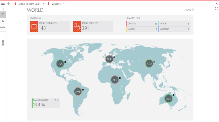
VISUAL: Contains all available Visual Overview pages.
VISUAL page in DataMiner 10.4.5Note
- A Visual Overview page can contain multiple tabs. If there are too many tabs to display them all on the screen, a "..." icon will be displayed. To open one of the tabs that are not displayed, you can click this icon and select the tab from the drop-down list.
- As you can also access these tabs from the card navigation pane, it is possible to hide them in Visual Overview by means of the Show tab pages user setting. For more information, see Visual Overview settings.
- If a Visual Overview page contains a background image, the header bar and navigation pane will be hidden after 3 seconds without mouse movement. Simply move the mouse again to make them reappear.
- Whether zooming in and out on a Visual Overview page is possible depends on the configuration of the page in Visio. See EnableZoom and DisableZoom.
DATA: Contains all available Data Display pages.
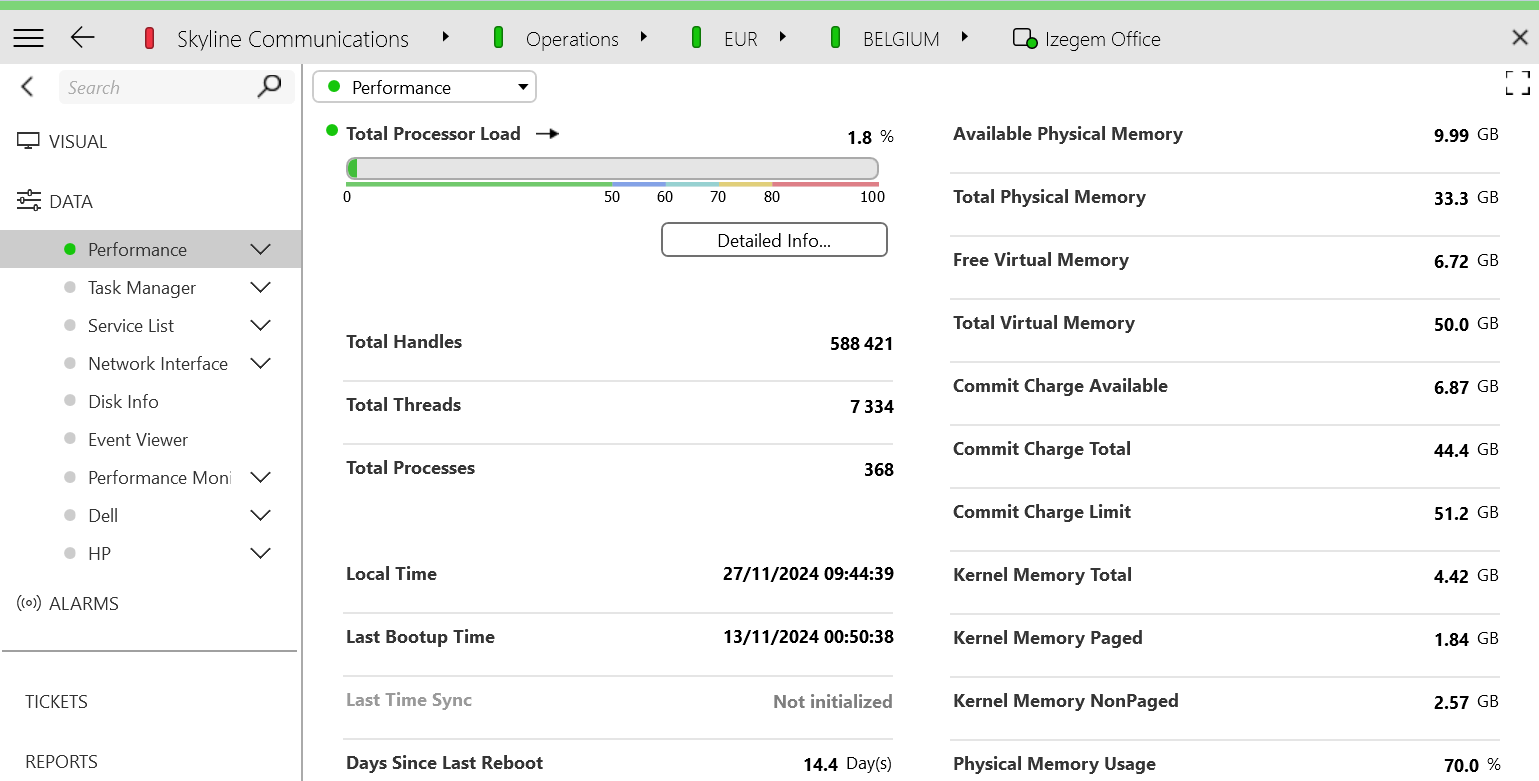
Data Display page in DataMiner 10.5.1Note
- Optionally, a Data Display page selector can be displayed on an element card, in addition to or instead of the tree view in the navigation pane. See Card settings.
- If you open a subpage of a Data Display page by selecting it in the card navigation pane instead of by clicking a page button, the subpage is opened in the same card, and at the top, a button "Up to [parent page name]" is displayed, which allows you to quickly go to the parent page.
- Element protocols can be configured to hide one or more Data Display pages depending on a parameter value.
- Instead of a DATA node, a view has a "BELOW THIS VIEW" node with pages listing the items within the view.
ALARMS: Displays an overview of all alarms on the selected item.
Note
If this page is open, the card’s header bar menu contains an additional item, Alarm Console, with the same settings as in the Alarm Console menu. For more information, see Alarm Console settings.
REPORTS: Displays graphical reports of the alarm distribution, alarm events, alarm states, and alarms on a timeline.
DASHBOARDS: Displays the legacy Dashboards module.
Note
The legacy Dashboards module is by default disabled from DataMiner 10.4.0/10.4.1 onwards. If you want to keep using this module, you need to enable it with the LegacyReportsAndDashboards soft-launch option. Prior to this, starting from DataMiner 10.2.0/10.1.12, the legacy Dashboards module can optionally be disabled with this soft-launch option.
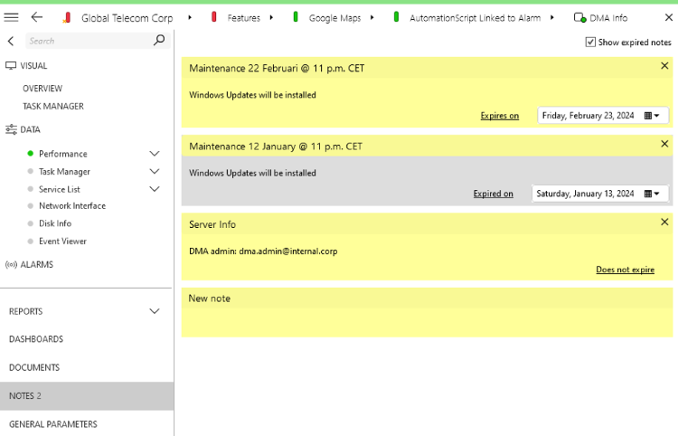
NOTES: Allows users to add short notes to DataMiner items:
Each note can have a title, a description and an expiration date.
Each note can be removed with the x in its top-right corner.
Expired notes are only displayed if you select Show expired notes in the top-right corner of the card. They are then displayed in a different color, so you can clearly see the difference with the notes that are not expired.
Notes in DataMiner 10.4.5ANNOTATIONS: Displays more extensive comments on DataMiner items. With the pencil icon on this page, you can open an HTML editor that allows you to add text, hyperlinks, pictures, etc. to the annotations. There is also an icon that can be used to print the annotations, and an icon to refresh the annotations page.
Note
The Annotations module is by default disabled from DataMiner 10.4.0/10.4.1 onwards. If you want to keep using this module, you need to enable it with the LegacyAnnotations soft-launch option. Prior to this, starting from DataMiner 10.2.0/10.1.12, Annotations can optionally be disabled with this soft-launch option.
Depending on the type of cards, more nodes may be available, e.g. AGGREGATION on view cards.
Note
- When you select a page in the card navigation pane while holding down the SHIFT key, that page will be selected in every open card.
- While the navigation pane is collapsed, if you click the VISUAL or the DATA node, the last open Visual Overview or Data Display page will be displayed. To expand the navigation pane and select a different page, simply click the node again.
- For custom element applications, by default no card navigation pane is displayed. However, it is possible to open this pane by selecting the option Show card side panel in the card header menu.
Card header bar menu
When you click the hamburger button in the top-left corner of a card, a shortcut menu with several commands is opened.
Back: Goes to the previous open page.
Forward: Goes to the next open page.
Undock: Opens the card in a separate, undocked window.
Dock: Returns a card that was opened in a separate window to the main Cube window.
Pin this card: Select this option to keep the card opened in the same position when other cards are opened. To unpin the card, click this option again. See Pinning cards.
Close card: Closes the card in question.
Device discovery: Only available on view cards. See Locating devices in your system to add to your DMS.
Visual overview: Allows you to set different Visio files for the card’s Visual Overview pages. See Switching between different Visio files.
Close other cards: Closes all cards except the one you have clicked.
Close all docked cards: Closes all cards that have been opened in the main Cube window, instead of in a separate window.
Close all undocked cards: Closes all cards that have been opened in a separate window.
Close all cards: Closes all cards.
Note
- Depending on the type of card, more options can be available. These are discussed in detail in the sections of the help related to the item in question.
- If some of these options are not available for you, it is possible that you do not have the necessary permissions to use them.
Opening cards
By default, if you left-click items in the Surveyor using a card layout other than the tab layout, each new card you open will replace the previous open, docked card. You can then navigate between the cards with the back and forward commands.
If only an undocked card is open when you open a new card, opening a new card will not replace the contents of the undocked card. The card will instead be opened as a new, docked card.
If a card is open on a particular page, and a new card is opened to replace that first card, DataMiner Cube will open the new card on the page that is most similar to the page that was open in the first card. However, unless there is an exact match, if a default page has been defined in the protocol, that default page will be displayed instead.
Width and collapsed/expanded state of the card navigation pane are remembered across cards. When you open a new card, the card navigation pane will be displayed in the same way as in the previous card.
However, you can also open items in a new card next to any cards that are already open, if you:
Click an item with the middle mouse button in the Surveyor or on a view card,
Hold Ctrl when you click an item in the Surveyor,
Select Open in new card in the item’s right-click menu.
Note
There is a limit to the number of cards, docked or undocked, that can be open on each side of the Cube. By default this number is set to 16, but it can be changed in the user settings. If you try to open more cards, a message will appear, telling you that the maximum number has been reached and you must close a card to continue.
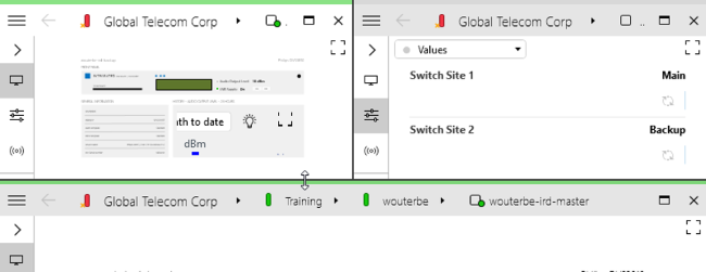
Changing the card layout
To change the card layout on the fly, drag the edge of a card to adjust its size.
Master bottom card layout option in DataMiner 10.4.5
To select a preconfigured Cube card layout, click the user icon in the top-right corner of the Cube UI (1) and select Change layout (2). This will open a side panel where you can select a card layout (3).
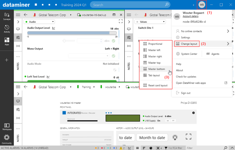
Master bottom card layout option in DataMiner 10.4.5
The following layout options are available:
| Card layout | Description |
|---|---|
| Proportional | The size of the displayed cards is adapted so that they all have the same size. |
| Master left | One large card on the left is the master, all other open cards are shown proportionally to the right of it. |
| Master right | One large card on the right is the master, all other open cards are shown proportionally to the left of it. |
| Master top | One large card at the top is the master, all other open cards are shown proportionally below it. |
| Master bottom | One large card at the bottom is the master, all other open cards are shown proportionally above it. |
| Tab layout | The different open cards are shown in a row of tabs at the top of the screen. Click a tab to switch to that card. |
| Reset card layout | Resets any manual changes to the card layout, so that the cards again have the size determined by the selected card layout. This option is only available from the Cube header bar. |
Tip
If you use the tab layout, from DataMiner 10.2.9/10.3.0 onwards, you can quickly close a tab by clicking the tab header with the middle mouse button.
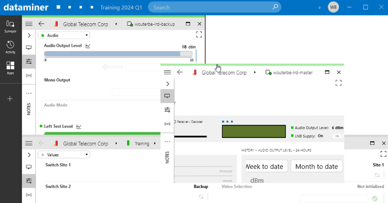
Dragging cards
It is possible to drag a card, by left-clicking and dragging the top edge of the card to its destination.
DataMiner 10.4.5
You can drag a card:
If more than one card is open, to make the cards switch place. This can for instance be done in a Master/Detail card layout, to change which card is the master.
If a maximized card is open above other cards, to drag the maximized card aside and check what is below it.
To undock a card, by dragging it out of the workspace.
Undocking cards
There are several ways to undock cards:
Drag an open card out of the workspace.
Hold Shift when you click an item in the Surveyor.
Select Open in new undocked card in an item’s right-click menu.
If you open a different card from inside an undocked card, it will replace the undocked card in the same window.
Pinning cards
To keep a card open in the same position when other cards are opened, it is possible to pin the card.
To do so, right-click the card header bar and select Pin this card.
To unpin the card again, right-click the card header bar and clear the selection from Pin this card.
Note
- On a pinned card, no close button is available, so that you cannot close the card by accident. However, you can still close the card by selecting Close card in the header bar context menu.
- If you use the tab layout, an additional option is available in the header bar context menu: Use small pinned tabs. If you select this option, pinned cards will have smaller tabs that only display the item’s icon.
- This feature cannot be combined with marking cards as non-closable or designating a Master card. When you select Pin this card in the hamburger menu, the Hide close button and Set as Master card options (Available from 10.3.9/10.4.0) will be disabled.
Marking cards as non-closable
From DataMiner 10.3.9/10.4.0 onwards, if the card layout is set to "Proportional", it is possible to hide the close button in the top-right corner of a card to prevent it from being closed.
To do so, click the hamburger button in the top-left corner and select Hide close button.
To restore the close button, click the hamburger button and clear the selection from Hide close button.
Note
This feature cannot be combined with pinning. When you select Hide close button in the hamburger menu, the Pin this card option will be disabled.
Selecting a Master card
From DataMiner 10.3.9/10.4.0 onwards, if the card layout is set to "Proportional", it is possible to promote one card to Master card.
To do so, click the hamburger button in the top-left corner and select Set as Master card.
Once a Master card is chosen, all new cards open within it, regardless of the number of displayed cards.
To deselect a Master card, click the hamburger button and clear the selection from Set as Master card.
Note
- Only one card can be Master card at a time.
- This feature cannot be combined with pinning. When you select Set as Master card in the hamburger menu, the Pin this card option will be disabled.