DataMiner Cube sidebar
On the left-hand side of the Cube UI, a sidebar is displayed. By default, this sidebar contains the following buttons:
| Icon | Name | Description |
|---|---|---|
 |
Surveyor | Opens the Surveyor pane. See Surveyor pane. |
 |
Activity | Opens a pane listing recent items. See Activity pane. |
 |
Apps | Opens a pane listing the different apps available in Cube. See Apps pane. |
 |
Workspace | Opens a pane where you can select and manage different Cube workspaces. See Working with workspaces. |
 |
Community | Clicking the button opens a menu with different links to the DataMiner Dojo user community, including the blog, the learning hub, a page where you can ask questions about anything related to DataMiner, a page that allows you to suggest new features, and a page that allows you to provide feedback. |
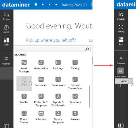
You can pin additional buttons to the sidebar using the "..." or "+" button. This button opens a menu where you can select the buttons you want to pin.
| Icon | Name | Description |
|---|---|---|
 |
Overview | Displays the root view page listing all items below the root view. |
 |
Search | If an advanced search is done from the Cube header bar, an additional Search button is displayed, which displays the pane with the advanced search results. If this button is not pinned to the sidebar, it will no longer be displayed as soon as you click a different button. See Searching in DataMiner Cube. |
| ... | ... | A button representing any of the available modules, the "About" information, the Help, or the settings. |
To unpin a button again, right-click the button and select Unpin. This is not possible for the buttons that are displayed by default.
DataMiner Cube sidebar in DataMiner 10.4.5
Note
- At most 4 items can be pinned to the sidebar. If the maximum number of items has been added, the button to pin more items is no longer displayed, until an item is unpinned again.
- It is possible to move the position of the sidebar to the right-hand side. To do so, press Ctrl+Alt+Shift+RightArrow. To move the pane back to the left-hand side, press Ctrl+Alt+Shift+LeftArrow. The sidebar position can also be changed in the Cube settings. See Cube settings.
- In an EPM environment, an additional Topology button can be available, which allows you to navigate through the EPM topology.
Surveyor pane
The Surveyor pane contains a hierarchical overview of all views, elements, services, etc. in your DataMiner System. It features alarm bubble-up, state indication, etc.
When you click an item in the tree, it opens in a card:
If you click the item with the left mouse button, the new card replaces a card that is already open.
If you click the item with the middle mouse button, the new card is opened next to any cards that are already open.
Note
- For the right-click menu options in the Surveyor, see Surveyor right-click menu.
- You can drag an element, service, view, or SLA from a card or from the Surveyor to another application, such as Microsoft Word or Outlook, to copy information about that DataMiner item to the application in question.
Icons
The icons that precede an item name in the tree show what kind of item it is and what state and alarm state it is in.
Note
Depending on the user settings, the legacy icons may be displayed instead of the icons described below. These look similar to the icons displayed below but allow some additional icon settings.
There are specific icons for different types of items:
Icon Item description 
View 
Element 
Service 
Service template 
Redundancy group 
SLA 
Protocol 
Parameter 
Script 
Setting 
Default function DVE (requires DataMiner Service & Resource Management) View icons are filled with a different color, depending on their alarm state. On other icons, a colored circle is displayed when they are in a particular alarm state. In addition to the default colors indicating the alarm severity, the circle can also be displayed in purple to indicate that an item is masked.
💡 TIPS TO TAKE FLIGHT
The alarm state color is determined by the most severe of all the current alarms for the item. There are four alarm severity levels, each indicated by a color. These default alarm colors can be changed in the DataMiner.xml file.
There may be additional symbols on an icon to indicate a particular state:
Symbol Description Gray square Located in the corner of an icon to indicate that the item is stopped. Two vertical bars Located in the corner of an icon to indicate that polling on the item is paused. Orange X Indicates that an element in a view or service is in timeout state. White X on red background Indicates that an element is in error state. Upwards arrow Displayed next to a service child in case the capped severity of the service child is lower than the actual severity. The icon has the color of the severity that will bubble up to the parent service. Circle containing a horizontal line, for example: 
Indicates that the DMA hosting the item is currently unavailable. Though the information on the item is still available in the cache, it is not possible to execute any actions on the item.
Special icon settings
In the DataMiner settings, there are several options to show more alarm information next to an icon than just the current state. These icon settings are only available if the Use modern icons setting is not enabled.
The following options are available:
Split view alarm level: Shows the alarm color of child views in a second rectangle separated from the alarm color of the elements directly in the view.
View/element/service latch level: Shows the latched alarm color in a smaller rectangle. This is the color of the previous highest alarm severity level of the item.
Note
When this setting is activated, you can reset the latch level of items in the Surveyor. To do so, right-click the item and select Reset latch level.
Timeout state overrules element alarm level: Though normally a timeout state is shown separately from the last known element alarm level, you can also have the timeout override the alarm level.
View aggregation level: Indicates aggregated alarms on views with a triangle next to the colored bar indicating the view alarm state.
Surveyor right-click menu
In the Surveyor right-click menu, the following options are available, depending on what type of item is right-clicked:
| Menu option | Right-clicked item | Description |
|---|---|---|
| Expand all in alarm | View only | Expands all subviews with an active alarm. |
| Collapse level | View only | Collapses the level of the right-clicked view. |
| Open | Any | Opens the item in a card. |
| Open in new card | Any | Opens the item in a new card. |
| Open in new undocked card | Any | Opens the item in a new, undocked card. |
| Ticket | Element, service, view | Allows you to create a new ticket related to the right-clicked item. Only available on DMAs with a Ticketing license. However, note that this functionality is being retired. See Ticketing. |
| State | Element only | Opens a shortcut that allows you to change the element state. |
| Mask | Element only | Masks the element. |
| Unmask | Element only | Unmasks the element. This option is only available for masked elements. |
| Multiple set | Element only | Allows you to set a parameter value in multiple elements. From DataMiner 10.4.0 [CU17]/10.5.0 [CU5]/10.5.8 onwards, this menu option is only available when the Enable 'Multiple set' Cube user setting is enabled. |
| Protocols & Templates | Element, enhanced service | Opens a submenu where you can: - View the used protocol or service protocol, alarm template, and trend template. - Assign alternative templates. - View all available templates. |
| View | Element | Opens a shortcut menu that allows quick access to DataMiner logging or Stream Viewer. |
| Edit | Element, service | Opens a card where you can change the configuration of the element or service. |
| Remove from parent | Any view child item, except a child view | Moves the item from the parent view to the root view. |
| Delete | Any except root view | Removes the item. |
| Duplicate | Element, service | Duplicates the item. |
| Rename | Element, service, view, redundancy group | Allows you to rename the item. |
| New | Any | Opens a submenu where you can select to create a new element, service, service template, redundancy group,redundancy group template, or SLA. If you right-clicked a view, you can also select to create a new view. |
| Actions > Alert me | Element, service, view | Allows you to configure a personal alert for alarms related to the right-clicked item. |
| Actions > Export | Element, service, view | Allows you to export the selected item to a DataMiner package or to a CSV file. |
| Actions > Import | View | Allows you to import a DataMiner package or a CSV file in the right-clicked view. |
| Actions > Create simulation | Element | Allows you to create a simulation file based on the right-clicked element, which can be used to create a simulated element. |
| Actions > Enable simulation | Element | Allows you to create a simulated element. |
| Actions > Add tab to global Alarm Console | Element, service, view | Creates a filtered tab in the Alarm Console to show alarms for the right-clicked item only. |
| Actions > Apply service template | View | Allows you to apply a service template to the right-clicked view. |
| Actions > Upgrade to service | View without child views | Allows you to transform the right-clicked view into a service. The child elements in the view will become child elements of the new service. |
| Actions > Analyze | Element, service, view | Allows you to analyze the alarms for the right-clicked item in order to create a Correlation rule based on that analysis. |
| Actions > Add element/service to dashboard | Element, service | Allows you to add the right-clicked item to a legacy dashboard. However, note that the legacy dashboards module is being retired, and it is by default disabled from DataMiner 10.4.0/10.4.1 onwards. |
| Properties | Element, service, view | Opens the item’s Properties window. |
| Drag and drop editing | Any | Enables the drag-and-drop view editing mode. |
Note
- For some special items, such as redundancy group templates or service templates, additional options are available.
- The View option is also available for enhanced services, with the options to view the protocol, alarm template, or trend template of such a service.
- When opening an item from the right-click menu, you can hold Ctrl while clicking the menu option to open the item in a new card, or hold Shift while clicking the option to open the item in a new undocked card.
Activity pane
The activity button displays a pane listing recently opened items, such as elements, services, views, and apps.
The following actions are possible with this list:
Click an item in the list to open it in a card. If you wish to open the item in a new card, use the middle mouse button.
Pin an item so that it is placed in the Pinned section at the top of the list: hover over the item with the mouse pointer until a pin icon appears to the right of it, then click the pin icon.
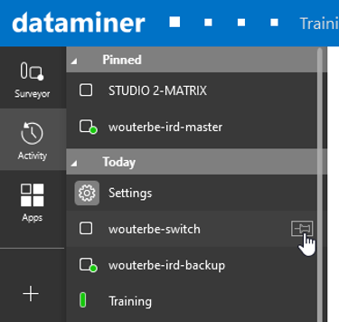
Activity pane in DataMiner 10.4.5
Note
- Regardless of how frequently you view them, pinned items remain in the top section of the list until you click the pin icon again to remove them.
- The list of recent and pinned items is kept synchronized between DataMiner Cube client and the Monitoring app.
- Recent items can be views, elements, services, redundancy groups, service templates and DataMiner modules.
Apps pane
The apps button displays a list of DataMiner applications.
Depending on the configuration and version of your DataMiner System, as well as on which user permissions you have been assigned, the list can contain the following sections:
Modules: DataMiner modules such as Automation, Documents, and Trending.
Web Apps: The Monitoring app, Dashboards app, and any available low-code apps.
General: The Help, Settings, and About.
WFM: Custom DataMiner WorkFlow Manager components.
Any custom sections configured in the DataMiner Low-Code Apps module, listing low-code apps.
Click any item in the list to open it. If you wish to open the item in a new card, click the item while pressing the Ctrl key. However, note that the web apps will always open in a browser tab instead of in DataMiner Cube.