Dashboards and Low-Code Apps style guide
Use this documentation as a basis to build or improve dashboards and low-code apps. This guide will allow you to create intuitive, visually appealing solutions, ensuring that users experience consistent behavior across different dashboards and low-code apps. For DevOps Engineers at Skyline, adhering to this style guide is mandatory. Note that many things will only be applicable for low-code apps, as dashboards have more limited possibilities.
Note
If you come across something that has not been added to this style guide yet, create a pull request to update this documentation.
Tip
Are you new to designing low-code apps and dashboards? This will help you get started:
- Kata #19: Transform low-code apps into visual delights on DataMiner Dojo

- Tutorial: Creating a visually appealing and user-friendly low-code app
Themes
When you choose the main color for a low-code app, ensure that there is enough contrast between the header, sidebar, and buttons.
When you create a new app or dashboard, always start from a default theme. From DataMiner 10.4.0 [CU13]/10.5.0 [CU1]/10.5.4 onwards, the following default themes are available:
Skyline Light - White
Skyline Dark
Use the same theme consistently across all pages and panels.
Customize component themes only to make minor adjustments, such as removing padding inside a maps component.
Always use the Default component style, except for the following components, where you should use the Transparent style:
The default component styles include a predefined set of data colors. If you add custom colors to the color set, make sure they are complementary to the existing ones.
Use the same color to represent the same data consistently across the app. To do this, configure conditional colors as part of the theme.
Templates
Use the interface colors provided in the default themes to enhance usability and readability The table below shows how these colors are applied in both default themes. Combinations are suggested, but you can mix and match depending on your needs.
Purpose Skyline Light - White Skyline Dark Component background #FDFDFD #23272F Secondary component background #F6F6F6 #1C2129 Page background #EFF0F0 #151A22 2nd background hover #E8E8E9 #30353C Component border #E1E1E2 #383C43 Secondary border #D3D4D5 #44484E Hover state for component border #C5C6C8 #4F5258 Secondary hover state for component border #B8BABC #5B5E64 Disabled text #A0A2A6 #727579 Quiet text #727579 #A0A2A6 Subtle text #44484E #CECFD1 Default text #151A22 #FDFDFD For selected states or call-to-action elements, use your app's main color or
#2563EB.For a selected state, use the color as a border and apply a background overlay using the same color with 10% opacity.
For a call to action, use the color as a background and pair it with the default light or dark text color, depending on contrast.
Only use the default font.
Limit templates to a maximum of 3 visible actions. If more actions are needed, add them behind a context menu.
Tip
For an example, refer to Styling a table component - Step 7: Add a context menu
Use tooltips or
titleattributes in HTML layers to clarify layered content.If your visualization does not have fixed dimensions, make sure your template is fully responsive. Use techniques such as CSS Flexbox, container queries, the
text-overflowproperty, etc.
Tip
Creating a template from scratch? You can find inspiration on Dribbble, sketch and structure parts of your template in Figma, and test your HTML/CSS layers in Codepen.
Layout
Make sure components on a page/panel are aligned vertically and horizontally.
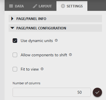
In the page settings, make sure the Number of columns setting is set to 50. This will give you more flexibility when choosing the size of your components. From DataMiner web 10.4.0 [CU20]/10.5.0 [CU8]/10.5.11 onwards, this is the default setting.
Leave one column of spacing on the left and right sides of every page.
Apply consistent spacing between components.
Avoid clutter. Tailor the complexity of the interface to your target audience (e.g., technical users vs. management).
Use the fit to view option when the content fits the screen.
Adjust component sizes to the content they display (e.g., avoid oversized ring and state components or undersized tables and timelines filled with data).
Before you publish a low-code app, test your layout on different screen resolutions to ensure that it displays correctly on all target devices.
Navigation
Use the sidebar as the main navigation to the different pages defined in the app. When there are too many pages in your sidebar, or if you want to show the same data in another way, use buttons in the header bar as tabs to open hidden pages.
Note
Make sure you do not use both regular action buttons in the header and buttons that are meant to be used as tabs, as this will lead to confusion. Regular action buttons should only be added when no tabs are needed.
If you are using buttons in the header bar as tabs, make sure you show a title on each page or use a circle icon that is filled on the selected page.
Place the "About" page at the bottom of the sidebar and use the info circle icon.
If your app has more than 10 pages (including sidebar and header tabs), add an overview page. It should highlight key data and provide quick links.
Panels
Show additional information in a side panel on the right for each item on a page.
If your panel updates based on a selection, add a title with the selected item's name.
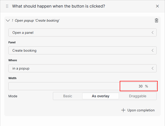
Show forms in a pop-up panel.
If you reuse an existing panel, make sure to configure the same width as before in the action configuration, so that the same panel is always shown with the same width.
Every panel should have a close button in the upper-right corner. An icon is enough; the button does not need a label.
If you have too much information in one panel, you can split it into multiple panels and use buttons in the header bar as tabs.
Use the "As overlay" option when opening a panel.
Do not set the width of a panel to 100%, because it should be clear that it is a panel instead of page.
Actions
Only include one access point for a certain action per page/panel.
Confirm important data change actions with a notification.
Components
Make sure you choose the right visualization for your data.
For example, if your data is event-based, show it on a timeline, or if your data is location-based, show it on a map.
If the data displayed by a component depend on a query, make sure you add a custom empty component message that helps the user in case the query returns no results.
Titles
You can add a title to a page by using a web component. This is optional, depending on whether users will need more context information about what they are looking at.
For example, most one-page apps will not need a title, but if a page uses buttons in the header bar as tabs, a title tends to be needed.
Start from this title:
<div style="height: 100%; display: flex; flex-direction: column; justify-content: center; font-family: Segoe UI,Segoe UI Web Regular,Segoe UI Symbol,Helvetica Neue,BBAlpha Sans,S60 Sans,Arial,sans-serif;">
  <H1 style="color: #151A22; margin: 0; font-weight: 400; font-size: 24px">People</H1>
  <p style="color: #44484E; margin: 0; font-weight: 400; font-size: 16px">
  An overview of all managed people.
  </p>
</div>
Do not repeat the low-code app name as a title on a page.
Do not make the titles too big.
Use the same title styles across your low-code app.
Place titles in the exact same place on every page.
Do not add icons in your title.
Buttons
Label your buttons with enough context so users understand exactly what each action will do.
Add an icon whenever possible.
Images
Avoid adding logos.
Do not add unnecessary images.
Only add images if they are dynamic, so that they change based on the displayed data. You can do with a web component on a page or HTML tool in templates.
Forms (DOM and IAS components)
Make sure forms are always shown in a pop-up panel.
Place any form actions, such as "Save" or "Delete", at the bottom of the form.
Enable the "Fit to view" option on a pop-up panel with a form.
Make sure labels are shown above the inputs in DOM forms by setting the pop-up width to 35%.
If the DOM instance shown in the form has states, show a stepper component at the top showing the current state of the instance.
Tables
Limit the number of columns so all columns shown fit the screen size for which the app is intended. Show any additional information in a panel.
Add a component title to your table mentioning which kind of data it is.
Do not show IDs.
Rename your column titles to straightforward, clear but concise names.
If you override the default row selection indication, make sure that the overrides you configure in the templates are visible on the entire row.
Add actions in the first or last column of your table.
Use 49px row height.
Only use icons next to values if the icon changes based on the value.