Dashboards and Low-Code Apps style guide
Use this guide as a basis to build or improve dashboards and low-code apps. These best practices will allow you to create intuitive, visually appealing dashboards and apps, and they will allow users to experience consistent behavior across different dashboards and apps. Note that many of the best practices will only be applicable for low-code apps, as dashboards have more limited possibilities.
Tip
See also:
- Kata #19: Transform low-code apps into visual delights on DataMiner Dojo

- Tutorial: Creating a visually appealing and user-friendly low-code app
Note
If you come across something that has not been added to this style guide yet:
- Investigate what the best possible solution would be, ensuring consistency across the app and across the different available solutions.
- If you have any doubt, check with rens.ampe@skyline.be.
- Create a pull request to update this documentation.
Colors/themes
When you create a new app or dashboard, it essential to start from a good theme. The same themes exist across the Dashboards and Low-Code Apps module within a DMS. The themes are primarily managed in the Dashboards app. If the theme you want to use does not exist yet, start by duplicating a theme in the Dashboards app that has a similar look and feel to what you have in mind, and then fine-tune it. In a low-code app, you can then select this theme on page level. Use the same theme for every page.
Tip
See also: Creating a new dashboard theme
Each theme must have a component style with a transparent background. Use this component style for titles, images, and buttons.
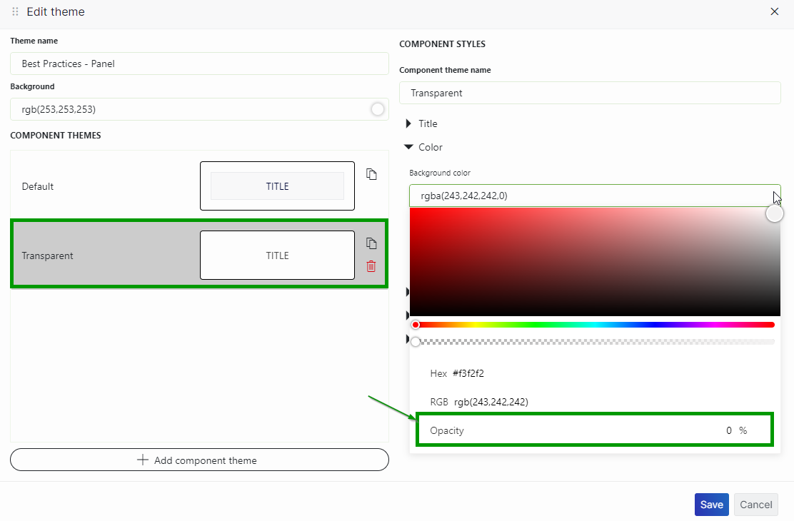
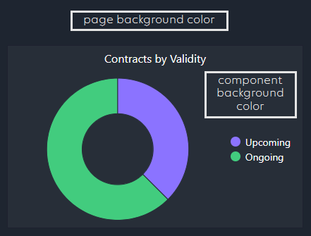
When you define a background color for pages/panels (as part of the theme), never use full white (#FFFFFF) or full black (#000000). Here are some good default colors:
☀️ Light background 🌙 Dark background #F4F4F5 #1E2530 Make sure the background color of your component style is different from the page/panel background. This way, components can easily be distinguished from the background. This can be used for query filters, tables, timelines, etc. (anything but titles, images, and buttons). Generally, it is best to choose a slightly lighter color than that of the page/panel background. Here are some good default colors:
☀️ Light background 🌙 Dark background #FDFDFD #272E38 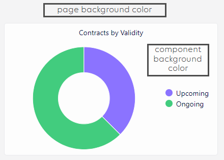
When you pick colors for pages, panels, buttons, grids, and tables, there must be enough contrast between text and icons and their background. Otherwise, users will have trouble seeing the text and icons.
👍 Good 👎 Bad 

When you pick the main color for a low-code app, also make sure there is enough contrast. When you select an app color, the app itself will determine what the color of the text is, based on the selected background color. Be sure to pick a color that results in enough contrast between the text and background color, especially in the pages menu on the left, as this will be a slightly darker color than the selected app color.
👍 Good 👎 Bad 
The colors for states in tables and charts must be used consistently, so that the same color is always used to represent the same state. To best way to achieve this in charts is by using conditional colors as part of the theme, which allows you to map a display label to a specific color consistently across components.
Limit the number of colors that you use in a dashboard or app. Avoid making it too colorful or too monotone.
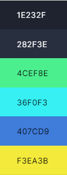
Picking good colors to start from is often a challenge. One way to approach this is to pick some colors from a layout you find online, like this sample below:
Sample UI Color palette Resulting app with same color palette 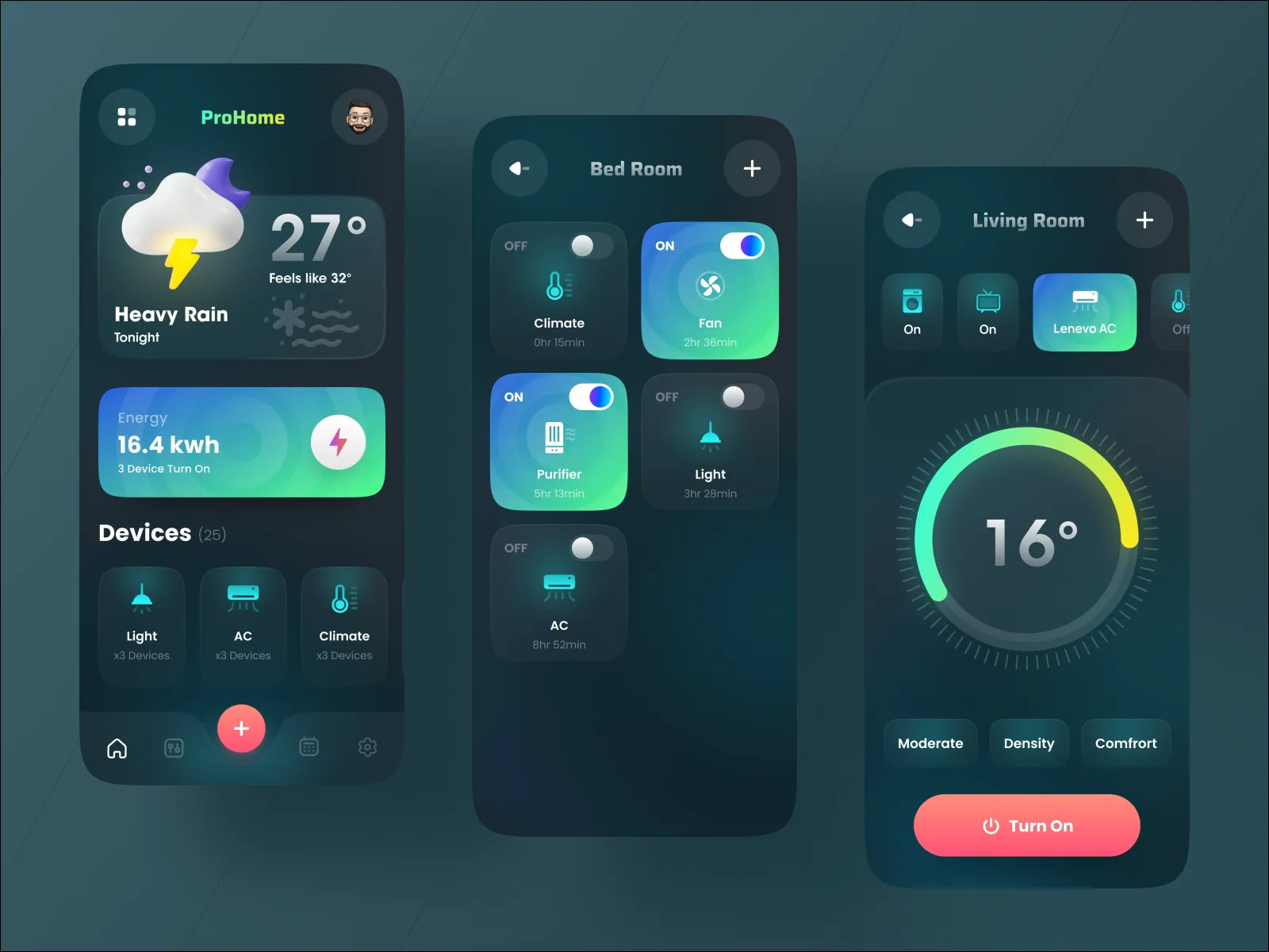
Layout
Make sure components on a page/panel are aligned vertically and horizontally.
👍 Good 👎 Bad 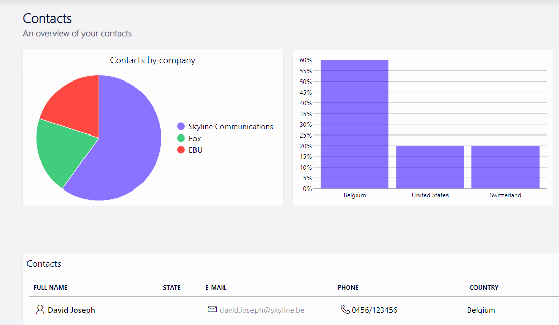
Use consistent spacing and a consistent margin on the left and right edge of each page in a low-code app. Avoid stretching components to the edge of the page with no spacing.
Make sure the available space is used, so there are no large empty areas on a page. At the same time , do not clutter the interface with too much information. In a low-code app, you can hide additional information on panels instead.
Try to limit the number of different font styles and font sizes.
Adjust the size of components to fit the information they contain. This means you should for example avoid very large ring/state components or very small tables and timelines.
You must ensure that your layout has been tested on different screen sizes before you publish a low-code app. Make sure it also works on a smaller screen like a laptop and not only on big monitors.
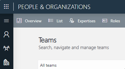
Navigation
In order to have consistent navigation, we recommend applying the following order for navigation in a low-code app:
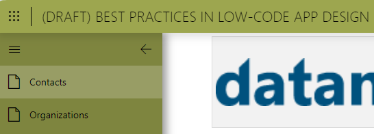
Sidebar: Main navigation to the different pages defined in the app.
Note
Use a side panel to show additional information for each item on a page.
Header bar: Navigation within a page.
This can open up a hidden page, in which case it makes sense to change the title of each page so users know where they are.
Important
It is generally not advised to use buttons for navigation.
Panels
Panels in a low-code app should primarily be used to show additional information about an item selected on a page. This can for example be a DOM form or additional details/metadata that were not shown on the original page.
Panels can be shown on the left or the right of the screen or as a pop-up window. Try to always show a panel in the same location in an app, with the same width, etc. As a default, we recommend showing DOM forms in a pop-up window and showing additional information about a selected table row in a side panel on the right.
Every panel should have a close button in the top-right corner. This can be in the menu bar or it can be a separate button.
Components
Titles
Titles are optional on pages, depending on whether users will need more context information about what they are looking at.
Avoid repeating the app name as a title on an app's pages.
Do not use a background color for titles.
Do not make the titles too big: the focus should be on the content of the page.
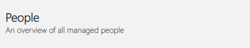
We recommend adding a title to a page as a web component instead of just text. For example:
HTML code:
<div style="height:100%;display:flex;flex-direction:column;justify-content:center">
  <H1 style="color: rgb(20,33,42); font-family:'Segoe UI Light','Segoe UI Web Light','Segoe UI Web Regular','Segoe UI',Arial,sans-serif;margin:0;font-weight:100;font-size:24px">
    <b>People</b>
  </H1>
  <p style="color: rgb(20,33,42,0.7); font-family:'Segoe UI Light','Segoe UI Web Light','Segoe UI Web Regular','Segoe UI','Segoe UI Symbol',HelveticaNeue-Light,'Helvetica Neue',Arial,sans-serif;margin:0;font-weight:600;font-size:16px">
  An overview of all managed people
  </p>
</div>
Result:
Buttons
Buttons can trigger different actions on a page or panel. Here are some things to keep in mind when you add buttons:
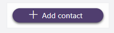
Use short labels.
Add an icon to a button whenever possible. This will make it easier for users to see at a glance what the button is for.
Make sure buttons have a transparent background.
👍 Good 👎 Bad 
Images/icons
Do not add customer logos to apps. While these may look useful for marketing purposes, they usually take up space without adding much value.
If you want to add an image to an HTML component or a table/grid template, you can convert the image to a data URI using a converter. This way, you can include the image in the HTML code. Only do this for small images.
<img height="45px" src="data:image/png;base64,iVBORw0KGgoAAAANSUhEUgAACWAAAAlgCAYAAAAMTQxuAAAgAElEQVR4nOzcTWjl+13H8c//JPecPgjNXOhBrGBRMvjAhEDNCS2ziJPWhSBuPCCYhc3Cdjrj6bkLTTbKwZmgEp0UtVgE4S7Vi+suurkglj5QfEYoCIK1VlsSWmpzTe/Mz83l0nqfZjJJfv//Oa/X/s/v/d9/+CYAAAAAAAAAAAAAAAAAAAAAAAAAAAAAAAAAAAAAAAAAAAAAAAAAAAAAAAAAAAAAAAAA .... />When you use emojis inside text or HTML, keep in mind that these can look different depending on the machine where they are shown.
DOM forms
When you include a DOM form in a low-code app, keep the following best practices in mind:
Make sure forms are shown in the same manner in all the apps you build: either in a pop-up window or in a side panel.
Use the As overlay option to open the pop-up window or panel, so that the focus will be there instead of on the background.
Add any form actions, like save or delete, in the header bar of the pop-up window or panel.
In the configuration of the panel showing a form, the Fit to view option must always be enabled. This will make sure the form adapts to the available screen size of the user.
When you configure the event to open the panel, set the width to at most 35 %. This will make sure the labels of the form are shown above the inputs, which may make them easier to read.
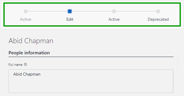
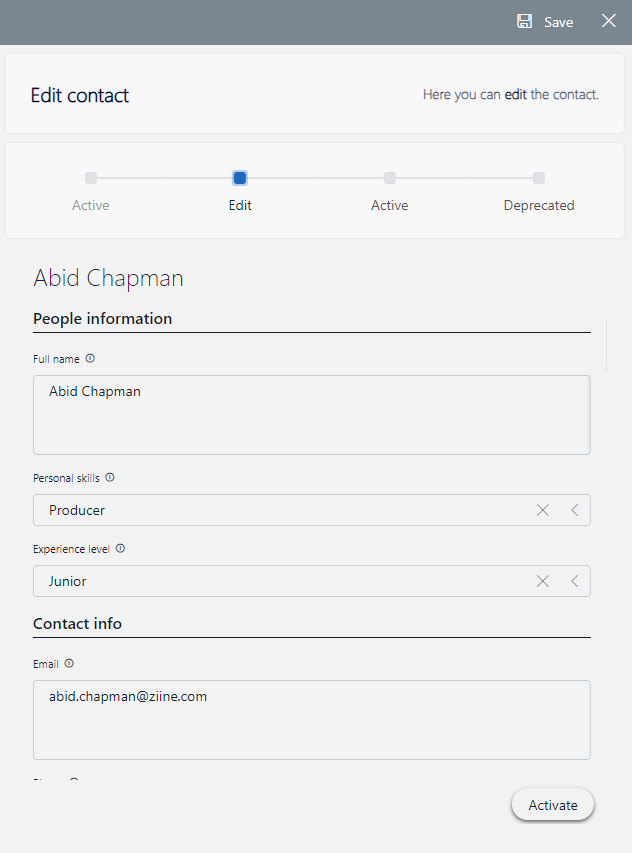
If the DOM instance shown in the form has states, show a stepper component at the top showing the current state of the instance.
When a user performs an action on a form (e.g. saving or updating), it is good practice to show them a notification with the result of the action:
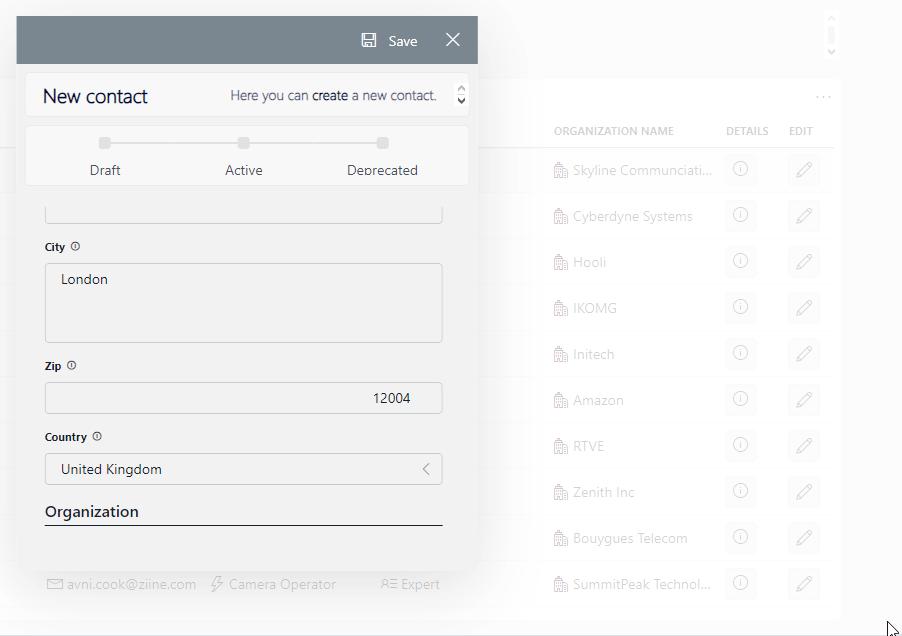
Here is a good example of a DOM form with a stepper component inside a panel with a save and close button:
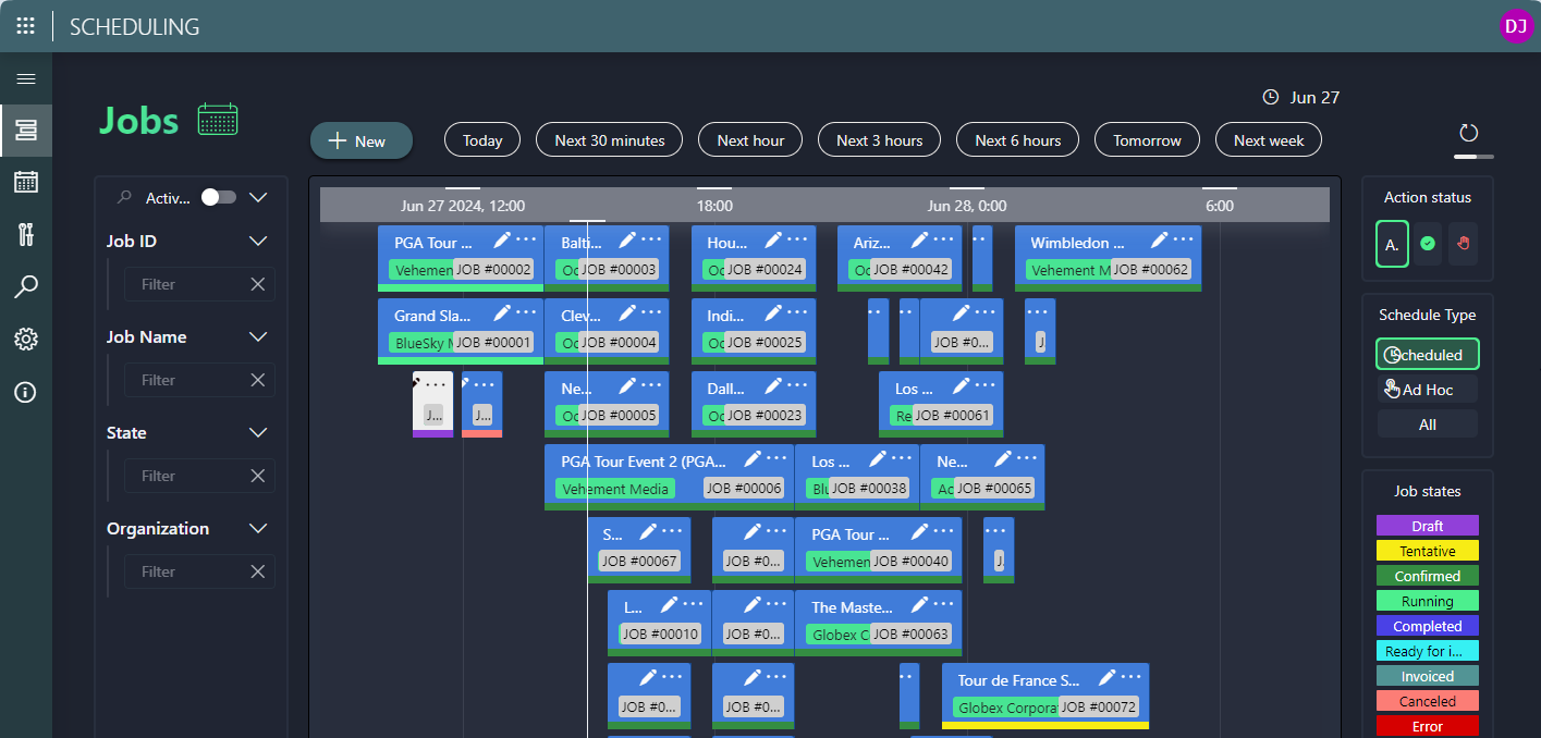
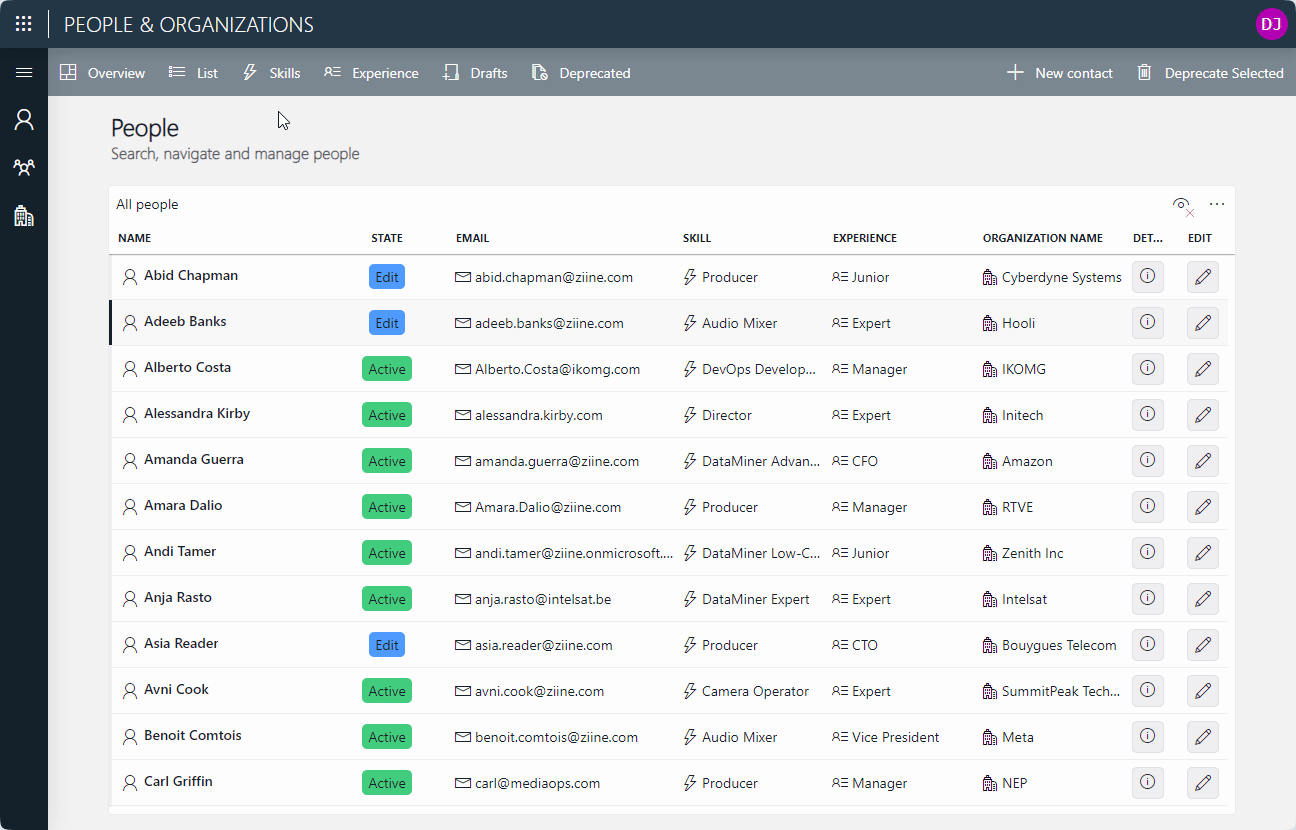
Tables
To display multiple records, usually, a table is used. Keep the following guidelines in mind when you add a table:
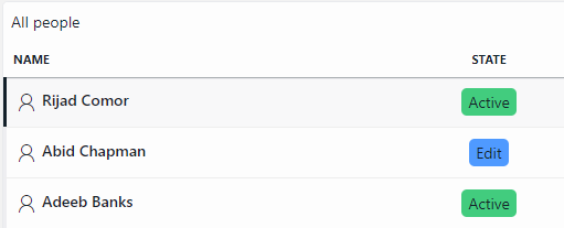
Tables should only contain the most relevant data. Try to limit the number of columns.
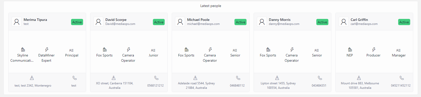
It is generally good practice to add a title to the table component (via Component > Layout > Title) to indicate what the content of the table is.
Do not show GUIDs in a table column, even if this data is part of your GQI query. You should hide these by using a filter on the columns that are shown.
Make sure the tables in your apps or dashboards have the same look and feel.
The Empty result message must be customized so that it clearly states why no data is shown in the table. The default message is not user-friendly.
👍 Good 👎 Bad 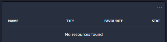
Tip
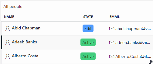
Use the template editor to add a visual indication to the first column to clearly show which row is selected:
Tip
See also: Styling a table component
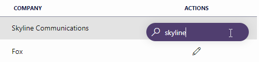
When you add actions to a table (e.g. to edit a row), you can add icons to the first column or in the last column. However, if you use the last column, it can occur that the table quick filter blocks access to the last column of the first row of a table. The first column is therefore preferred. If you add more than 3 actions, add them in a context menu.
👍 Good 👎 Bad 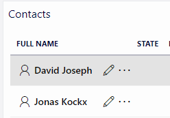
Use the template editor for each column:
To add icons to the column where relevant.
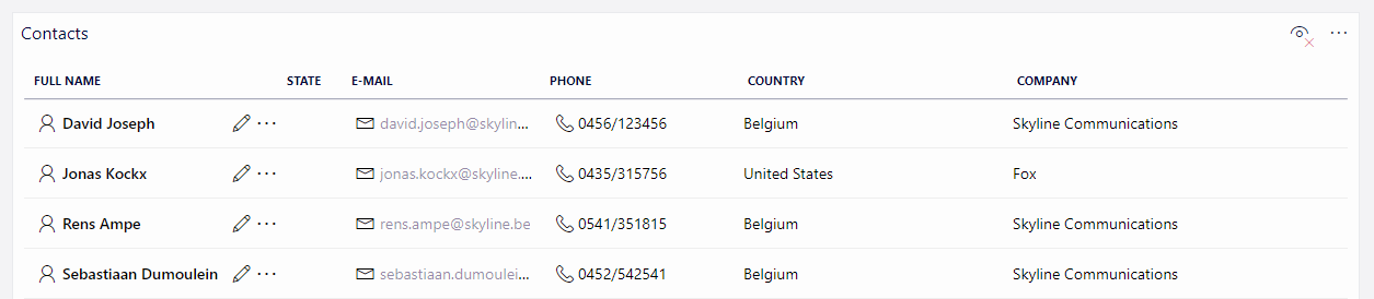
To increase the row height. To make the table content easier to read, we recommend a height of about 46 px instead of the default row height.
For example:
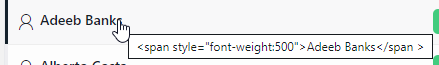
When you use HTML inside a table template, there must be an outer HTML element with a title attribute (with the same value as the table cell); otherwise, if you do not specify a title attribute, the HTML will show up as a tooltip:
👍 Good 👎 Bad <span title="{Name}" style="font-weight:500">{Name}</span ><span style="font-weight:500">{Name}</span >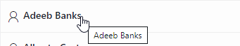
Grids
In some cases, a grid can be used instead of a table to display multiple records. Keep the following guidelines in mind for the use of a grid:
Only use a grid instead of a table in case you need very specific visuals with horizontal and/or vertical rows. Otherwise, it makes more sense to use a table, as this comes with sorting and filtering options out of the box.
Here are some examples where it makes sense to use a grid:
To create a button panel.
For button-style filters:
Horizontal filter 
Vertical Filter 
To summarize/visualize items in a more creative way:
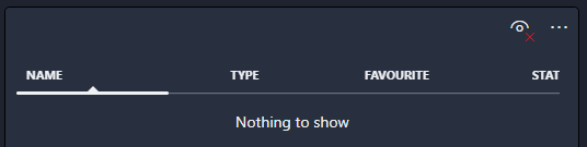
As with tables, the Empty result message must be customized so that it clearly states why no data is shown in the table, because the default message is not user-friendly. See Displaying a custom empty component message.
Like for a table, when you use HTML inside a grid template, there must be an outer HTML element with a title attribute (with the same value as the grid cell); otherwise, if you do not specify a title attribute, the HTML will show up as a tooltip.
Low-code app examples
The following apps can give you some inspiration to create your own user-friendly low-code apps: